
The Challenge
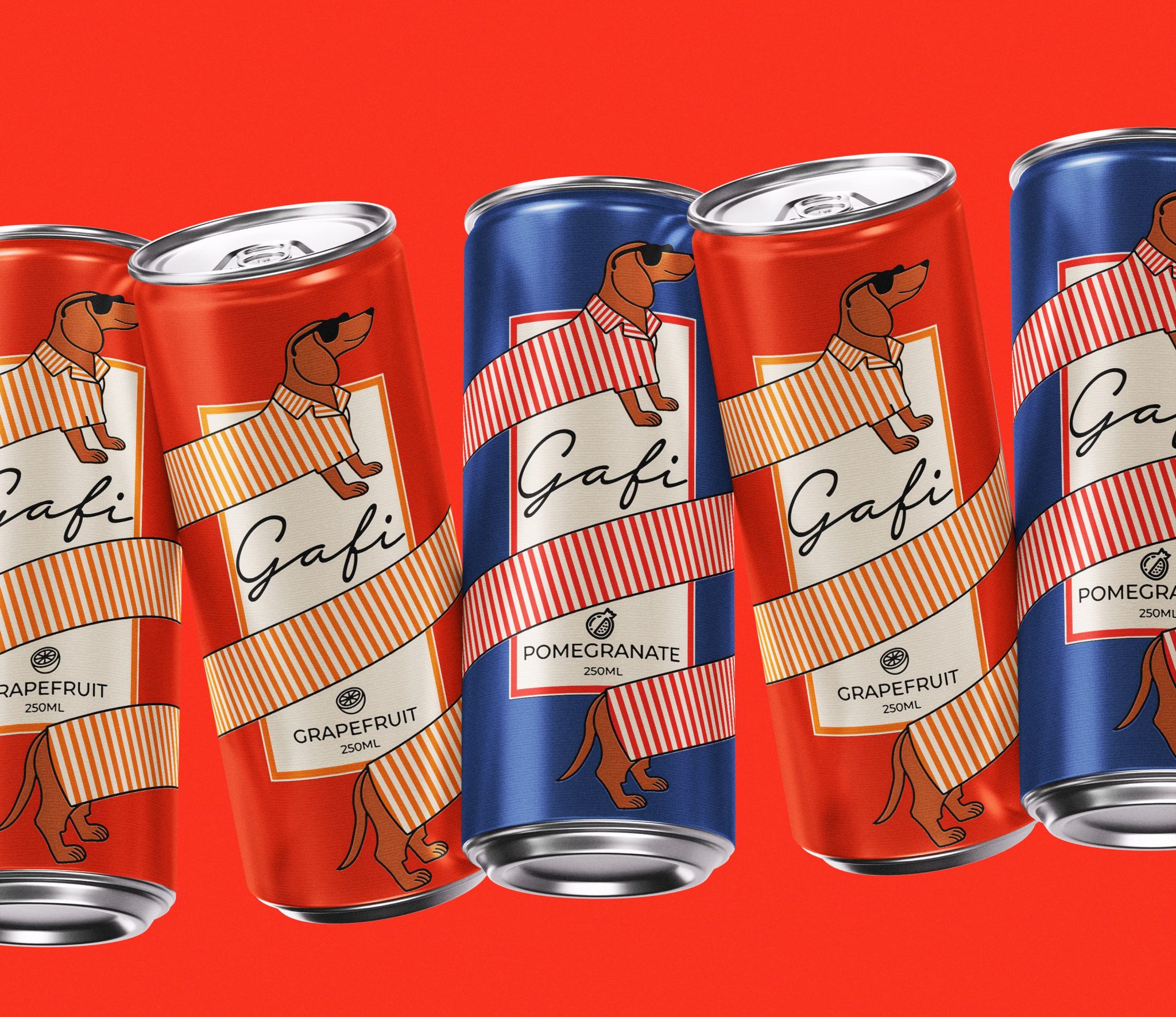
The soft drink category is crowded with predictable visuals: fruit illustrations, splashes, and flavor-driven communication. As a result, many products become interchangeable on the shelf. The goal for Gafi Juice was to create a packaging system that builds recognition around the brand itself rather than the product — a brand people can remember instantly.
The Idea & Emotional
Instead of designing around the beverage, the identity was built around a character. Gafi, a dachshund, serves as the face of the brand. More than just a mascot, it becomes an integral part of the packaging structure. A striped ribbon wraps around the can while simultaneously transforming into the dog’s clothing, creating a seamless connection between illustration and packaging.
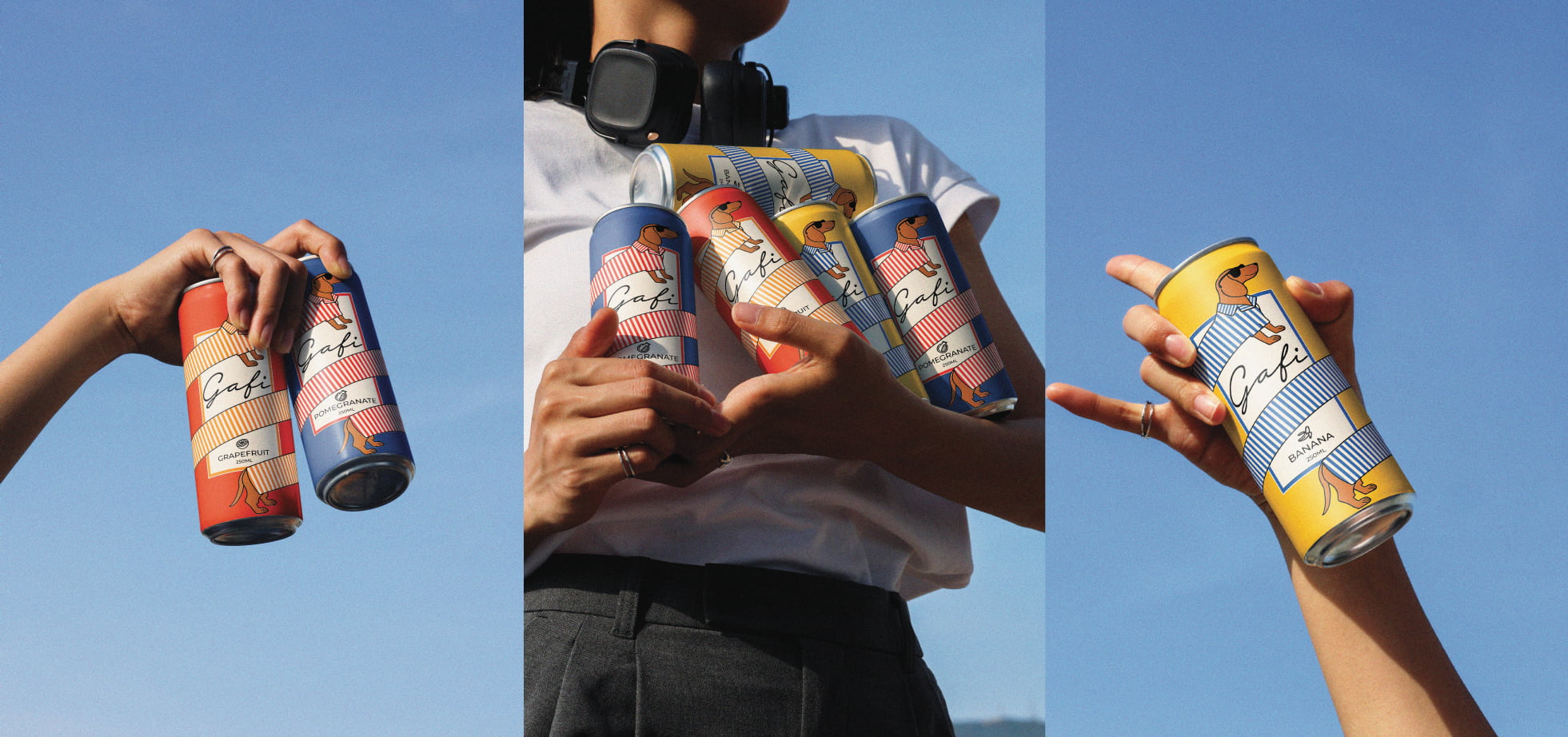
People rarely connect deeply with just flavors; they connect with stories, personalities, and characters. Gafi was created to bring familiarity and emotion into a category often dominated by purely functional communication. The objective was simple: create a soda can that makes people smile before taking the first sip. This approach creates a distinctive visual asset that strengthens recognition and memorability across the entire product range.
The Result
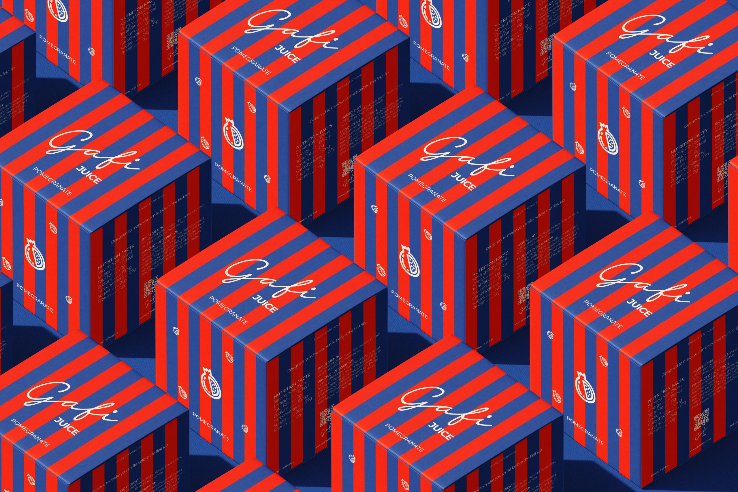
A character-driven packaging system that transforms a simple soda can into a memorable brand experience. By replacing category clichés with a distinctive visual identity, Gafi achieves stronger shelf presence, deeper emotional engagement, and a brand language capable of extending far beyond packaging.
Curator’s Insight
The striped ribbon is doing more work than it first appears. On the surface it reads as a graphic device, but follow it around the can and it becomes the dog’s clothing, which means the structural layout and the character illustration are actually the same element. That kind of integration is harder to pull off than it looks, and it’s what separates a mascot slapped onto packaging from one that feels native to it. The bold can colors also help: red and navy give the character enough contrast to read clearly at a distance, which matters the moment this hits a shelf next to a dozen competitors. Fun concept, tight execution.

 NEV
NEV Stefano Bracci
 Alina
Alina monther al omari
 Lizakjx
 JOAOMARCOSDESIGN
 alchimistestudioParis
 Harriet Neild
 octavio rojo
 宏洛图品牌设计HONGLT
 DESIGN CONCEPTS
 Alexander Skurihin
 Studio K95
 ARMBRAND
 Richa Rai
 houseoferas by Miti
 Agence des Coteaux
 Kushi Eaknath
 Ann Treasa
 Xiao Ning
 krrrrrllii
 babyage
 Deep
Deep