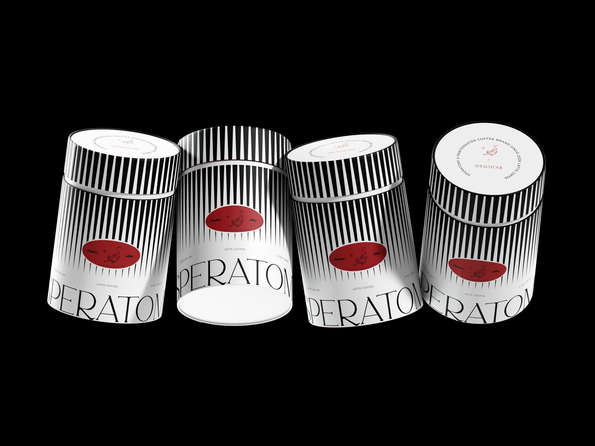

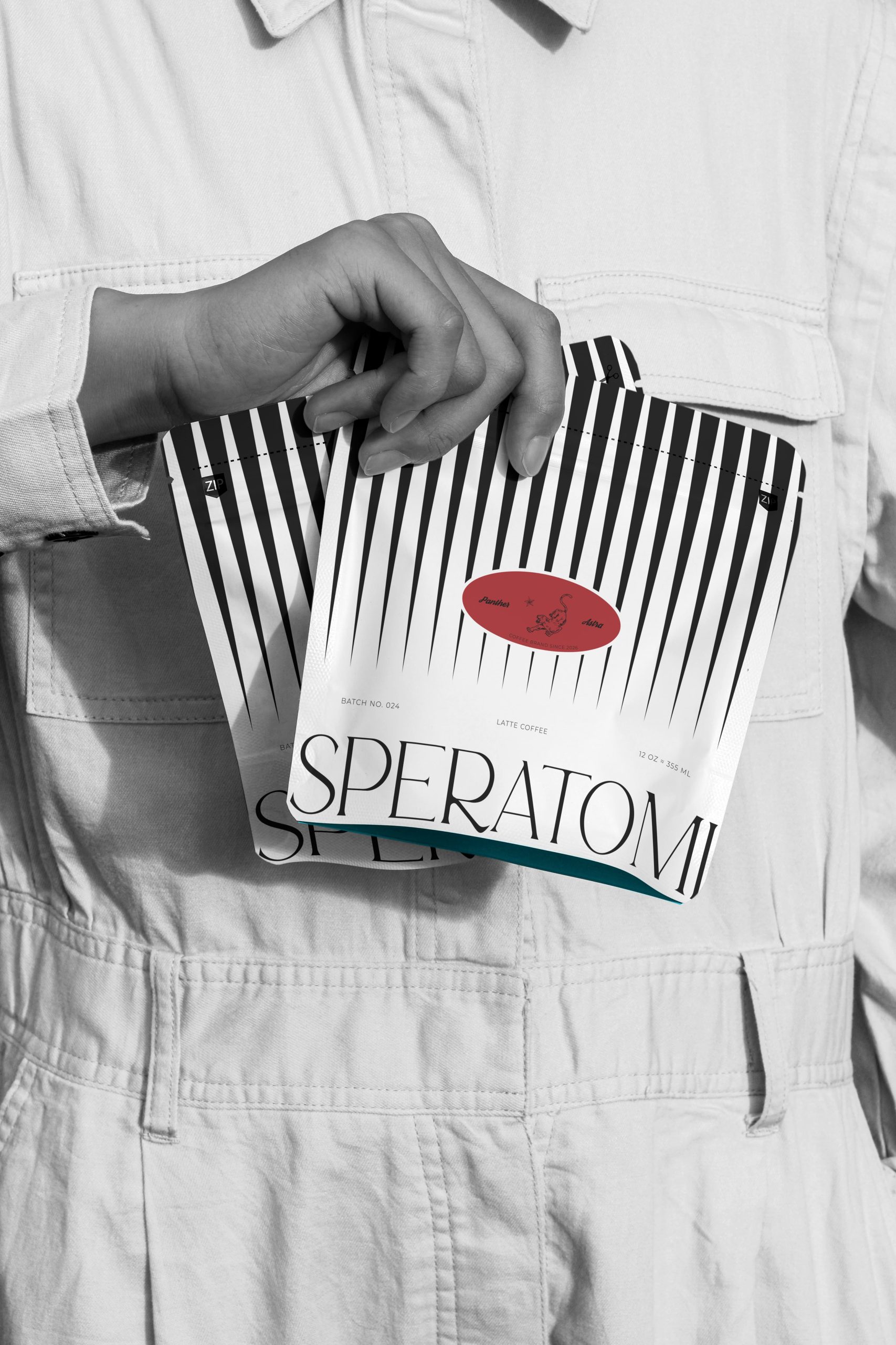
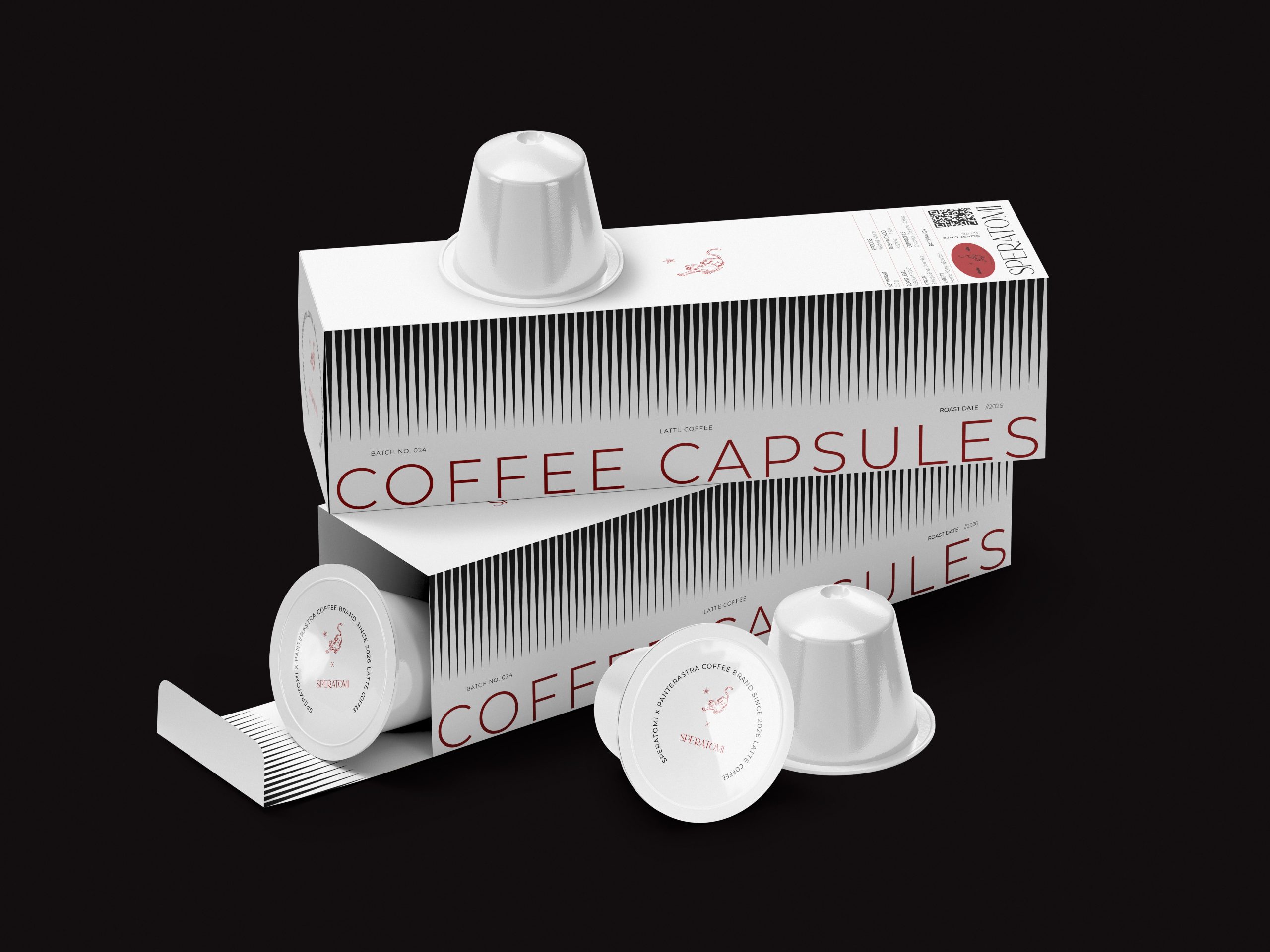
SPERATOMI is a conceptual specialty coffee brand built around the belief that premium packaging doesn’t need to speak loudly.
Instead of competing through visual noise, it embraces a restrained, balanced, and timeless visual language where every design element serves a clear purpose.
Today’s specialty coffee market is often defined by overly technical aesthetics and visually overloaded packaging. Many brands communicate expertise through complex graphics, excessive information, and attention-seeking design.
SPERATOMI challenges this approach by expressing premium quality through simplicity, discipline, and consistency.
The visual identity is built around a restrained color palette, clean typography, balanced proportions, generous negative space, and a structured rhythm of vertical lines, creating a calm yet distinctive packaging system.
Rather than competing for attention, the design builds trust. The result is a scalable packaging identity distinguished by clarity, recognizability, and long-term visual consistency across the entire product range.


 Hashem Gerashi
 monther al omari
 Emi Renzi
 Bonsanco Creative Studio
 Isha
Isha Confetti Design Studio
 Luks Piekut | Wytrawny
 TOGNOLLO STUDIO
 Svea Bode
 Valérie Colace
 宏洛图品牌设计HONGLUOTU
 Toolstika
 Marta Wasilewska
 Heramb Arora
 Nadya Chunikhina
 Elodie Clarke
 MID-AIR STUDIO
 Tríona O'Donoghue • Design
 Cocoon Prague
 alchimistestudioParis
 hugo zapata