

A Heritage Brand, Reimagined
Seagull is a heritage skincare brand with more than five decades of pharmaceutical expertise across the MENA and GCC markets. The brand approached us to rethink its visual identity and packaging system in a way that could preserve its clinical credibility while making it feel clearer, more contemporary, and more relevant to today’s skincare audience.
The challenge was not to erase the brand’s past, but to translate its scientific foundation into a more confident visual language. Seagull already had trust, recognition, and a strong pharmaceutical background. What it needed was a design system capable of communicating these values with greater clarity, consistency, and shelf impact.
Designing Clinical Clarity
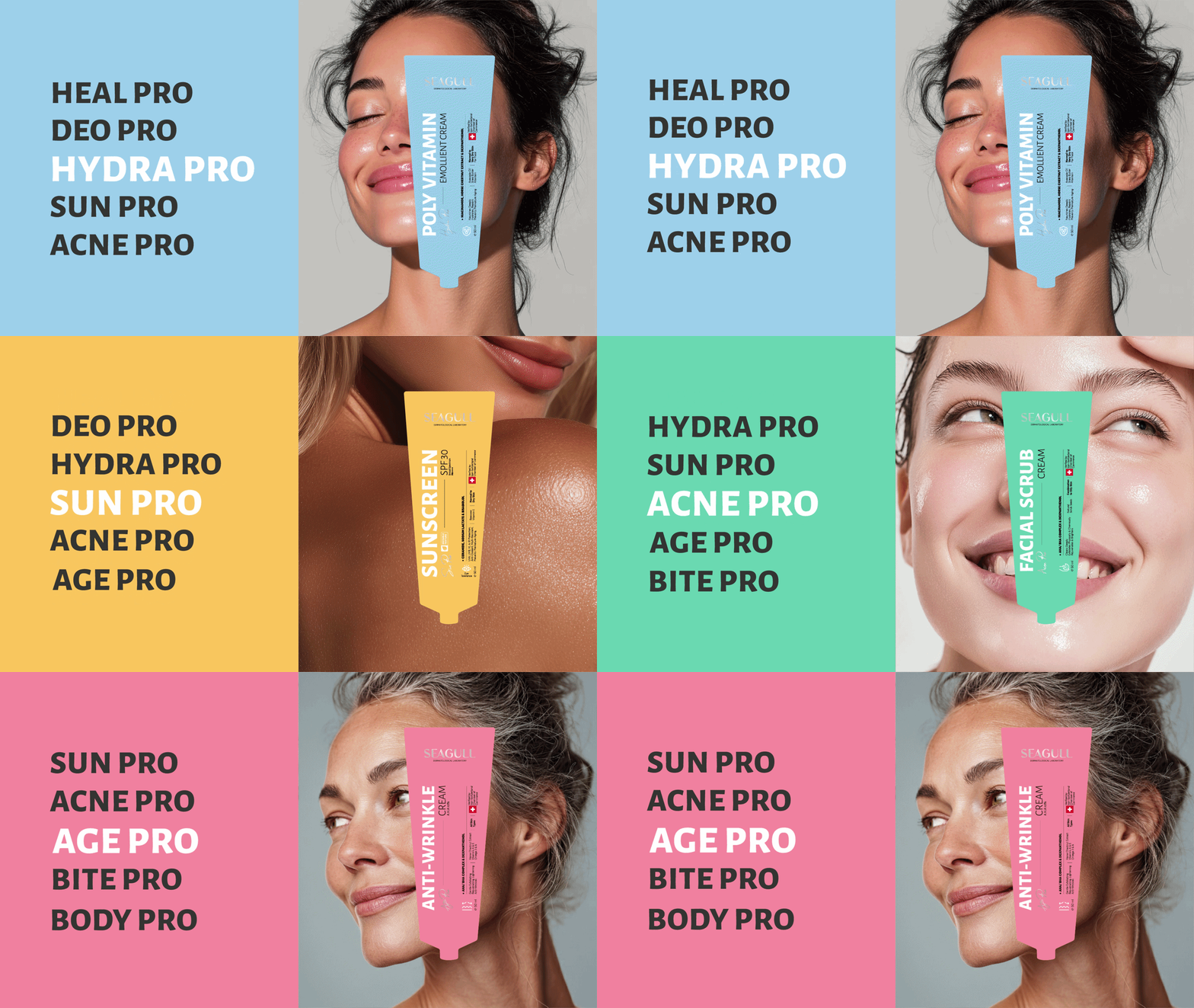
Our solution focused on creating a unified skincare packaging design system that could work across multiple categories, from sun care and hydration to vitamin C and dermatological treatments.
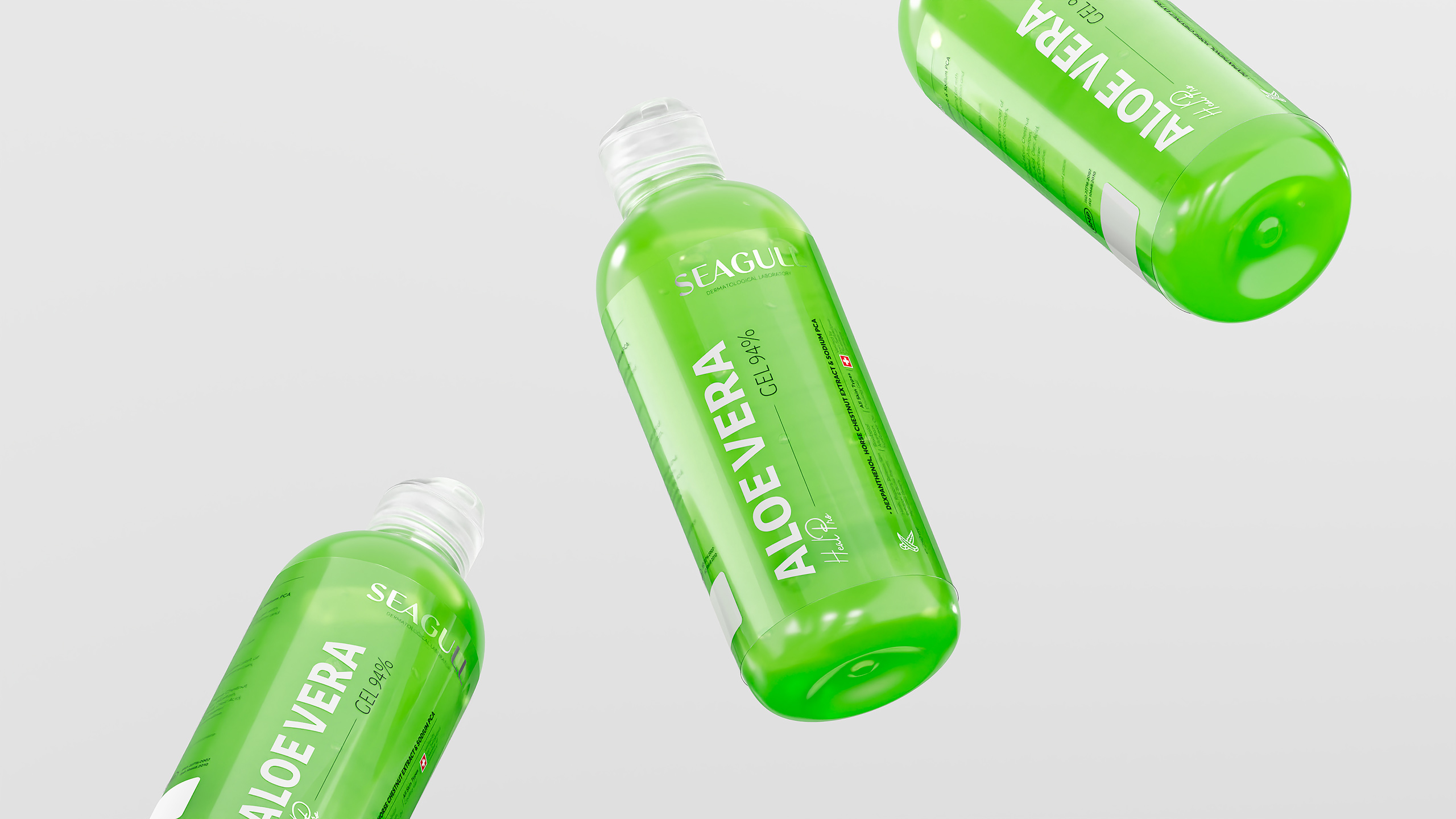
We redesigned both the Persian and English logotypes, refined the brand architecture, and introduced a cleaner information hierarchy across the packaging. Typography, spacing, colour coding, scientific icons, and product information were all carefully structured to make the range easier to navigate while maintaining a clinical and premium expression.
The visual system was built around simplicity, confidence, and functionality. Each product needed to feel part of one coherent family, while still being clearly recognisable within its own category. The result is a packaging language that feels scientific without becoming cold, minimal without losing character, and modern without disconnecting from the brand’s heritage.
From Pharmacy Shelf to Brand System
The redesign transformed Seagull from a fragmented packaging range into a cohesive dermatological skincare brand. By creating a flexible design system, the brand gained stronger shelf presence, clearer product differentiation, and a more contemporary identity across its portfolio.
The outcome is a skincare packaging design that respects the brand’s long-standing pharmaceutical roots while preparing it for a new generation of consumers. A familiar brand was not simply redesigned; it was reorganised, clarified, and elevated into a stronger visual system.






 Derrick Lin
 Axiniya Knyazeva
 Hadi Samir
 Atiq Alam
 Furt Goods
 宏洛图品牌设计HONGLT
 Ampersand Creative
 Modern Theory
 Palashcc
 neo creative studio
 Valérie Colace
 Anshuman
 Archi Jain
 DESIGN CONCEPTS
 Shapers Studio
 jamajkajakub
 tamara barakat