
Background
TUC crackers from Mondelez Rus have been a leader in the salted cracker category* for many years and one of the most recognizable brands in the salty snack category. The product is aimed at a younger audience—schoolchildren, young adults, and anyone who enjoys spending time with friends. TUC is a snack for socializing, watching movies together, parties, and simple moments that become brighter when shared.
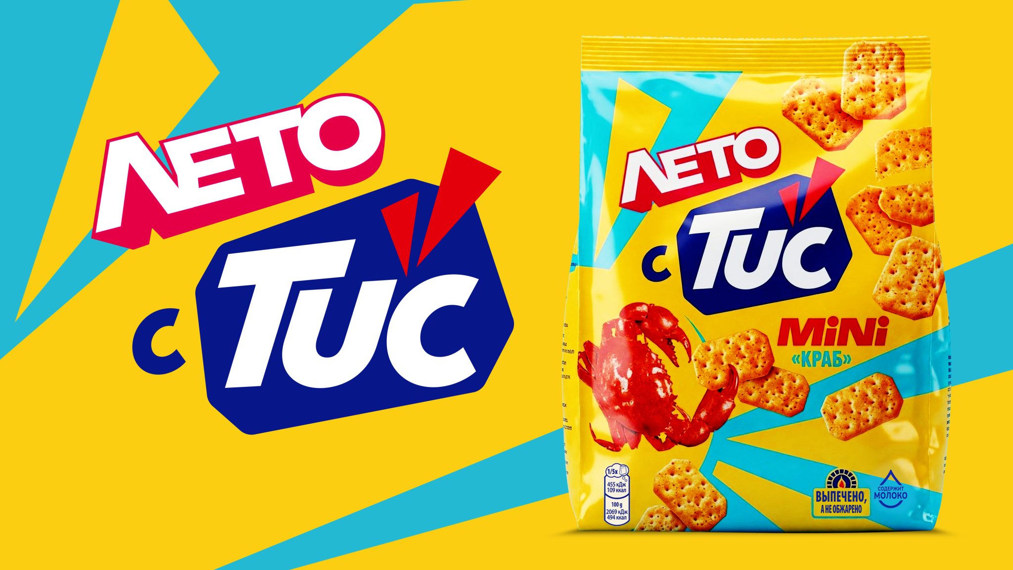
In 2025, the TUC team rebranded, changing the logo (above which was added the key unique positioning, “Crunchy”), adding a yellow ray graphic element, making the food zones even tastier, and making the overall design brighter and more youthful. The rebranding strengthened the brand’s DNA and visually embodied the idea of ”Bright Taste for Bright Moments.”
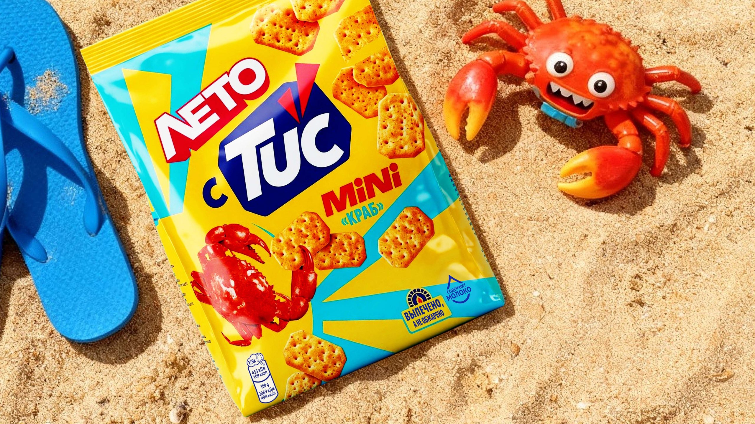
The new stage of the brand’s development was the seasonal limited edition TUC mini with crab flavor – the first limited edition launch for the brand, which needed to be integrated into the brand’s identity, while adding a distinctive note and vibrant communication.
Challenge
VIEWPOINT was tasked with developing the design of TUC’s seasonal limited editions and creating taglines for them. A key part of the project was adapting the “Crab” flavor for the TUC mini line in a limited design for multiple seasons.
The key objective was to preserve the brand’s DNA, make the combination of the logo and the signature “ray” the main design element, and highlight the season and infuse a youthful fun (fun) spirit into the design. At the same time, the packaging had to be shelf-friendly, ensuring high visibility and easy information reading.
The team also had to develop a visual language for the seasonal editions practically from scratch. The goal was to convey the atmosphere of summer and winter holidays using simple, clear symbols while remaining within the brand’s minimalist and vibrant style. Another important challenge was to create a universal principle that would allow for easy scaling of the design for new seasons and future special editions.
Solution
The VIEWPOINT team retained the key elements of the TUC identity and transformed them into the foundation of a flexible graphic system. The central element remains the connection between the logo and the signature ray, which serves as the brand’s primary visual and semantic code.
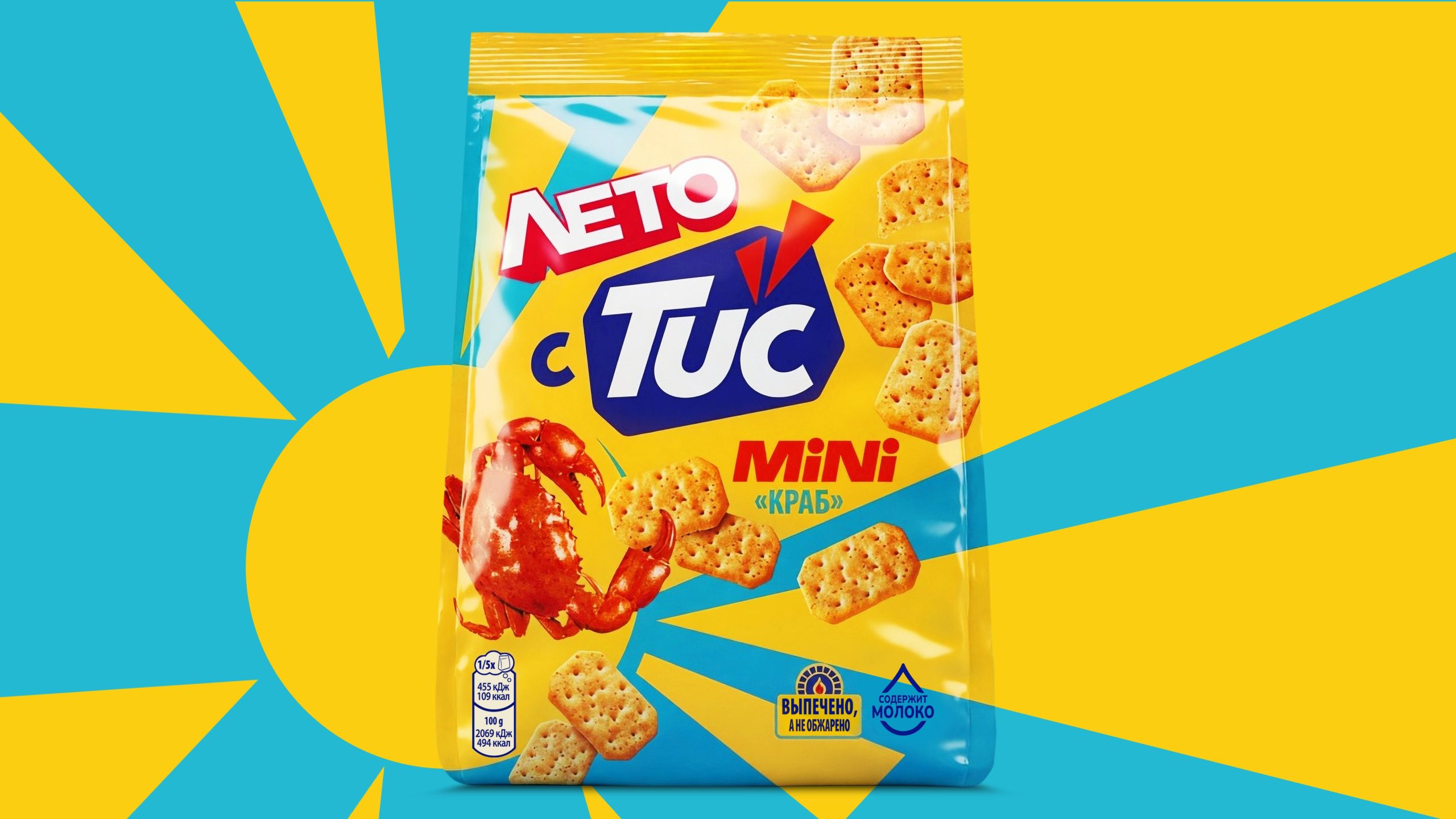
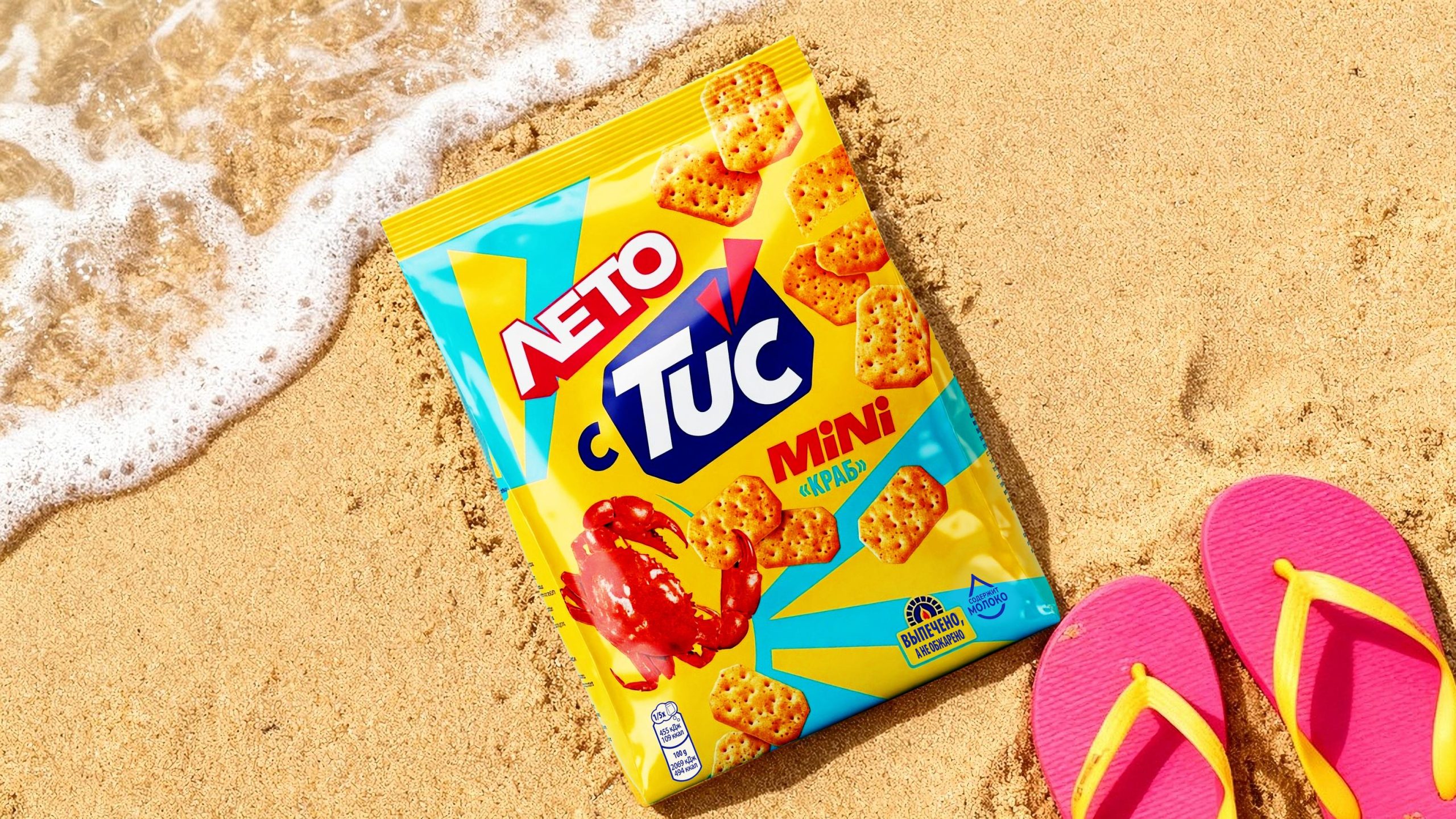
For the summer limited edition, the ray from the regular packaging was reimagined and transformed into a symbol of the sun, evoking associations with warmth, relaxation, and carefree moments with friends.
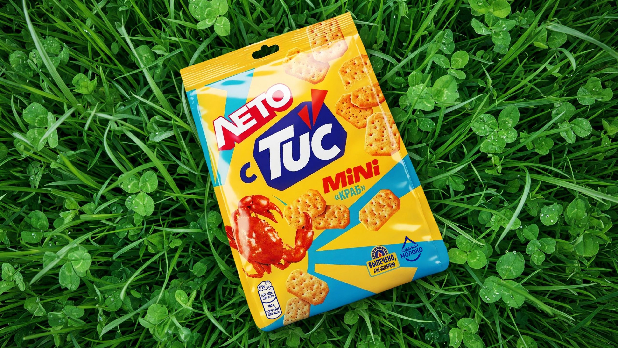
This approach allowed for continuity between the seasonal series while giving each its own distinct feel. Simple solid-color elements, bright colors, and minimalist graphics support TUC’s minimalist visual style and make the packaging stand out on shelf. Particular attention was paid to the food zone and flavor presentation to ensure the product looked as appetizing as possible and was easily understood by consumers.
As a result, VIEWPOINT developed a universal graphic system that retains all the key elements of the brand’s DNA while easily adapting to different seasons, events, and special editions. The seasonal flavor design received a positive response from consumers: according to the results of TUC’s online seasonal design test, 83% of respondents considered it youthful, 82% noted that it was eye-catching, and 76% expressed a desire to purchase. This new approach allowed for the creation of vibrant and recognizable limited editions, strengthening the brand’s emotional connection with a younger audience and opening up opportunities for further development of seasonal communications.
 monther al omari
 Shustova p
 mutta
mutta @Allenarts13
 Sirka Agency
 Atiq Alam
 Dozen Agency
 j.substance
 SCD
SCD Cristian Lepore | crilep Copia
 Chris Creative Works
 Aligned Design Co.
 CreativeWise
 Agence des Coteaux
 Ramyromeo2024
 Grain of Design ®
 Ebbi
Ebbi BFS Studio
 butterflyhunters
 Asprey Creative
 About House of Ta
 Up-Brands
 KJS CRAFT
 hello ocean
 PG Branding