
Background
Actimuno is a brand of functional dairy products from Milk Logic (ex Danone), based on a scientific approach to supporting and strengthening the immune system. The product formula contains billions of probiotics, and the brand’s key consumers are parents concerned about their children’s health, as well as adults leading an active and mindful lifestyle.
Challenge
VIEWPOINT was tasked with updating the brand’s visual identity, strengthening its expert positioning and emphasizing the product’s scientific foundation. It was important to shift the perception of Actimuno from the category of “tasty fruit milk” to a functional product with clear health benefits and strong expertise.
An additional challenge was to increase brand visibility on a crowded and visually noisy shelf. At the same time, it was essential to maintain high brand recognition and continuity with the existing identity, despite the scale of the upcoming changes.
Solution
VIEWPOINT developed a new design based on simplicity, visual discipline, and the functional nature of the brand. One of the key decisions was the inversion of the brand’s color scheme.
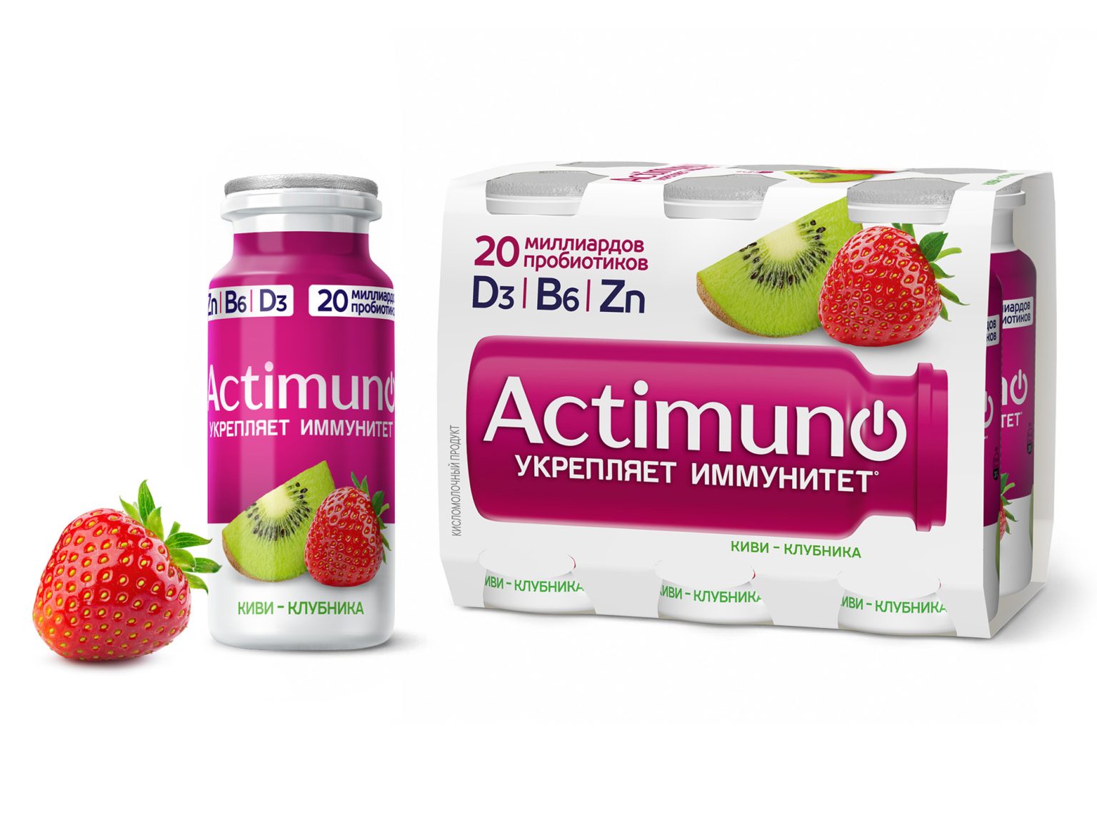
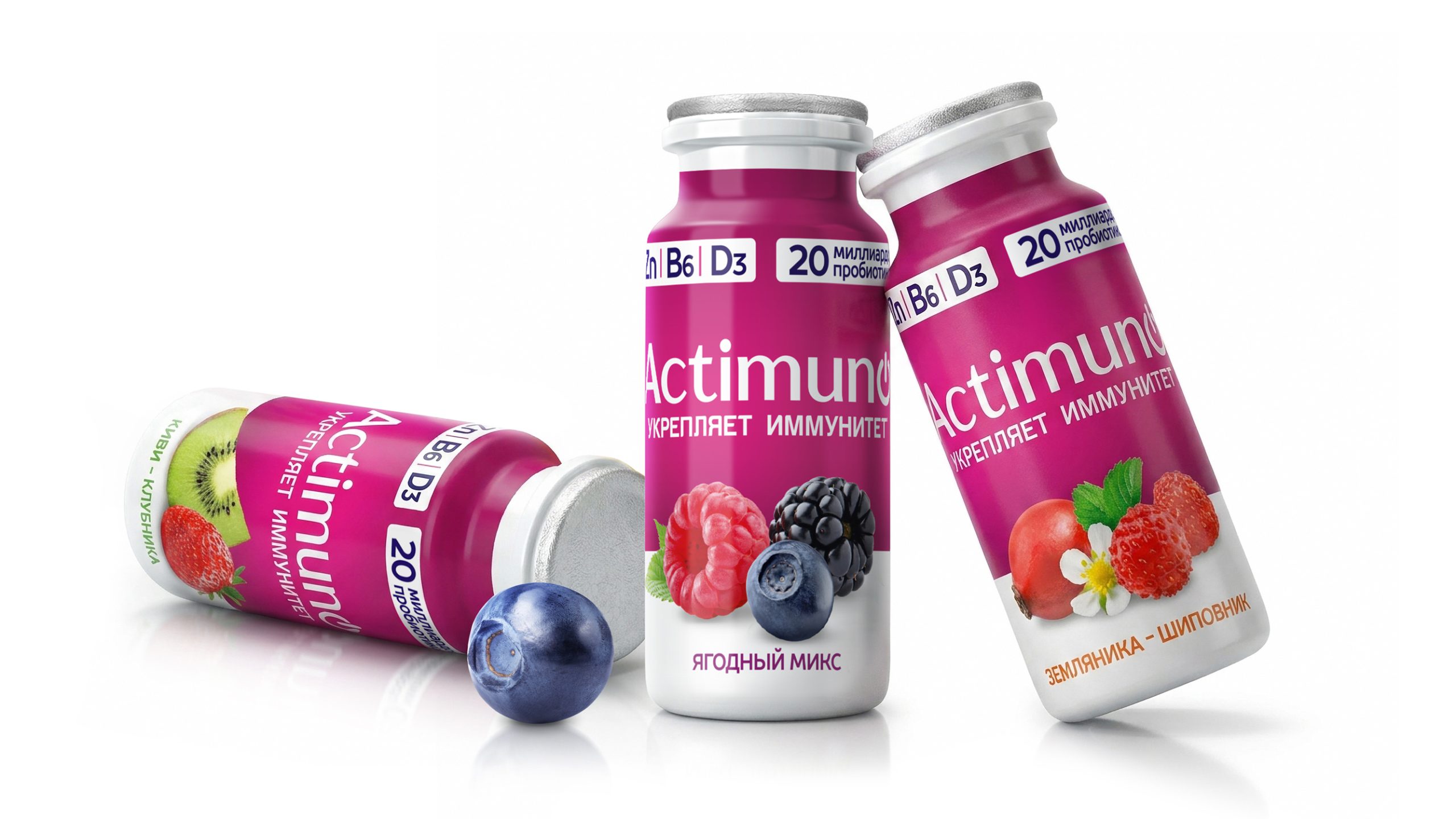
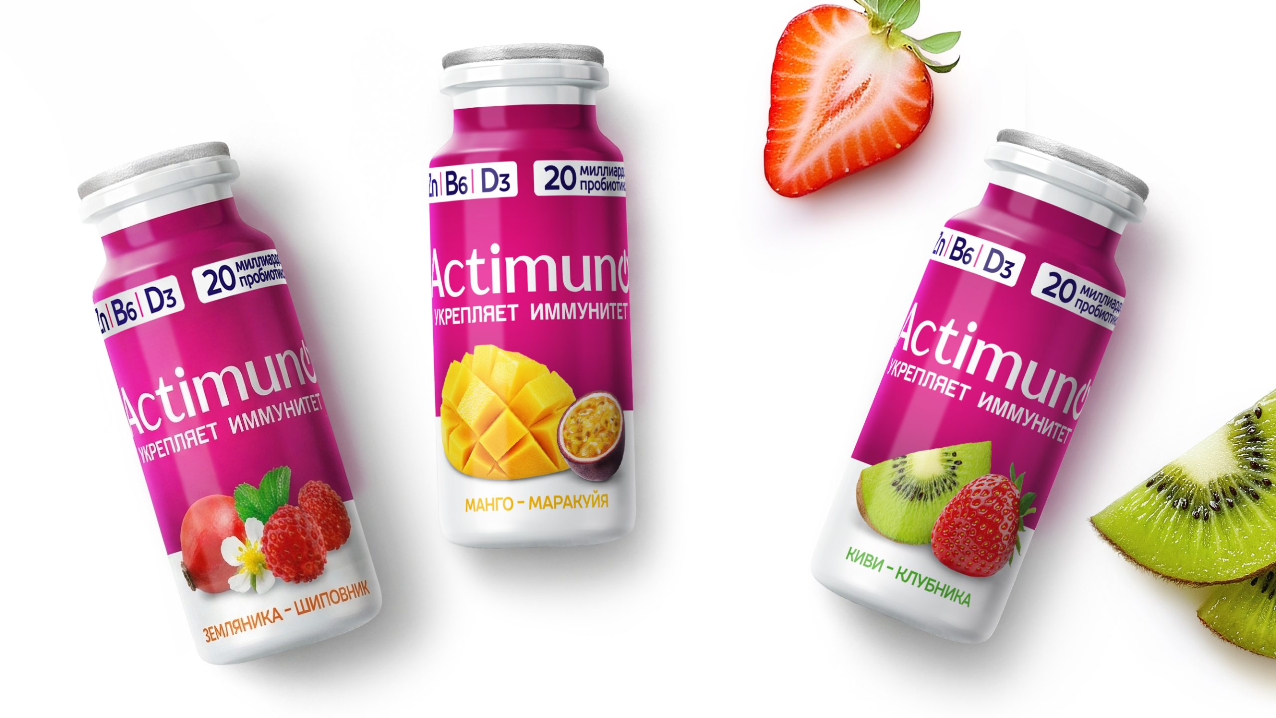
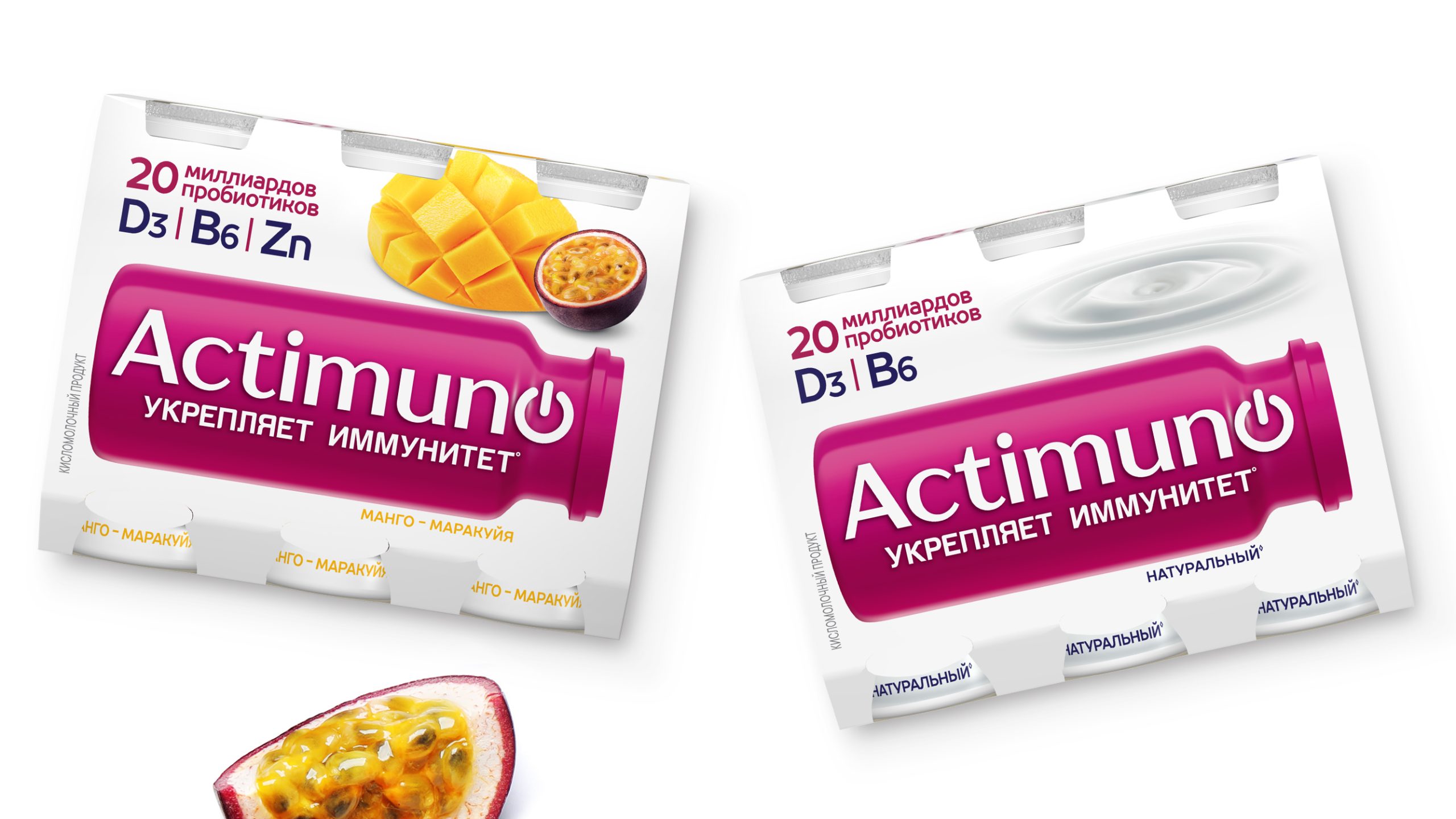
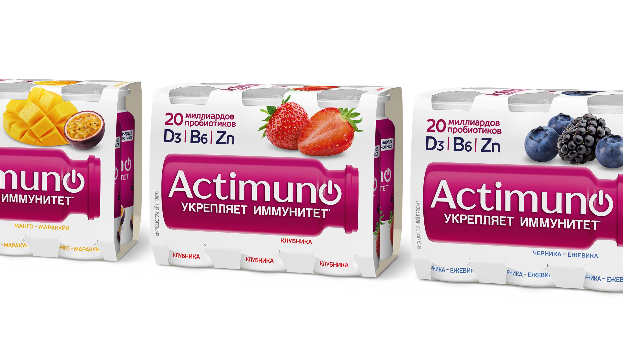
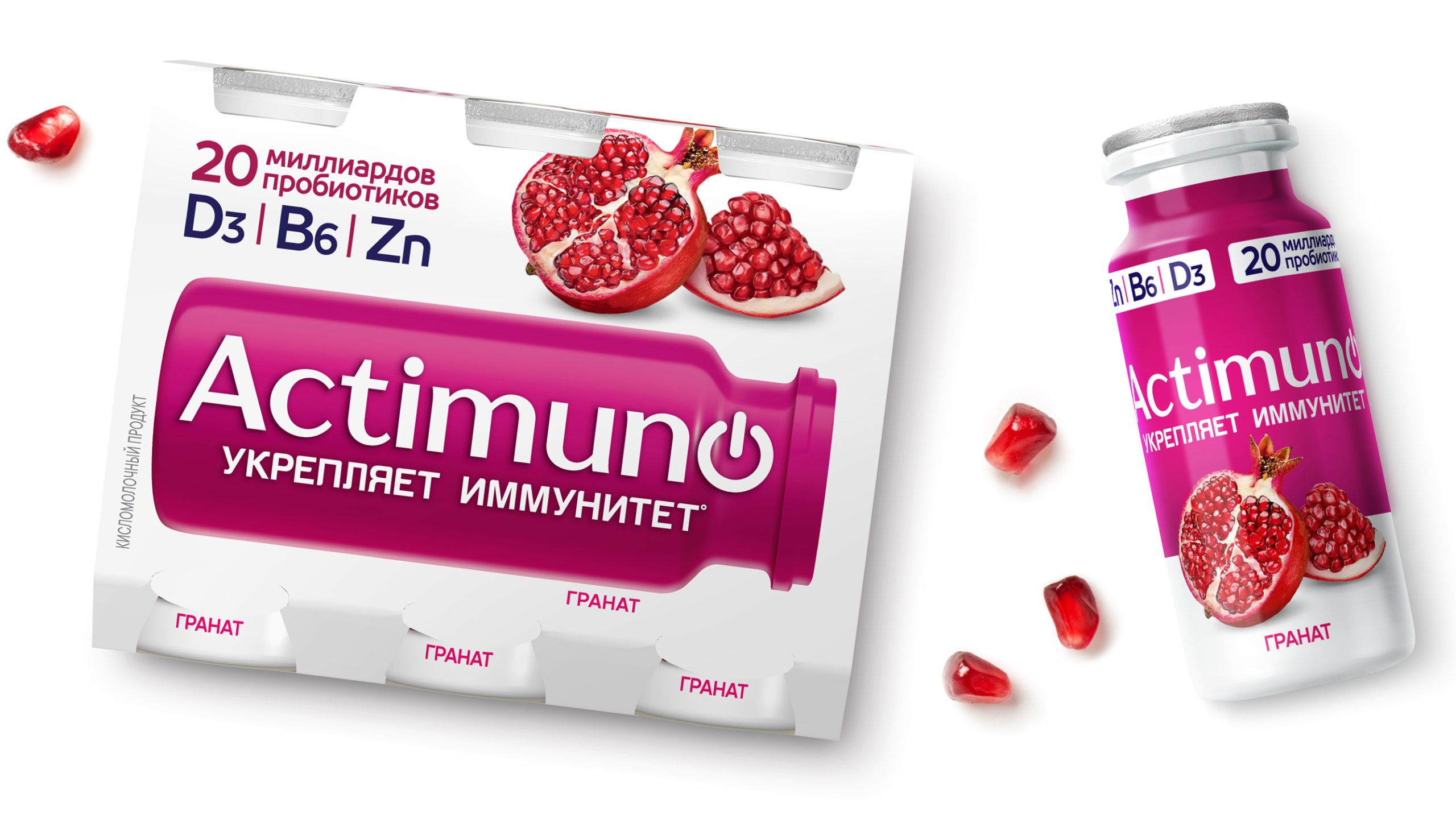
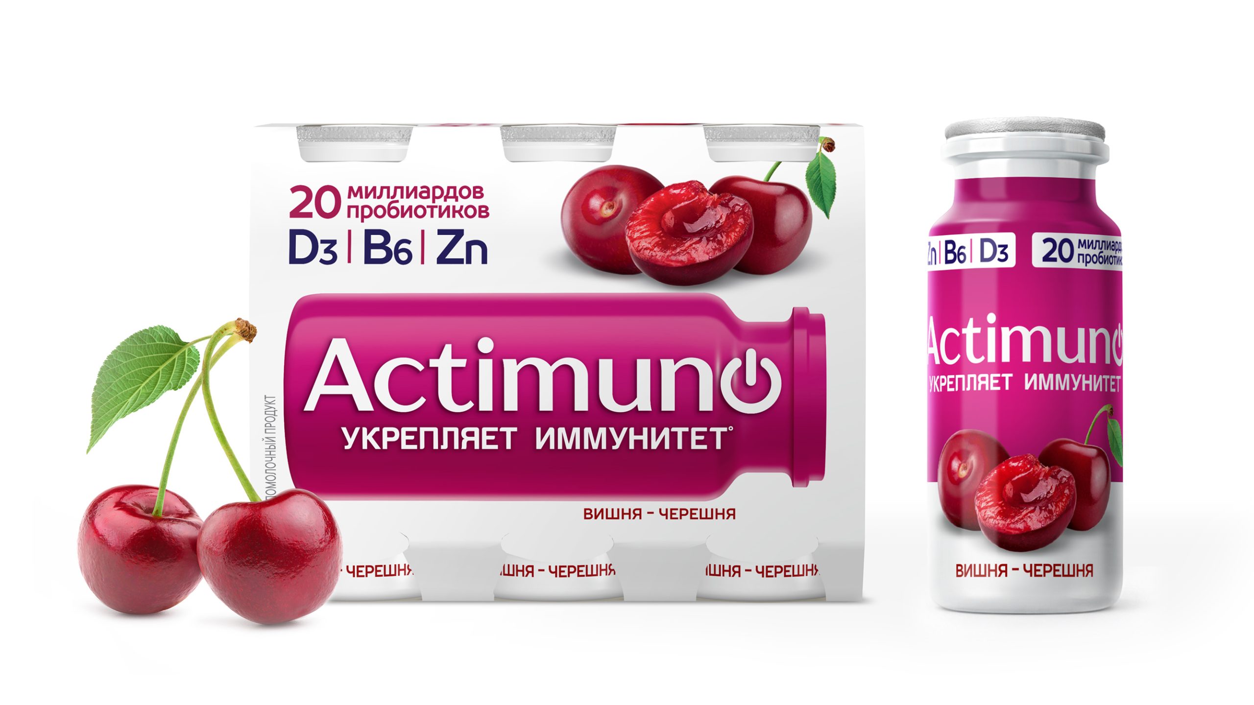
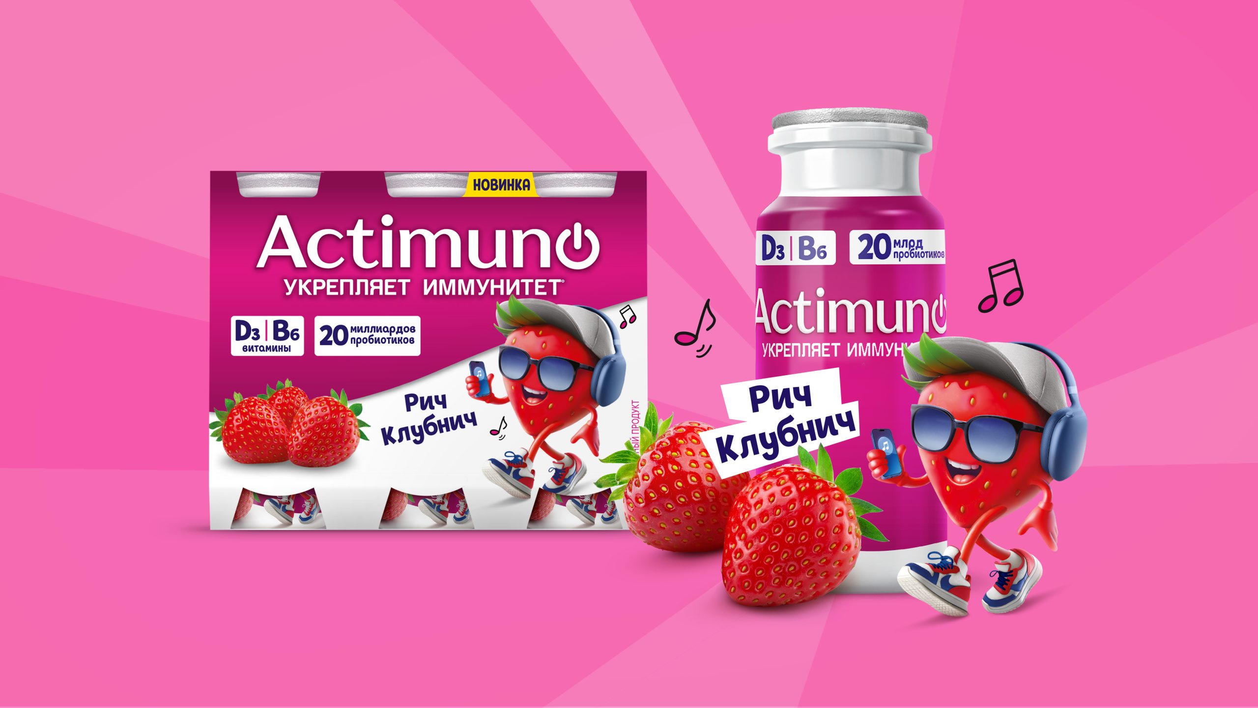
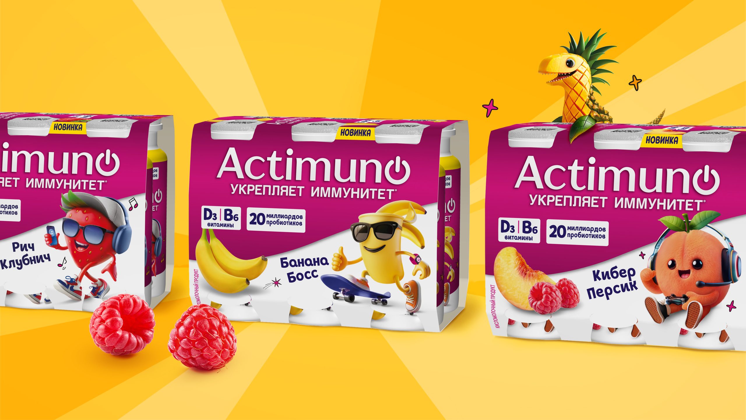
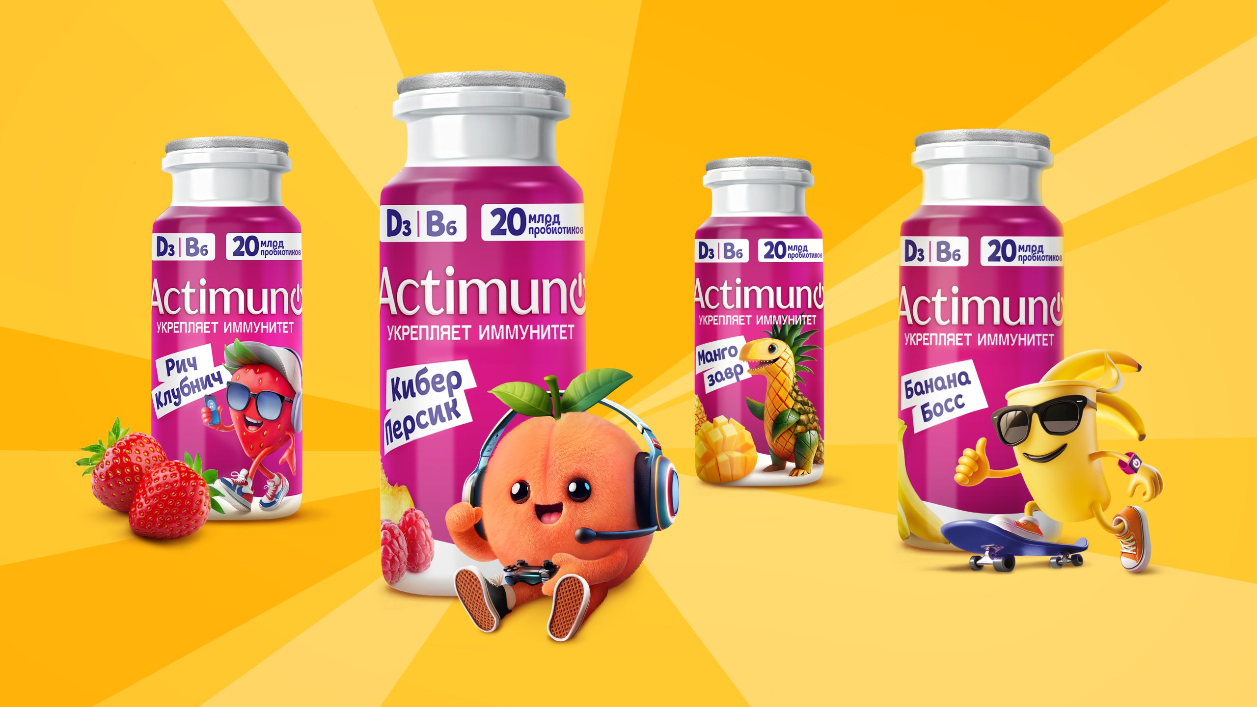
In the updated packaging design, magenta became the dominant color of the bottle, while the white background gave the packaging a sense of purity, austerity, and scientific precision.
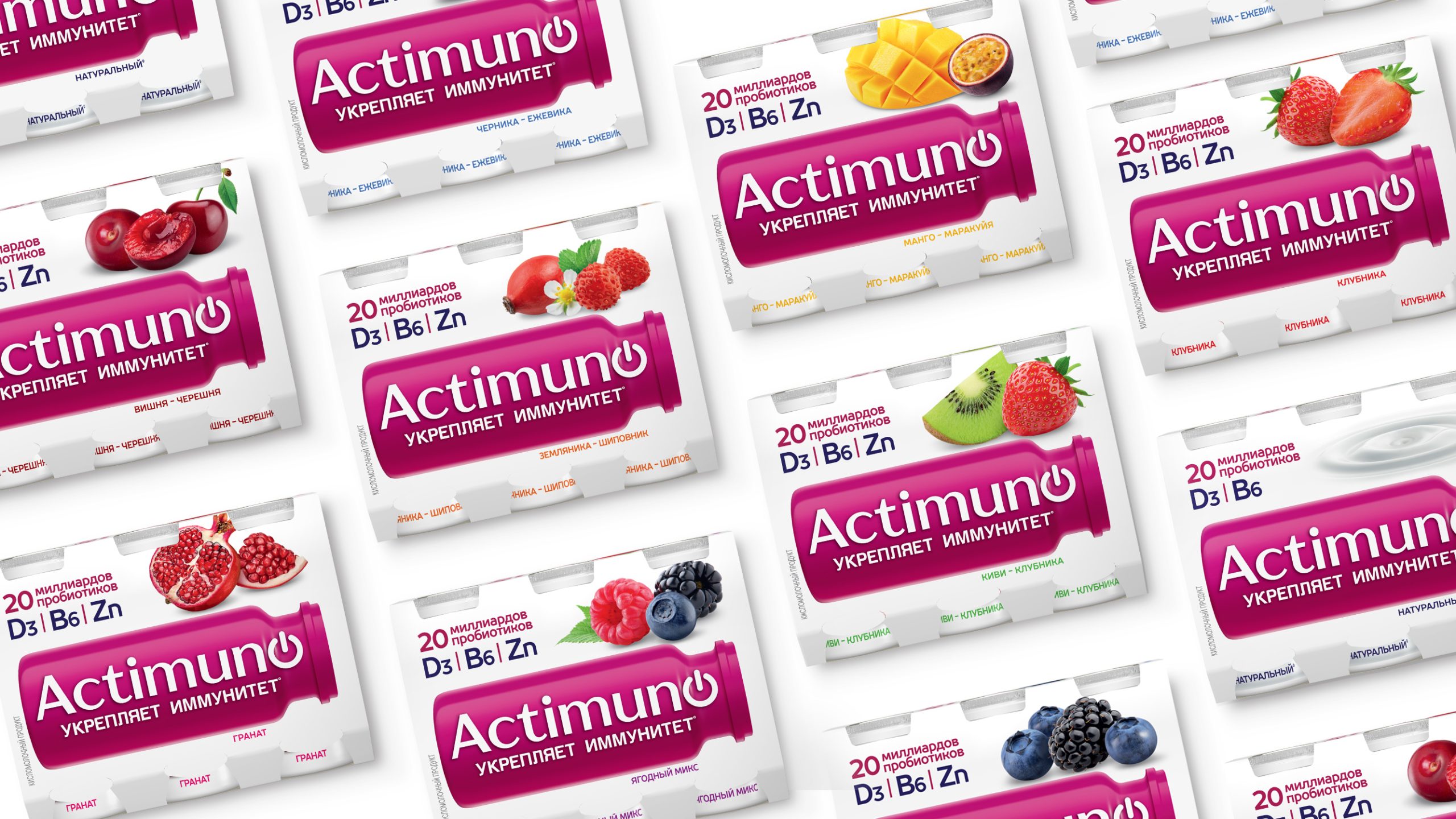
The contrasting combination of white and magenta, which makes the brand instantly recognizable, significantly increased the product’s visibility on the dark and crowded competitive shelf. The white color reinforced associations with functionality and expertise, while the vibrant brand block ensured a strong visual presence.
The recognizable bottle shape, which the brand had previously used, became a key element of the new design system. The team built a refreshed graphic architecture around it, uniting the shape, logo, and other packaging elements into a single brand block.
The logo now features a “Turn on Immunity” button instead of the letter “O,” reflecting the brand’s core idea. Modern typography and a more compact product area make the packaging structured and informative. While previously the wave of yogurt and abundance of fruit images had shifted perceptions toward the traditional dairy category, the new design emphasizes the brand’s functionality and scientific expertise while maintaining its friendly character.
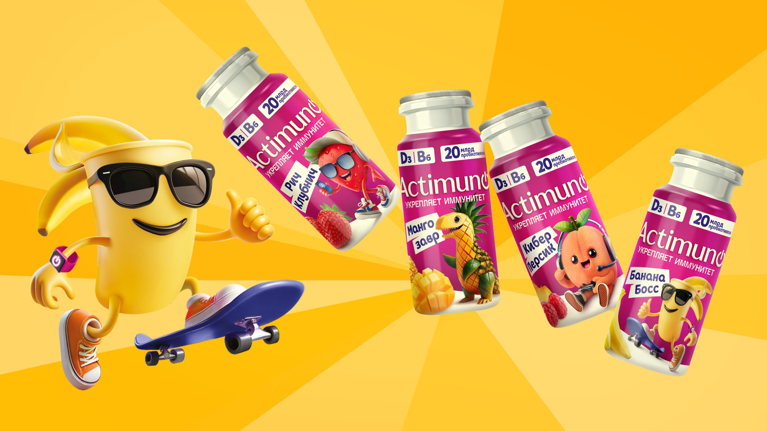
Special attention was paid to the Actimuno Kids line. A bright and friendly visual system was created for it, adapted specifically for a child audience.
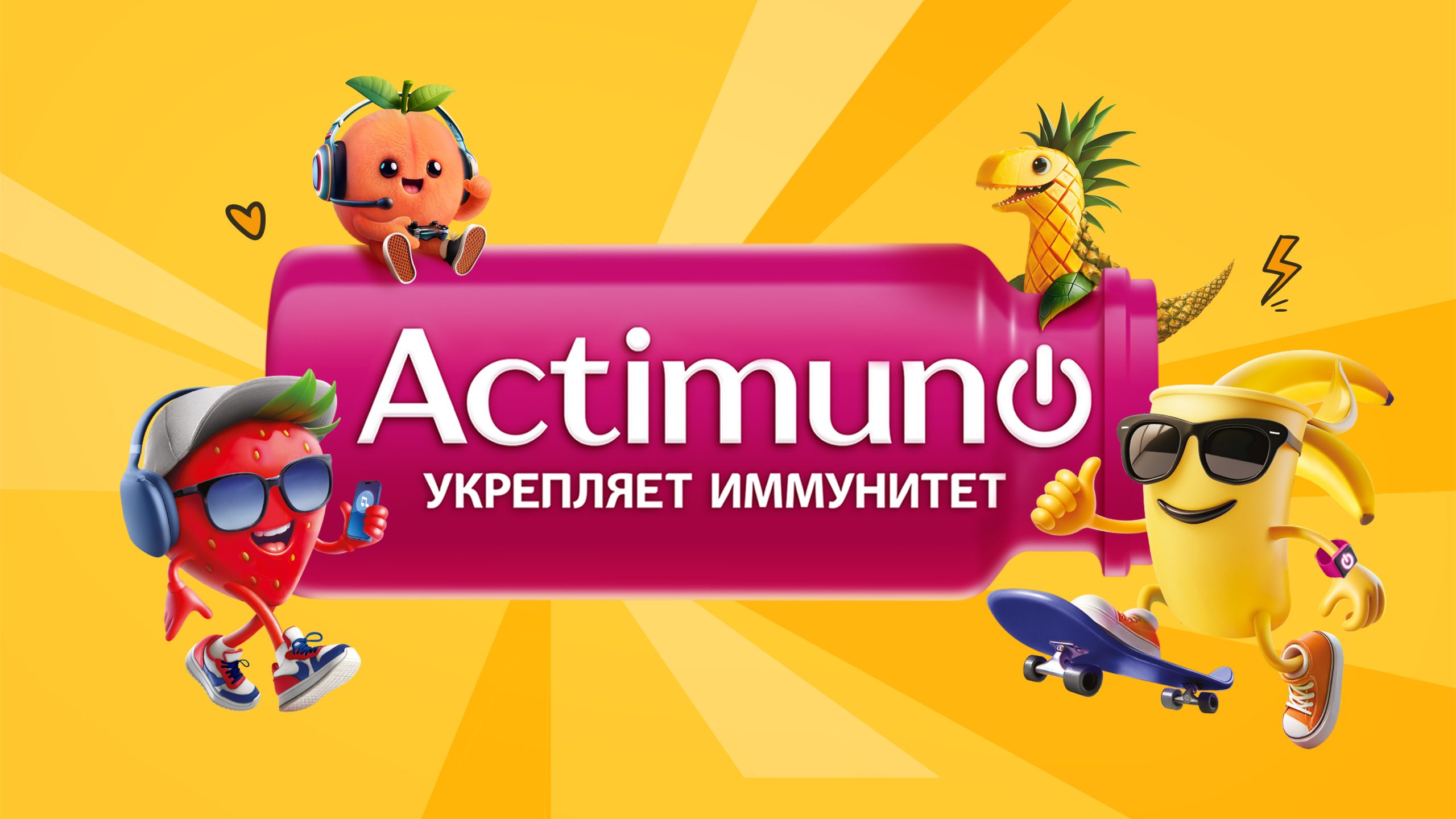
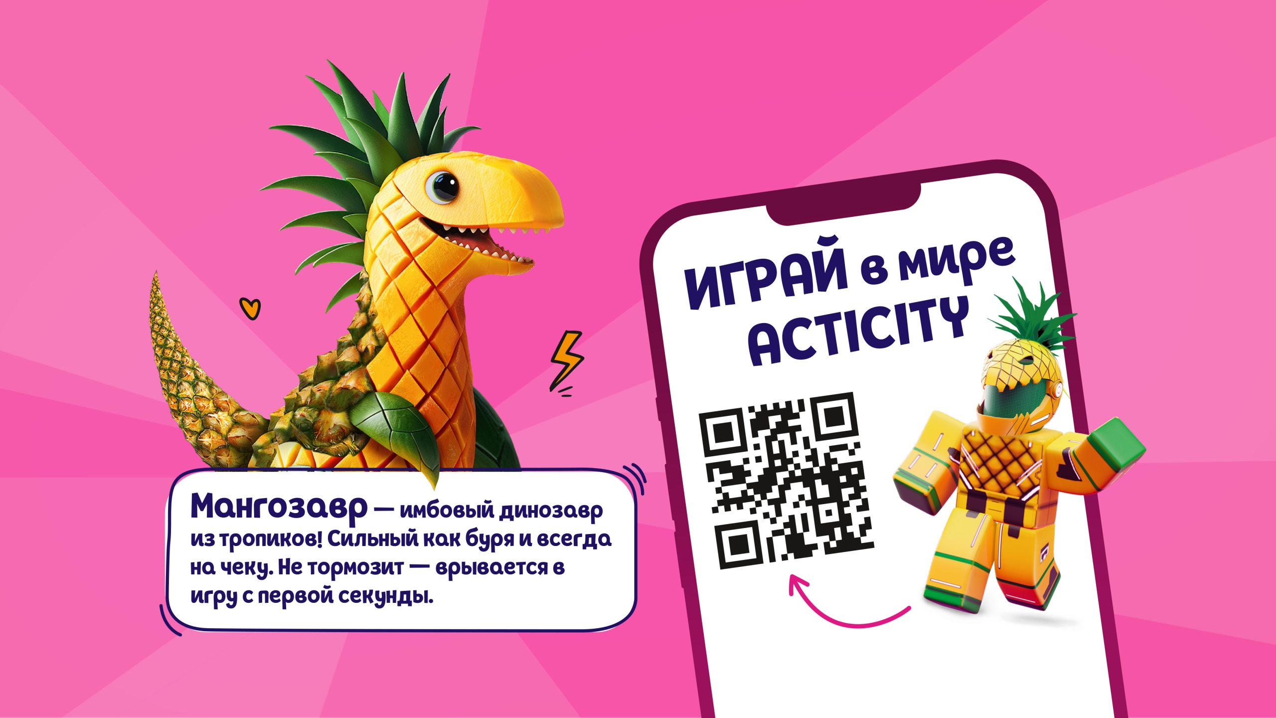
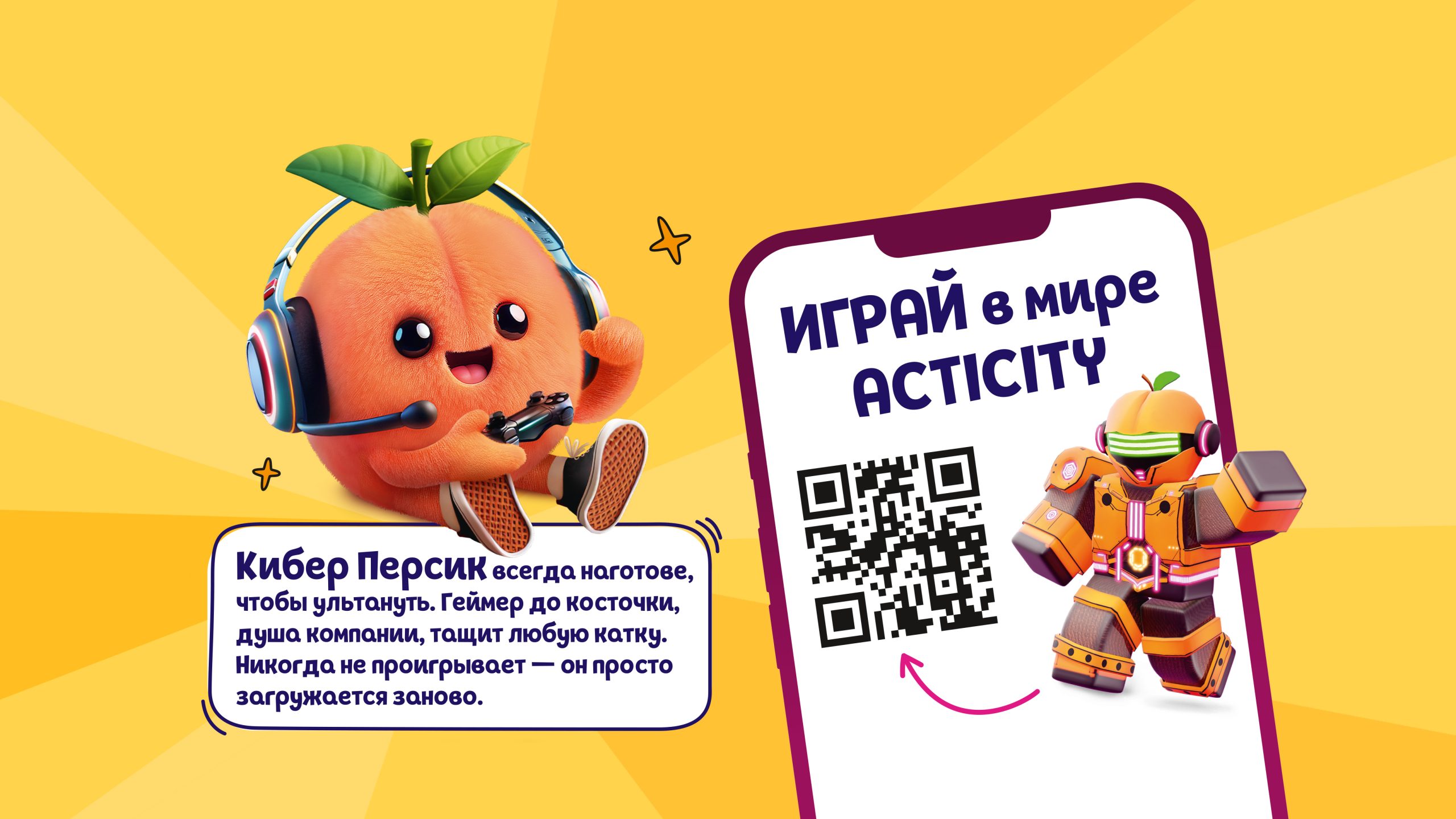
The brand’s signature characters include Mangosaurus, Rich Strawberry, Cyber Peach, and other charming fruit monsters. While maintaining the brand’s core codes, the design makes the product more appealing and understandable for young consumers.
Thanks to a new interpretation of the brand color, the integration of the existing bottle shape into the updated design system, and the reimagining of recognizable visual codes, Actimuno has maintained a connection to its history while becoming more modern, functional, and recognizable to both adults and children.


 lunapanda
 Tridimage
 Analoguecreative
 lettera7
 alchimistestudioParis
 Lana B
 Colossal
 Pivot Studio
 M&A CREATIVE AGENCY
 monther al omari
 Anastasia Cherepanova | xtramez
 Hollóka Grafikai Műhely / Graphic Design Studio
 BOLD branding
 Antonia Skaraki
 Pâmella Lorrany
 Z9BKAdsgn
 Francesco Paternoster
 b1studio.ro
 Chris Creative Works
 Boordon
 Dmitriy Kuzovlev
 Brand Society
 yasharpic