
Chartley – Tasmania, Australia
Chartley is an artisanal wine business run by husband-and-wife team Loraine and Peter Kossmann. In their previous careers, Loraine was a hairdresser and Peter was a deep-sea abalone diver.
From scissors to secateurs. From seabed to vineyard row.
Their dedication to craft continues—now expressed through small-batch wines of depth and character. Located alongside one of the deepest sections of the river in the Tamar Valley, the vineyard is strongly influenced by the region’s cool maritime climate.
Chartley’s unique geographic position and the owners’ history inspired the brand identity.
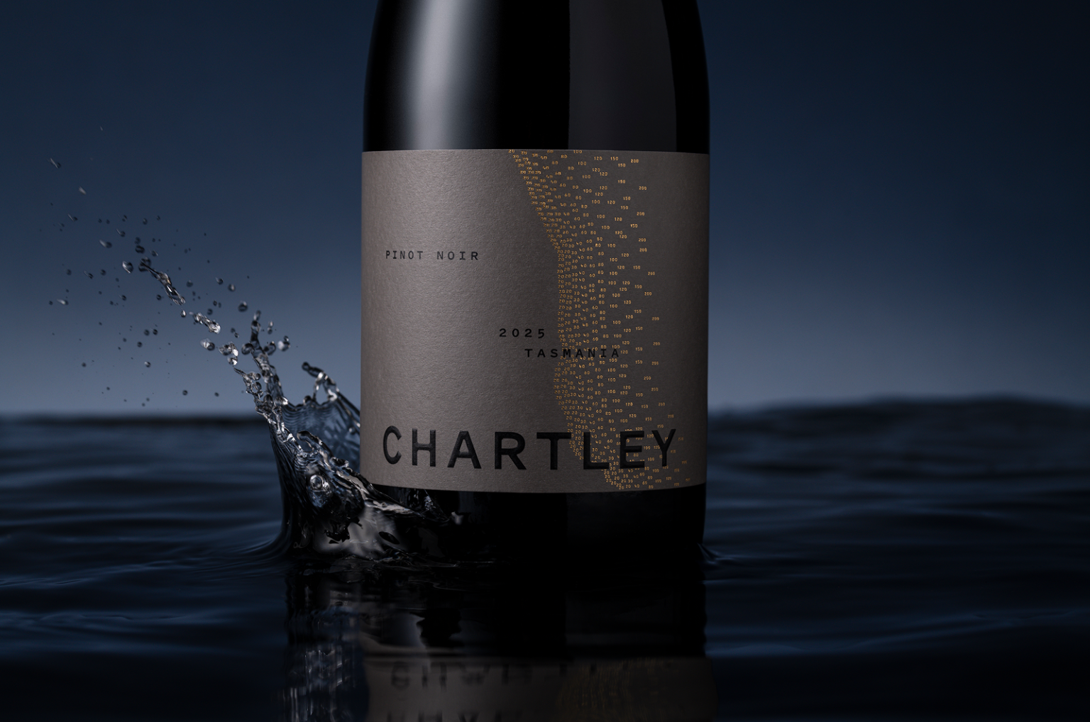
The dynamic typography and textural graphic featured on the labels are inspired by old diving charter maps. On closer inspection, the graphic is composed of numbers that represent the depth of the water from the shoreline. These numbers are embellished with gold foil.
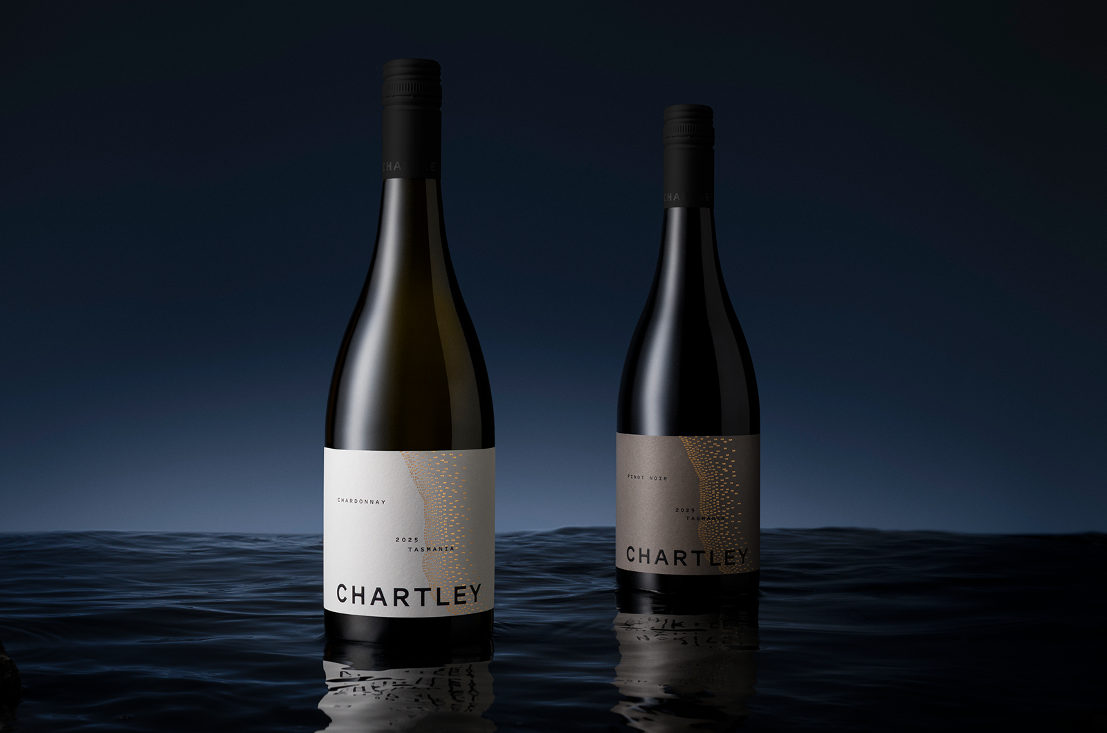
To reinforce the premium positioning, the Chartley logotype is finished with a subtle varnish and elegant rooftop embossing. Colour was carefully considered to differentiate each wine, as well as the various ranges and price points.
The Aromatics range features brighter colours to appeal to a younger, female-skewed consumer. The Premium range uses more understated colours to engage a slightly older, female-skewed market.
Overall, the packaging design is an elegant expression of Chartley’s unique story and the craft found inside every bottle.
“Chartley. Raised by the sea.”
Cornershop Design develop strategic design solutions for drinks, food, lifestyle brands and beyond — brands that you want to pick up and be a part of.
How can we help you today?


 monther al omari
 Ximena Ureta Design Studio.
 vitoramockup
 Up-Brands
 Sophiagdotcom
 Peter said
 ayeidadezigns
 Tancybox
 宏洛图品牌设计HONGLT
 Modern Theory
 Dozen Agency
 Atiq Alam
 Olio Studio
 Ruchi S. Joshi
 mmdesign
 awaiskhadim
 Octasoft
 United Creatives Studio
 Kingdom & Sparrow
 Anastasia Bakhmatskaya
 CreativeWise
 Great and Golden