Refreshing a Barossa icon
What started as an idea from an eavesdropped conversation in a Barossa pub in 2001, has grown into a success story. Teusner Wines have firmly established themselves as an iconic Barossa Valley brand; with loyal fans all around the world. In 2018, the small family-run winery merged with a large Spanish-owned company, giving them further opportunity to access international markets and grow.
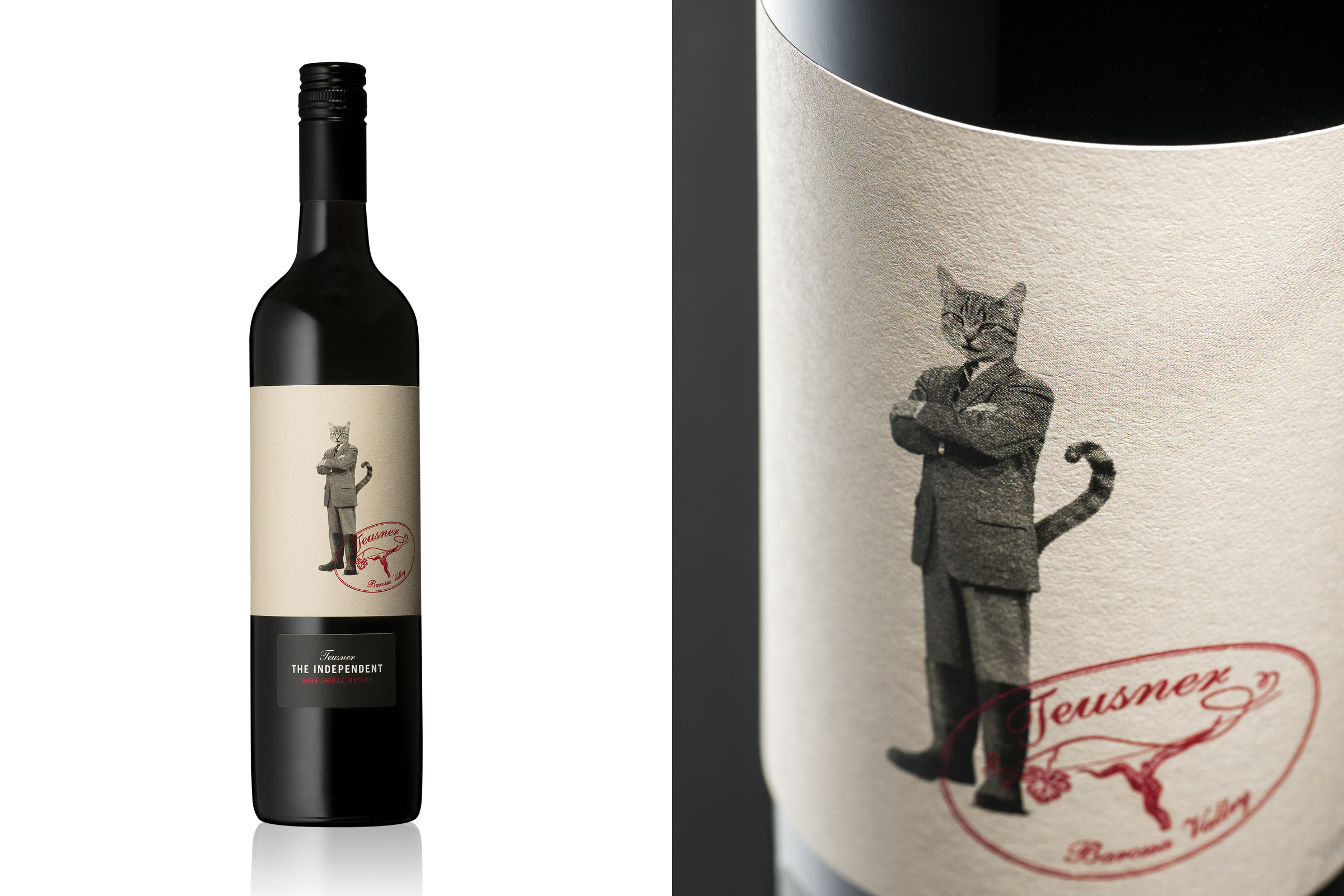
Cornershop began consulting with Teusner in 2009. One of the first wine sub-brands we created with them was ‘The Independent’. The packaging design featured a cheeky cat character; which helped the product stand out on the shelf and raise Teusner’s profile. Winemaker Kym Teusner spoke highly of the design:
“The cat probably sells more of this wine than the wine itself.”
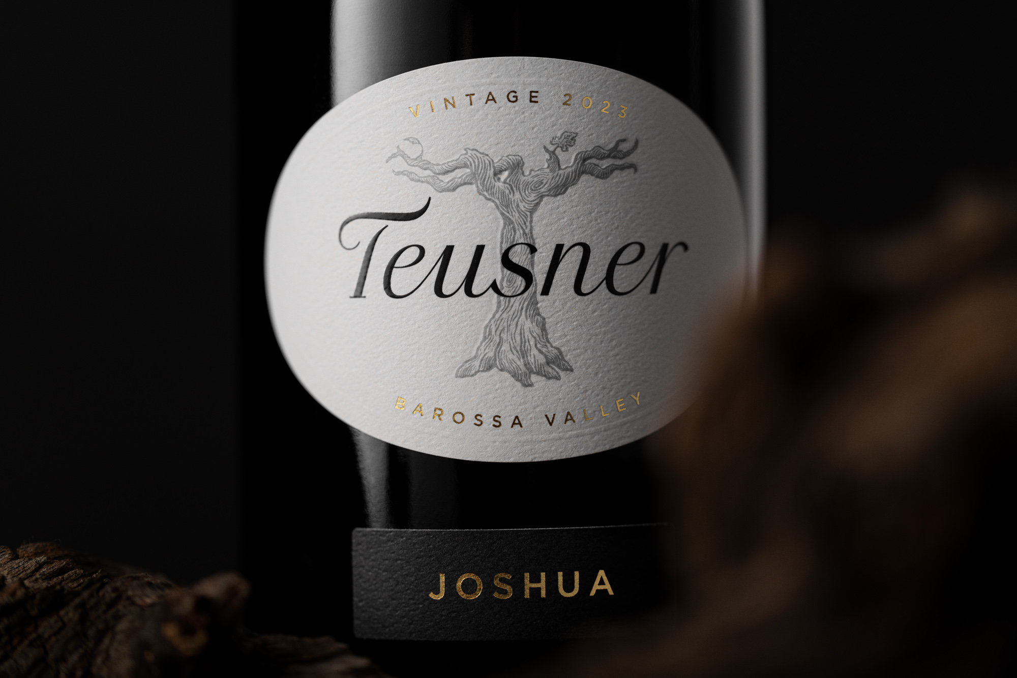
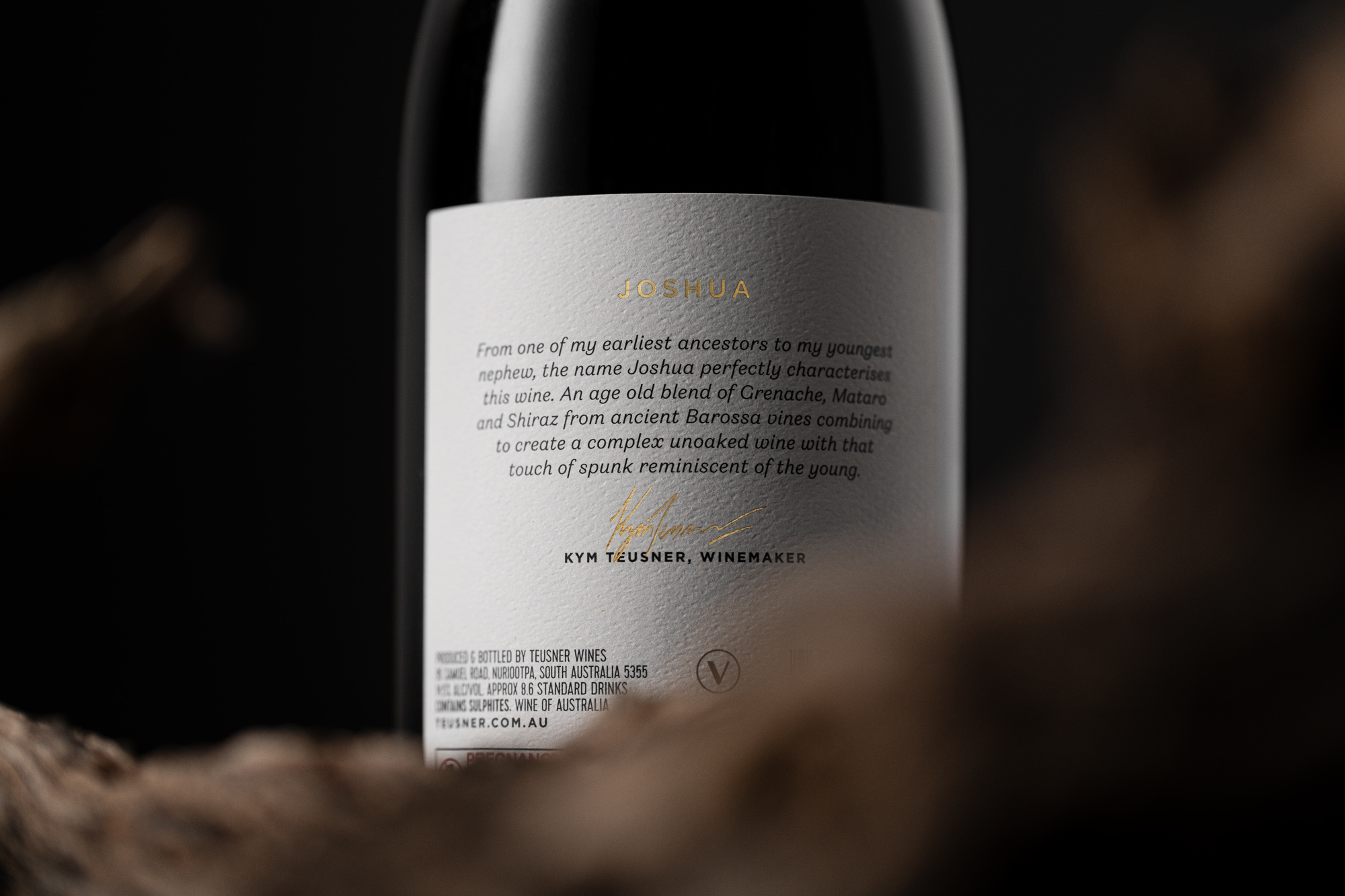
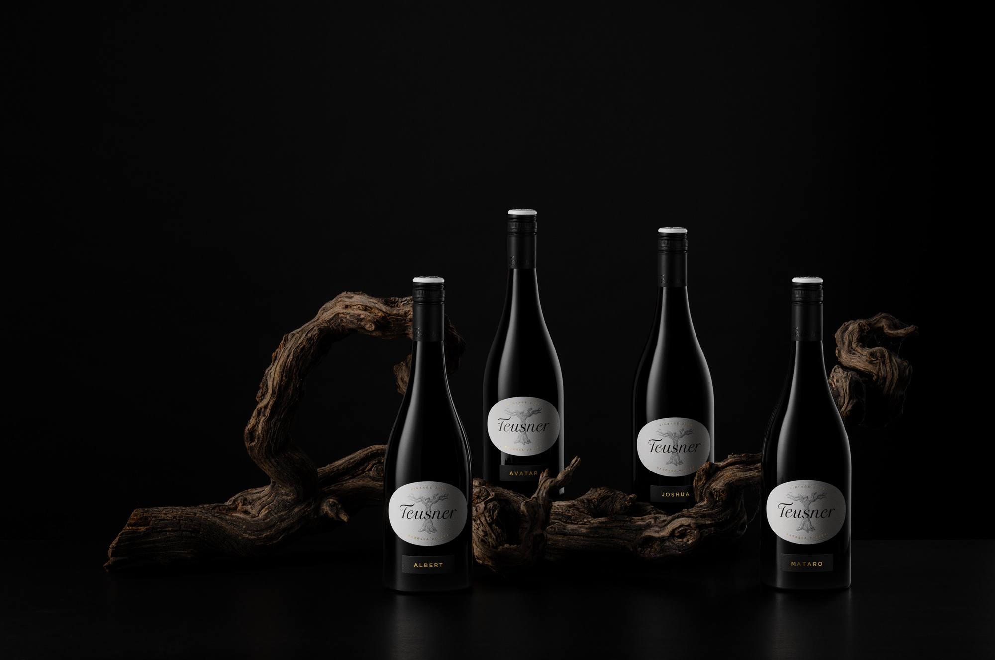
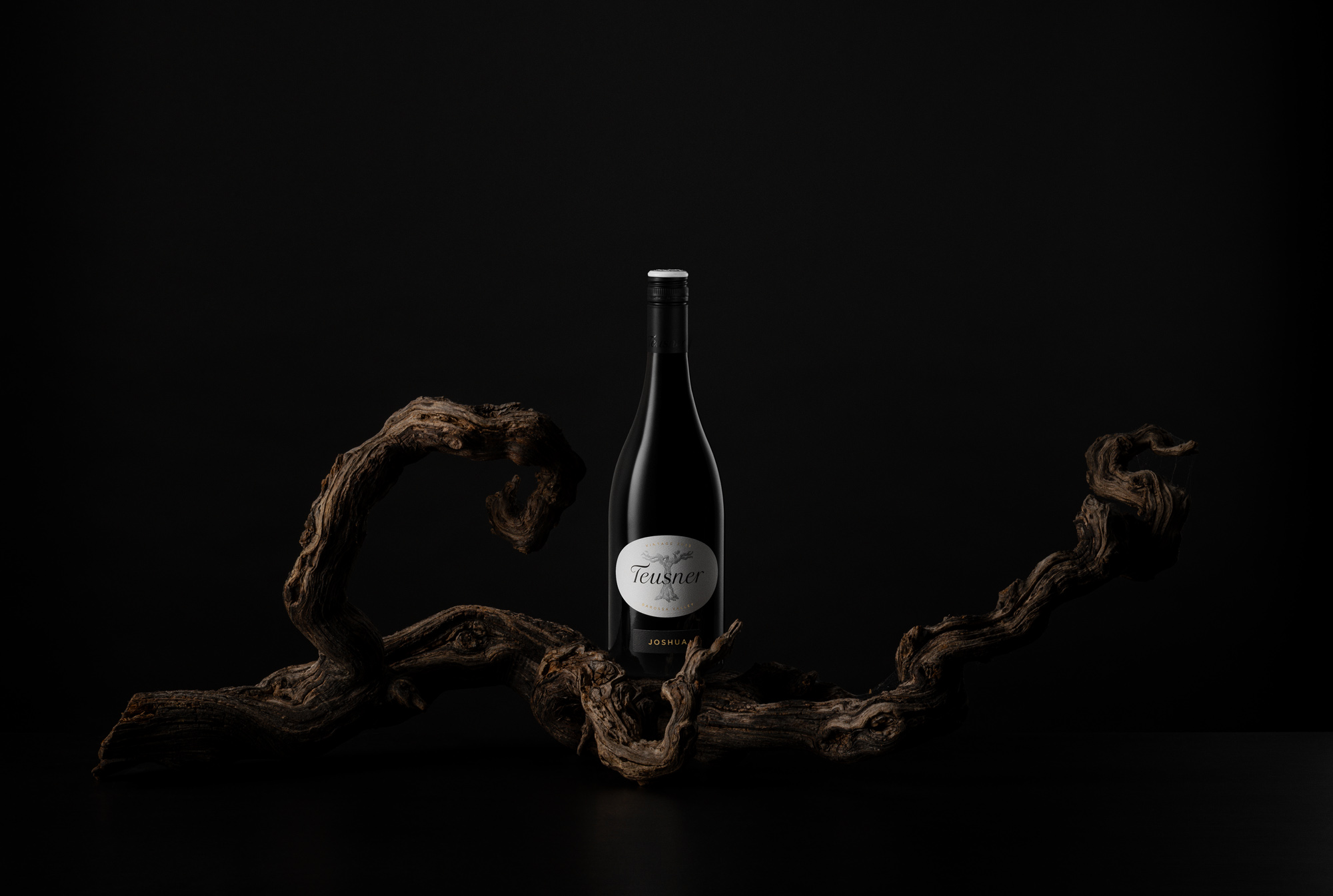
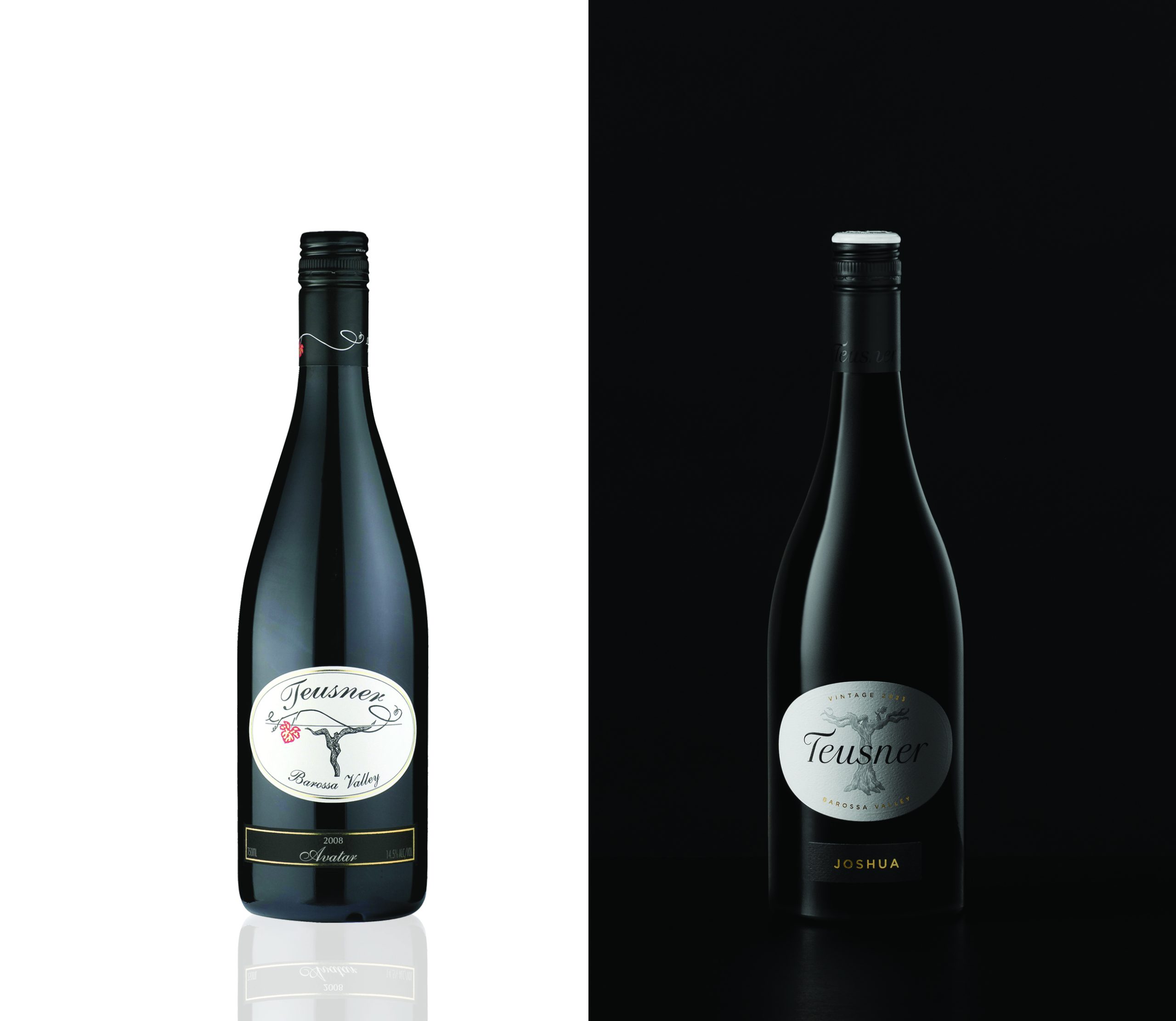
After almost 15 years creating over a dozen wine sub-brands together, Cornershop was offered the opportunity to refresh Teusner’s brand identity and packaging for their various wine ranges. The objective was to maintain brand integrity and appease existing customers, whilst attracting a new audience. Building on existing branding and brand recognition, for the ‘Traditional’ range we retained the distinctive oval label, script font style and vine illustration. To improve legibility, we created a more refined and progressive ‘Teusner’ logotype. The illustration, crafted to resemble a ’T’, is inspired by a gnarled Grenache vine; where the brand story began. This is finished as a sculptured embossing. The product name is clearly communicated and finished in a gold foil, alongside the vintage and region. Cornershop are proud of our long-standing partnership and hope to continue playing an integral part in Teusner’s growth.