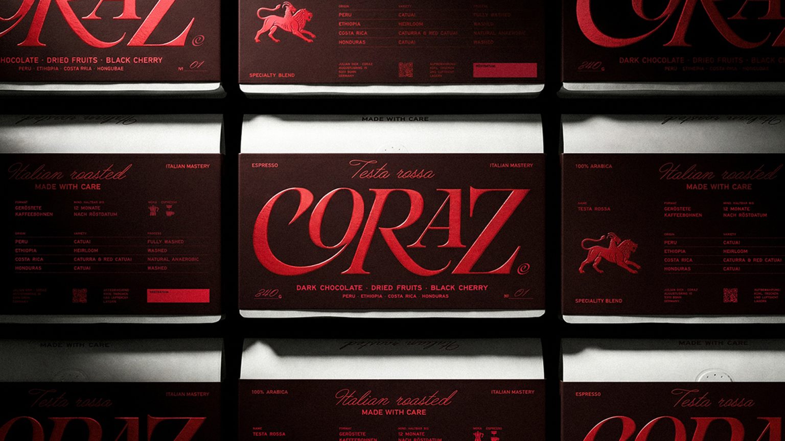

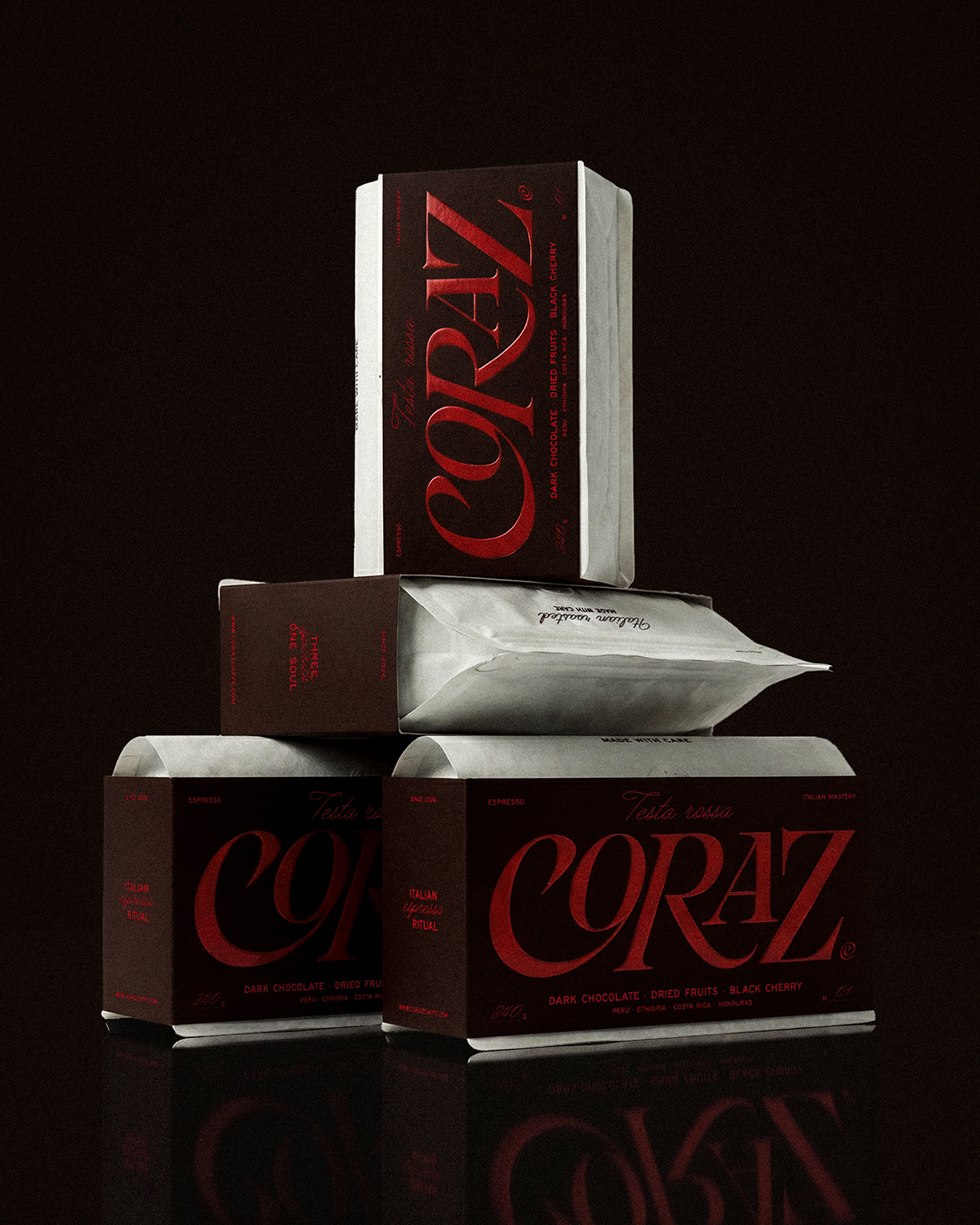
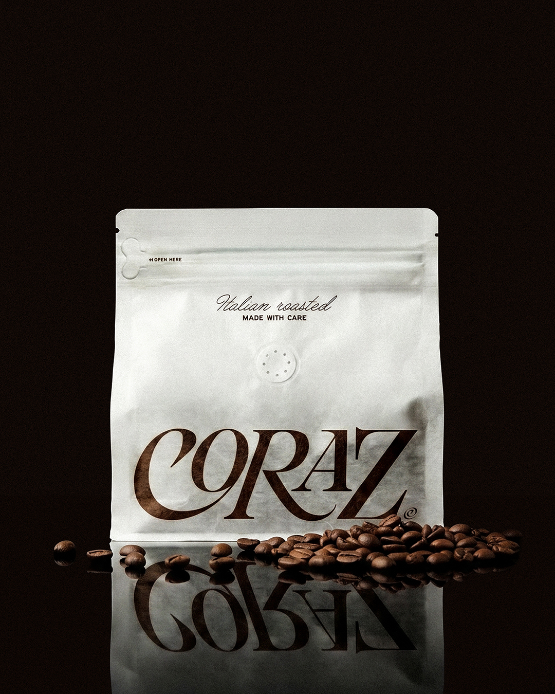
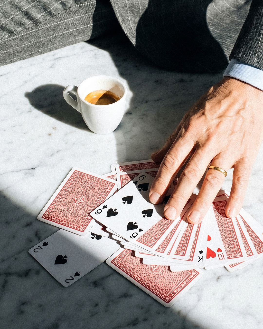
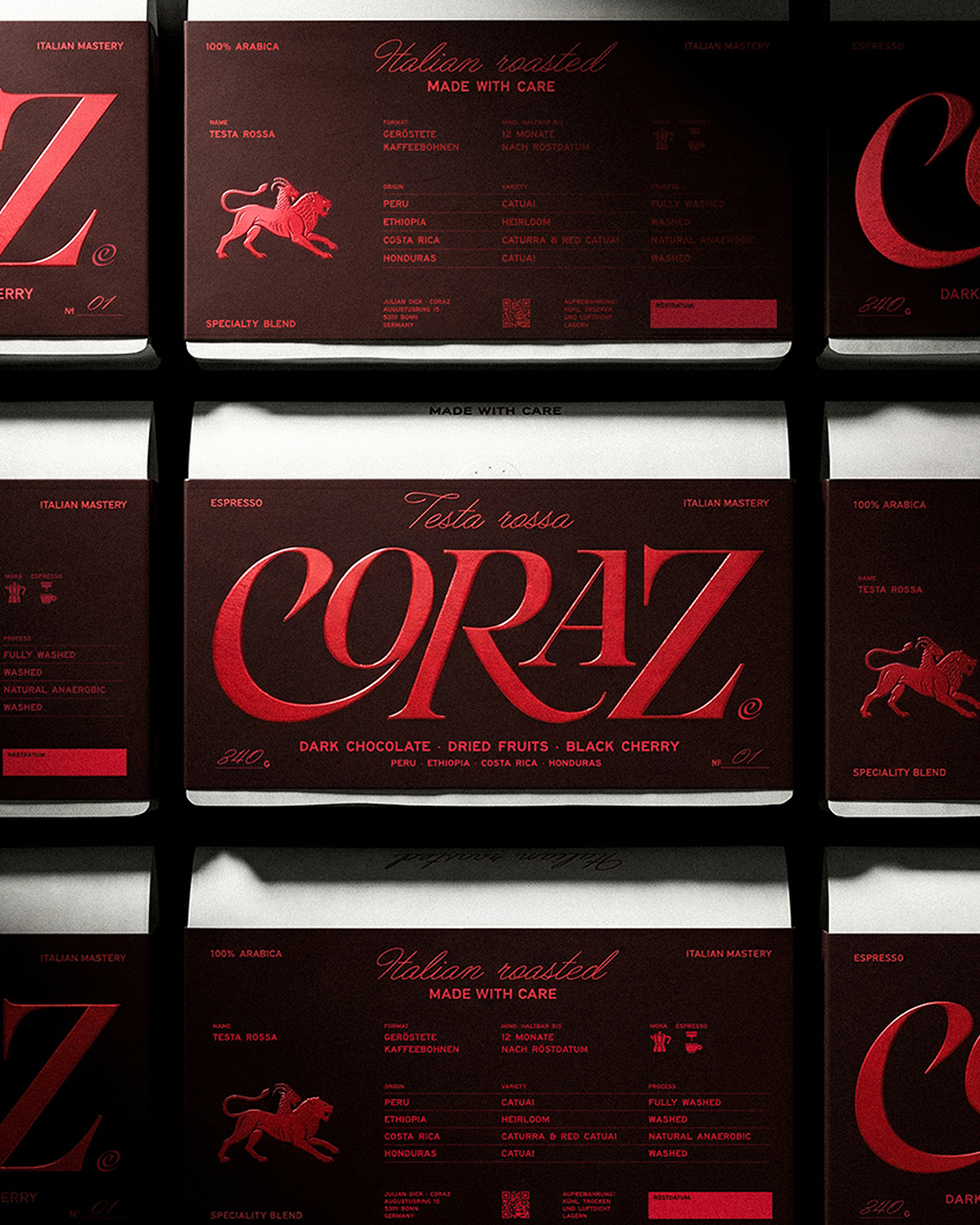
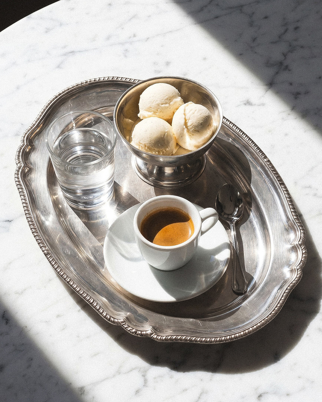
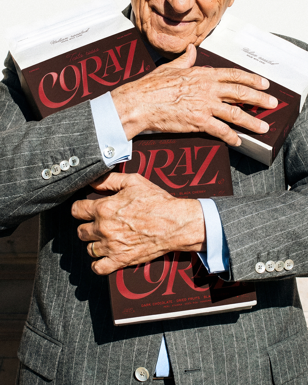
CLIENT Coraz is a modern Italian espresso brand rooted in specialty coffee culture. Rejecting the conventional “coffee lab” aesthetic, the brand focuses on the everyday ritual of drinking espresso. Inspired by Italian culture and craftsmanship, Coraz combines real coffee expertise with an approachable, understated lifestyle, aiming to make the simplest moments of the day better through great taste. ASSIGNMENT The brief required a branding and packaging direction that defied the conventional aesthetics of the specialty coffee market. The identity needed to convey deep expertise without resorting to technical jargon, snobbery, or sterile minimalism. The challenge was to create a visual system that felt warm, confident, and atmospheric, transforming the daily coffee break into a meaningful pause. The scope encompassed the core brand identity, packaging design, and art direction. SOLUTION & PROCESS The design concept is rooted in quiet expertise and the rhythm of everyday life. The visual language reflects an Italian atmosphere, translating the craft of roasting in Italy into a contemporary aesthetic. Deep burgundy tones and bold editorial typography set the mood, replacing loud marketing with calm confidence. The packaging is designed as an object of daily use, not a statement piece. The resulting system balances specialty standards with accessible taste, reflecting the core belief that great espresso doesn’t need to explain itself.
Curator’s Insight
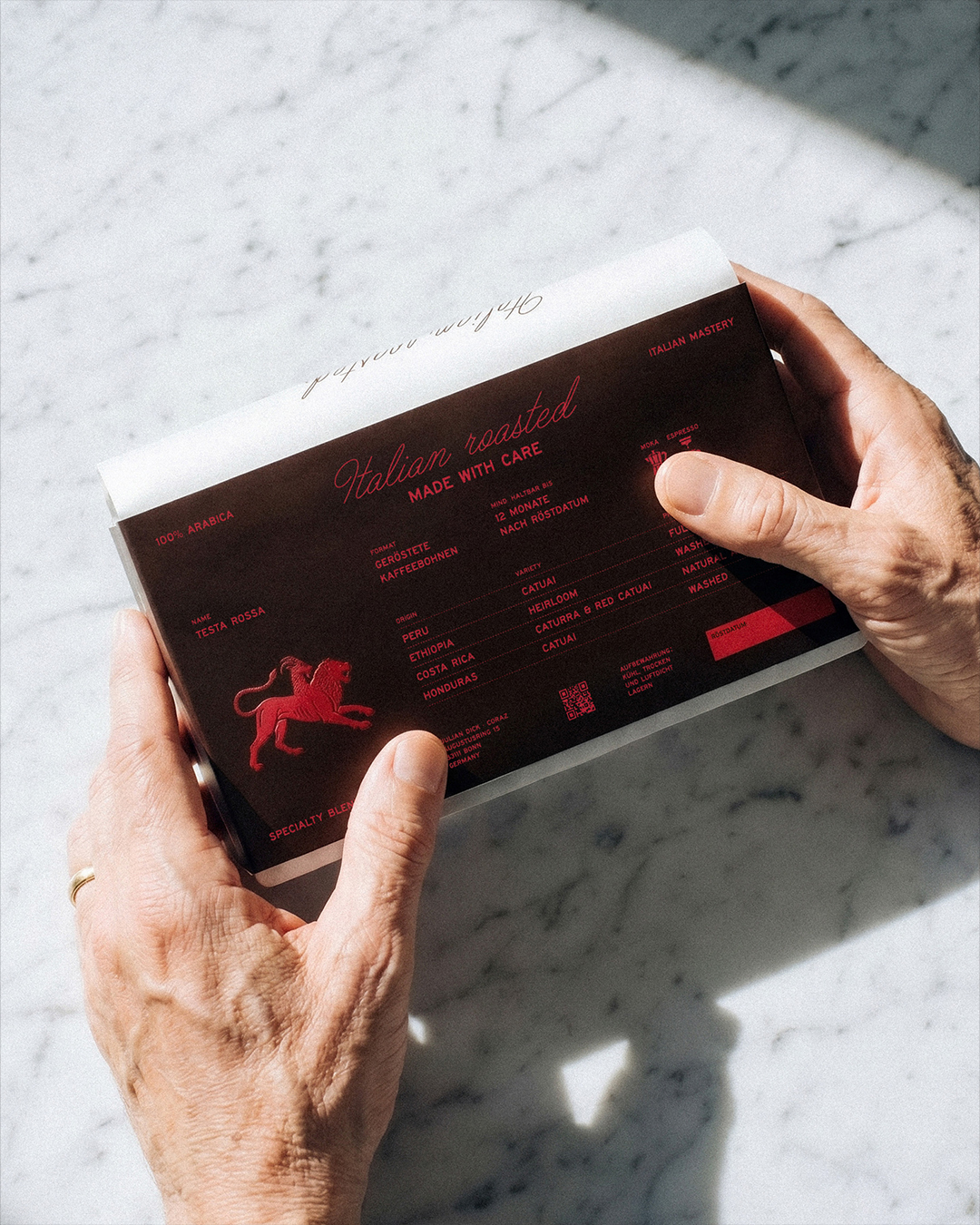
What makes this system work is restraint applied to a category that usually rewards excess. The single-color foil treatment, red on burgundy, forces every design decision through one narrow channel, so hierarchy has to come from scale and letterform rather than a competing palette. The heraldic lion functions less as decoration and more as a trust device, borrowing a visual language from wine and spirits rather than coffee, which quietly repositions Coraz outside its own category before a single tasting note is read. Technical information, origin, variety, process, is present but demoted to the register of fine print, treated as proof rather than pitch. That hierarchy choice is the real strategy here: expertise implied through composition, not stated through copy.




 Lizaveta Kharitonyuk
 Bonsanco Creative Studio
 DesignRepublic
 GIRAFA STUDIO
 PiotrWisniewski
 Sophiagdotcom
 monther al omari
 CreativeWise
 Modern Theory
 SoreThumbStudio®
 Modern World Studio
 Palashcc
 Valérie Colace
 andreamarinnn
 Chochoi Creative
 Hi estudio
 bachir bachchar
 Aferdini
 AUN BRANDS
 vitoramockup
 InterWish
 ash123456
 Studiotaketwo