

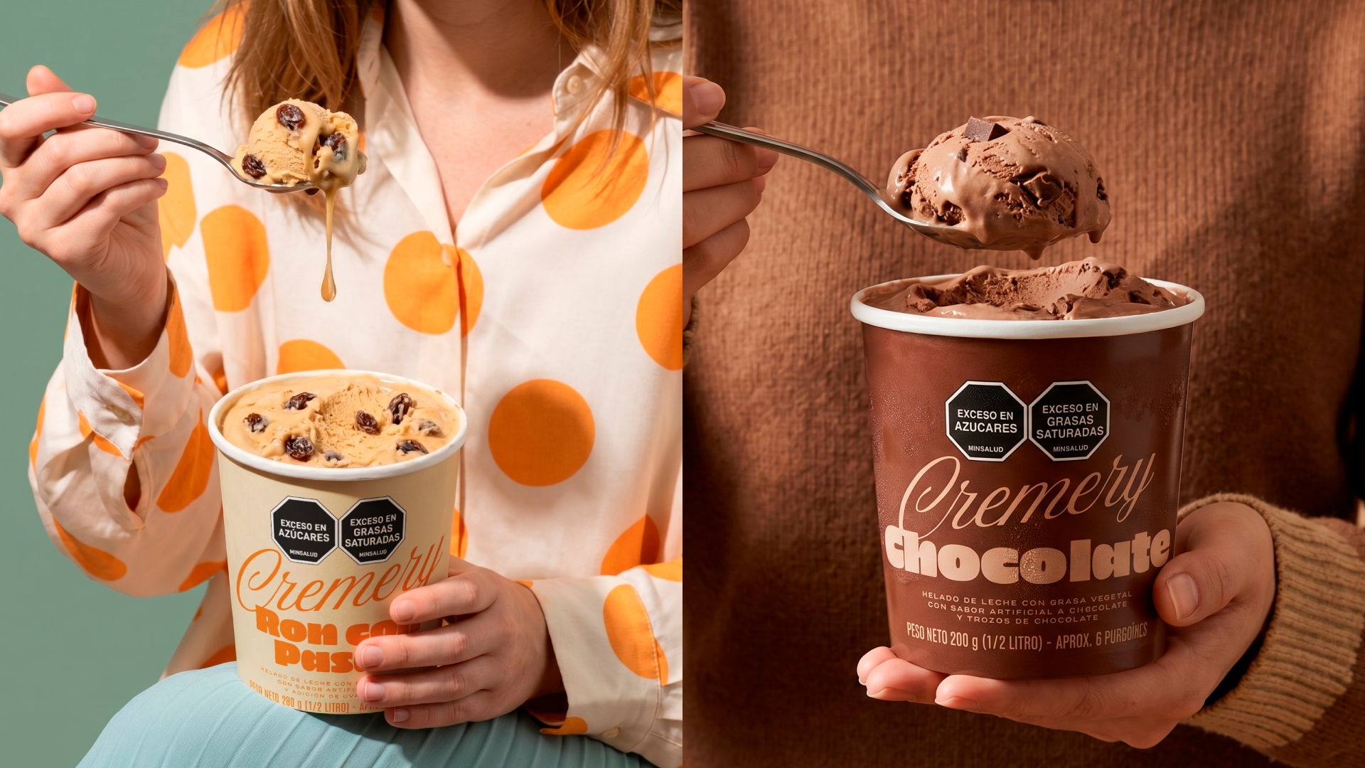
Mass consumer brands often risk feeling cold and disconnected from their audience. Cremery’s packaging design sets out to achieve the exact opposite, aiming to bring warmth, approachability, and a distinct human touch back to the ice cream aisle.
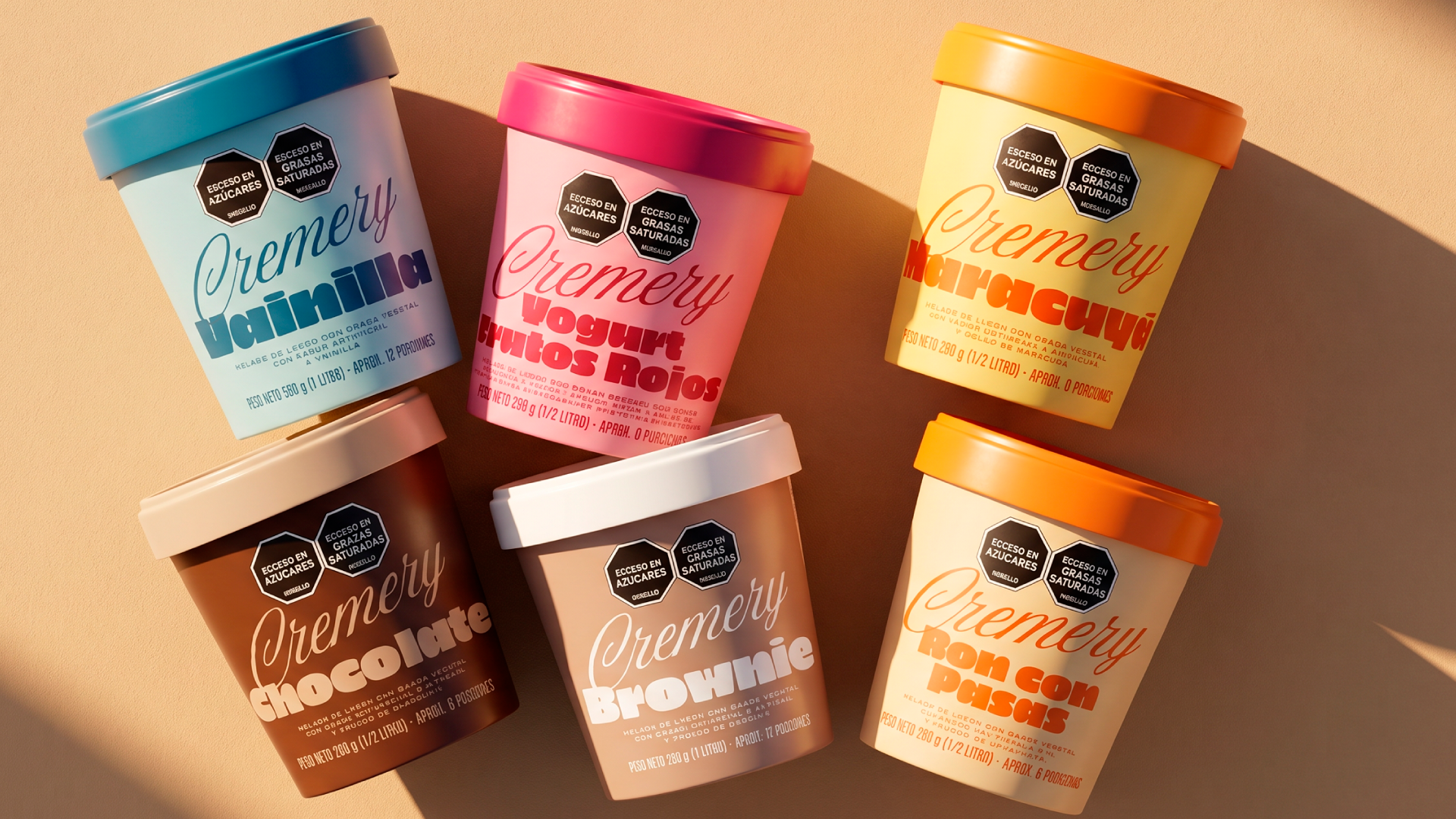
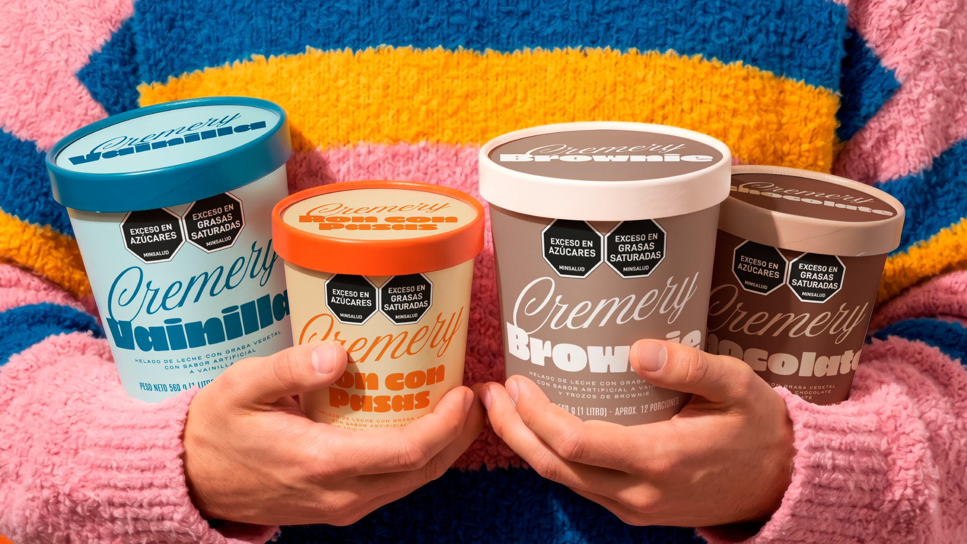
To achieve this, the typographic development was crucial. We selected a continuous stroke script typography for the central logo, placing it in deliberate tension with thick, mechanical fonts for the flavor descriptors. This striking typographic contrast provides a nostalgic, artisanal character that establishes an emotional connection from the very first glance, disrupting the overly clinical look of traditional mass-market competitors.
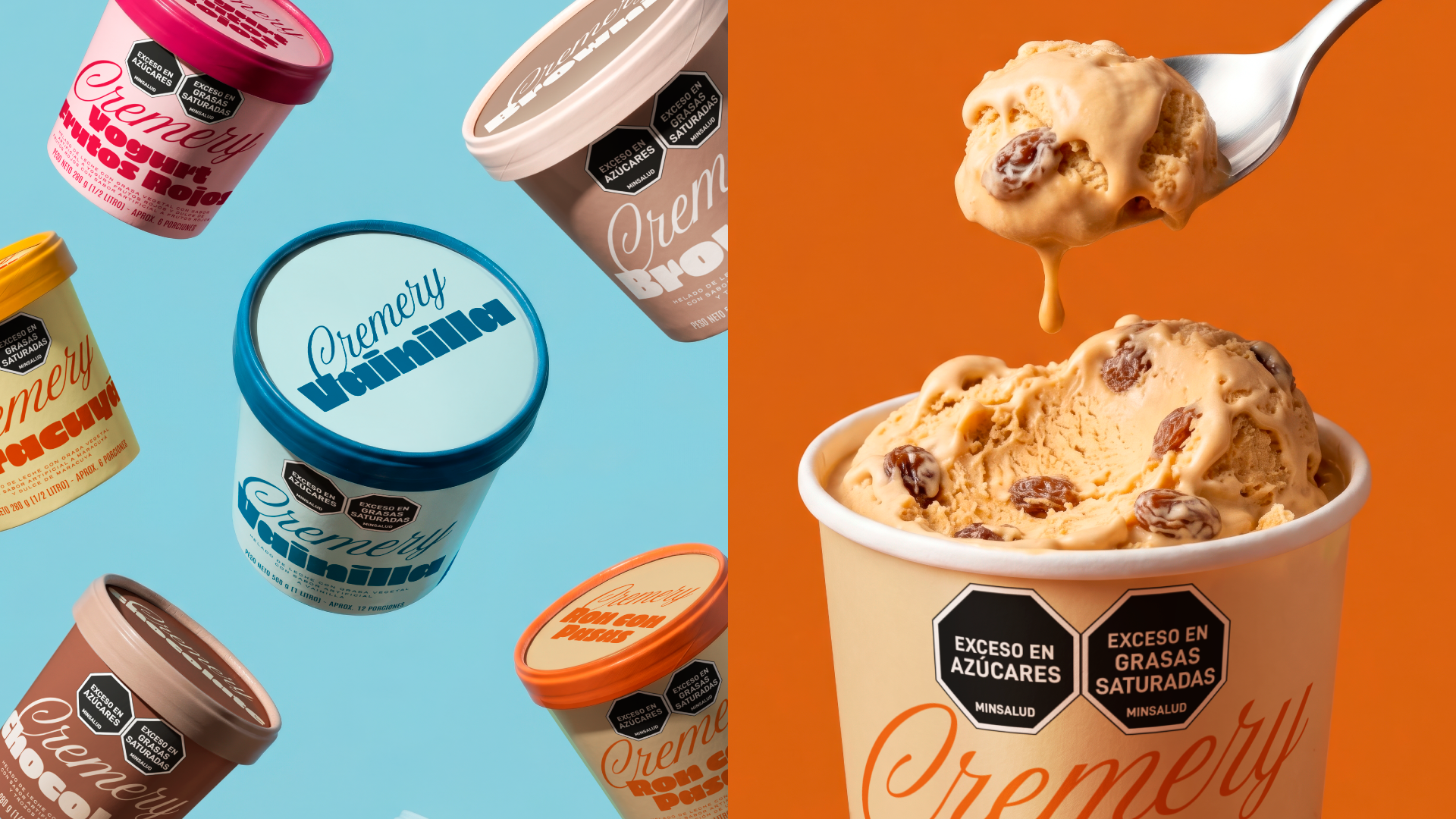
Furthermore, navigating a diverse flavor portfolio must be an effortless experience for the consumer. With Cremery, the color palette is far more than just decorative; it is a highly functional navigation strategy. We defined bold, solid color blocks that code each flavor variation, creating a high visual contrast against the brand’s red signature. This intentional color system quickly guides the eye, cohesively groups the portfolio on the shelf, and builds strong brand memory.
 United Creatives Studio
 Kingdom & Sparrow
 Anastasia Bakhmatskaya
 CreativeWise
 Great and Golden
 Ximena Ureta Design Studio.
 Sorted Branding
 Lisa Sirbaugh Creative
 vitoramockup
 YQIAN
YQIAN Navegante
 Anastasia Cherepanova | xtramez
 Polaris Designs
 pavlyai
 Milena Kocharyan
 monther al omari
 Mohamed sherif midoo
 DESIGN CONCEPTS
 mmdesign
 markcreativestudio
 Rosario Lo Iacono