

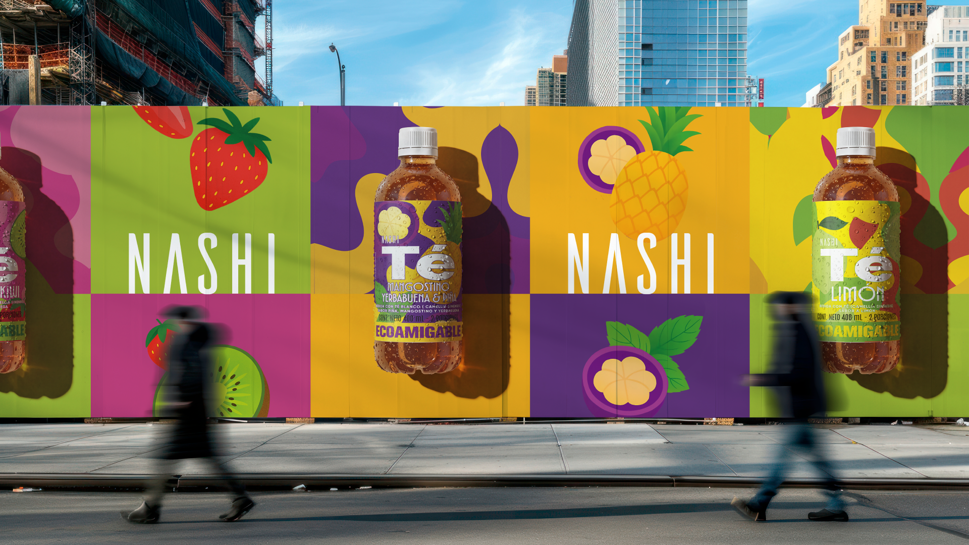
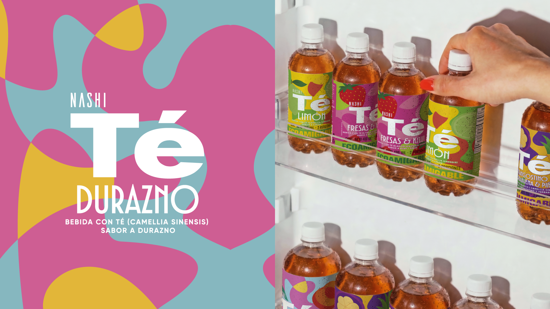
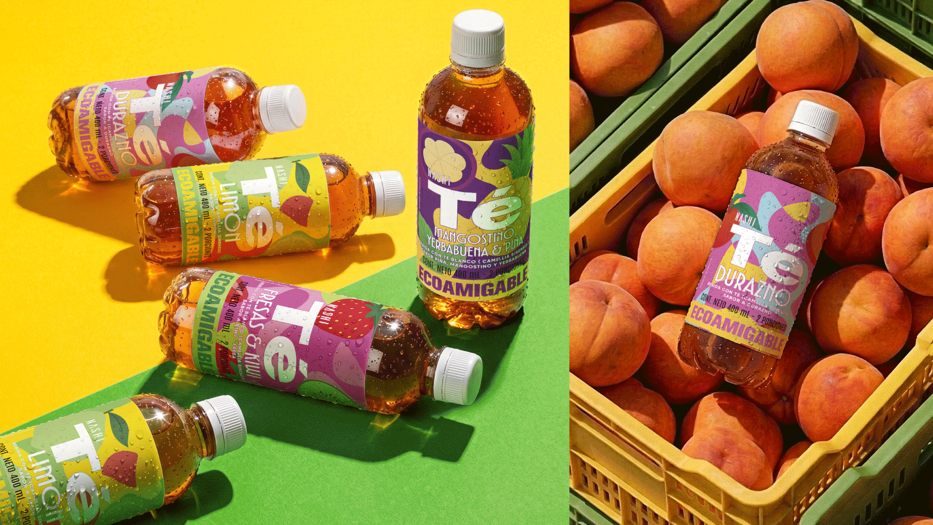
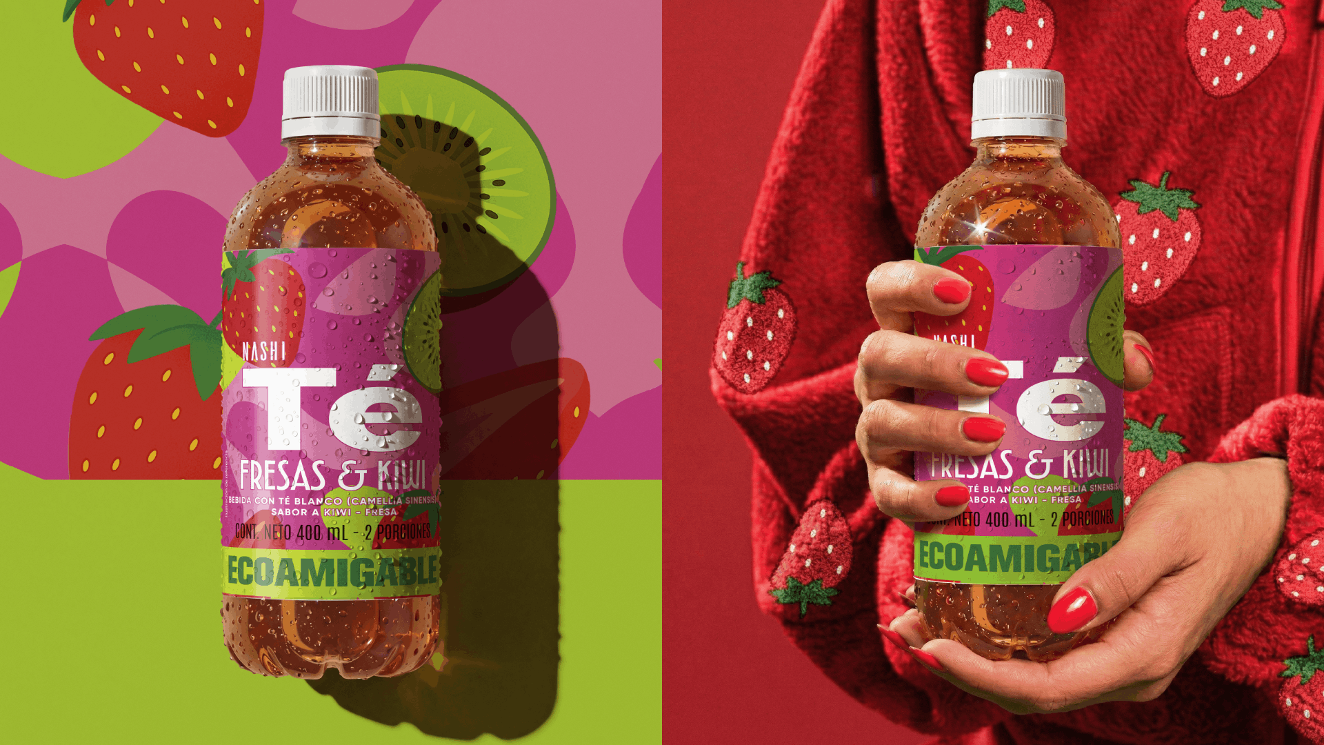
Nashi Tea needed a label design that felt like an instant burst of freshness—the true beginning of the consumer experience and their first physical connection with the brand. To achieve this, we developed a cohesive visual system grounded in the geometric abstraction of the tea’s natural ingredients.
Bold typography ensures easy flavor navigation, while a striking, vibrant color palette guarantees maximum visual impact on the shelf. Beyond the bottle, these color blocks and fresh illustrations are designed to integrate seamlessly into everyday life, allowing the product to function as a dynamic lifestyle element rather than just another beverage.
Because packaging design doesn’t end at the label, we engineered a modular graphic system that works like a visual puzzle. This 100% flexible and scalable approach expands and adapts beautifully across all brand touchpoints—from art direction to the point of sale—creating a rich, engaging visual universe without ever losing its core essence.

 United Creatives Studio
 Kingdom & Sparrow
 Anastasia Bakhmatskaya
 CreativeWise
 Great and Golden
 Ximena Ureta Design Studio.
 Sorted Branding
 Lisa Sirbaugh Creative
 vitoramockup
 YQIAN
YQIAN Navegante
 Anastasia Cherepanova | xtramez
 Polaris Designs
 pavlyai
 Milena Kocharyan
 monther al omari
 Mohamed sherif midoo
 DESIGN CONCEPTS
 mmdesign
 markcreativestudio
 Rosario Lo Iacono