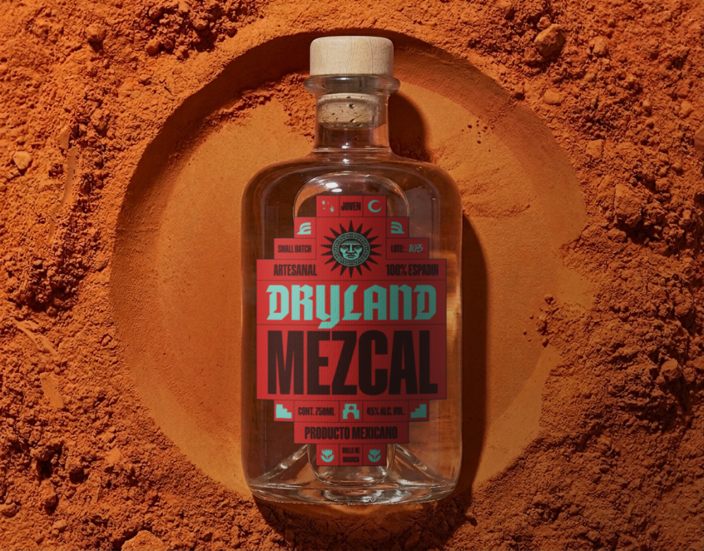

Dryland Mezcal is a conceptual branding and packaging project built around the idea of a landscape shaped by heat, time, and resilience.
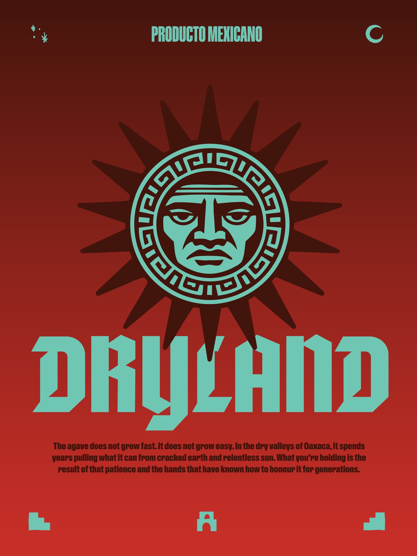
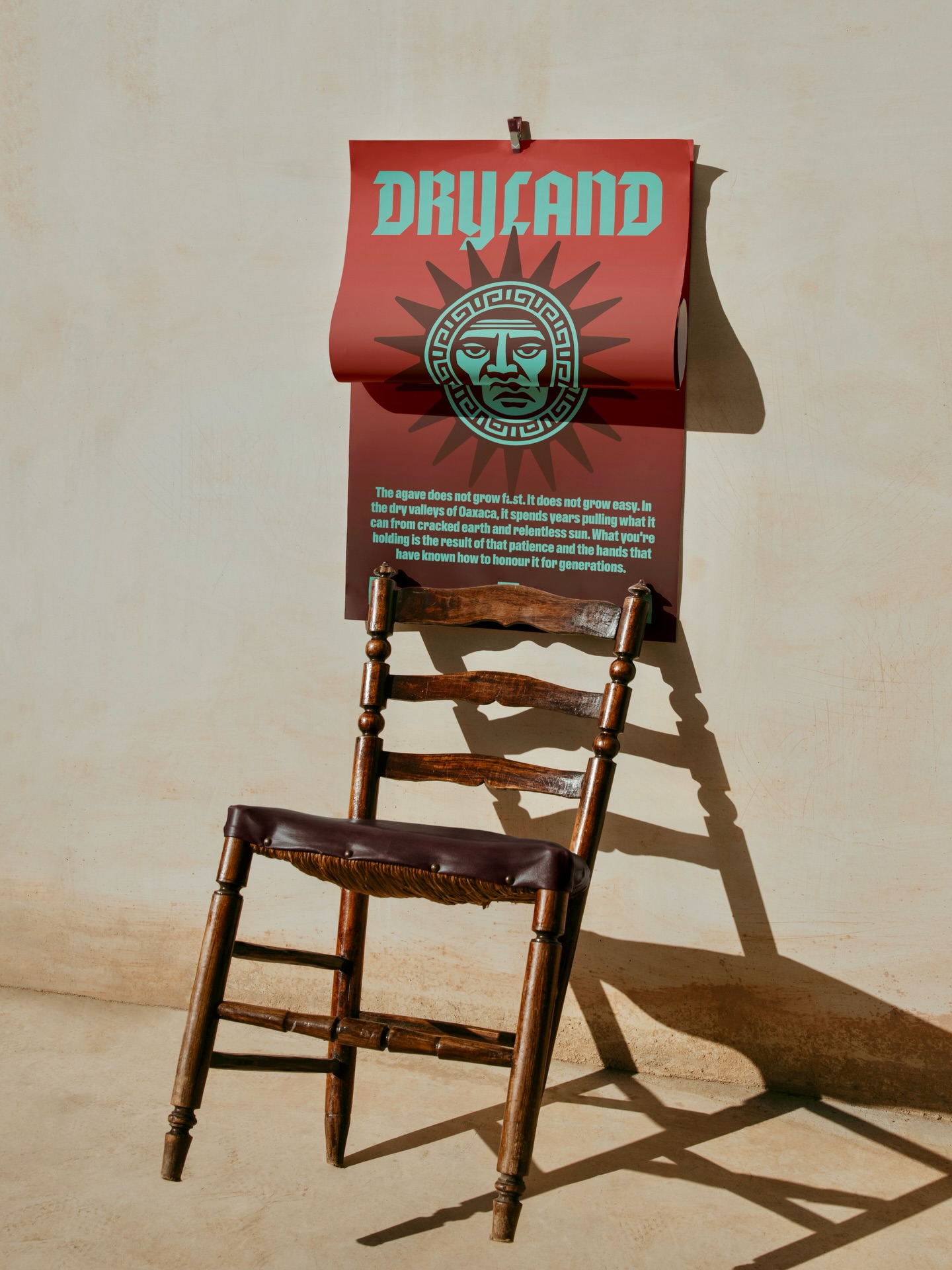
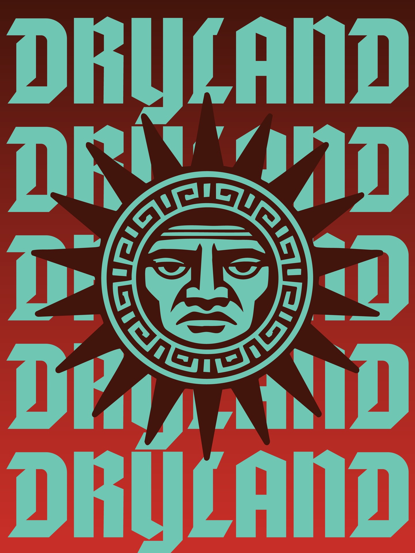
The identity began with a simple visual system: a geometric grid, an earthy color palette, and a sun symbol illustrated with a human face. Rather than functioning as a decorative element, the sun became the core of the brand, appearing consistently across every expression while changing through composition, scale, and color.
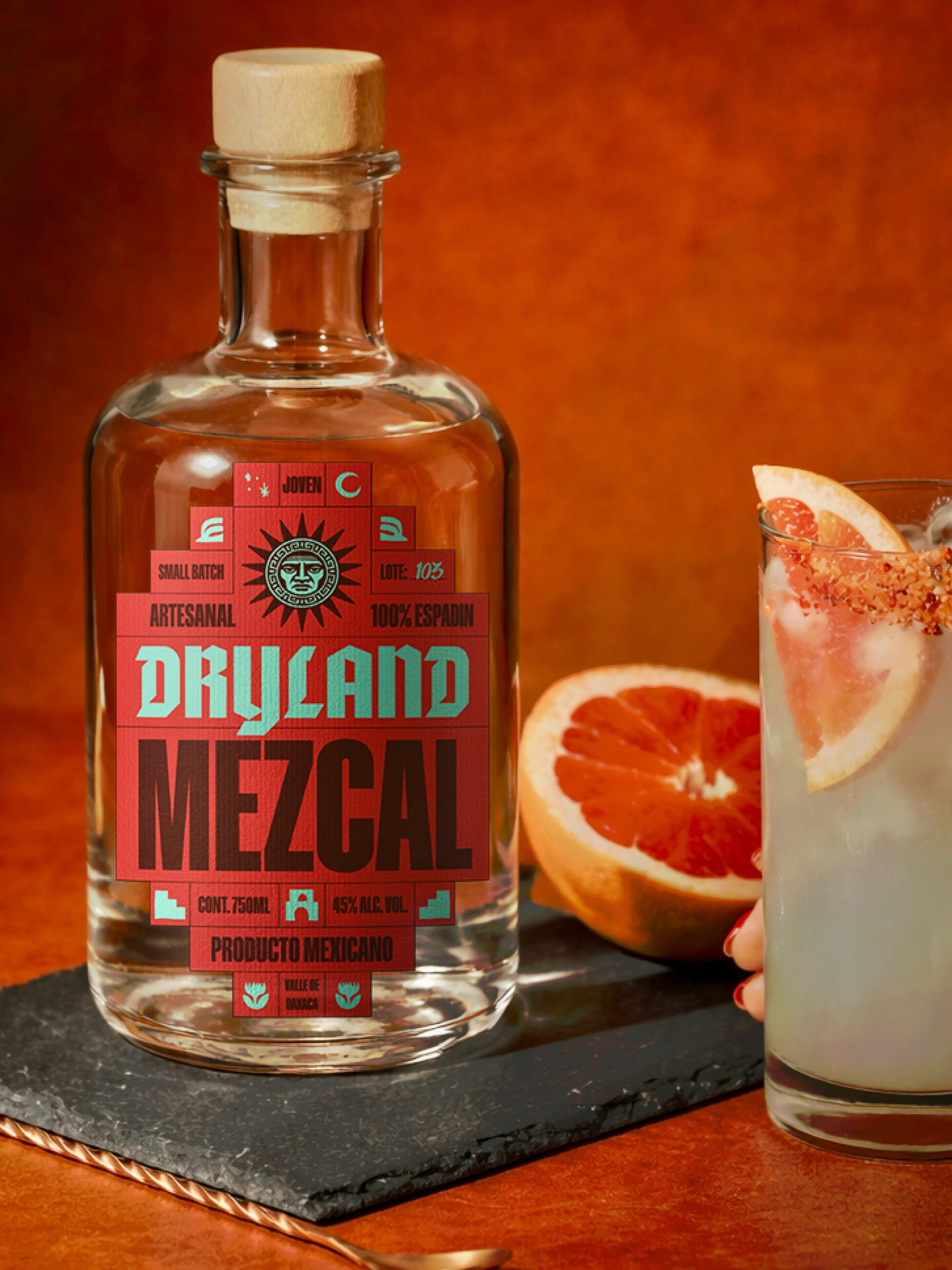
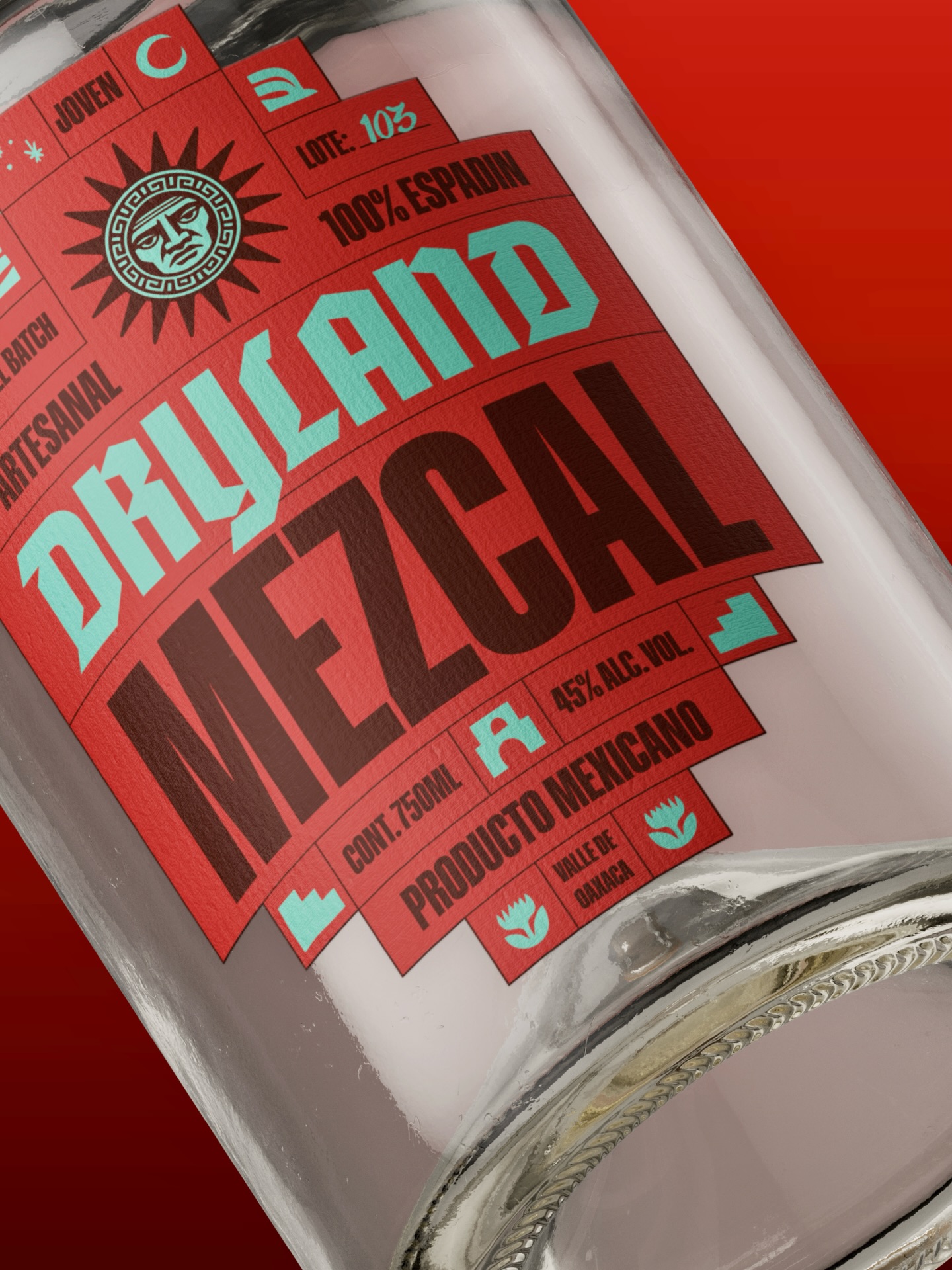
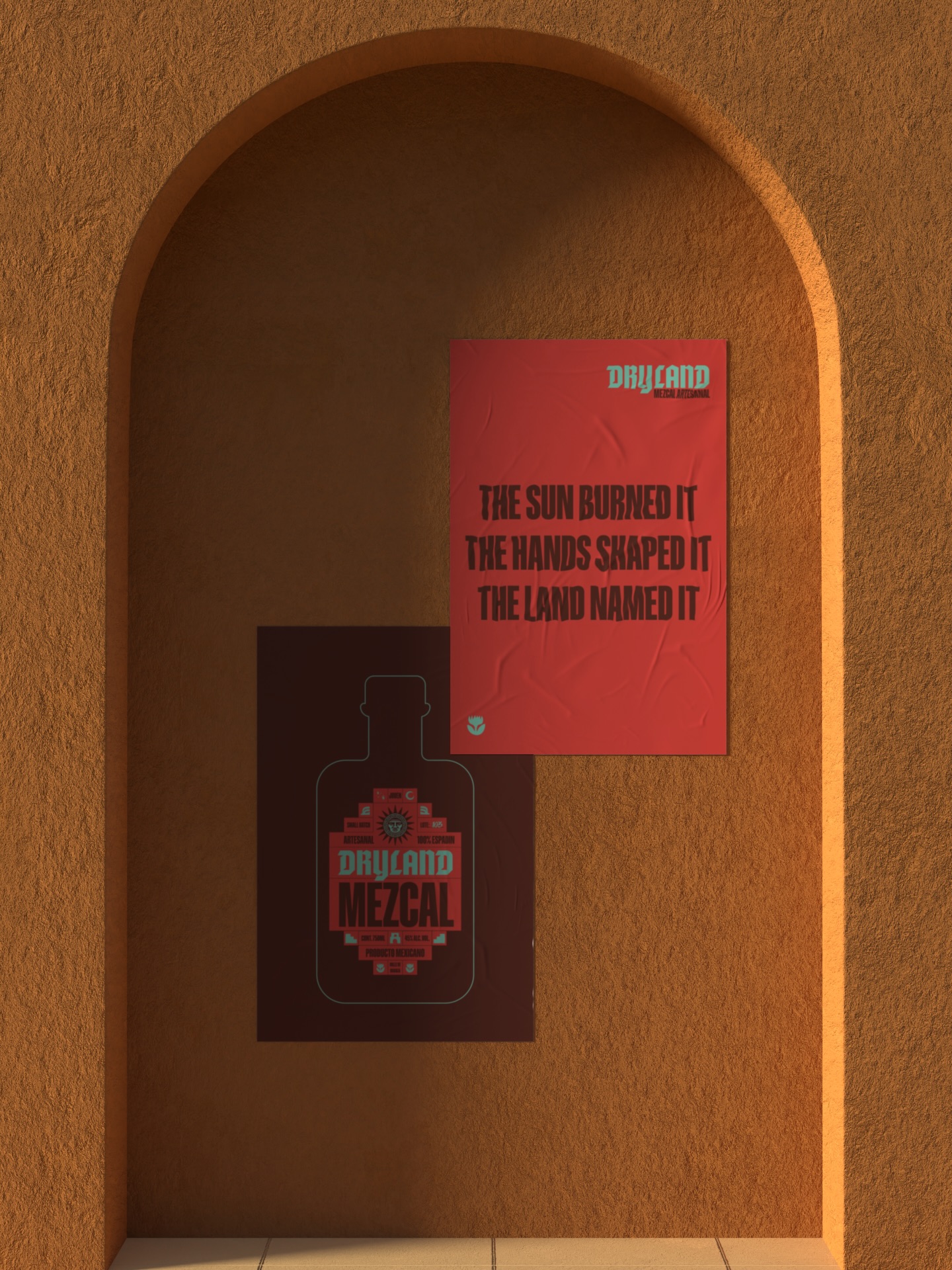
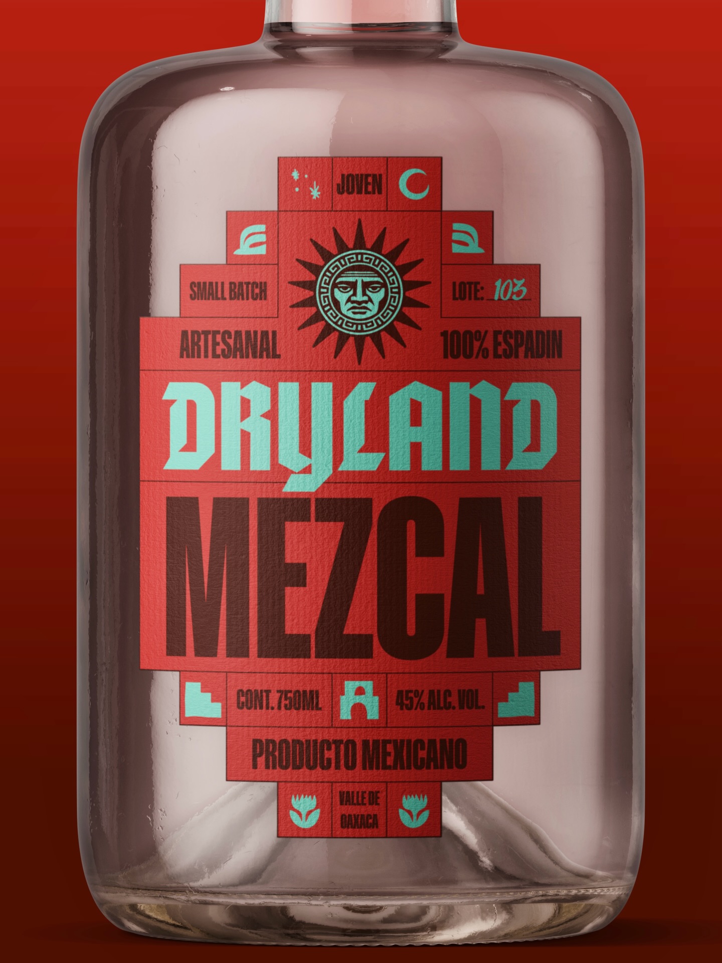
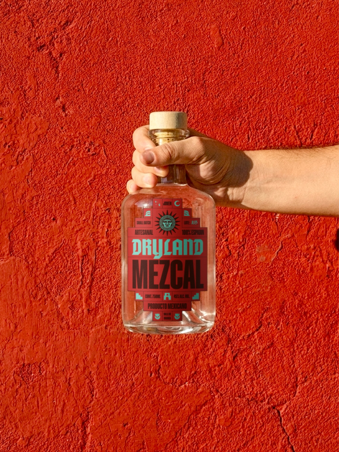
The packaging follows the same logic. A restrained typographic approach and structured layouts allow the symbol to carry the visual weight, creating a family of labels that feels distinctive without relying on constant variation. The muted palette references dry soil, agave fields, stone, and sun-faded terrain, reinforcing the character of the spirit.
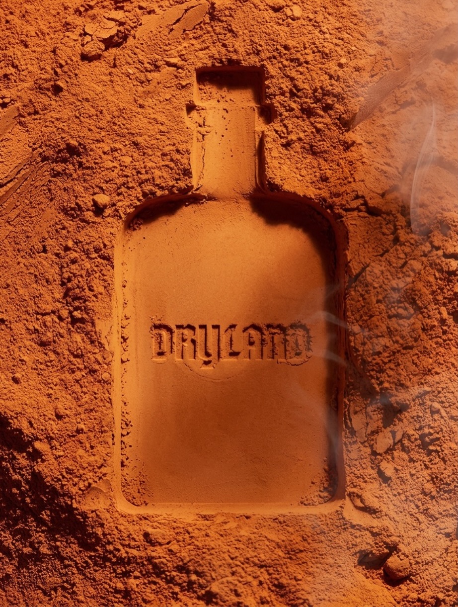
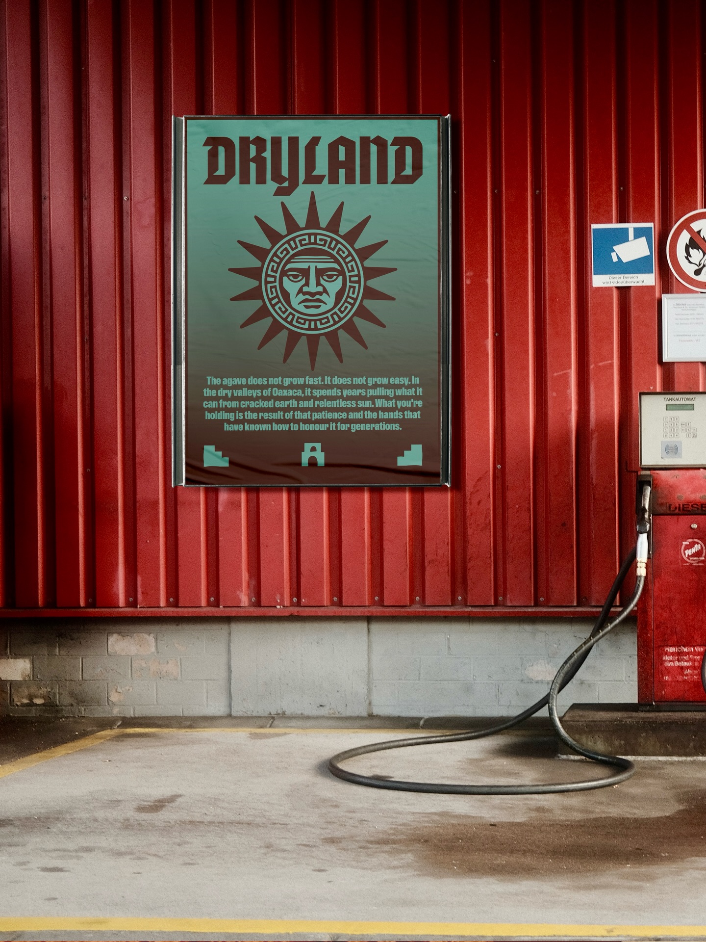
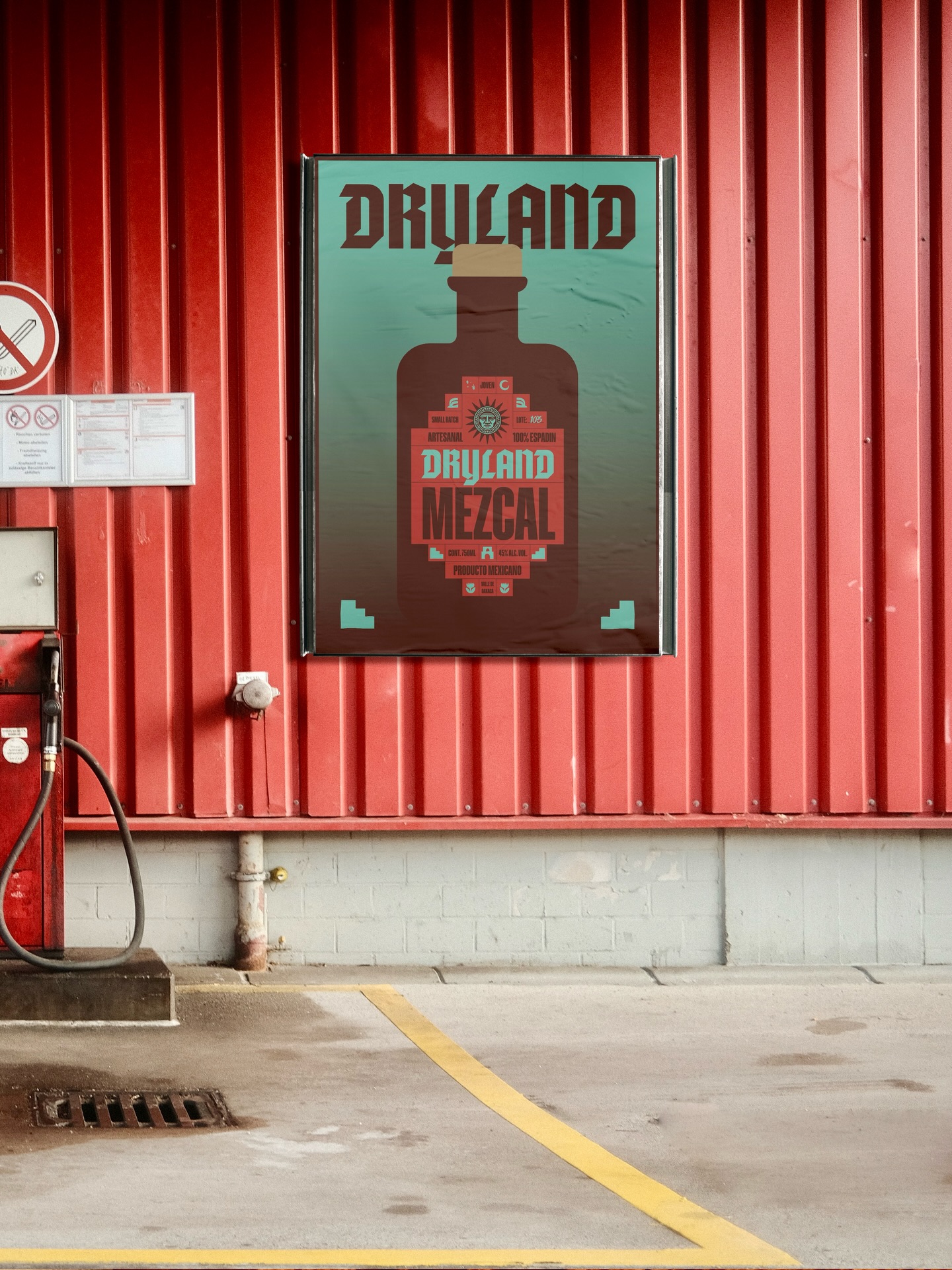
The project was developed as a complete brand world rather than a bottle label alone. From the photography to the secondary applications, every element follows the same visual language. An unexpected gas station setting became part of the presentation, contrasting the premium object with an everyday environment while highlighting the versatility of the identity.
Dryland explores how a minimal system can create a brand with depth, consistency, and a strong sense of place.
 MID-AIR STUDIO
 Heramb Arora
 monther al omari
 Tríona O'Donoghue • Design
 Cocoon Prague
 alchimistestudioParis
 hugo zapata
 Bonsanco Creative Studio
 parawaradesign
 UPRISE
 Brand Society
 Que Cálido Studio®
 Richest Branding Pvt. Ltd.
 STRATEDGY
 Shapers Studio
 Platon Ivantsov
 WPA Pinfold
 giselepereiradesign
 ShalaSketches
 05Creation
 Voit Studio
 SSTO
SSTO