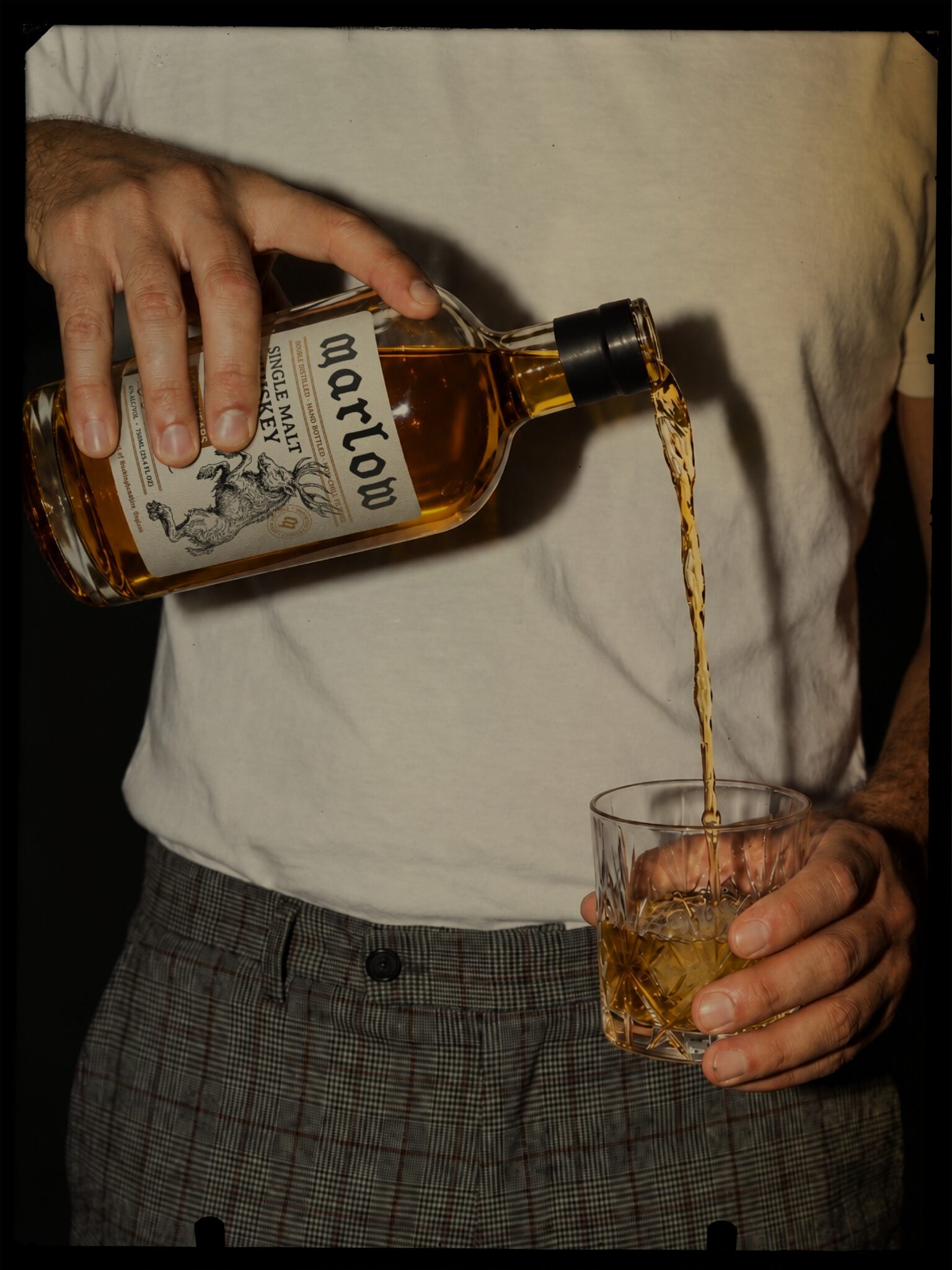

Marlow is a packaging project for a single malt whiskey from Buckinghamshire, England. The idea was to create a brand that felt as though it had been there much longer than you have, belonging to a small English town with a history of its own.
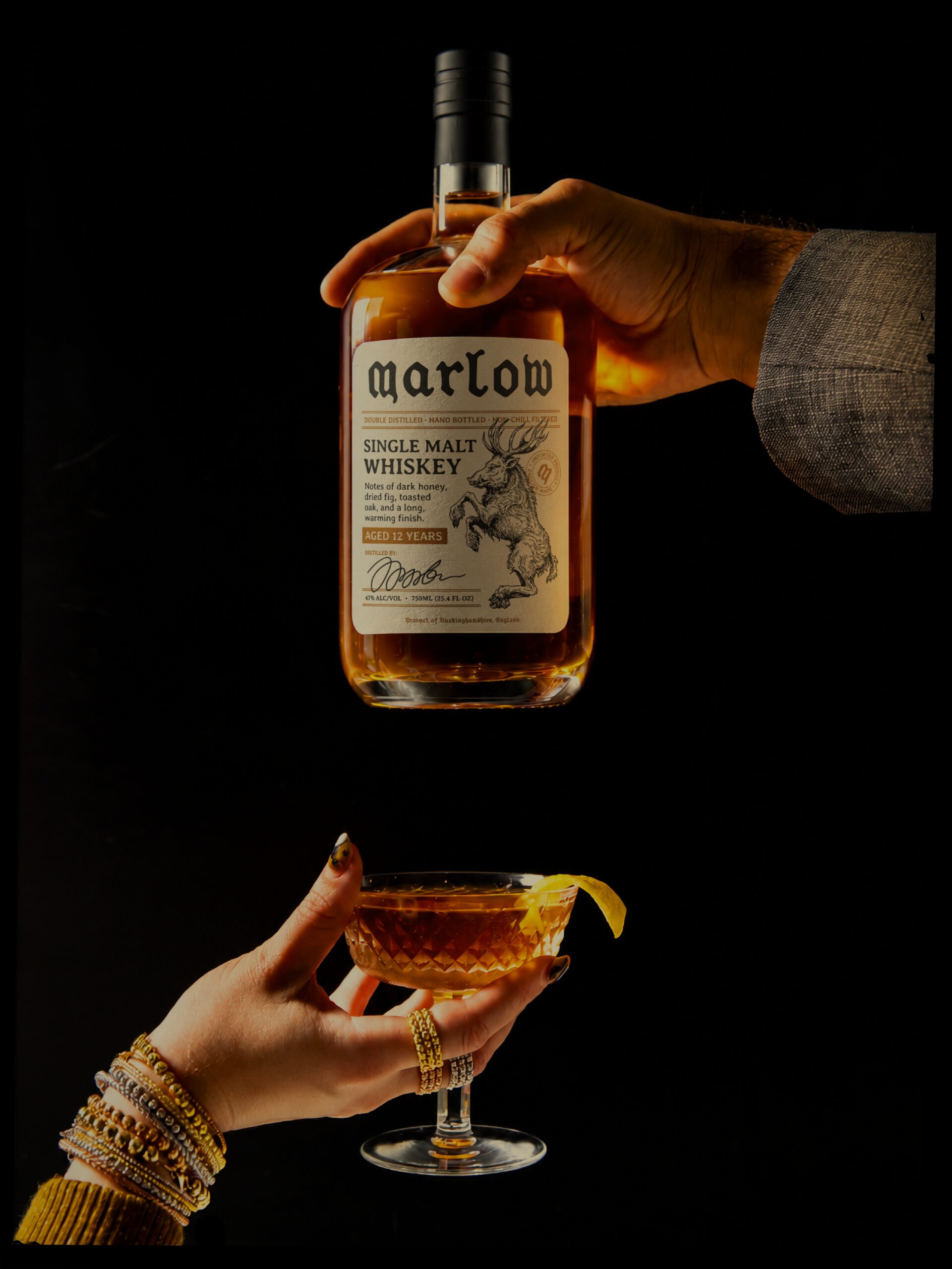
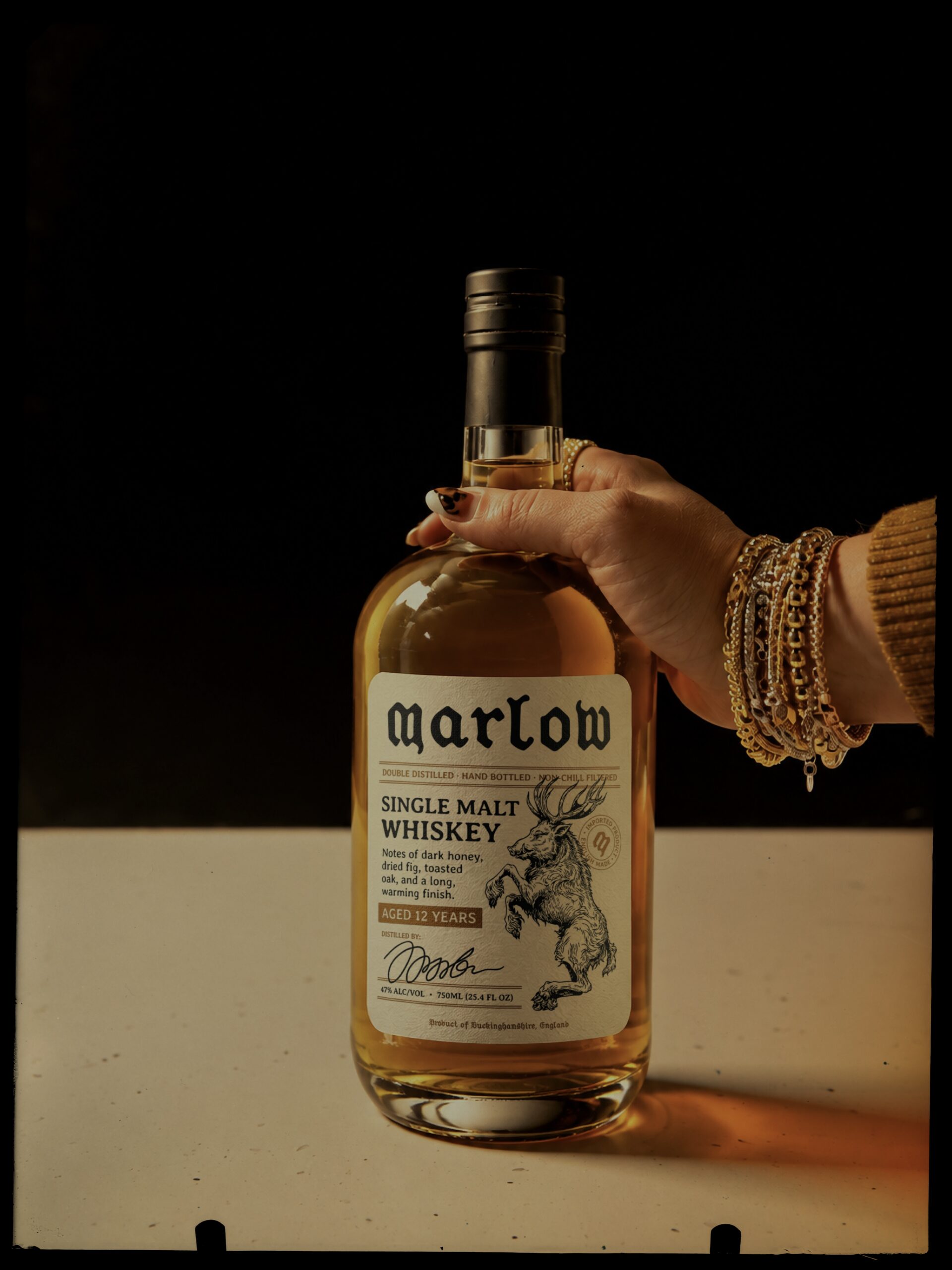
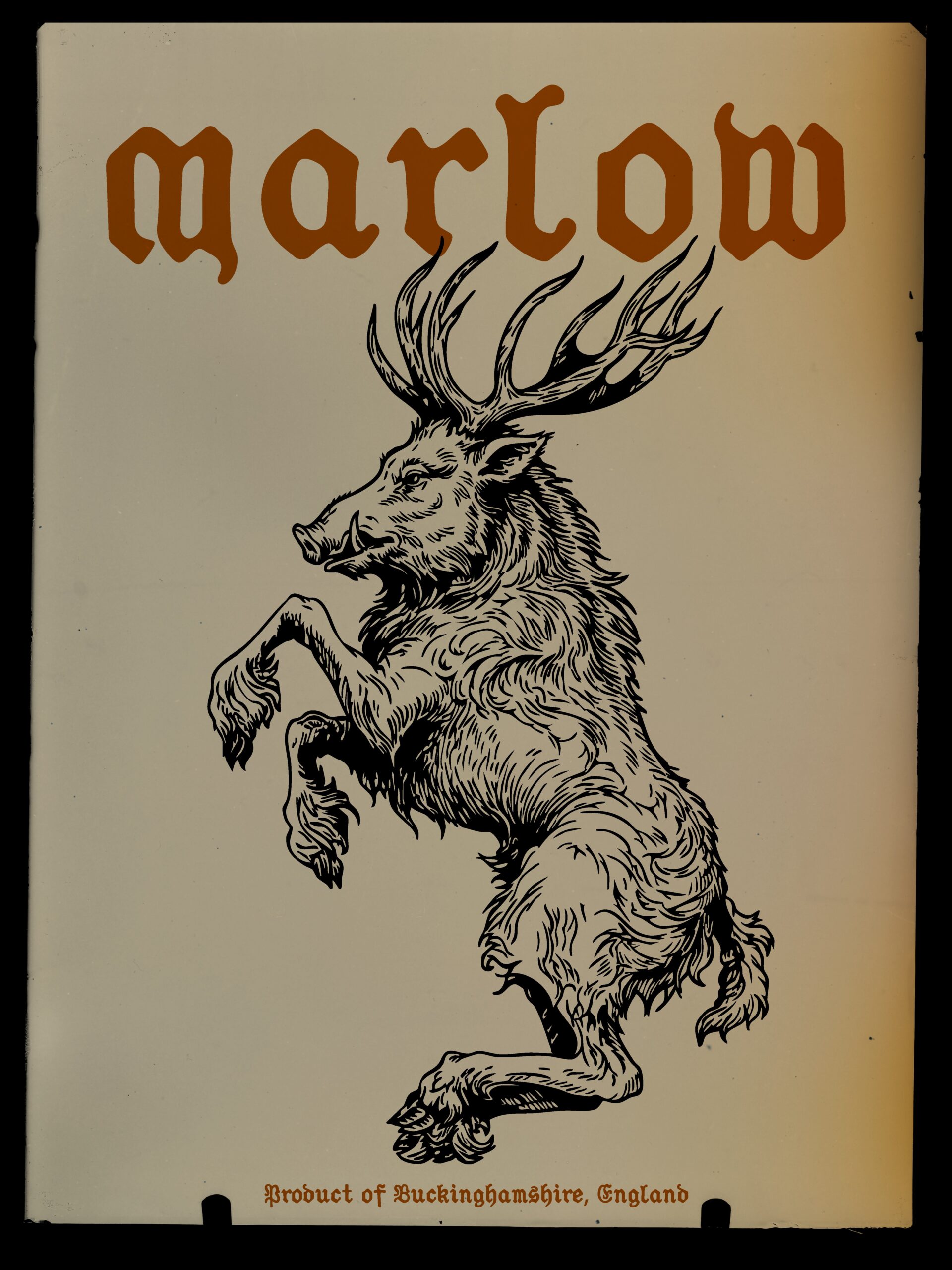
The identity centres on a blackletter wordmark and a detailed mythical creature illustration. Together, they give Marlow its old-world character, with just enough mystery to suggest there is more to the story without making it too literal. The aim was to create something distinctive and full of character, without leaning too heavily on the familiar conventions of expensive whiskey branding.
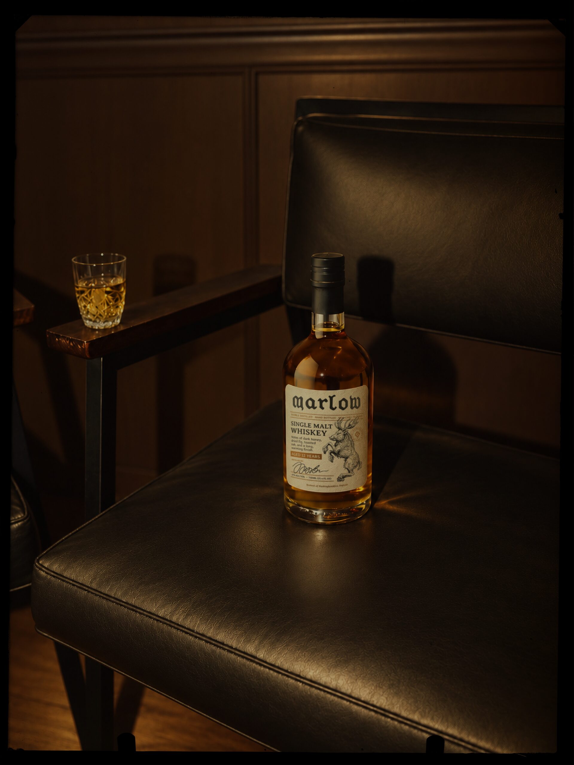
The bottle label gives the origin an important place, alongside the tasting notes and details about the whiskey itself. I wanted the information to be part of the design rather than something secondary to it. The idea was to present a well-made whiskey that earns its price through the quality of the product, without adding an inflated sense of luxury around it.
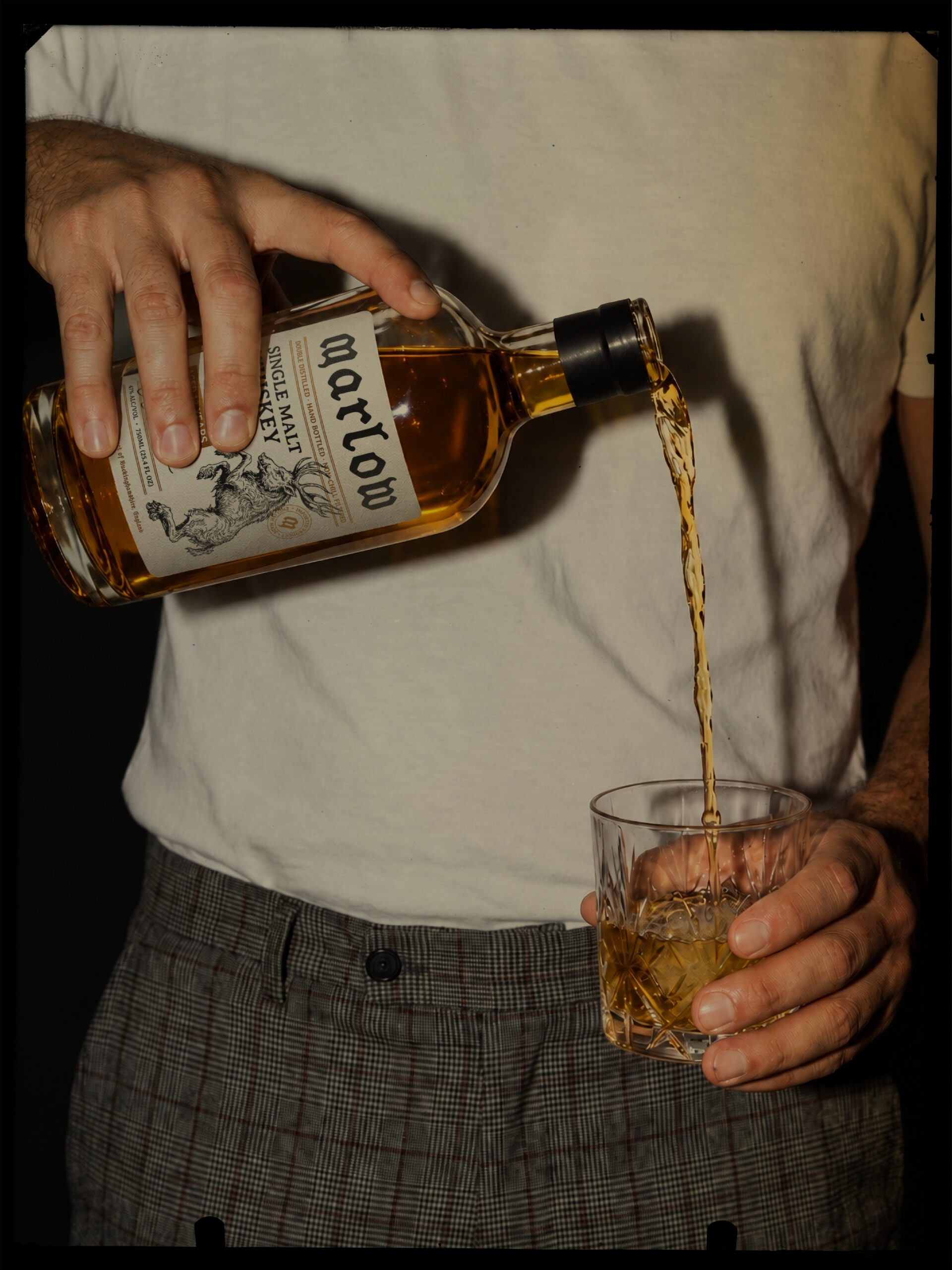
The photography combines warm tones, heavy grain, direct light and deep shadows, with close-up scenes of the bottle, glassware and the people around it. The result is a visual world that feels connected to the brand without making every image look like a conventional product advertisement.
Marlow is a personal exploration of how lettering, packaging and imagery can give a brand a sense of history and place, even when its story is still being imagined.
Design: Marjus Guza
Instagram: @marjusguza
 monther al omari
 Shustova p
 mutta
 @Allenarts13
 Sirka Agency
 Atiq Alam
 Dozen Agency
 j.substance
 SCD
 Cristian Lepore | crilep Copia
 Chris Creative Works
 Aligned Design Co.
 CreativeWise
 Agence des Coteaux
 Ramyromeo2024
 Grain of Design ®
 Ebbi
 BFS Studio
 butterflyhunters
 Asprey Creative
 About House of Ta
 Up-Brands
 KJS CRAFT
 hello ocean
 PG Branding