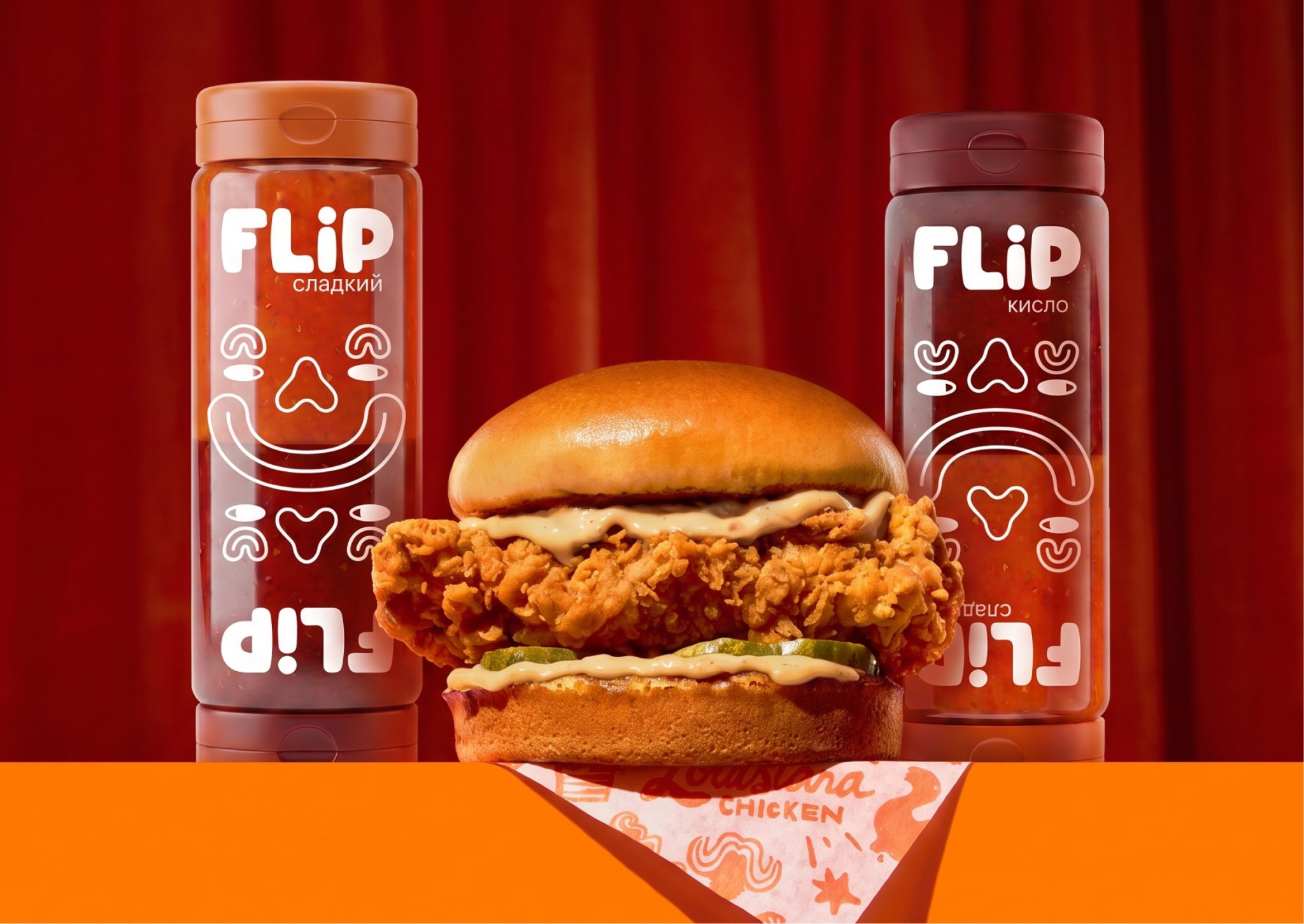

Fast food is all about choice, yet sauces are usually treated as an afterthought. They come in small single-use sachets, are inconvenient to use, generate unnecessary waste, and force consumers to choose just one flavour at a time.
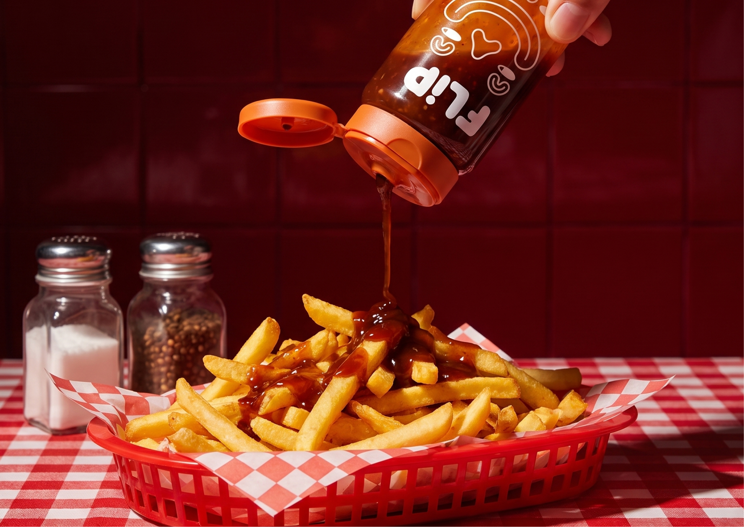
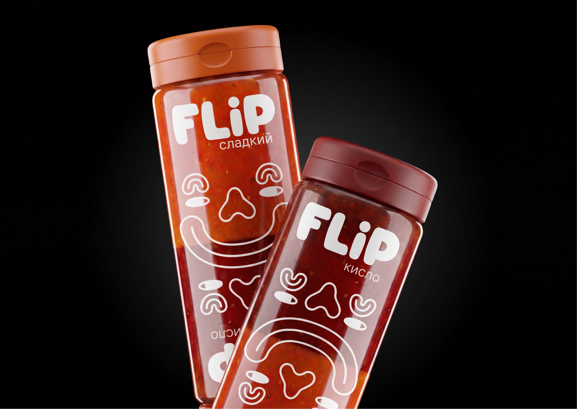
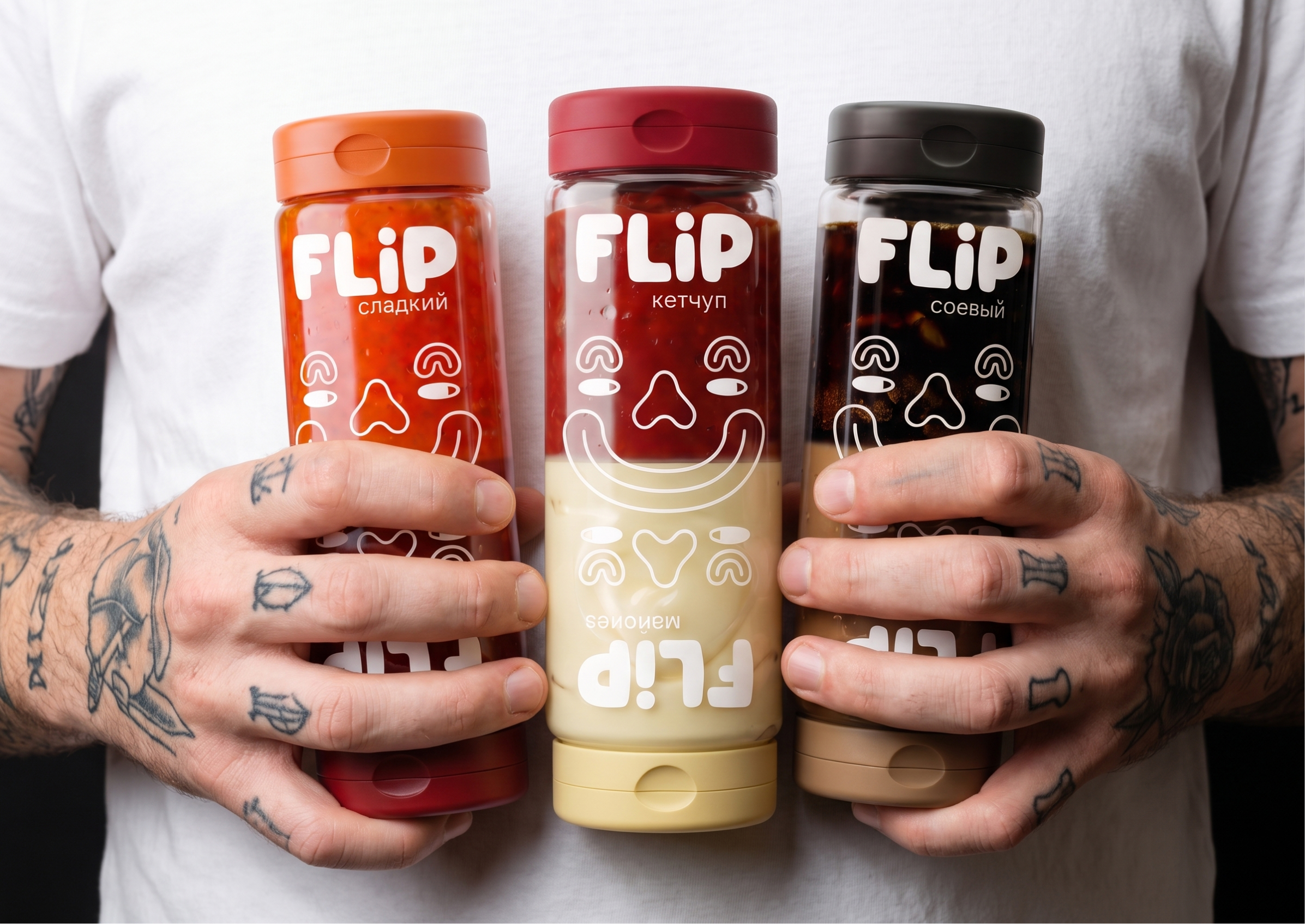
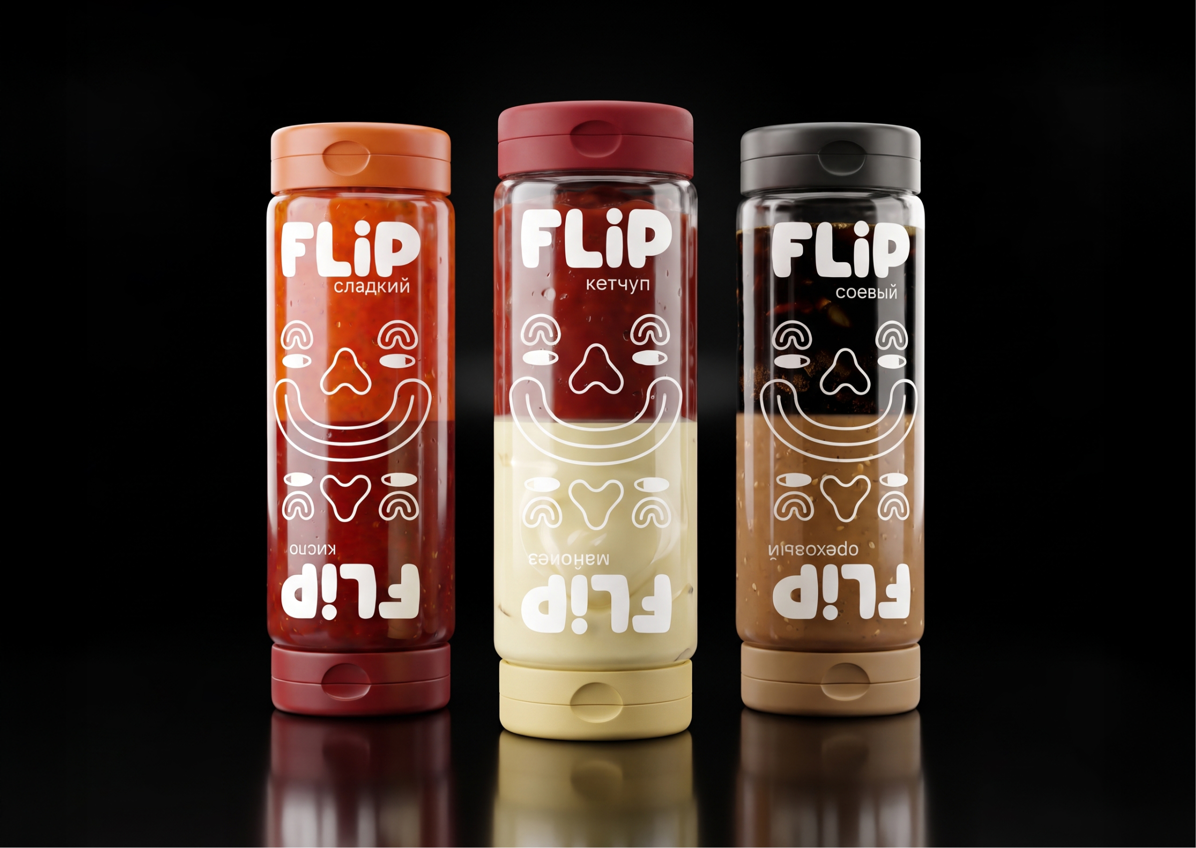
FLIP reimagines the sauce experience by transforming the packaging into an interactive object. Instead of separate containers, two complementary flavours are combined in a single bottle, allowing users to switch instantly between them with a simple flip. Sweet and sour become two sides of the same product, encouraging experimentation and making every meal more playful.
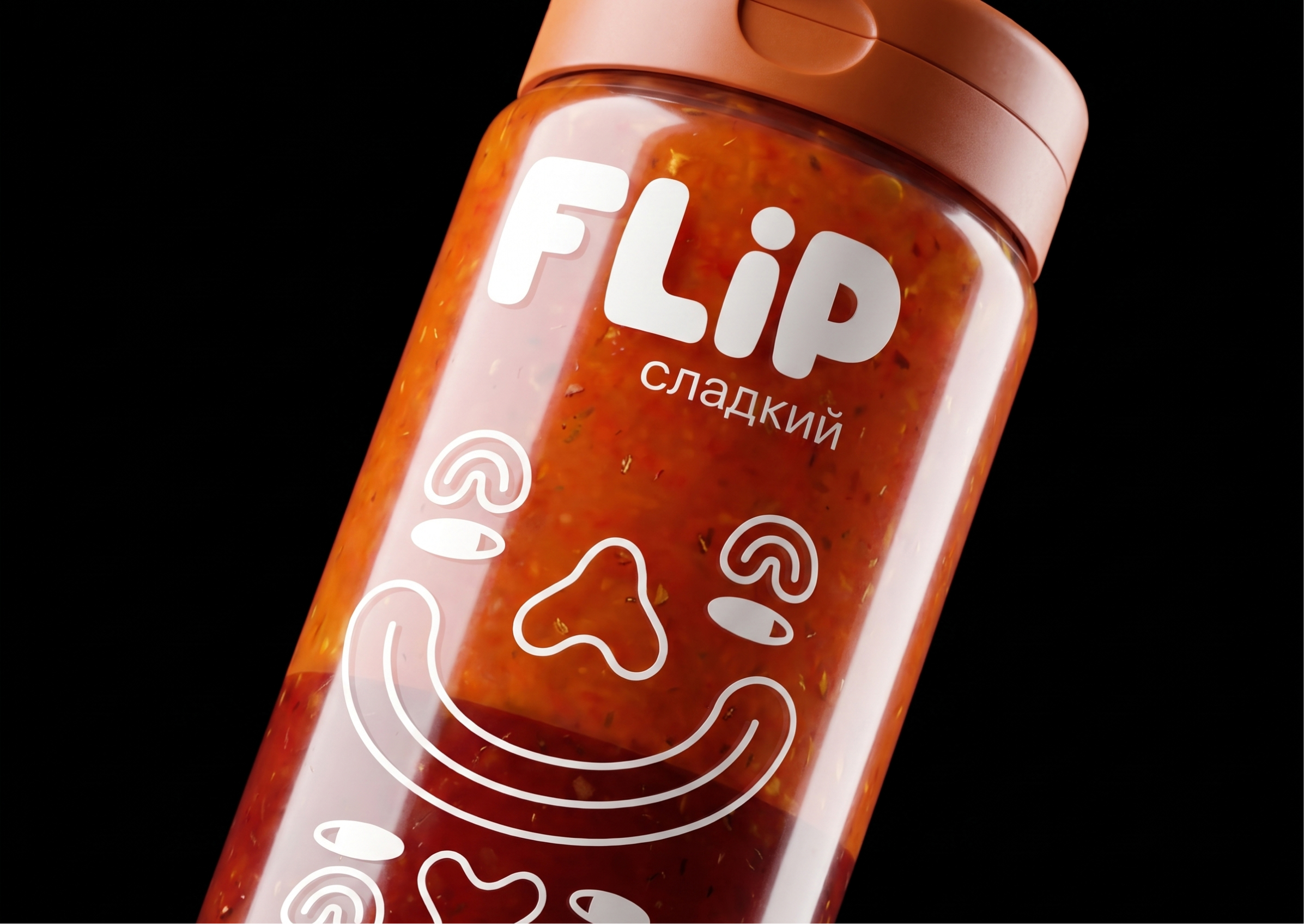
The transparent bottle showcases both sauces, while its symmetrical design visually expresses duality and balance. Two flip-top caps provide intuitive access from either end without the need for additional mechanisms. The name FLIP reflects both the physical action of turning the bottle over and the freedom to switch between flavours in seconds.
The visual identity is built around a reversible ambigram-inspired illustration that changes depending on the bottle’s orientation. When the bottle is flipped, a smiling face transforms into a sad one, visually representing the shift from sweet to sour. This simple interaction makes flipping the bottle an integral part of the user experience, creating a strong connection between the graphics, the packaging’s functionality, and the product itself. A minimalist typeface, expressive line illustrations, and a bold colour palette come together to create a distinctive and highly scalable brand identity.
Designed for takeaway, food delivery, and home use, FLIP eliminates the need for disposable sauce sachets while turning an everyday condiment into an engaging product experience. Rather than asking consumers to choose a single flavour, it invites them to enjoy both—making interaction an essential part of the brand itself.
 Derrick Lin
 Biaa
Biaa Petitmoulin Studio
 White Bear Studio
 Eva Chistyakova
 monther al omari
 Atipus
 alchimistestudioParis
 oneandother
 bloomburo
 helocrene
 Shapers Studio
 Denver Design
 Aidearte
 andrew.huerta
 softmachine
 airobtq
 Buzz & Co.
 Ruby
Ruby themythographer
 IDNB Inc.
 viktorflr
 Zenpack