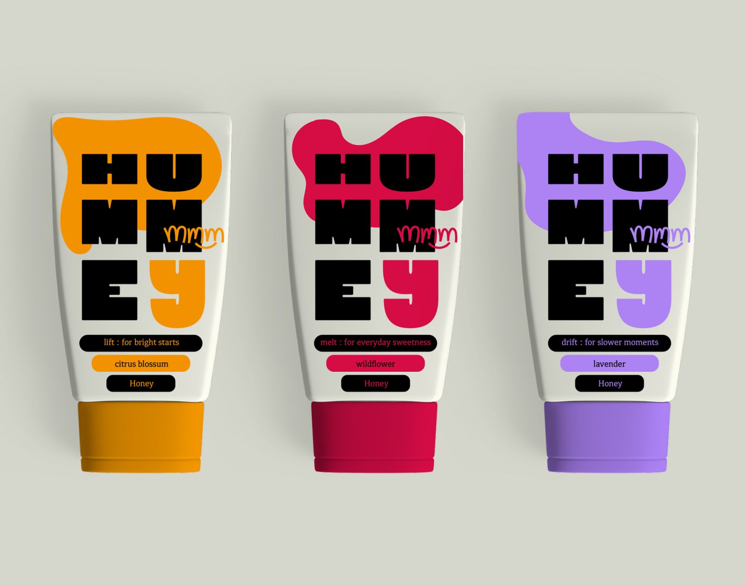

Honey has remained visually tied to heritage for decades.
Hummey reimagines the category through mood instead of flavour, creating a playful identity built around the everyday rituals that make life a little sweeter.
Instead of organising the range by flavour, we organised it by mood.
LIFT : for bright starts.
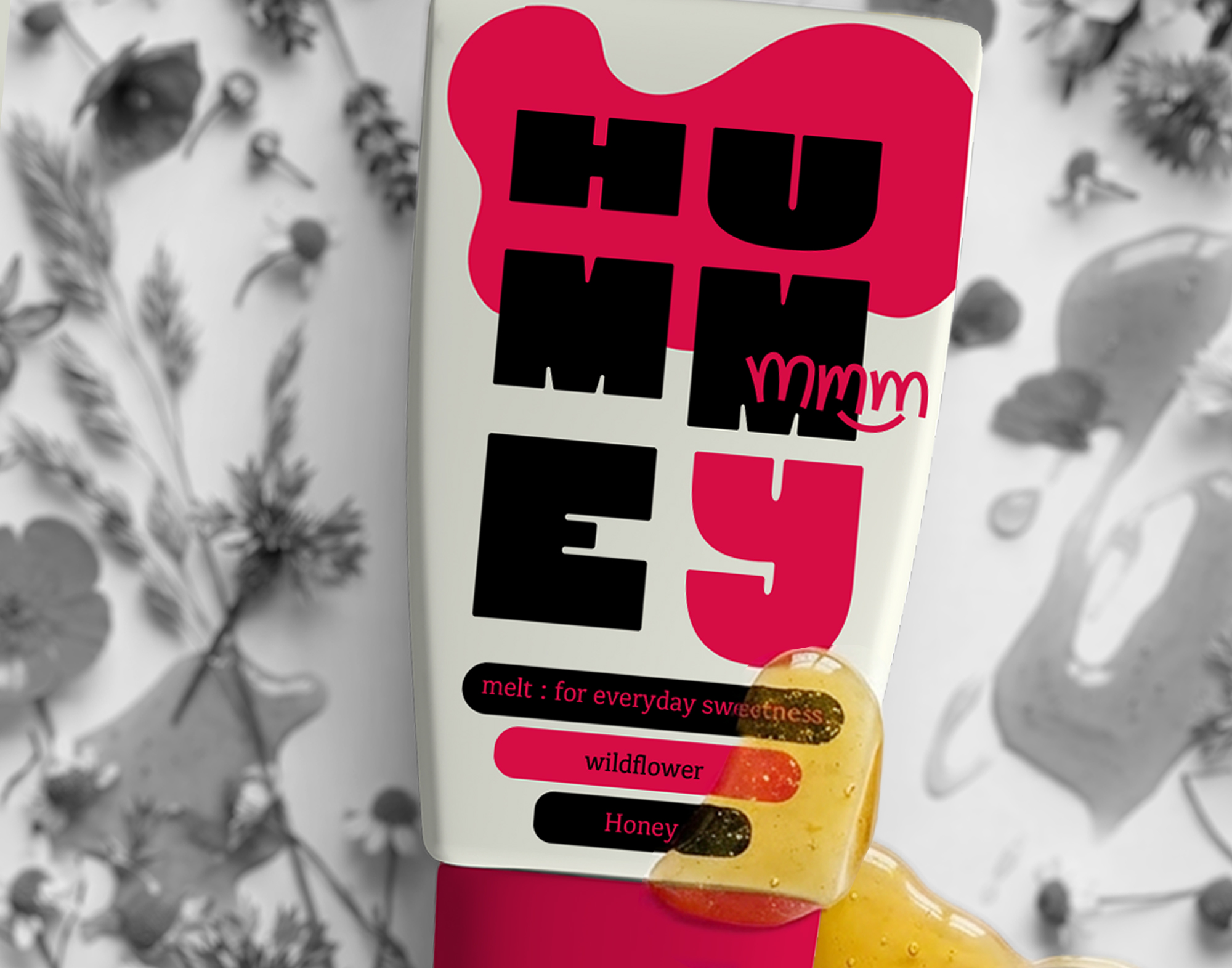
MELT : for everyday sweetness.
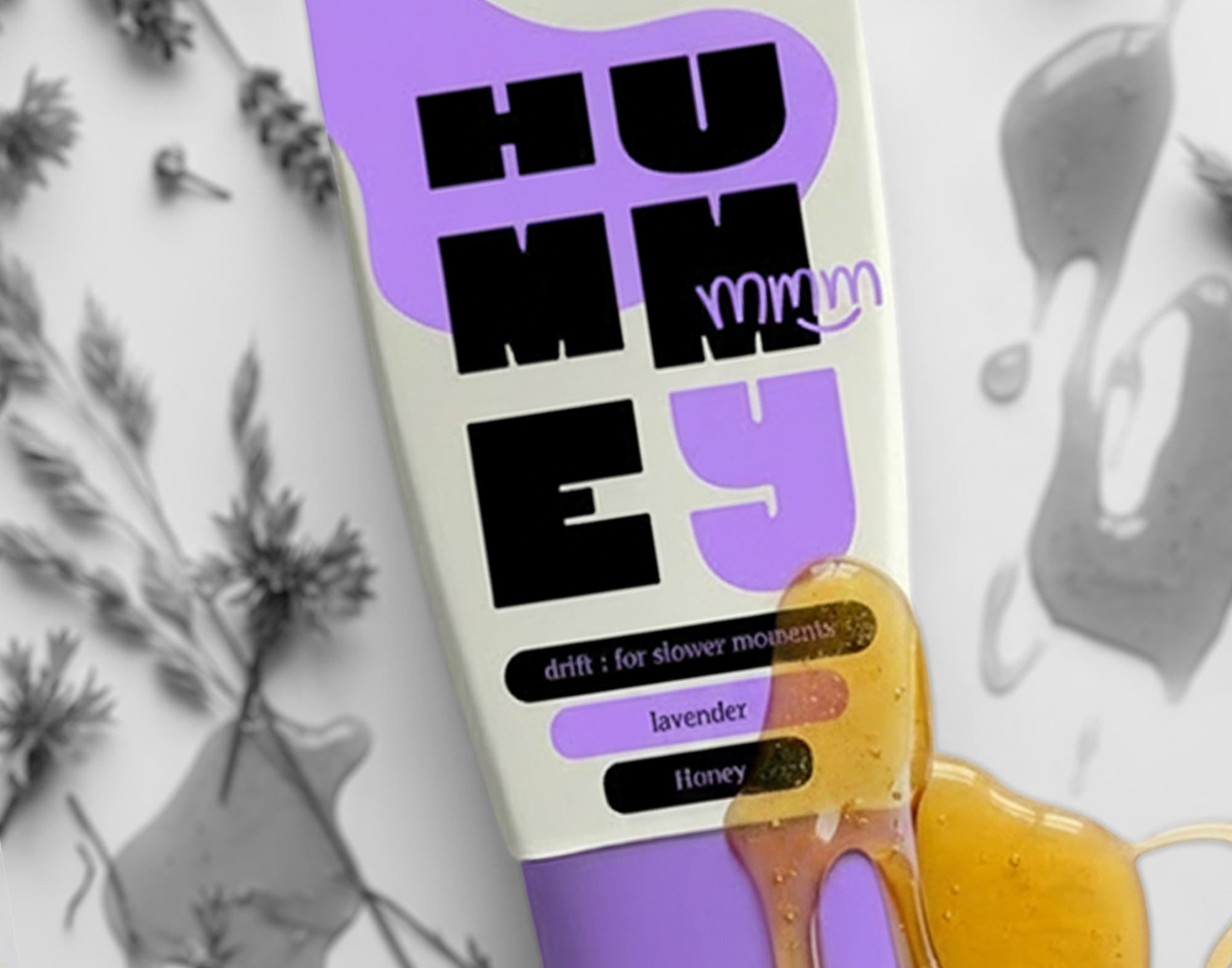
DRIFT : for slower moments.
Each variant is colour-coded to create an intuitive and playful navigation system while standing out as a bold family on shelf.
At the heart of the identity is The Flow: a fluid brand asset that captures the movement of honey in a single recognisable gesture. It adapts across packaging, posters, stickers and motion, becoming the visual thread that connects the entire brand world.
Combined with oversized typography, a restrained colour palette and a contemporary tube format, the identity repositions honey as part of modern daily rituals rather than a traditional pantry staple.
Hummey is a conceptual branding project exploring how strategic thinking can reshape one of the world’s most familiar food categories.
Because sometimes the sweetest brands don’t change the product. They change the way people experience it.



 Stefano Bracci
 monther al omari
 Widakk Design
 Studio Garces
 宏洛图品牌设计HONGLT
 DN Designs
 alchimistestudioParis
 BoldCrest
 Maruf Nishat
 Oksana
 Dozen Agency
 erandy
 Leyma Design
 aabnasserr
 Palashcc
 habiba gomaa
 AntaPetrenco1
 Packart Bd
 sophioc
 Marta Wasilewska
 House of Thought
 Krithika Chakkaravarthy
 Reema
Reema