

In this Curator’s Insight, let’s take a look at LUE designed by studiokopaz
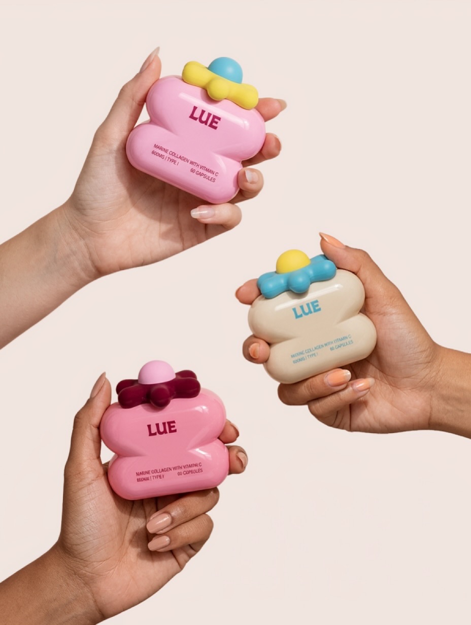
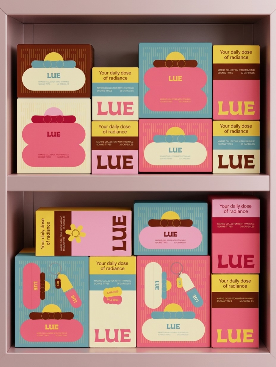
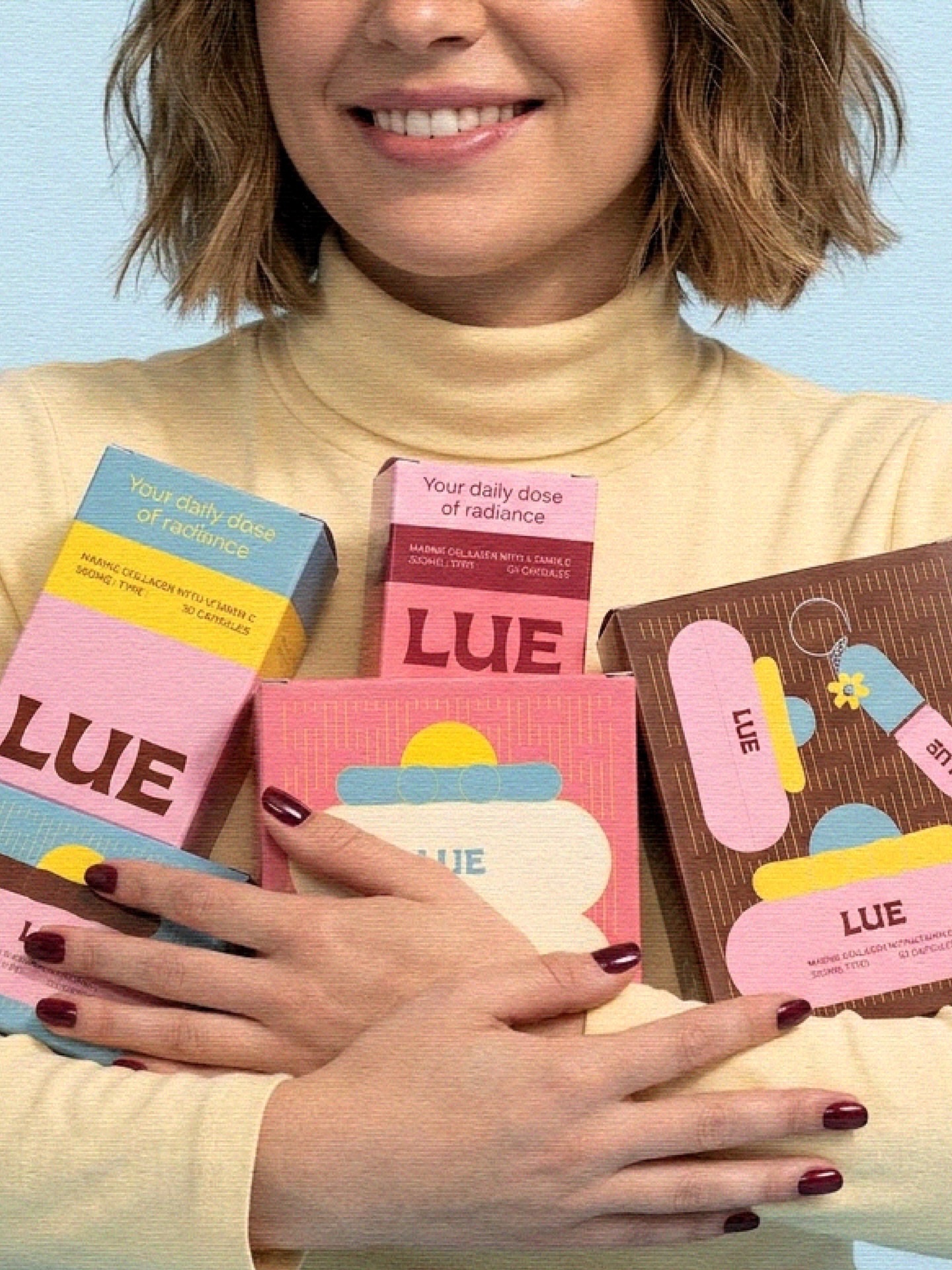
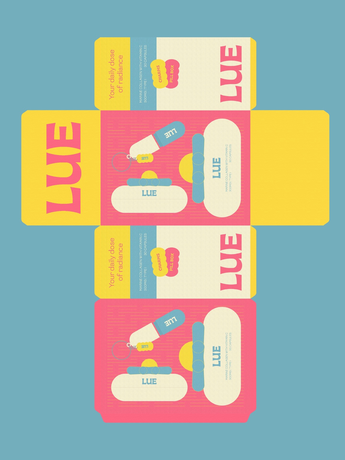
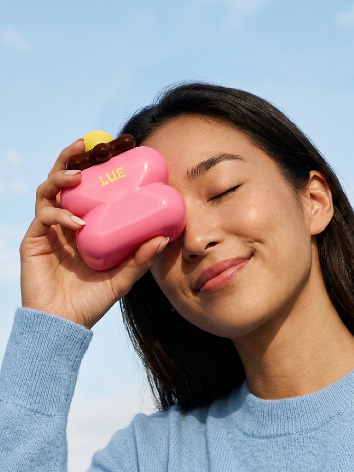
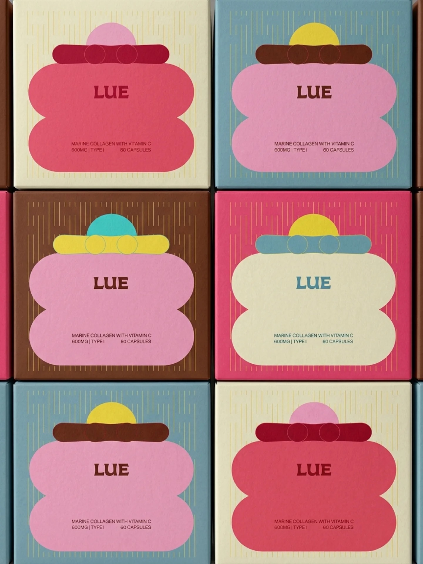
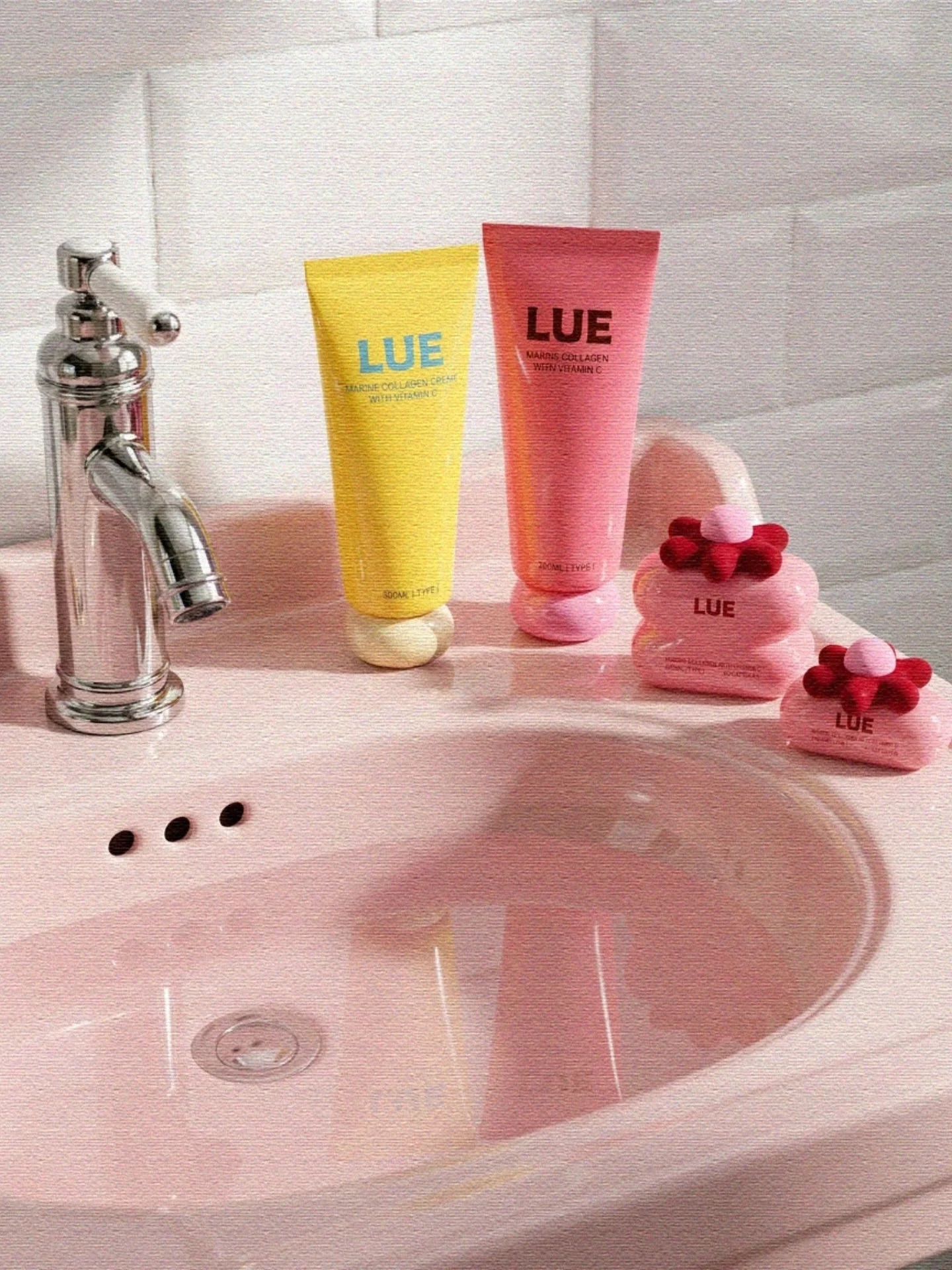
The supplement aisle has a trust problem disguised as a design problem: brands lean clinical to signal efficacy, and in doing so end up visually indistinguishable from one another. LUE solves this by refusing the premise. Instead of a label communicating dosage and credibility through sterile whites and clipboard fonts, the packaging builds a character out of its own structure. The rounded die-cut edges stack into a face-like form with a fringe, a nose, a little grin, so the product reads as a companion before it reads as a capsule count.
What makes this hold together across a full range is the discipline in the color system. Each shade shift, blush to cornflower to cocoa, functions the same way a flavor code would in a beverage line, letting the customer sort a shelf full of variants at a glance without needing to read a single word. That’s a hardworking design decision wearing a very soft costume.
The lesson for anyone building in a trust-heavy category: warmth and rigor aren’t opposites. A system can feel playful and still carry all the functional weight a clinical label would, if the structure itself is doing the sorting.


 waanrong
 nazystudio
 Daria Fox
 g.apolly
 sahildoesartt
 Stiandco
 BREAK DESIGN
 ShreyaDighe
 Sameh Elnahas
 Minim Brand Design
 Ebbi
Ebbi Shabouk Printing & Packaging (Shabouk Carton Boxes – شعبوق)
 Brandegree
 Abbydraw Designs Unique Conceptual Branding & Packaging Designing Ideas
 bilel tkouri
 NEV
NEV Stefano Bracci
 Alina
Alina monther al omari
 Lizakjx
 JOAOMARCOSDESIGN
 alchimistestudioParis
 Harriet Neild
 octavio rojo
 宏洛图品牌设计HONGLT