

Background
The natural lemonade market is growing year on year and is part of a trend toward more conscious and healthy beverage choices. Consumers are increasingly choosing products with clear product labels, natural ingredients, and new taste experiences. However, the category offers virtually no truly new formats — most brands speak the same language of naturalness. It was at this point that Drinks Together, Russia’s largest brewer and one of the leading producers of non-alcoholic beverages, came up with the idea for the first malt lemonade in Russia, which would combine the refreshing character of lemonade with the depth of malt flavor.
The new product had to be natural not only on the inside but also on the outside: the packaging uses aluminum made from 100% recycled materials. Previous malt beverage launches were perceived more like non-alcoholic beer: the packaging, color palette, and visual code led consumers into a different category. The new brand had to avoid this trap and literally create a new niche.
Challenge
The agency faced the following tasks: • Create a visual identity for a completely new product – malt lemonade; • Explain the unfamiliar category to consumers within seconds on the shelf; • Maintain a sense of naturalness and freshness; • Make the product noticeable and modern; • Develop a design that is easily scalable across flavors and works equally well in cans and glass bottles.
Furthermore, the UPRISE team faced a key challenge of the project – finding a balance between two worlds: showcasing the product’s origins through malt without creating associations with beer.
Solution
The brand concept is based on the idea of a new nation united by a love of unusual flavors and natural ingredients. This isn’t just a name, but an entire philosophy: malt is no longer just a “beer” ingredient but a symbol of a new generation of lemonades. Maltynation, literally “malt nation,” is born from the combination of two words: malt and nation. People who seek new experiences, are open to experimentation, and are ready to take a fresh look at familiar beverage categories.
The visual system is built on several principles.
Categorization through freshness and refreshing character
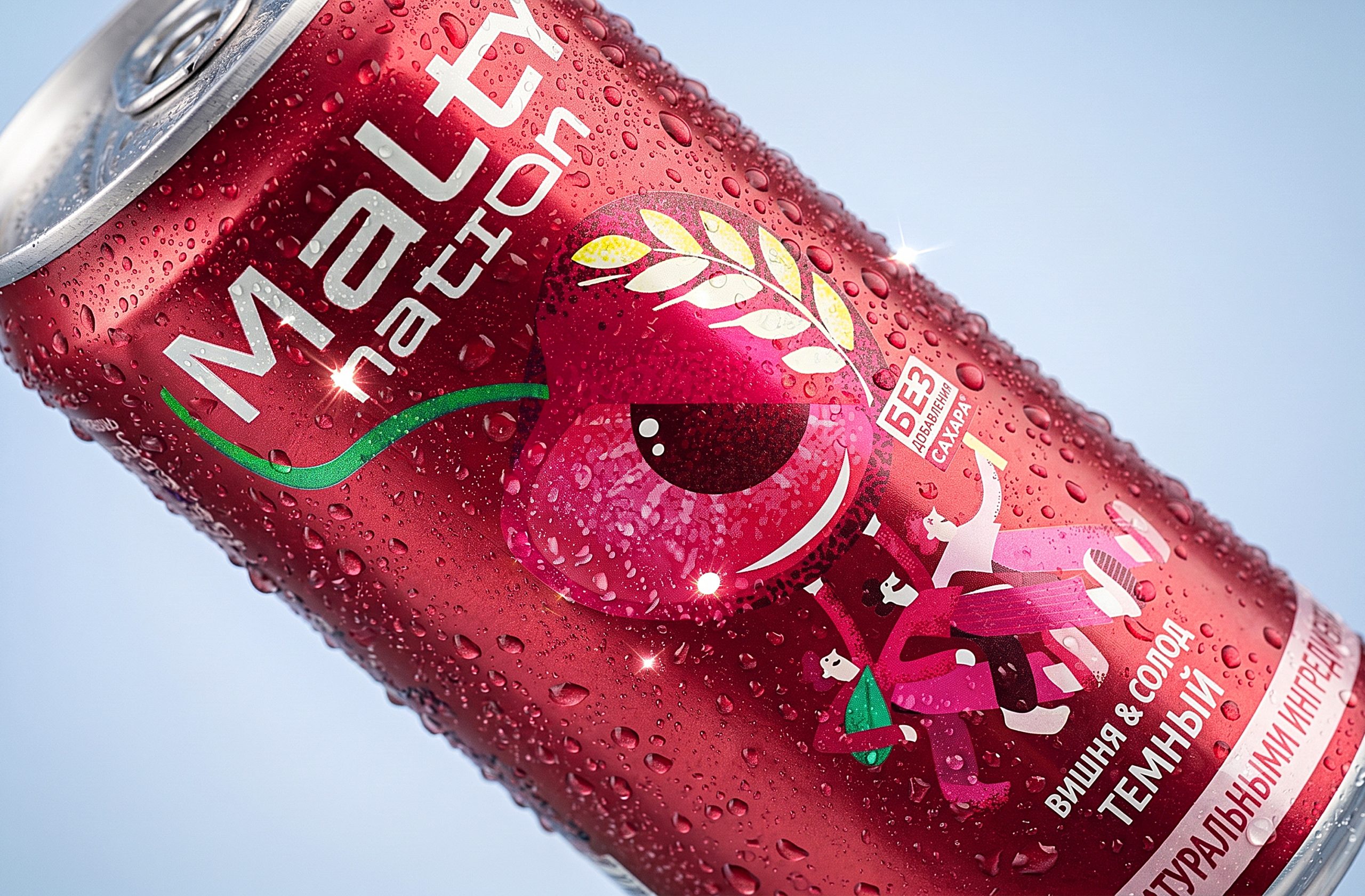
The light palette, large fruit accents, and a sense of juiciness immediately convey the idea of lemonade, not beer.
Naturalness as the keynote
Fruit, natural flavors, and the open display of ingredients highlight the presence of juice and malt extract, building trust in the new product.
Malt as a symbol of community
At Maltynation, malt is not an attribute of beer culture, but a unifying ingredient around which the brand’s own identity is formed — “malt nation,” creating a new beverage category.
A Visual World of Its Own
The unusual can shape, vibrant graphics, and expressive packaging architecture allow the brand to instantly stand out on the shelf and establish itself as a completely new phenomenon.
Result
The Maltynation project wasn’t simply the creation of a new brand; it was an attempt to shape a new beverage category at the intersection of natural lemonades and innovative flavors. Thanks to the strategy and design developed by UPRISE, the complex and controversial ingredient — malt — was reimagined and no longer associated exclusively with beer. It became the foundation of a new lemonade story — more unusual, modern, and open to experimentation.
Testing results confirmed the effectiveness of the visual solution: • 86% liked the design; • 77% perceived the design as unique; • 82% expressed an intention to purchase the product; • 84% considered the brand suitable for a younger audience.
Maltynation demonstrates how a smart strategy and expressive design can help elevate a familiar ingredient beyond its traditional category and create new meaning for it — and a new reason to choose it.



 lunapanda
 Tridimage
 Analoguecreative
 lettera7
 alchimistestudioParis
 Lana B
 Colossal
 Pivot Studio
 M&A CREATIVE AGENCY
 monther al omari
 Anastasia Cherepanova | xtramez
 Hollóka Grafikai Műhely / Graphic Design Studio
 BOLD branding
 Antonia Skaraki
 Pâmella Lorrany
 Z9BKAdsgn
 Francesco Paternoster
 b1studio.ro
 Chris Creative Works
 Boordon
 Dmitriy Kuzovlev
 Brand Society
 yasharpic