
Background
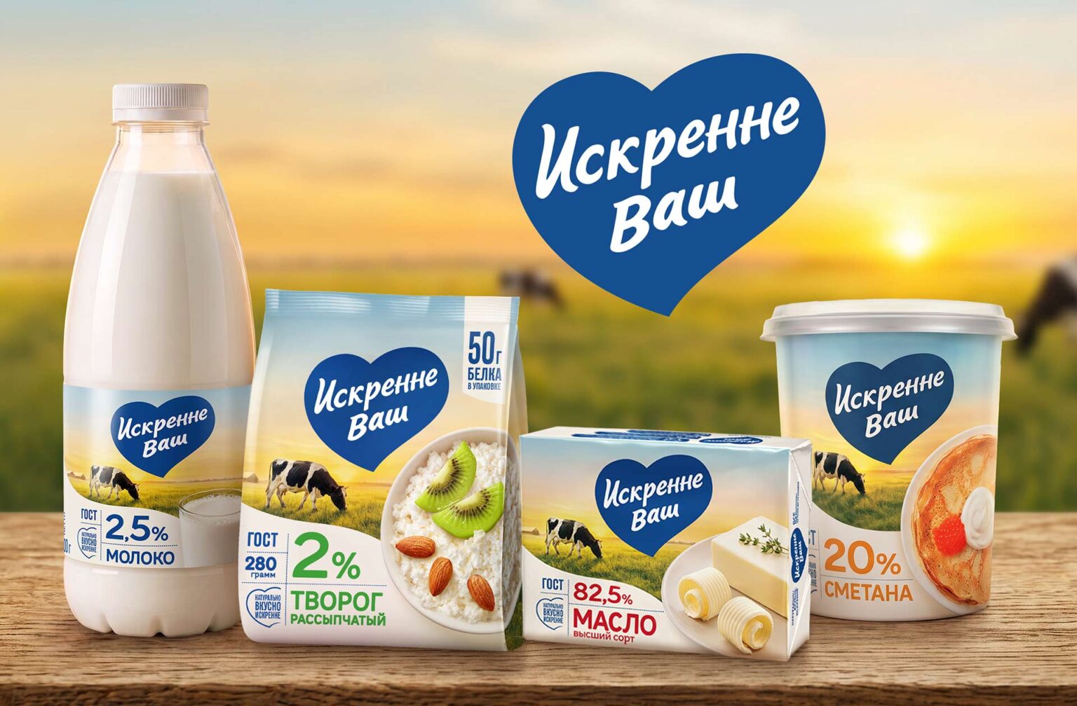
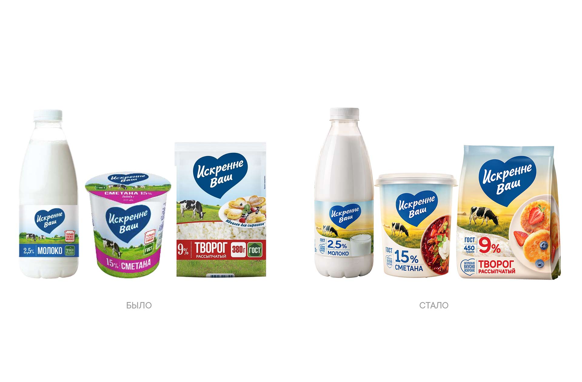
“Iskrenne Vash” (Sincerely Yours) is a brand owned by Agropromkomplektatsiya, a company with a strong regional presence and its own production facilities and raw material sources. The brand’s packaging underwent its first update since 2018. While retaining key brand elements, it adopted a more modern and eye-catching visual style.
Consumers perceive the brand as local, delicious, and natural; however, there was a need to enhance the perception of value and shelf visibility. The redesign aimed not merely to refresh the packaging but to create a stronger, more cohesive visual identity while maintaining a connection to the brand’s familiar image.
Challenge
UPRISE agency team was tasked with strengthening the brand through packaging design: highlighting the products’ natural quality by emphasizing clean ingredients and the manufacturer’s care and responsibility at every stage of production, all while boosting the brand’s perceived value.
It was crucial to attract younger consumers without alienating the existing audience and to establish a recognizable identity across the entire product line.
Solution
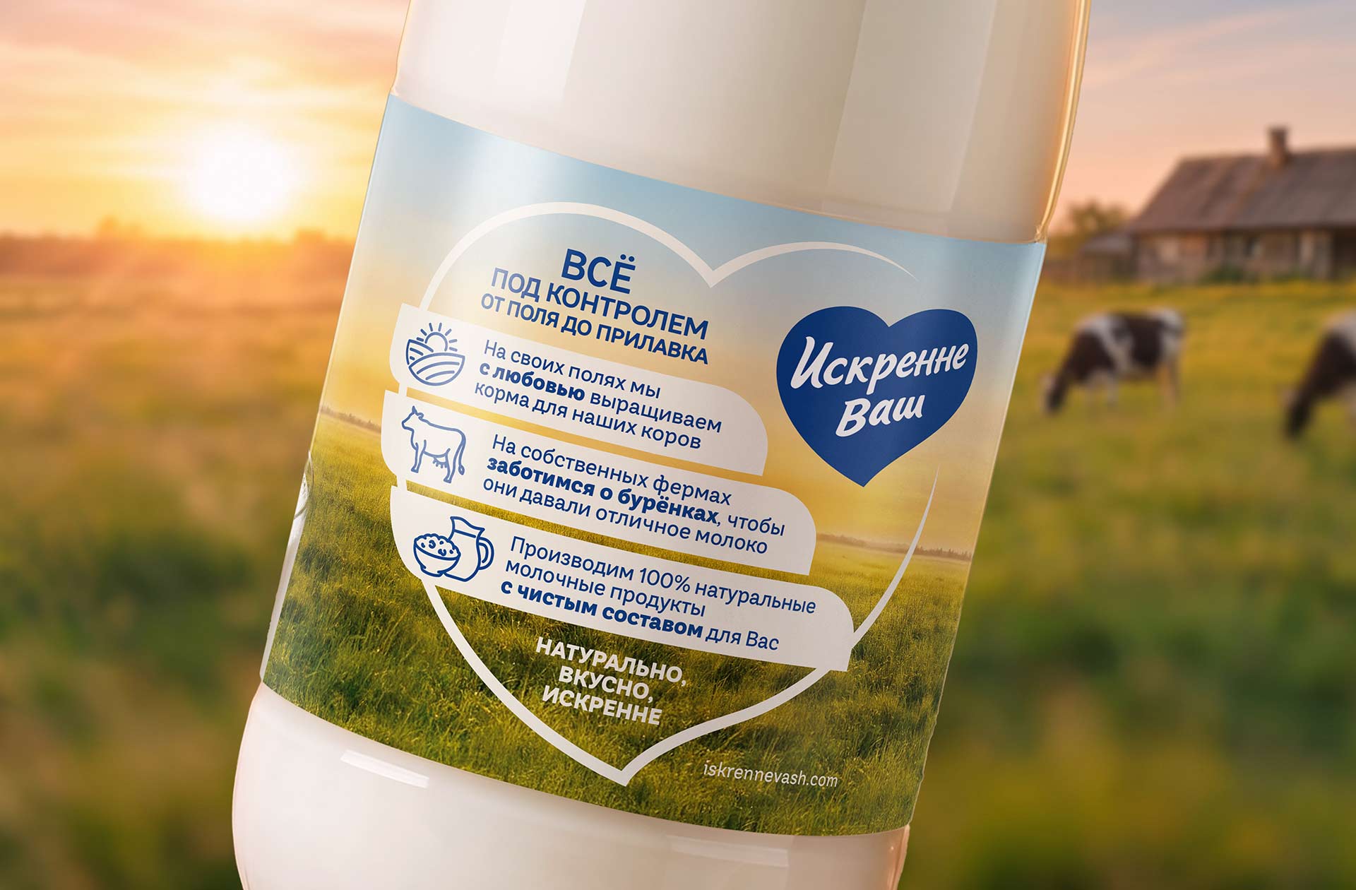
The new design is rooted in the concept of an honest and responsible approach to the product: natural dairy goods made from milk sourced from the company’s own farms, with quality control maintained at every stage of production.
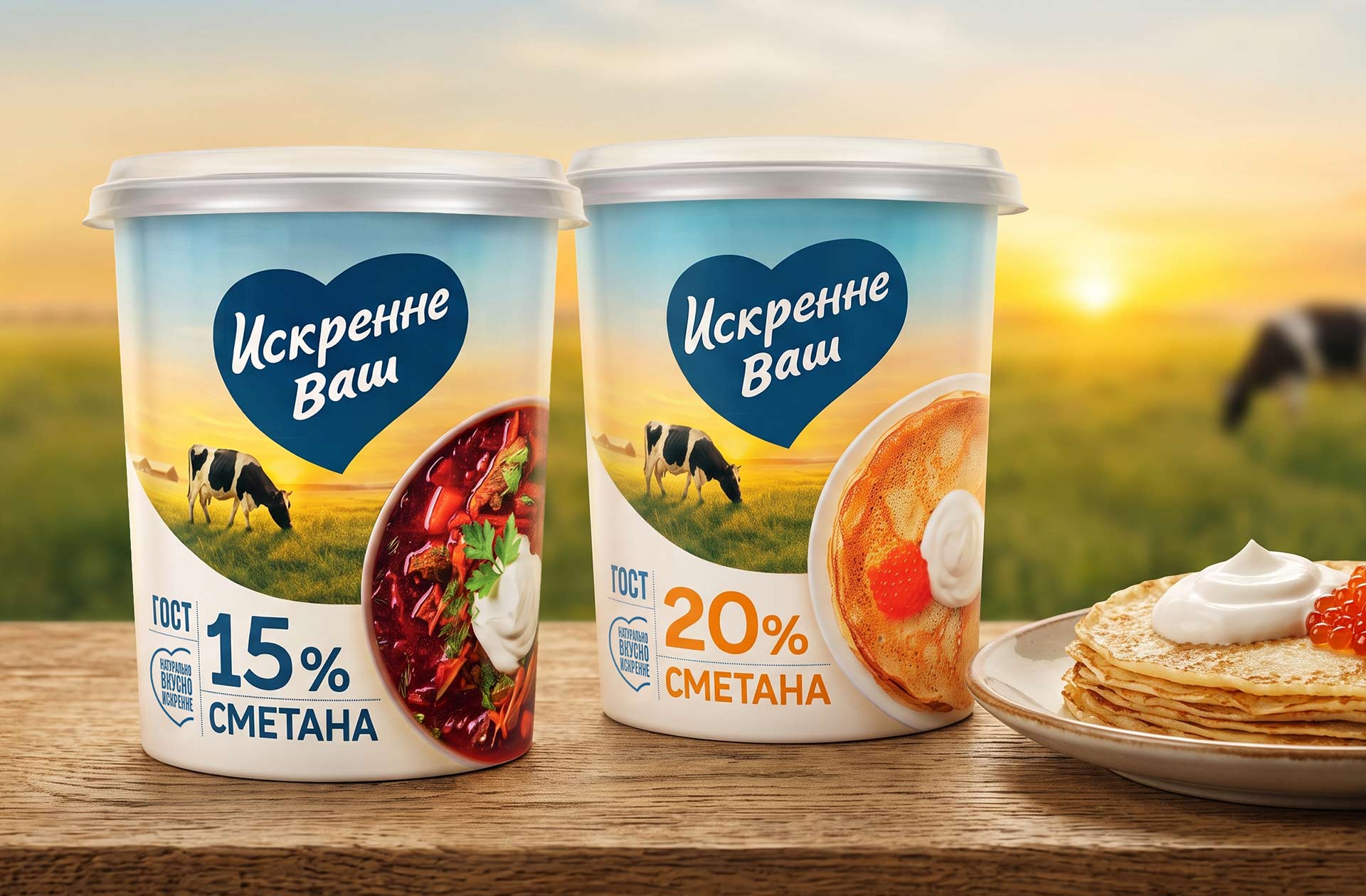
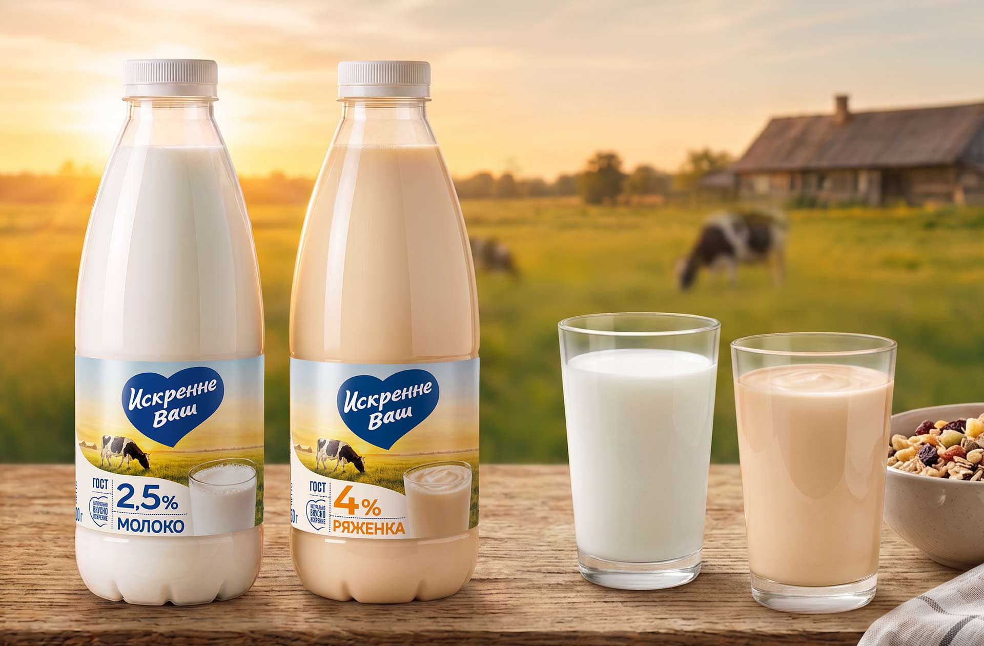
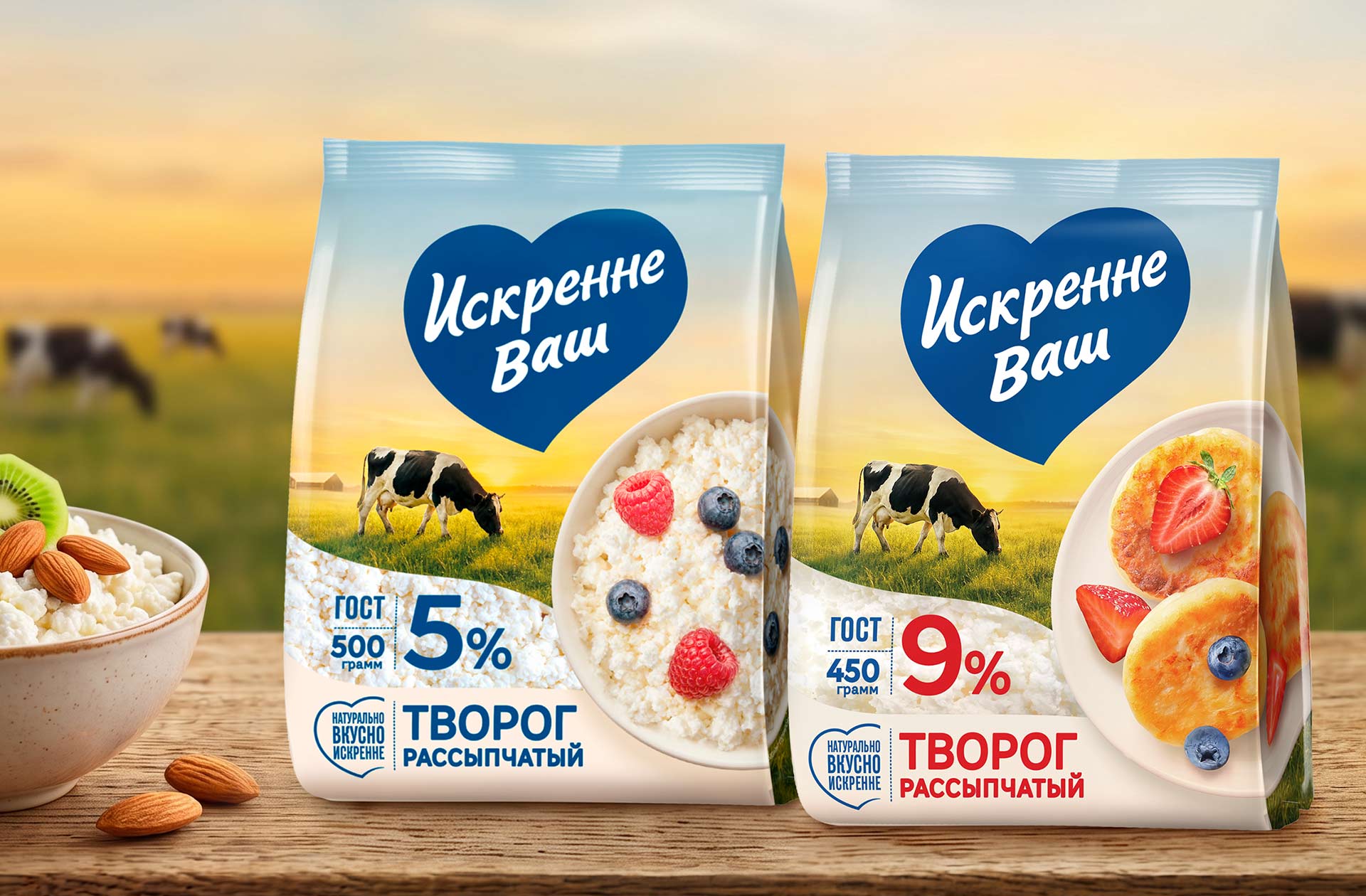
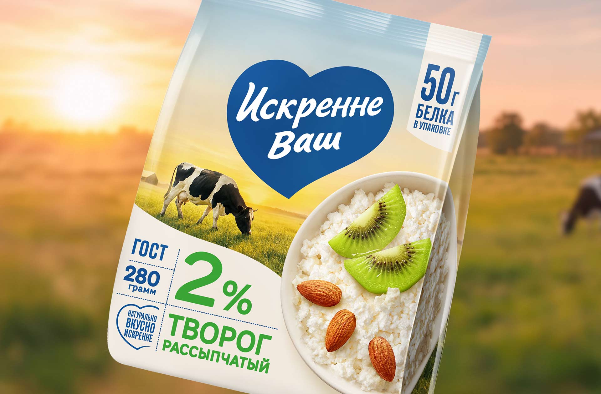
The UPRISE team retained the brand’s key asset—the heart-shaped logo block—as well as the familiar imagery of the cow and the landscape. At the same time, the visual style was reimagined: cool tones gave way to a warm “dawn” palette, infusing the packaging with a sense of coziness, care, and emotional warmth.
Food imagery, typography, and illustrations were all updated. Large, appetizing product images make the packaging stand out, while clear claims and updated typography ensure information is easily readable.
The brand slogan was also updated to: “Natural. Delicious. Sincere.” “That signature product with the blue heart—that’s how consumers recognize us on the shelf. That is precisely why we decided not to alter the logo, even though all other packaging elements were redesigned. We focused on the qualities of softness, warmth, naturalness, and sincerity that lie at the very foundation of our brand,” noted Elena Zakharova, Marketing Director at Agropromkomplektatsiya.
The updated design underwent consumer testing and outperformed the previous version by a factor of 1.5 across the measured criteria. The first batches of products in the new packaging have already reached retail chains.
 Derrick Lin
 monther al omari
 43oz
43oz lilyz design23
 Modern Theory
 Eighteen Brand Studio
 Bhumika Singh
 MohamedMashaly
 Pixels Studio
 Gulya
Gulya Lizaveta Kharitonyuk
 Bonsanco Creative Studio
 DesignRepublic
 GIRAFA STUDIO
 PiotrWisniewski
 Sophiagdotcom
 CreativeWise
 SoreThumbStudio®
 Modern World Studio
 Palashcc
 Valérie Colace