

Background
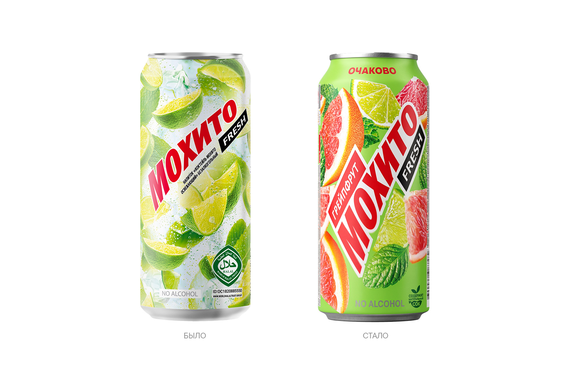
Ochakovo has expanded its “Mojito Fresh” line of non-alcoholic beverages by introducing a new flavor: Grapefruit. The new product has already hit store shelves featuring an updated package design, marking the first public step in the brand’s visual system evolution.
“Mojito Fresh” is one of Ochakovo’s most recognizable non-alcoholic product lines, popular in both Russia and Central Asia. While the brand has maintained high recognition over its years on the market, the packaging design had not been updated in a long time; an excess of decorative elements and visual clutter reduced the product’s shelf visibility. At the same time, it was crucial for the brand to preserve its familiar image and design continuity.
Challenge
The UPRISE team was tasked with carefully updating the “Mojito Fresh” visual system to make the packaging modern, cleaner, and more eye-catching, all without sacrificing recognizability. The objectives included strengthening the logo, establishing a clear visual hierarchy, improving flavor differentiation, and creating a foundation for the line’s future development.
Solution
The UPRISE team revamped the brand’s visual system while preserving its core DNA. The logo became larger and more expressive, the composition cleaner and lighter, and the fruit imagery more vibrant and appetizing. By reducing visual clutter, the packaging became more noticeable on the shelf and easier for consumers to process.
The new “Grapefruit” flavor was the first product to reach consumers with the updated design. The company continues its systematic work on developing the “Mojito Fresh” line while maintaining brand recognition and visual continuity.


 Studio Zak
 Ander Sanchez
 Atipus
 Widarto Impact
 hovski
 Ohmybrand
 CreativeWise
 Rauf Karaev
 Hooperstudio
 La Nube de Ideas
 Modern Theory
 Akim Melnik Design Studio
 preflightcreative
 Seyf El Haq Menouer
 Badraddine Attik
 Samriddhi Ravi
 Alessandro Ammaturo
 Amblr Studio
 vladlenalevit
 Sis Tsarukyan
 monther al omari
 alchimistestudioParis
 designsbysukaina
 About House of Ta
 Amjad Battal