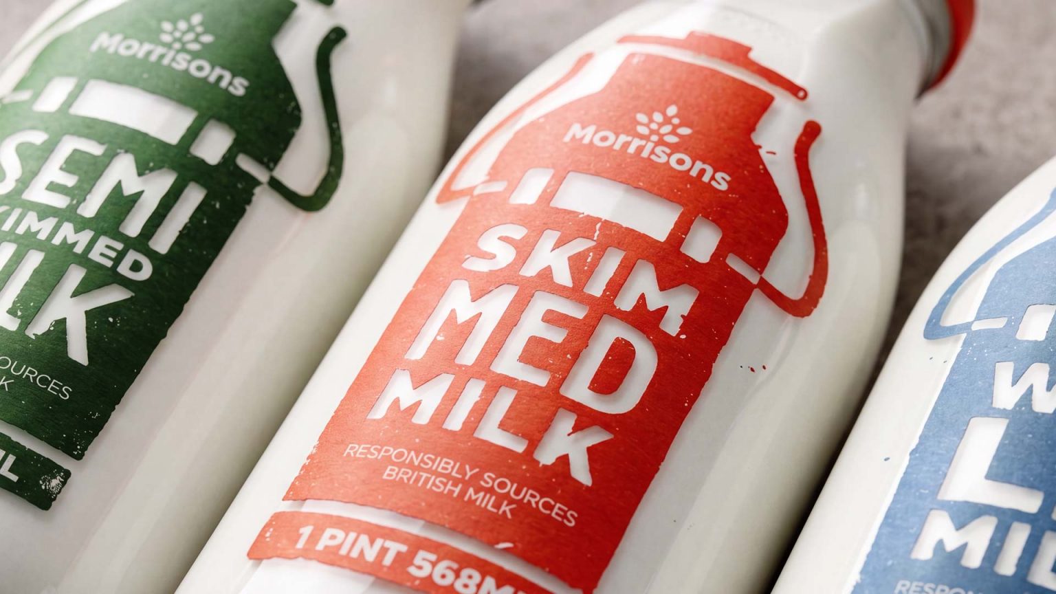

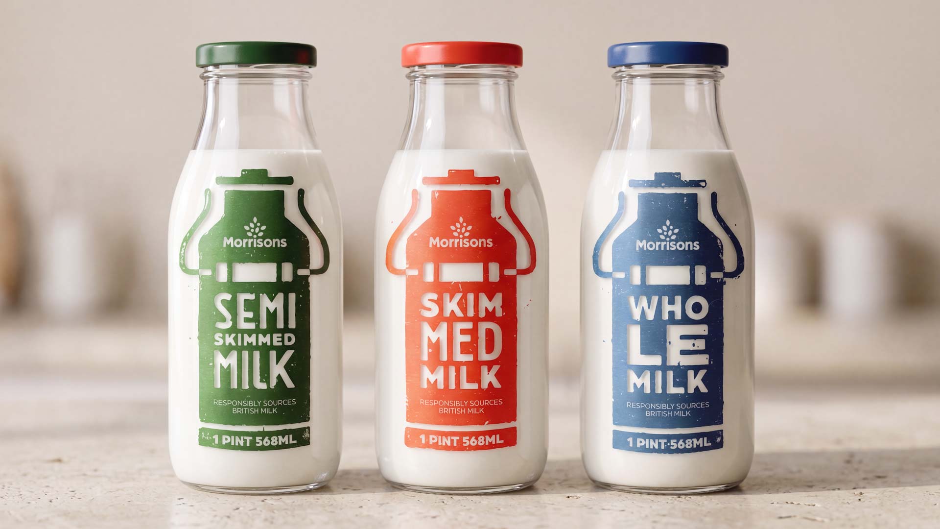
This self-initiated packaging design project explores how material, typography and visual language influence the way consumers perceive a product. The starting point was simple: could a more organic, handcrafted label strengthen the perception of organic milk?
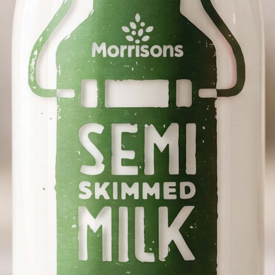
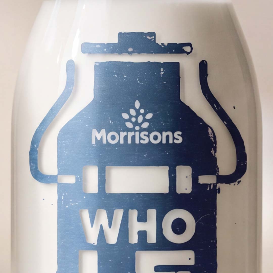
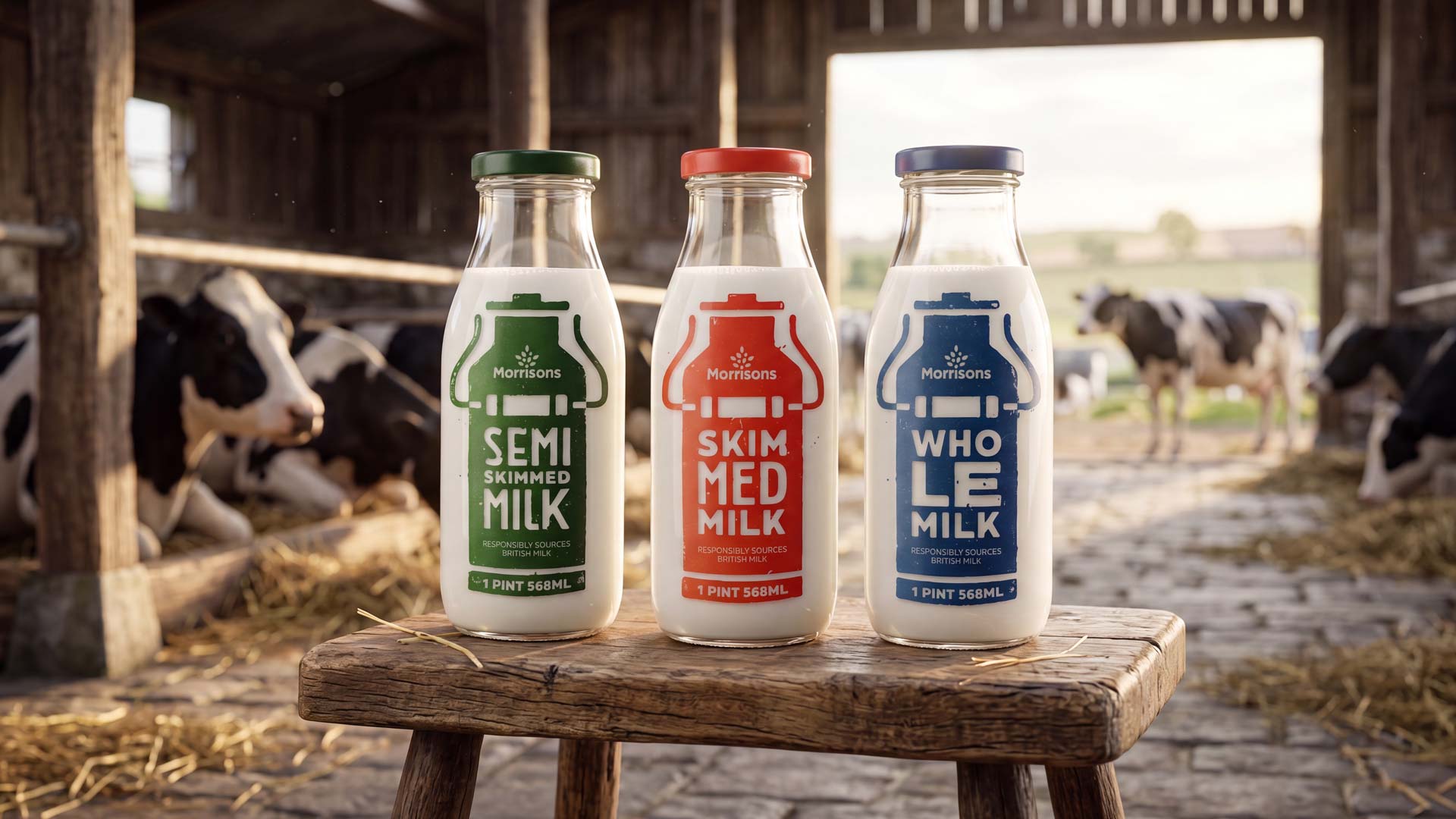
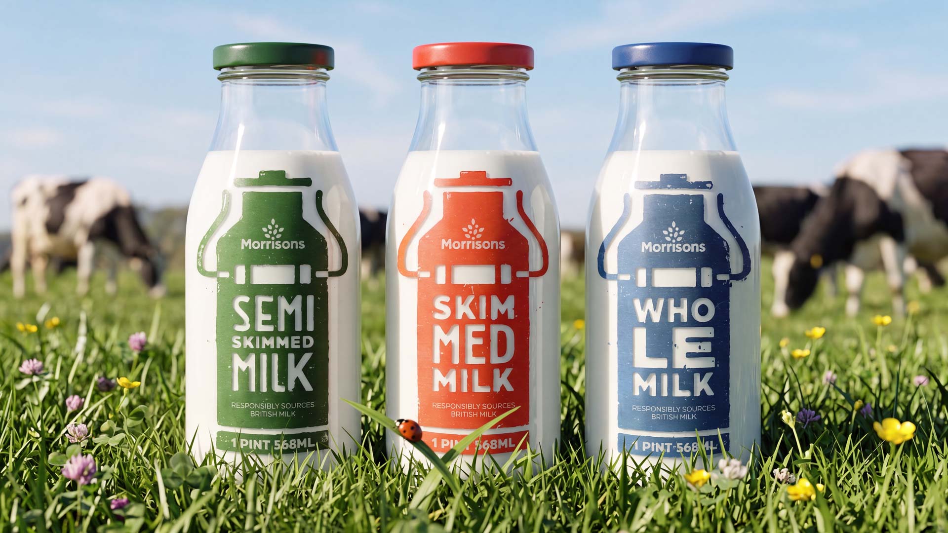
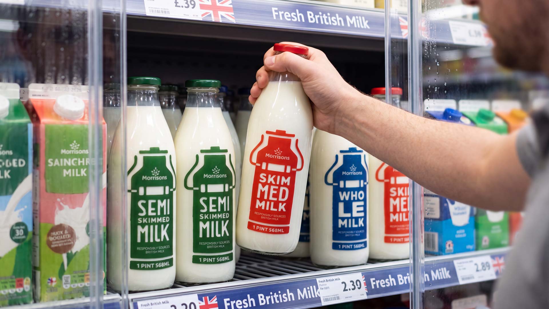
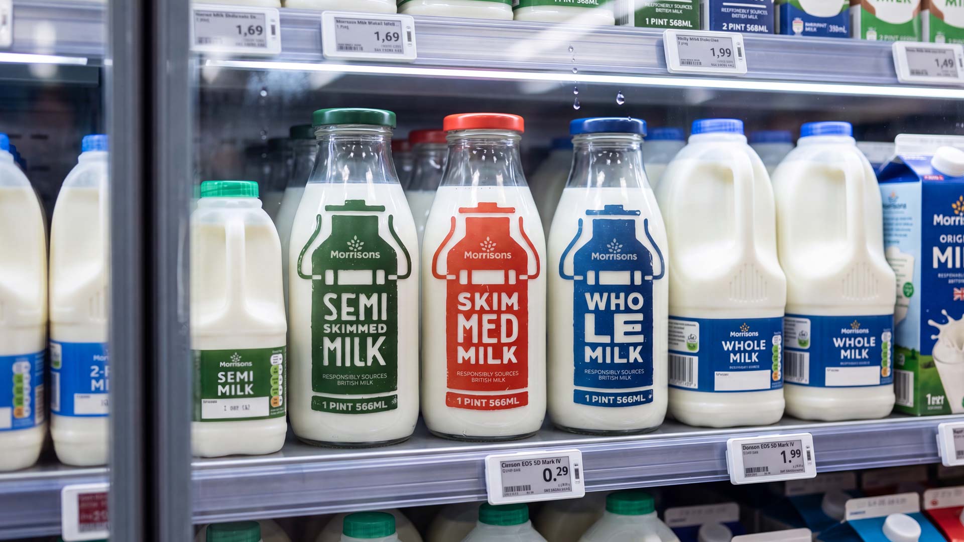
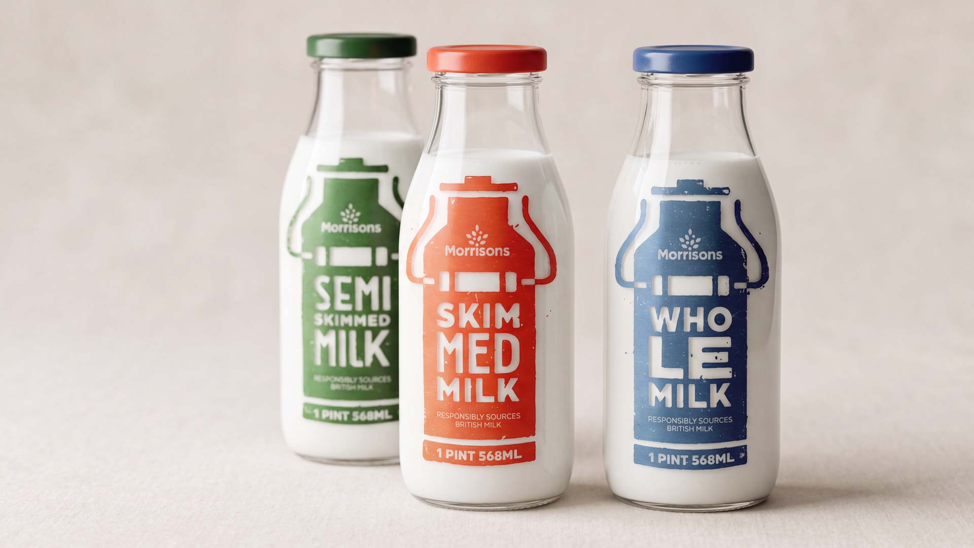
To explore this idea, I designed a packaging concept for the Morrisons milk range using screen-printed labels applied directly onto reusable glass bottles. The intentionally imperfect print texture, bold typography and limited colour palette create a more honest, tactile and authentic brand experience; qualities that naturally align with organic dairy products.
Rather than treating packaging as decoration, this project investigates how brand identity, material choice and packaging design work together to communicate quality, provenance and sustainability before a customer even picks up the bottle.
As with every self-initiated project, the goal wasn’t simply to create an attractive visual. It was an opportunity to explore how thoughtful packaging design can improve shelf presence, strengthen brand recognition and build a stronger emotional connection between product and consumer.

 Derrick Lin
 Biaa
Biaa Petitmoulin Studio
 White Bear Studio
 Eva Chistyakova
 monther al omari
 Atipus
 alchimistestudioParis
 oneandother
 bloomburo
 helocrene
 Shapers Studio
 Denver Design
 Aidearte
 andrew.huerta
 softmachine
 airobtq
 Buzz & Co.
 Ruby
Ruby themythographer
 IDNB Inc.
 viktorflr
 Zenpack