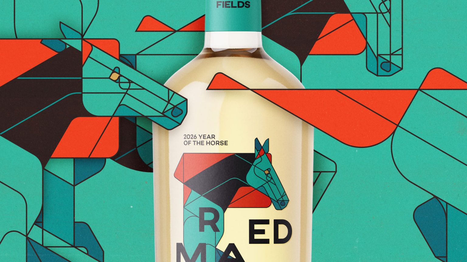

Red Mane is a conceptual limited edition packaging project inspired by traditional Chinese Baijiu and the 2026 Year of the Horse in the Chinese zodiac. The project explores how illustration-driven design can elevate spirits packaging while creating a strong narrative connection between product, culture and visual identity.
At the heart of the design is a series of custom geometric horse illustrations. Each illustration symbolises characteristics traditionally associated with the horse—strength, movement and elegance—translated into a contemporary visual language. The illustrations are not used as surface decoration, but as integral elements that define the structure, rhythm and hierarchy of the packaging.
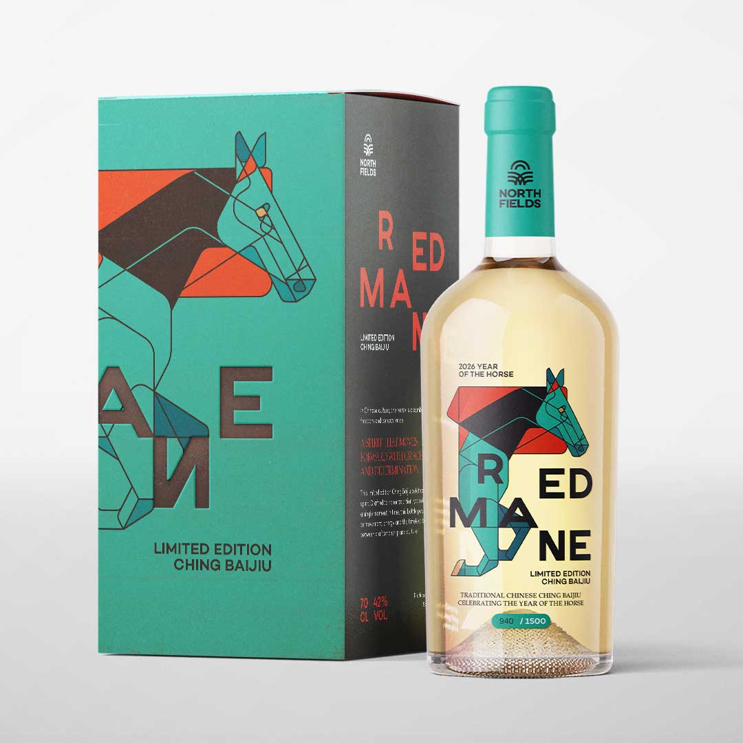
The limited edition consists of three bottle variants, each paired with its own horse illustration and colour composition. While the illustrations differ, the overall system remains consistent through shared typography, label construction and layout principles, ensuring a cohesive brand identity across the series. This approach also enhances collectability while maintaining a clear and recognisable brand presence.
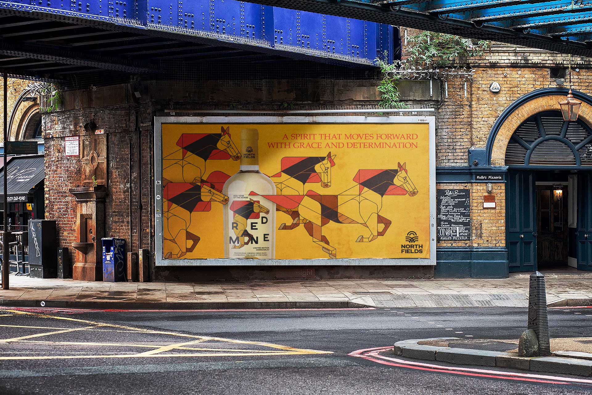
In addition to the bottle design, a premium gift box was developed to position Red Mane as a high-end product suitable for gifting and special occasions. Supporting elements such as neck tags and campaign visuals further extend the packaging concept, demonstrating how the identity can scale across physical and promotional touchpoints.
Although fictional, the Red Mane project was designed with realistic production constraints in mind, focusing on clarity, shelf impact and brand storytelling. It serves as a case study in illustration-led packaging design, where concept, form and function work together to create a memorable and culturally grounded spirits brand.




 NEV
NEV Stefano Bracci
 Alina
Alina monther al omari
 Lizakjx
 JOAOMARCOSDESIGN
 alchimistestudioParis
 Harriet Neild
 octavio rojo
 宏洛图品牌设计HONGLT
 DESIGN CONCEPTS
 Alexander Skurihin
 Studio K95
 ARMBRAND
 Richa Rai
 houseoferas by Miti
 Agence des Coteaux
 Kushi Eaknath
 Ann Treasa
 Xiao Ning
 krrrrrllii
 babyage
 Deep
Deep