

I. ABOUT PROJECT
At House of Ta, our foundational philosophy is simple yet profound: “Brand as Home.” Usually, a home is a static place of stillness. But for Solkiki, we faced the opposite paradox: how do you build a home for a craft that measures its worth not by scale, but by restraint?
The chocolate industry is often a landscape of excess — decorative foil, saccharine promises, and a flavour built to be forgotten the moment it melts. Our mission was to perform a subtraction. We sought to strip away the theatre and find the “truth” hidden inside the bean. Solkiki is not just a chocolate brand; it is an Honest Workshop, built for the two friends in Dorset who chose to make less, so that what remains could mean more.
II. THE INSPIRATION
We drew inspiration from the quiet honesty of this process: the rare, directly-traded cacao beans, the humble English county of Dorset where two friends chose distance from the industrial centre to be closer to the craft, and the cross-section of the pod itself — a hidden architecture that no consumer ever sees, yet holds the entire order of the brand within it.
At House of Ta, we do not merely illustrate the cacao pod; we translate it. We took the raw, botanical structure of cauliflory and placed it under the lens of design discipline — longitudinal ridges, symmetrical seed order, the soft ivory flesh cradling each bean — until the plant’s own anatomy became the brand’s own alphabet.
III. THE DISRUPTION
Most chocolate brands try to seduce the eye before they ever earn the tongue. We chose to let the tongue speak first. This is our Disruptive Restraint.
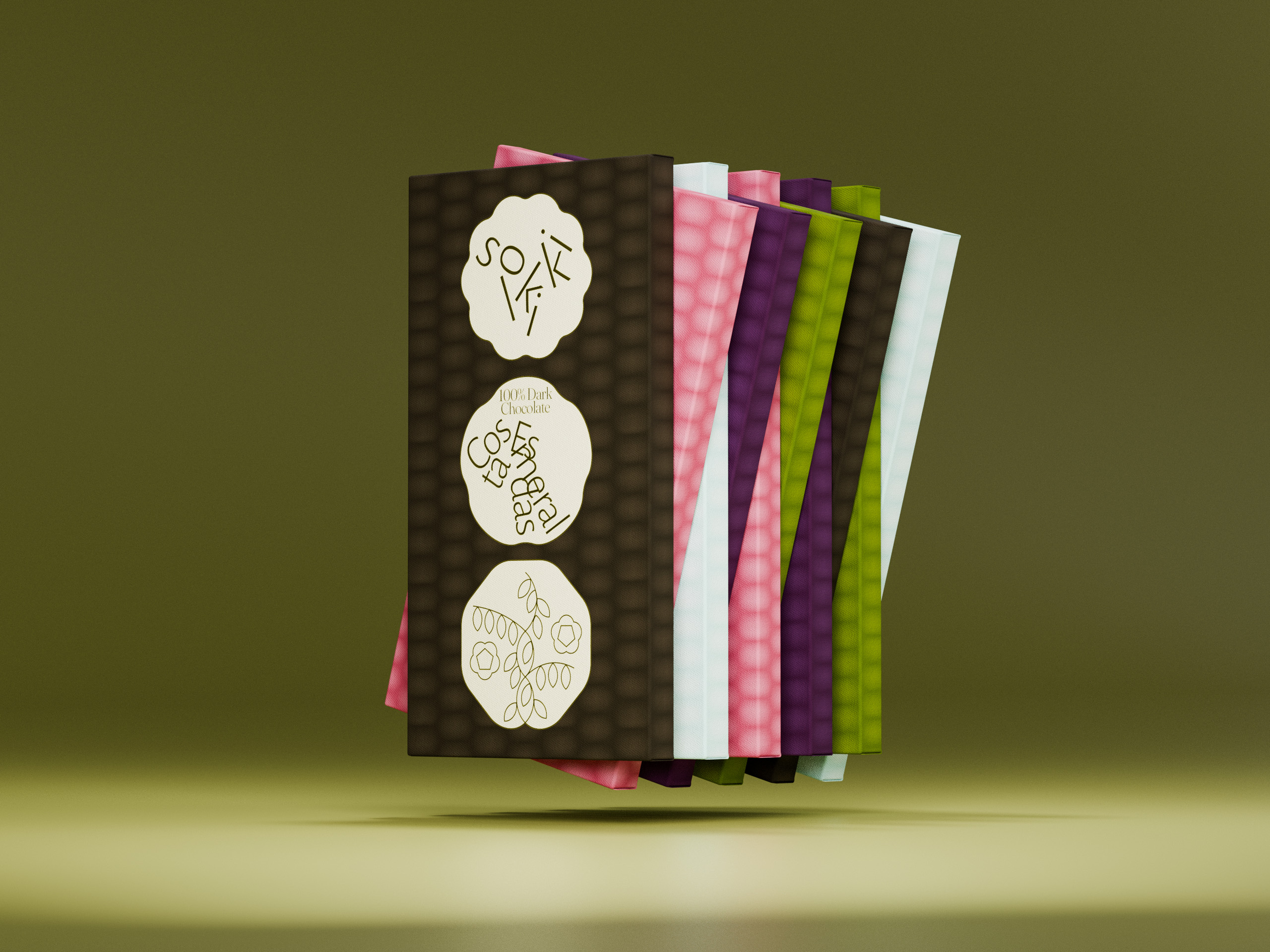
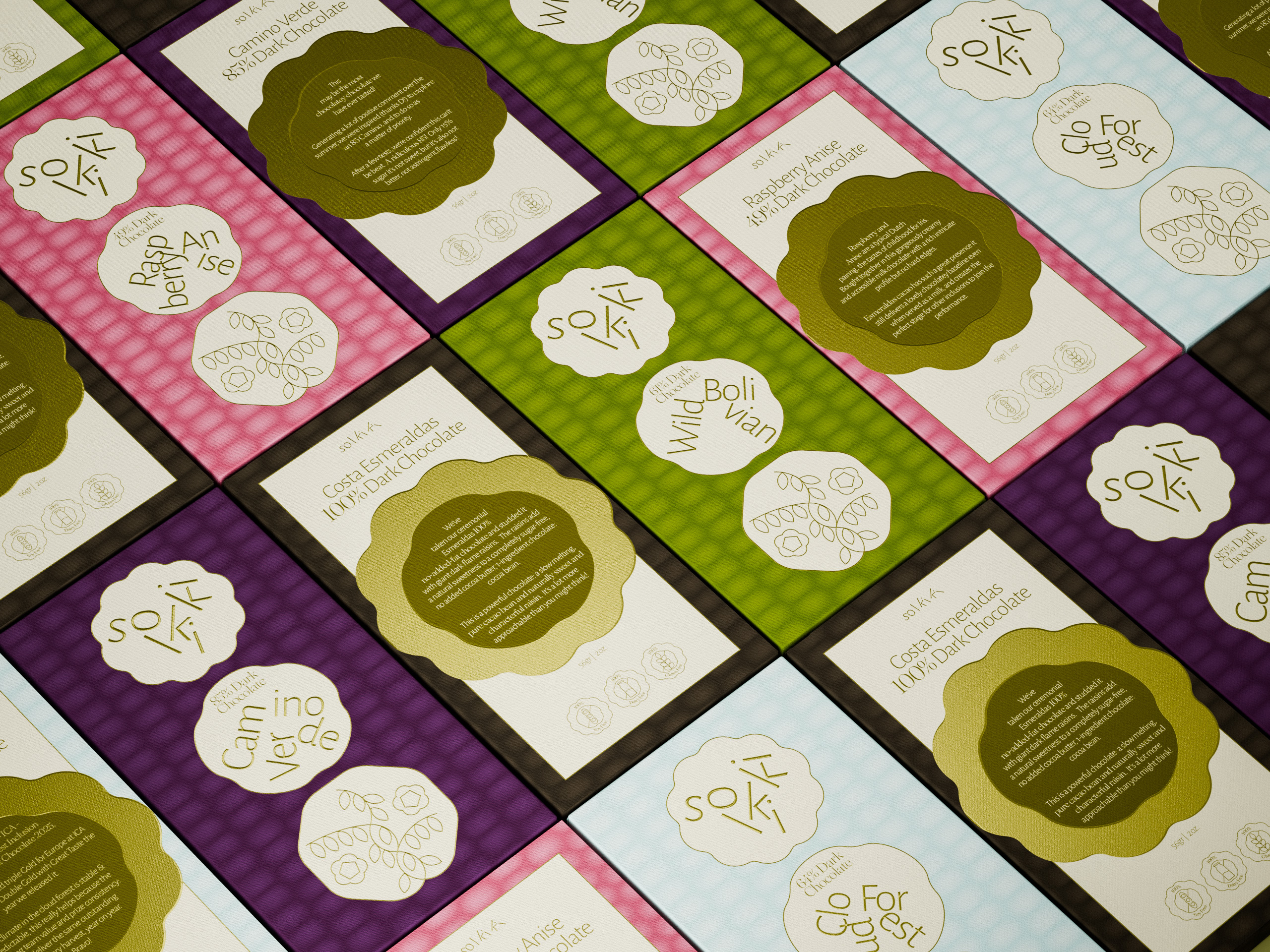
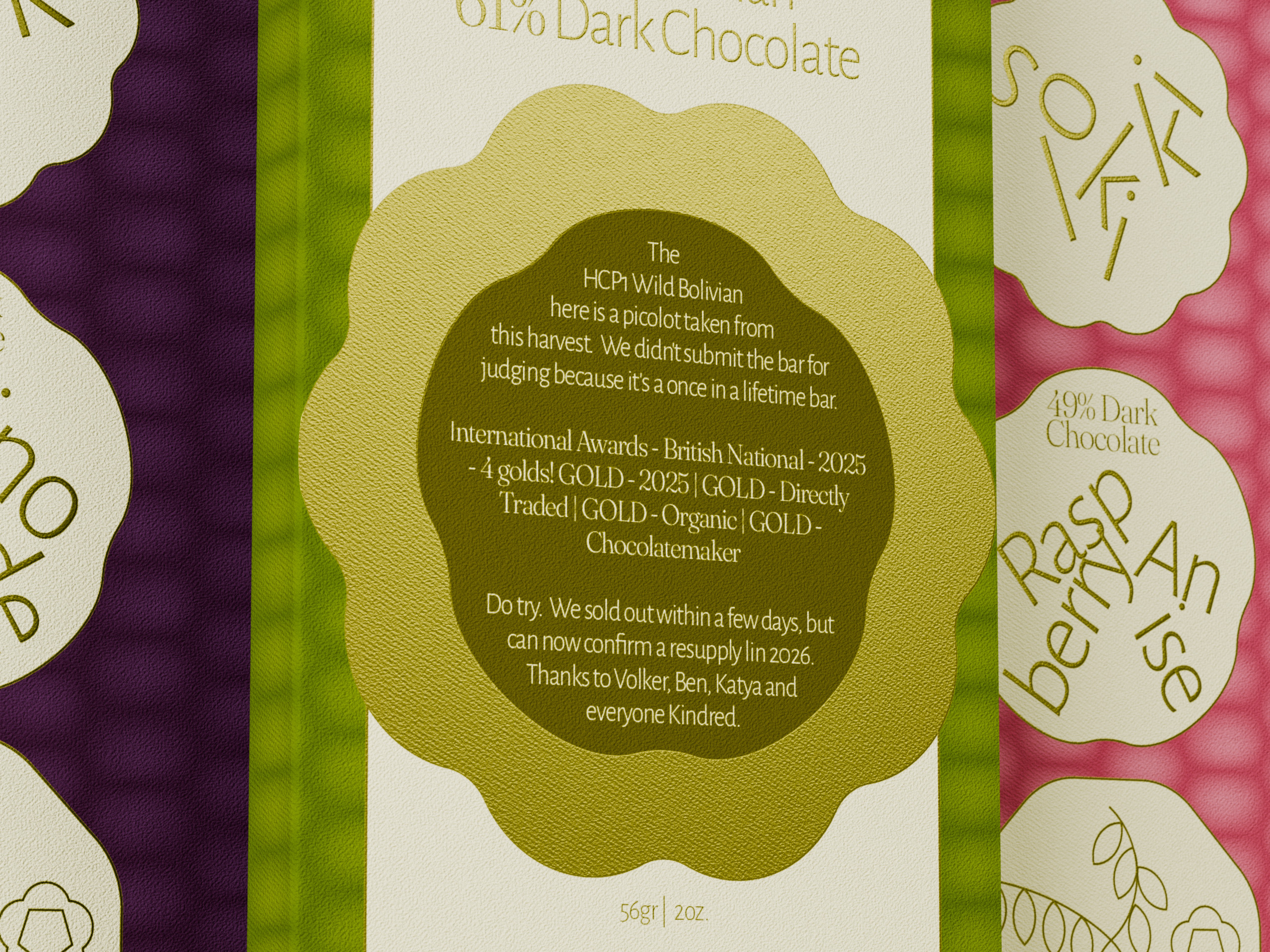
We challenged the confectionery status quo by daring to use The Power of Absence. We removed the gloss, the gold foil, the cartoon mascots that scream “indulgence” without ever proving it. We stripped away the decorative “sweetness” of packaging to reveal the Visual Anatomy of the bean itself. We believe that true craft positioning comes from the confidence to show your working — the pod, the cut, the seed — rather than hide behind spectacle. By breaking the conventional rules of “loud” confectionery, we found a clarity that is both premium and trustworthy.
IV. VISUAL CONCEPT
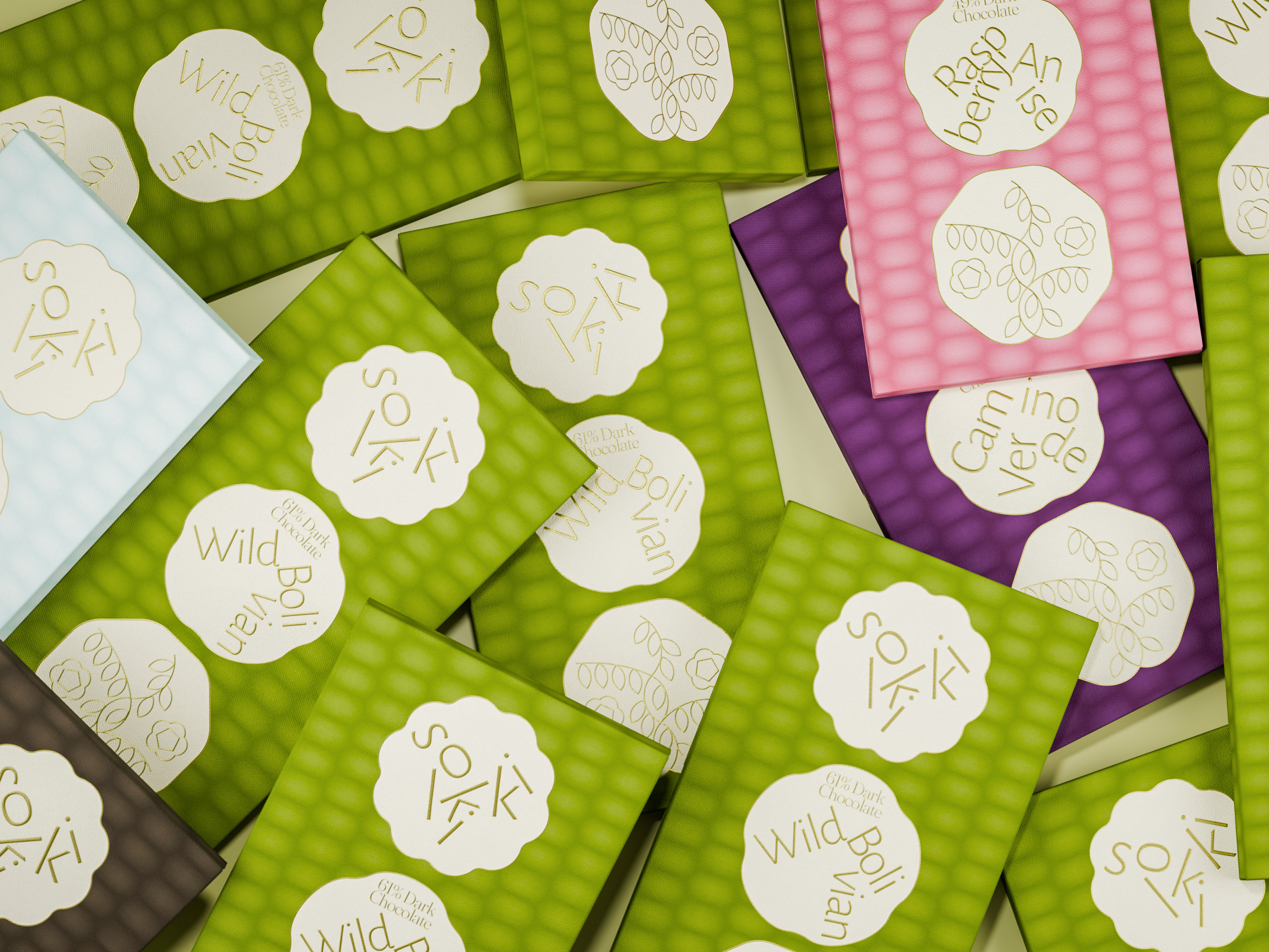
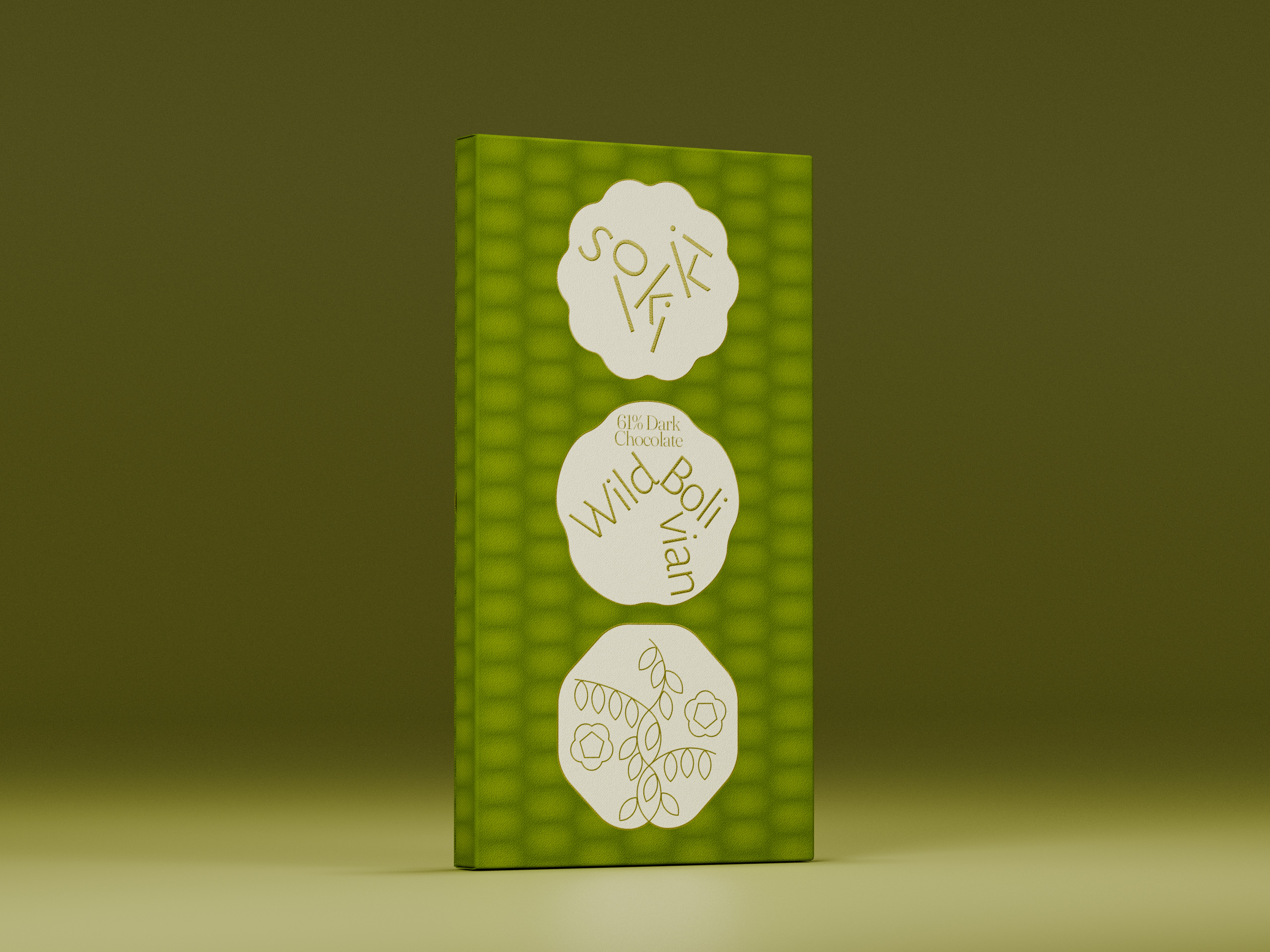
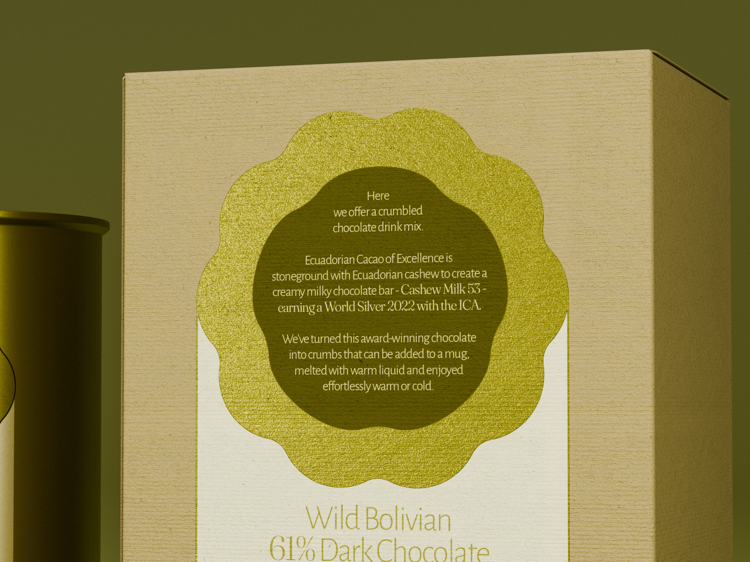
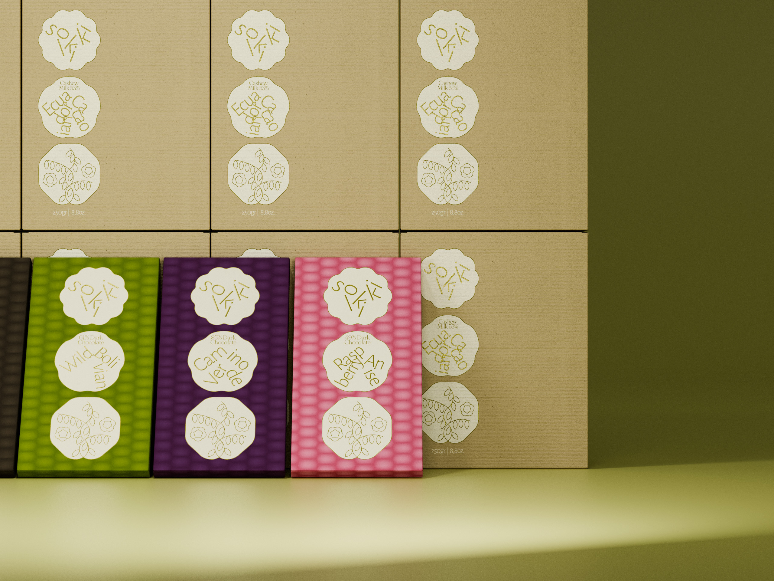
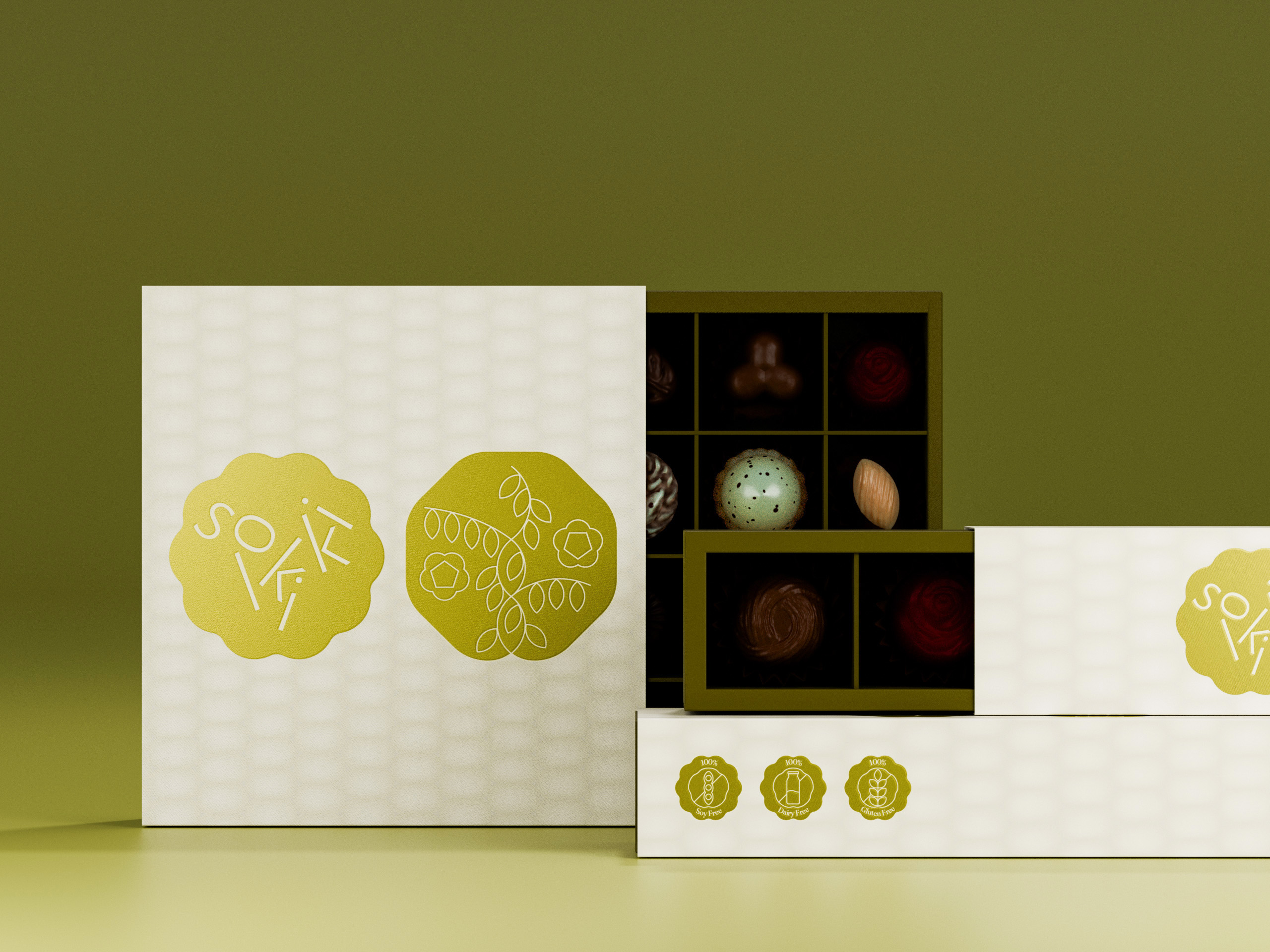
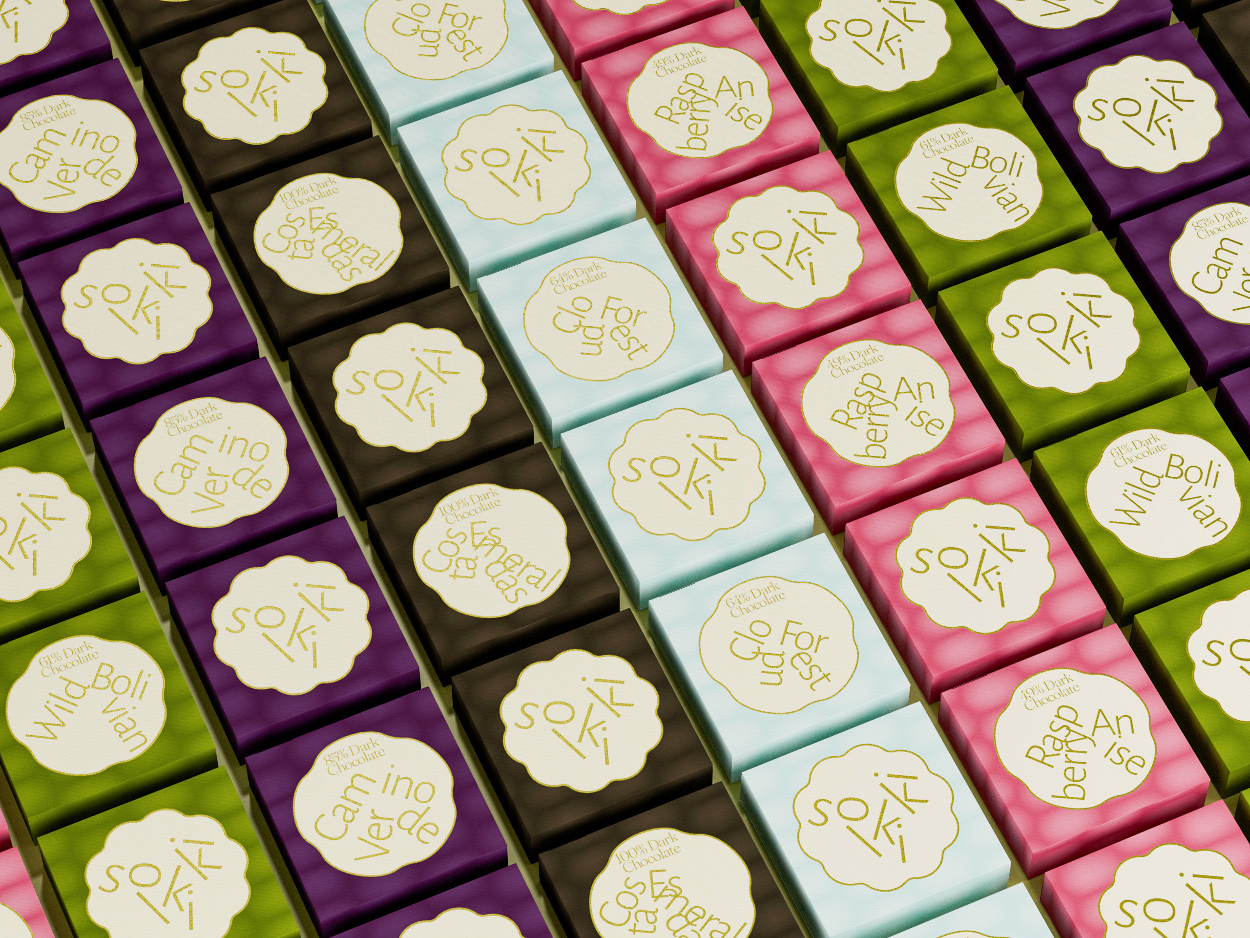
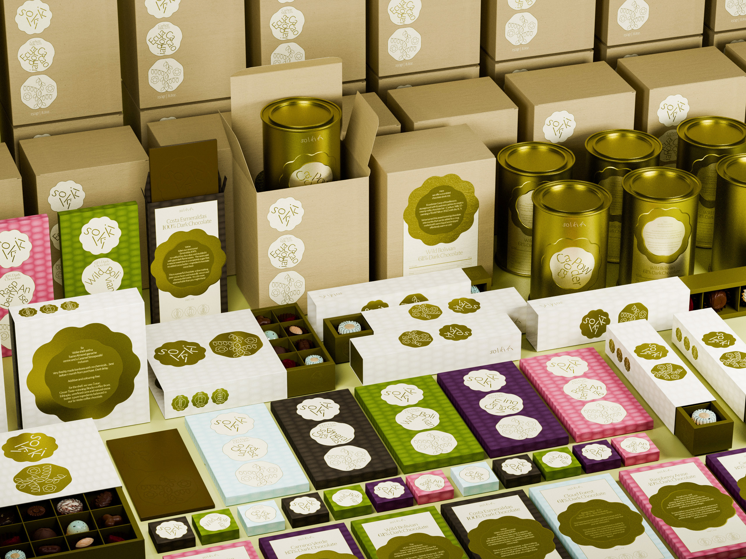
Solkiki’s visual language is born from the very body of the cacao pod — a dialogue between nature and design. The phenomenon of cauliflory, where fruit grows directly from the trunk of the tree like a primordial calling, becomes a symbol of absolute directness and deep-rooted origin.
The cross-sections of the cacao pod reveal a refined structure: longitudinal ridges run rhythmically throughout, while the soft ivory-white flesh tenderly cradles the cacao beans in a perfectly symmetrical order — forming the brand’s unique defining structure and pattern.
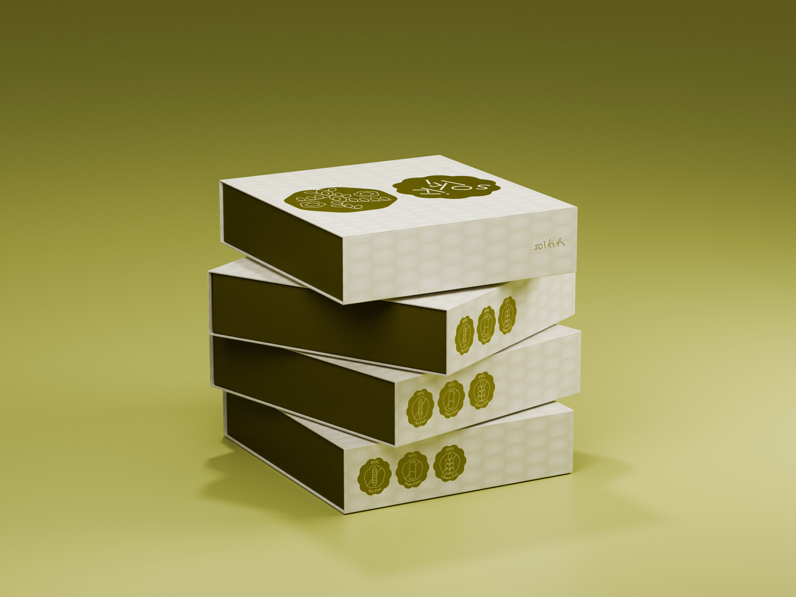
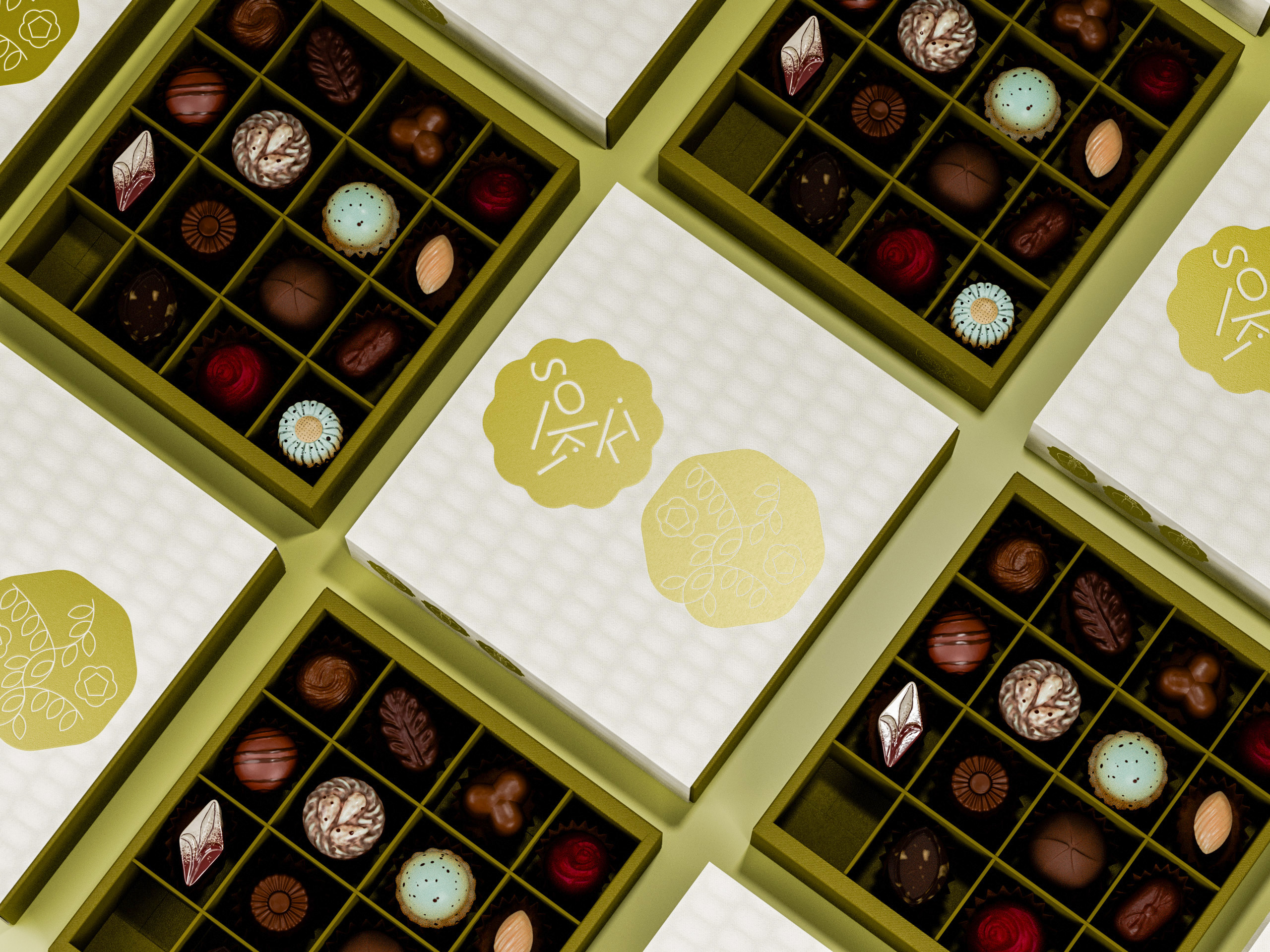
That familiarity — gently transformed into a design language: unpretentious, unobtrusive, effortlessly recognizable, and carrying the clarity of something made the right way, by artisan hands, with sustainability placed deep at the heart of everything.
V. CULTURAL RESONANCE: THE VOICE OF THE CONSCIOUS PALATE
By using international design thinking to translate a botanical, almost scientific origin story, we created a brand that feels both intimate and credible.
VI. THE RESPONSE
The completion of the Solkiki project is not just a delivery of assets; it is the quiet arrival of a new standard for what craft chocolate identity can be.
 monther al omari
 Ximena Ureta Design Studio.
 vitoramockup
 Up-Brands
 Sophiagdotcom
 Peter said
 ayeidadezigns
 Tancybox
 宏洛图品牌设计HONGLT
 Modern Theory
 Dozen Agency
 Atiq Alam
 Olio Studio
 Ruchi S. Joshi
 mmdesign
 awaiskhadim
 Octasoft
 United Creatives Studio
 Kingdom & Sparrow
 Anastasia Bakhmatskaya
 CreativeWise
 Great and Golden