

ABOUT BRAND
Garden of Wisdom is an independent skincare brand built on the belief that every skin is unique. Combining the wisdom of nature with scientific research, the brand develops small-batch formulas with a strong focus on transparency, quality, and the individual needs of the skin.
The new identity translates this philosophy into a visual language that explores the unseen, revealing the honesty and intelligence behind the brand.
VISUAL CONCEPT
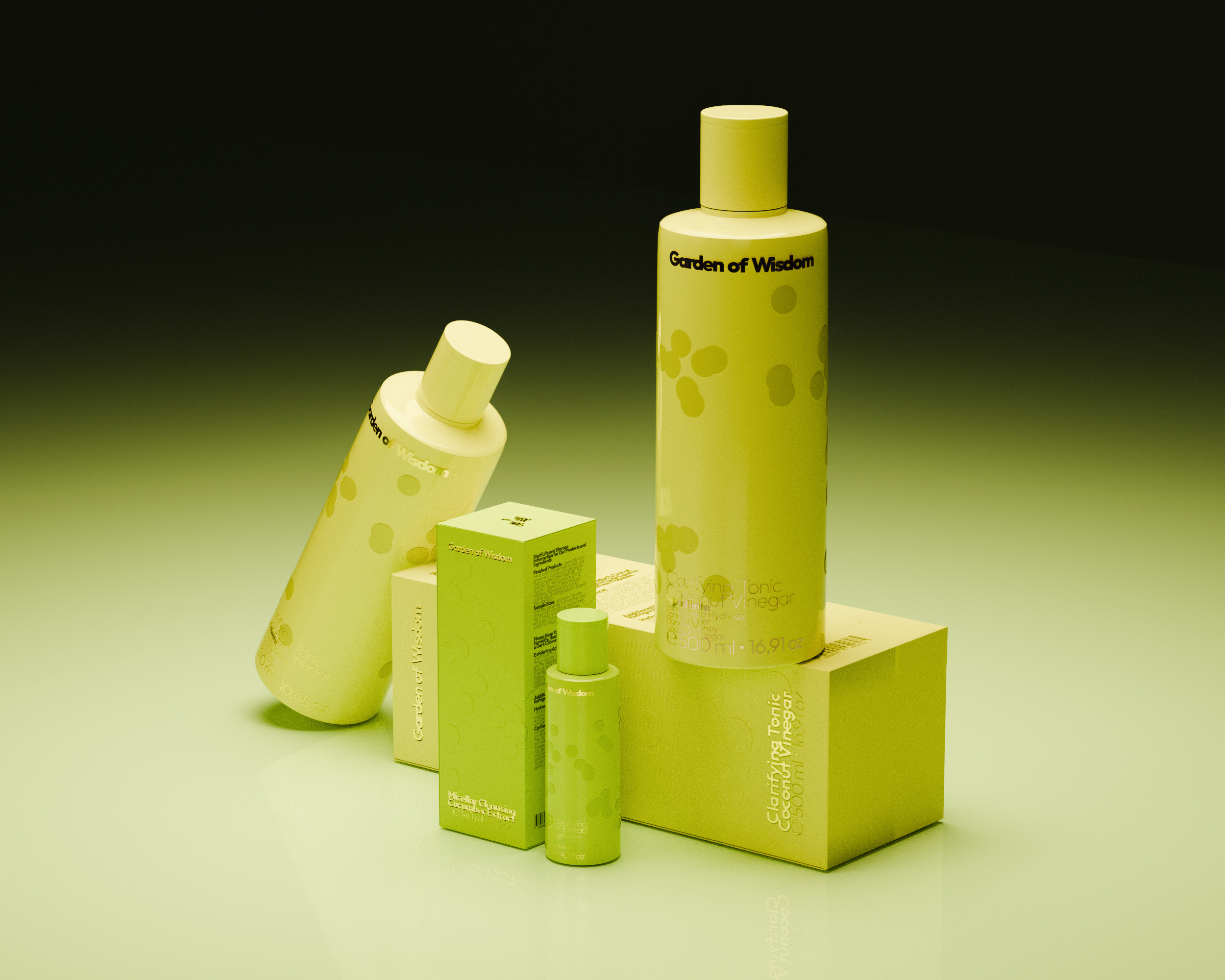
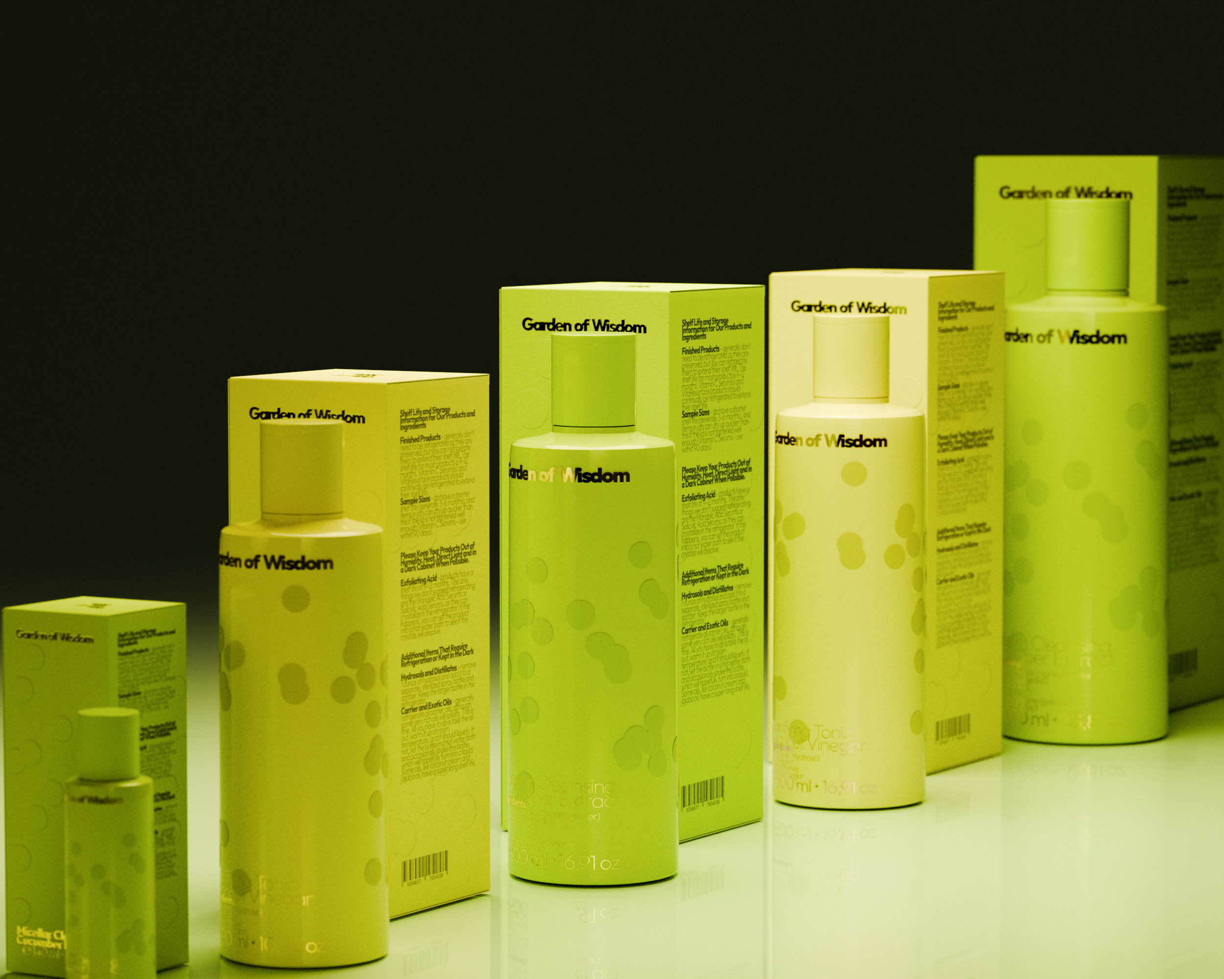
Inspired by plant cells observed under a microscope, the identity looks beneath the surface to reveal what is real.
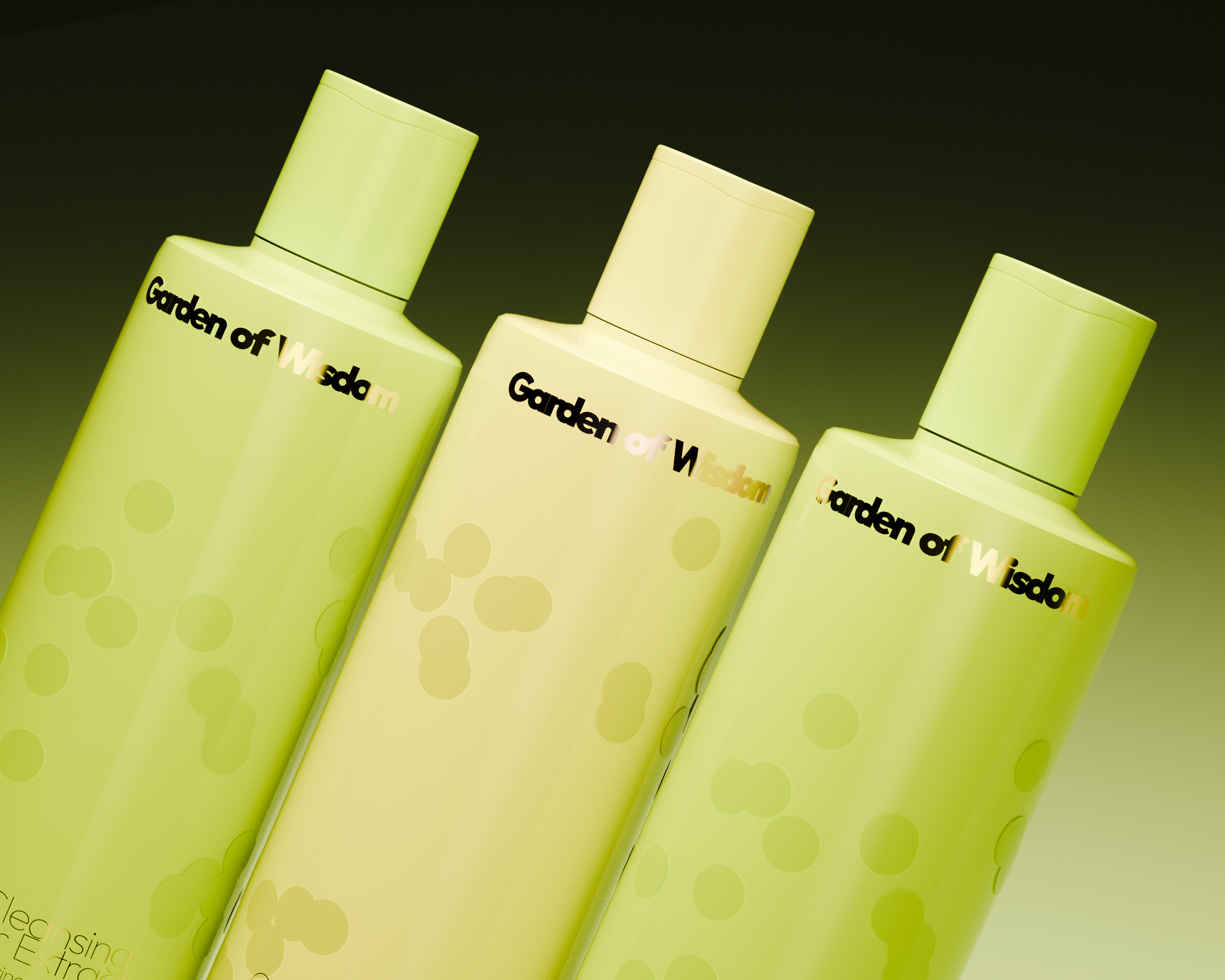
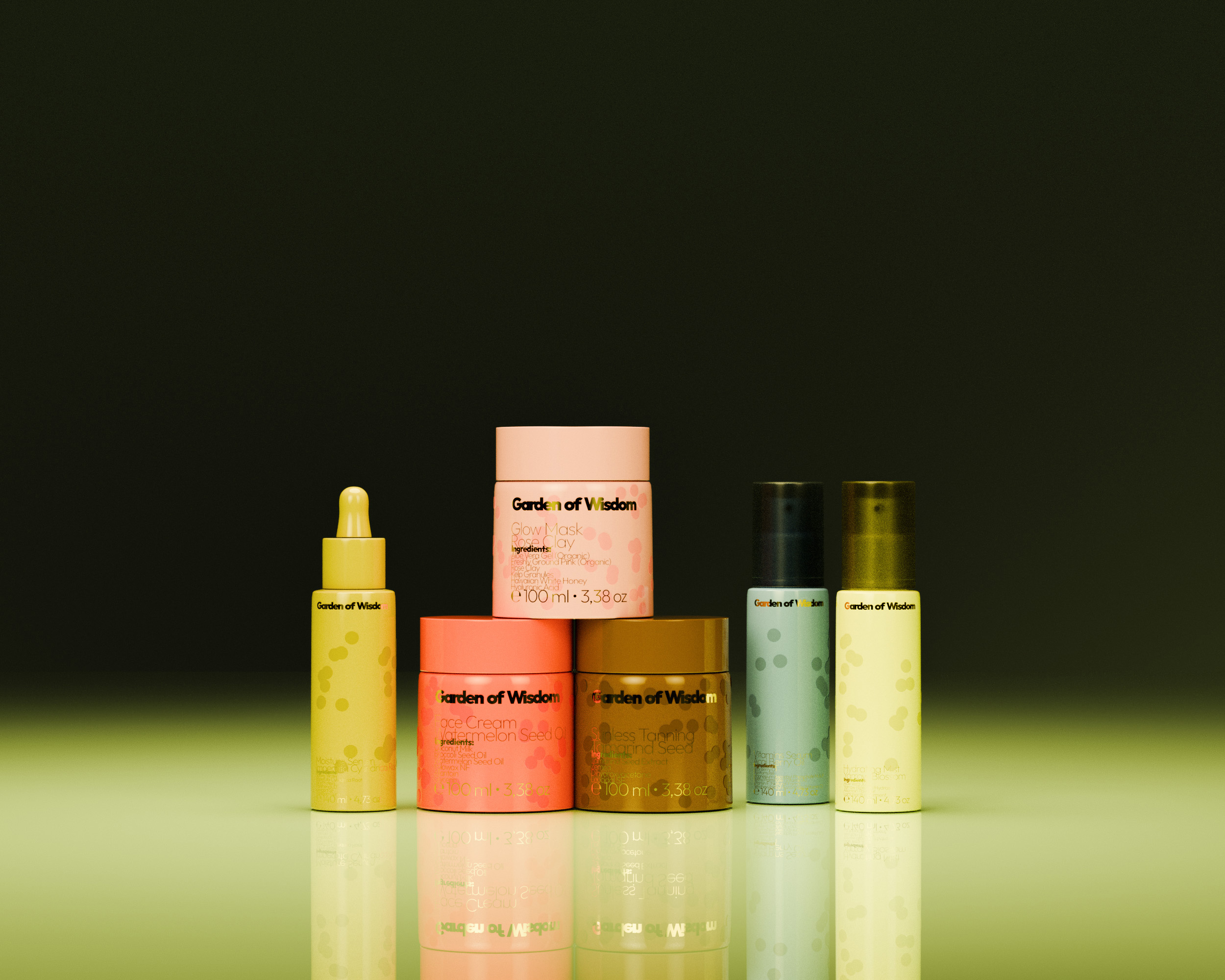
Each cell is unique and imperfect, reflecting Garden of Wisdom’s belief that every skin is different. Its raw forms also embody the brand’s commitment to transparency — stripped of excess, stripped of disguise, leaving only what matters.
The visual system translates these cellular forms into organic circles, irregular shapes, and layered compositions, balancing nature, science, and truth.
VISUAL GENERATIVE SYSTEM
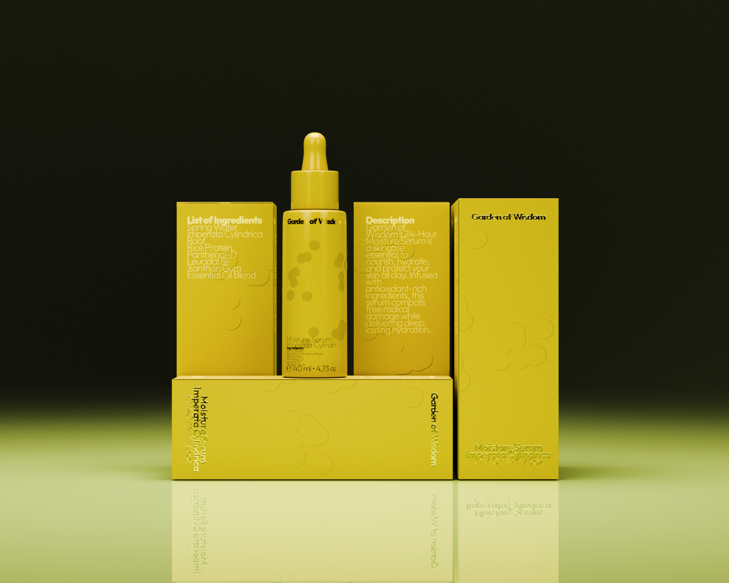
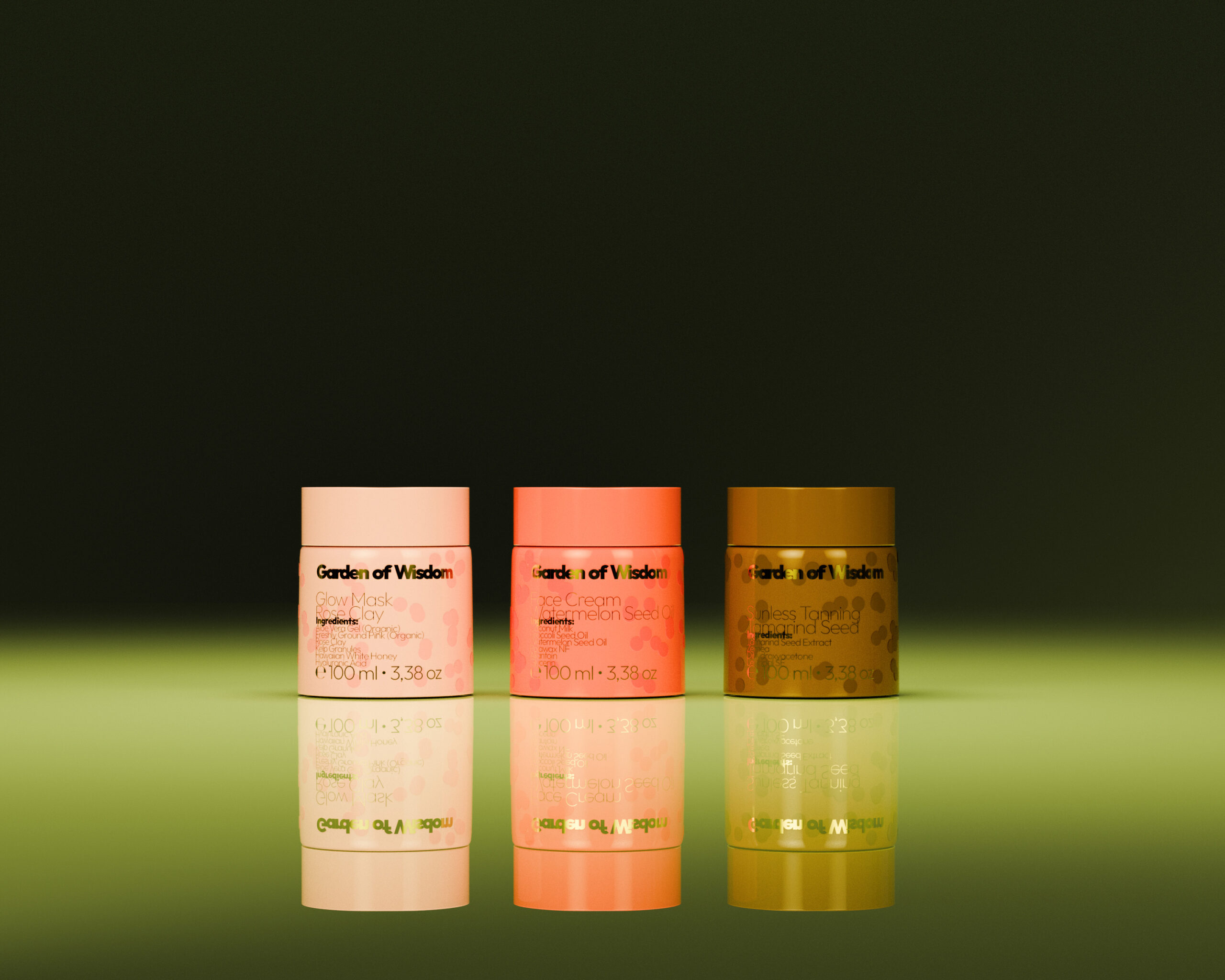
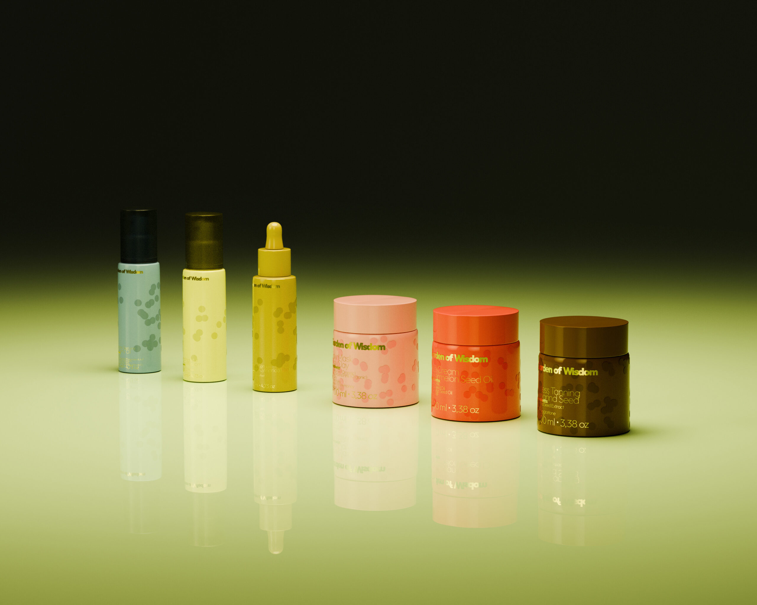
To translate this concept into the visual identity, we developed a Generative Visual System, in which dots — inspired by the organic forms of plant cells — become the core visual units and a defining graphic language throughout the Garden of Wisdom identity.By inputting text and adjusting variables such as Dot Size, Dot Count, Jitter, and Clustering with Organic Effects enabled, the system transforms textual information into visual structures composed of dots. Each input generates a unique visual outcome while following the same underlying logic, allowing the identity to remain both consistent and dynamically adaptable across different applications.








 krrrrrllii
 babyage
 Deep
Deep monther al omari
 Atiq Alam
 TUERCA Studio
 neo creative studio
 Pinot Agency
 Pixels Studio
 Anastasia Cherepanova | xtramez
 awaiskhadim
 Studio Be Design
 Belova Oksana
 We Craft Studio
 ArtDesignByDIna
 Ananya Taran
 Nadezhda Gorelikova
 orhanirmaktasarim
 WillBe
 Hi estudio
 43oz
43oz Rosario Lo Iacono
 alchimistestudioParis