

Some brands don’t need to speak loudly. They simply make you feel that you belong.
The idea behind SunshineClub began with a simple thought: wellness isn’t only about what happens inside the body. Sometimes it’s about recognizing something that has always been there – a quiet sense of energy, optimism, and balance.
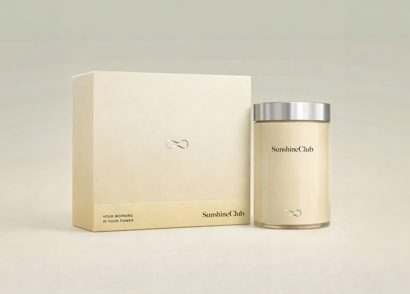
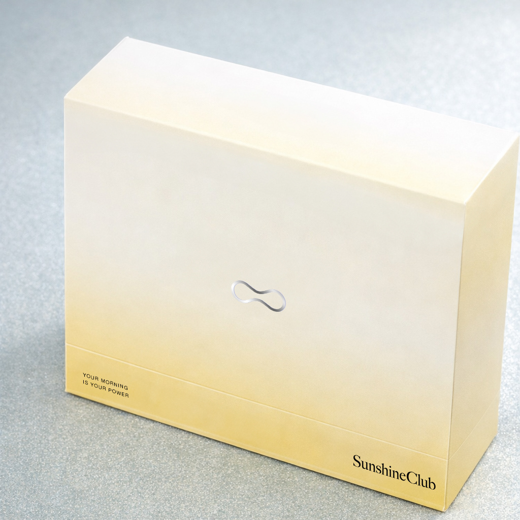
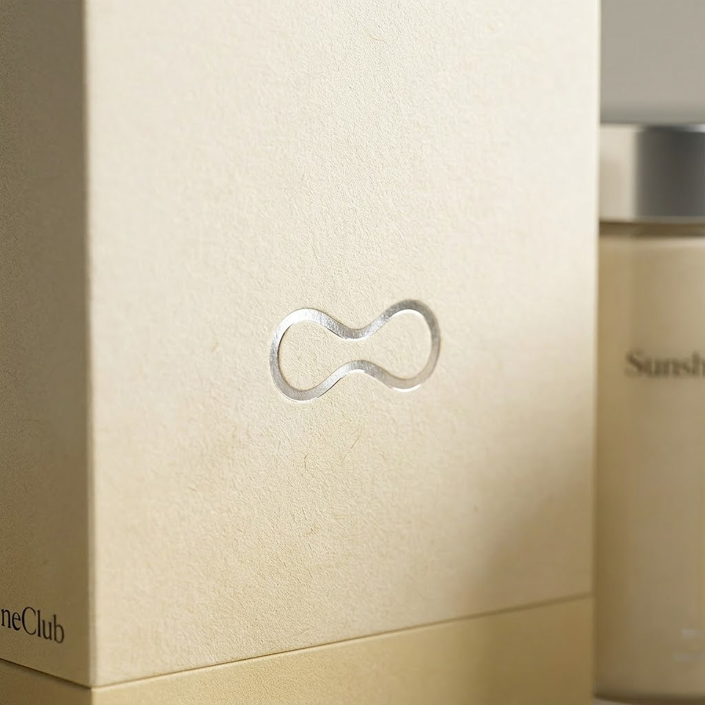
The identity reflects that idea through a minimal visual language. At its center is a symbol inspired by the infinity sign, representing the continuous relationship between what we carry within ourselves and what we share with the world around us.
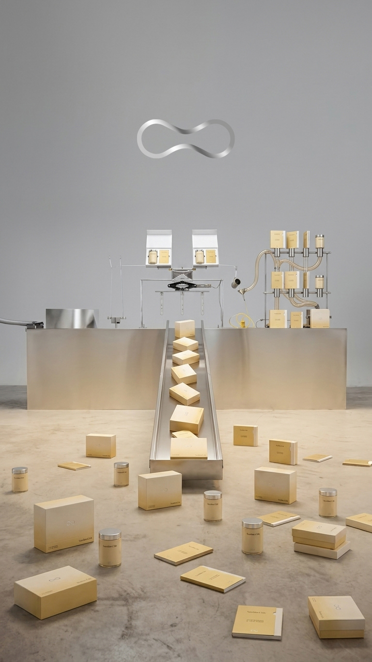
When developing the portfolio presentation, I wanted to take that concept one step further.
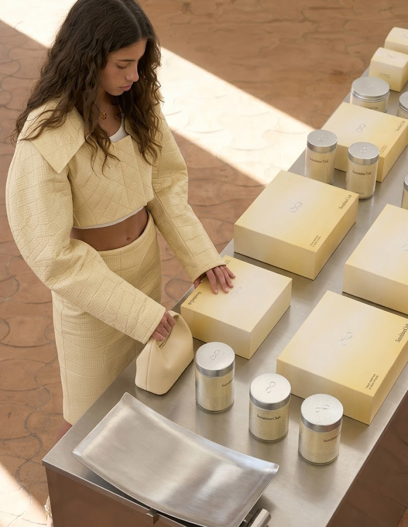
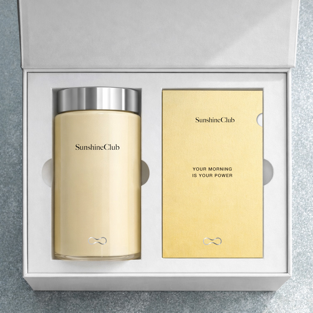
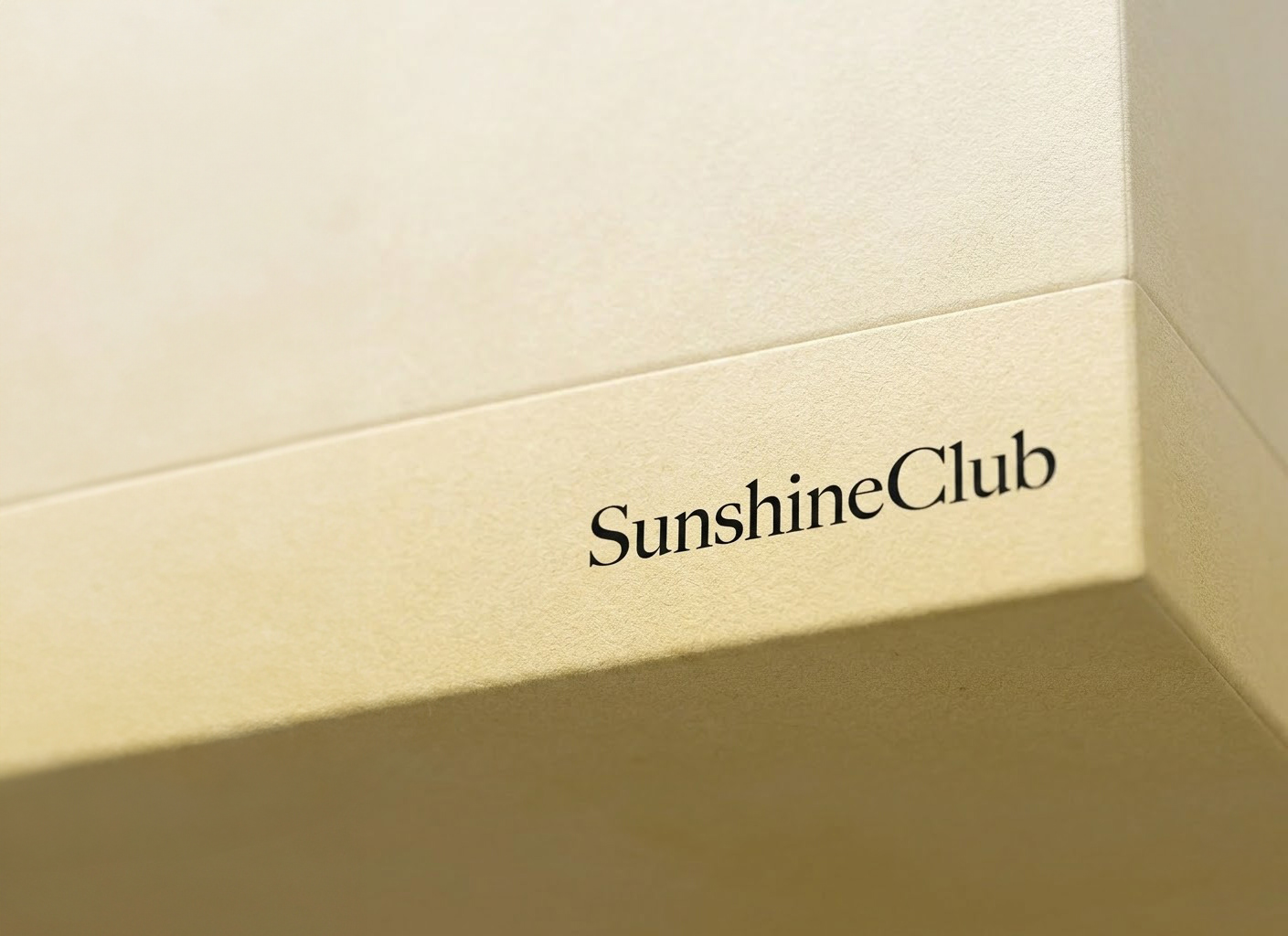
Rather than treating the packaging as a wellness product, I imagined it as something people would be proud to carry – almost like a personal object or a fashion accessory. Metallic finishes, clean forms and contemporary styling shifted the perception away from traditional supplements and closer to the world of modern lifestyle brands.
The name SunshineClub also suggested something more than a product, it suggested belonging. Not an exclusive club, but a community connected by shared values and a conscious approach to everyday wellbeing. Sometimes people don’t choose a product because of what it contains., but they choose it because it reflects who they aspire to be.
Looking for branding and packaging design for supplement brands? Explore my complete Wellness Packaging Design page, where I share additional projects and answers to common client questions.







 monther al omari
 Alexander Skurihin
 Studio K95
 ARMBRAND
 Richa Rai
 houseoferas by Miti
 Agence des Coteaux
 Kushi Eaknath
 Ann Treasa
 Xiao Ning
 krrrrrllii
 babyage
 Deep
Deep Atiq Alam
 TUERCA Studio
 neo creative studio
 Pinot Agency
 Pixels Studio
 Anastasia Cherepanova | xtramez
 awaiskhadim
 Studio Be Design
 Belova Oksana