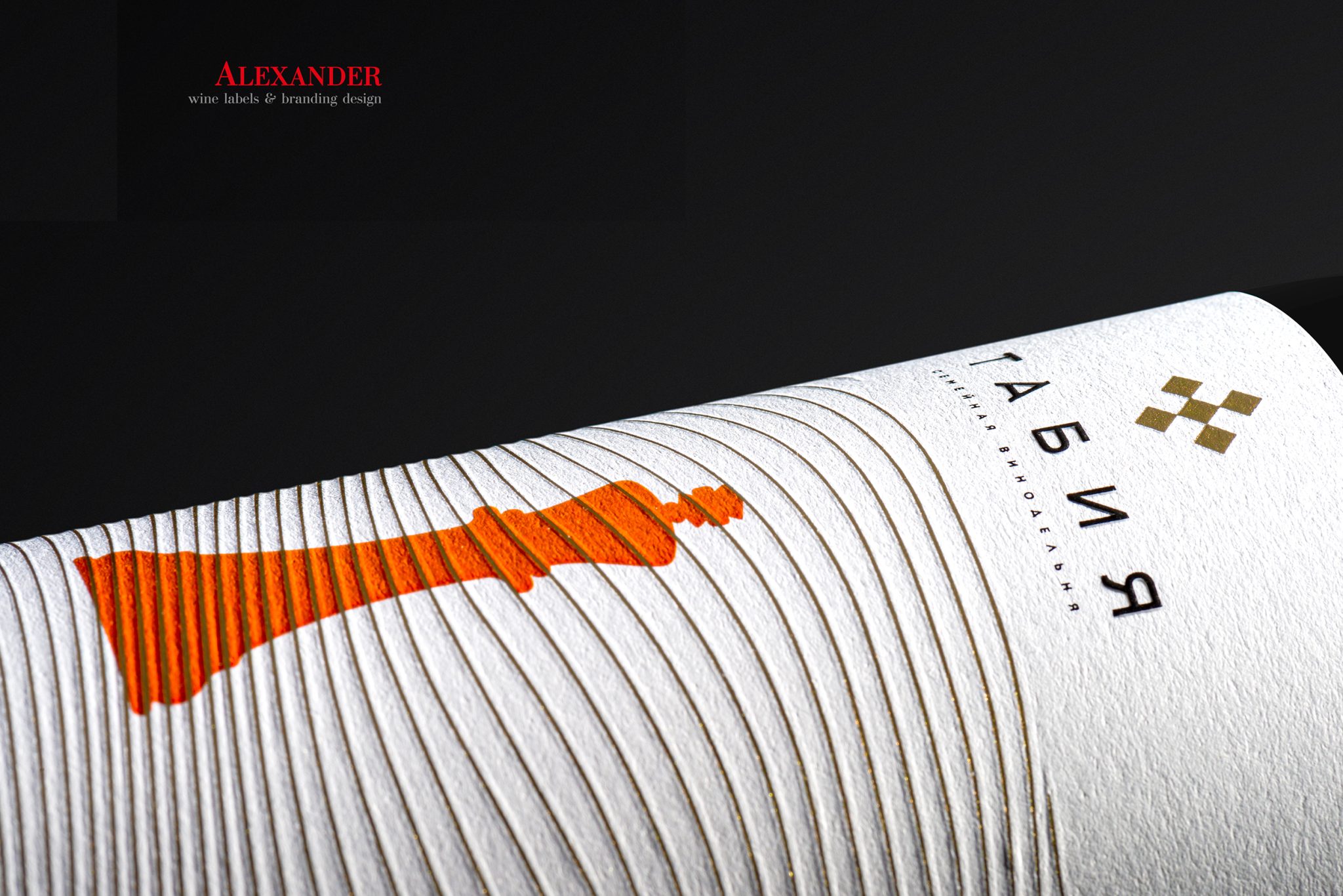

The design of the wine line, for the family winery “Tabia”.
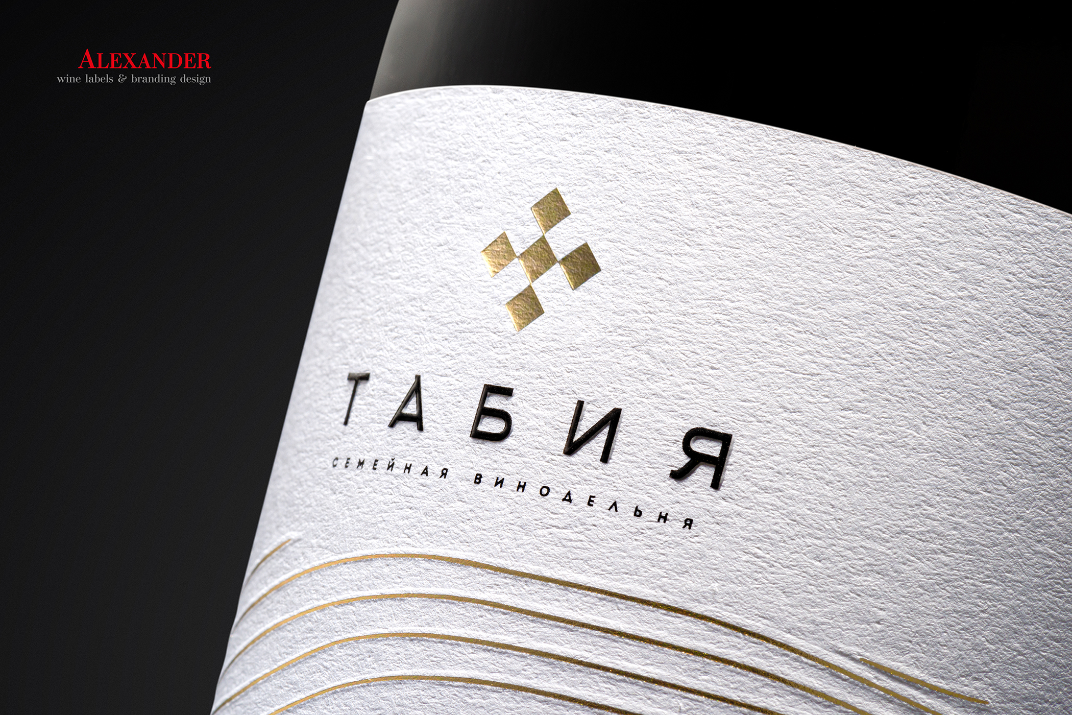
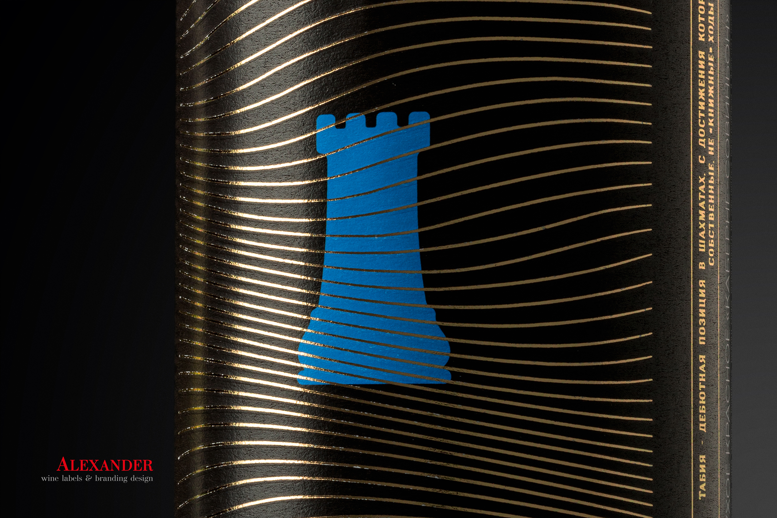
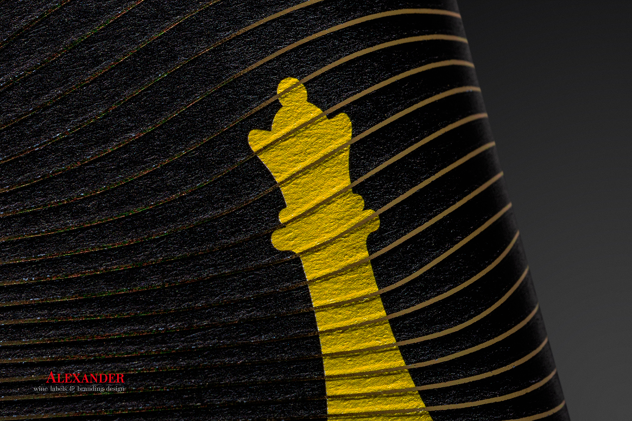
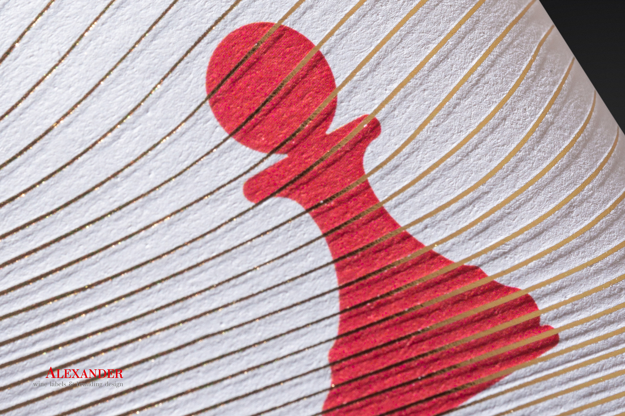
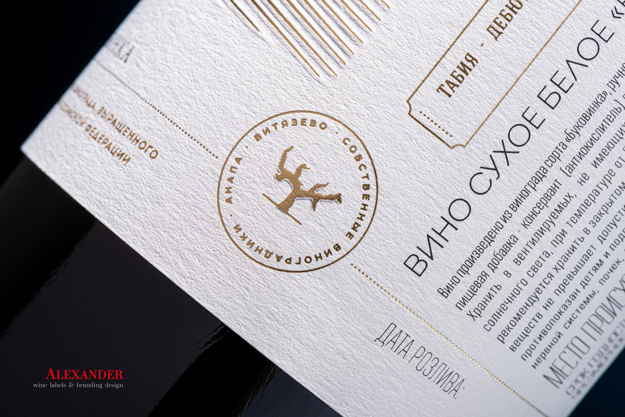
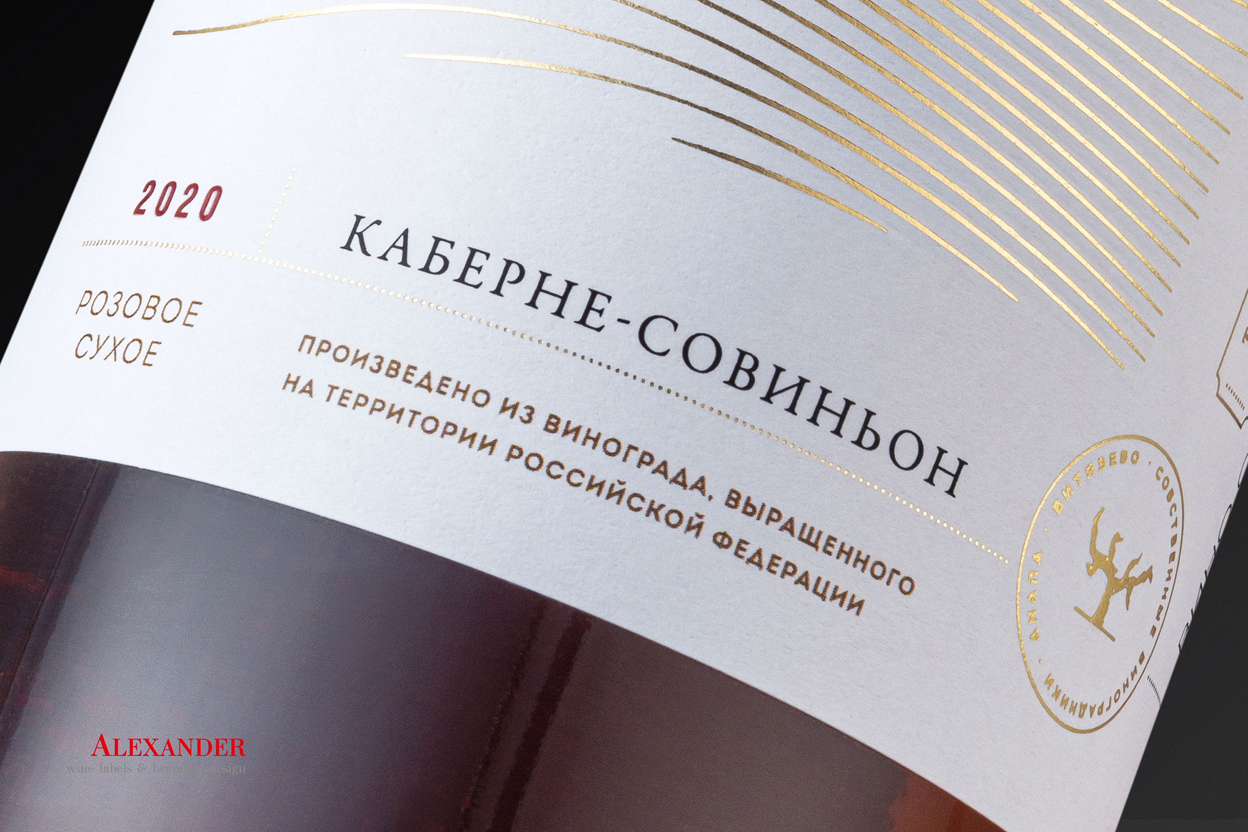
The quiet wines from the “Tabia” winery have an intelligent chess motif reflecting the strategic nature of the game, maturity and perfect harmony of taste. Conceptually, it’s all about contrasts – white and pink wines have clear white labels, while red wines have bright black labels. Each bottle depicts a live, simplified chess piece (king, queen, rook, bishop, knight or pawn), with grotesque lines symbolizing rows of vineyards on top of the pieces. The lines are embossed with gold foil.
Design: Alexander Skurihin
Curator’s Insight
The strongest decision here is restraint in the color story. Each label uses exactly two forces, a saturated piece color against a stark ground, which keeps six distinct chess pieces from turning into a cluttered set. That simplicity is what lets the line function as a family on shelf even though every bottle is visually different.
The gold foil lines do more than add shine. Running them as diagonal or curved sweeps across the pieces breaks up what could otherwise be flat, poster like silhouettes, giving each figure a sense of terrain or motion without adding any extra imagery. It’s a clever way to reference vineyard rows without resorting to literal landscape illustration, which keeps the design feeling modern rather than pastoral. Piece selection also reinforces the wine hierarchy in a subtle way. Reds carrying the more commanding pieces against black, and lighter wines carrying more understated ones against white, lets the chess metaphor do quiet work distinguishing weight and character across the range, without needing any additional label copy to explain it.


 NEV
NEV Stefano Bracci
 Alina
Alina monther al omari
 Lizakjx
 JOAOMARCOSDESIGN
 alchimistestudioParis
 Harriet Neild
 octavio rojo
 宏洛图品牌设计HONGLT
 DESIGN CONCEPTS
 Studio K95
 ARMBRAND
 Richa Rai
 houseoferas by Miti
 Agence des Coteaux
 Kushi Eaknath
 Ann Treasa
 Xiao Ning
 krrrrrllii
 babyage
 Deep
Deep Atiq Alam