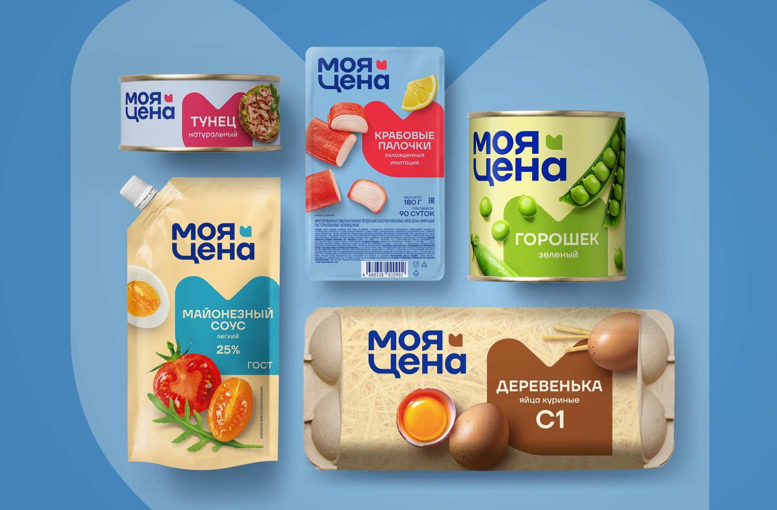

“Moya Cena” (“My Price”) is the Magnit large retail chain’s private label brand of first-price products. The brand helps customers who value stability and practicality save money.
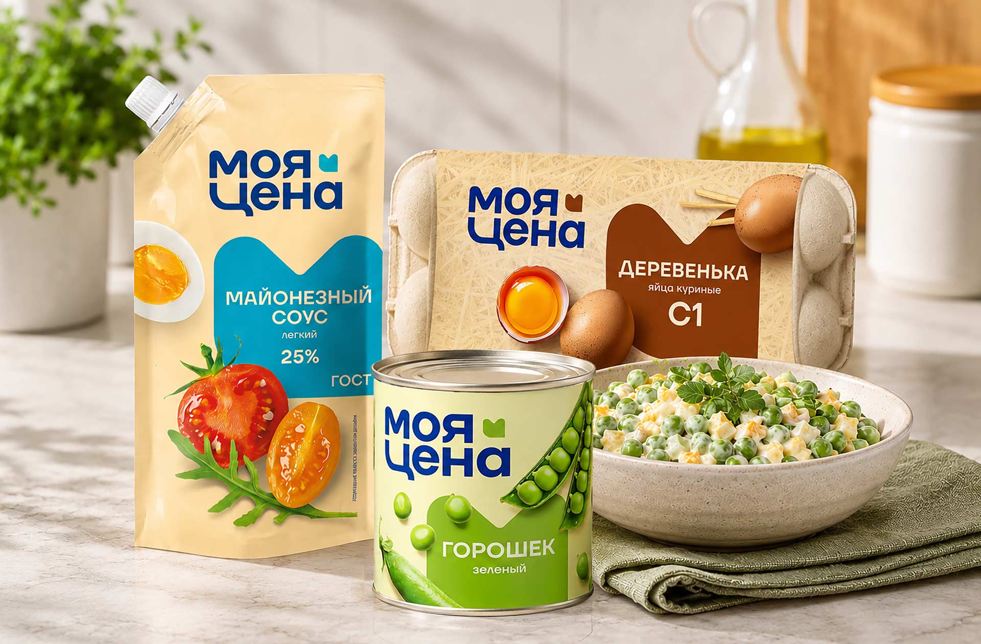
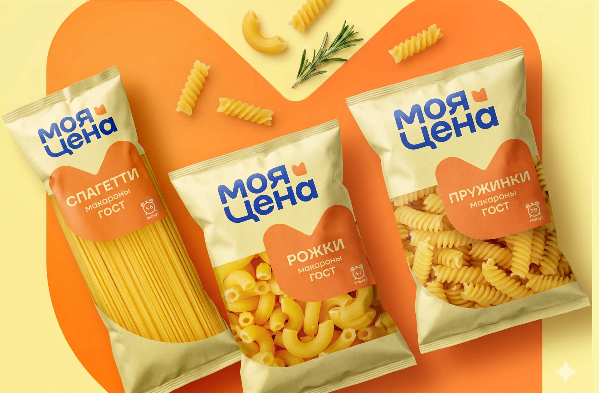
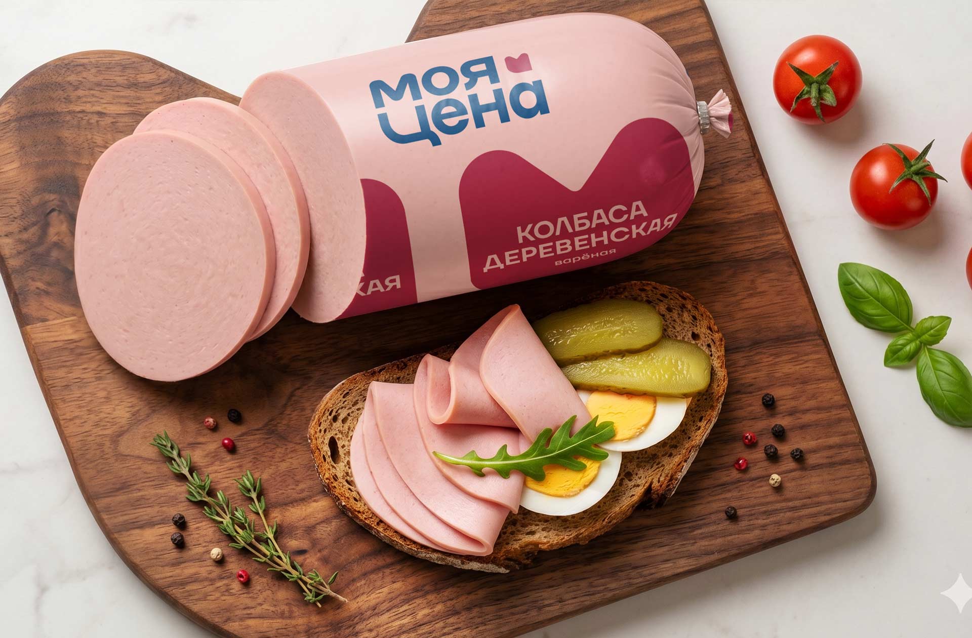
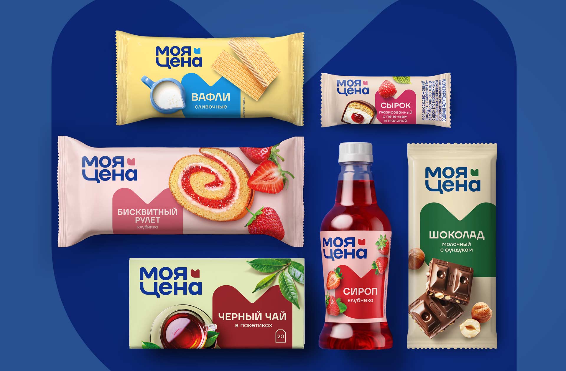
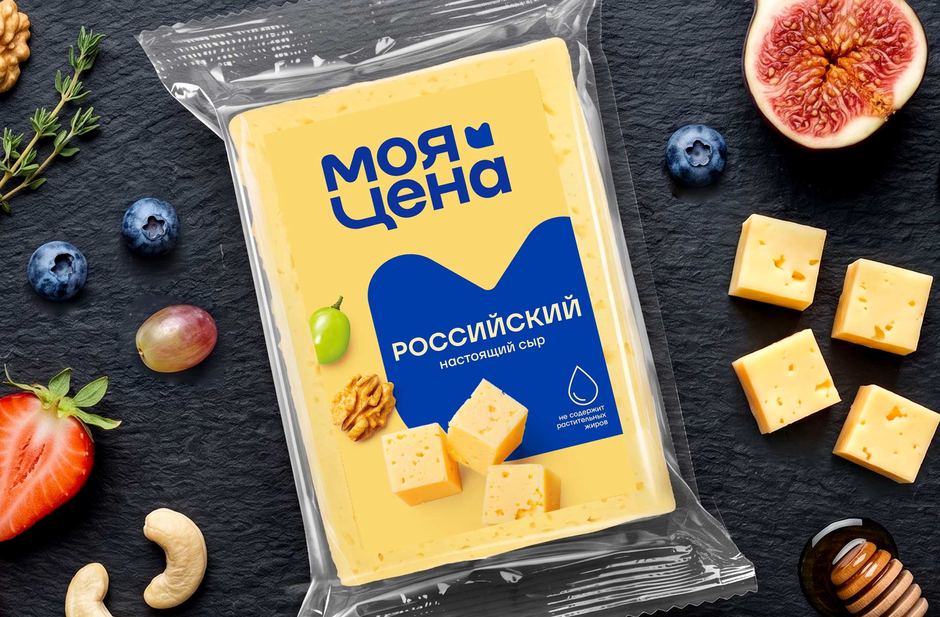
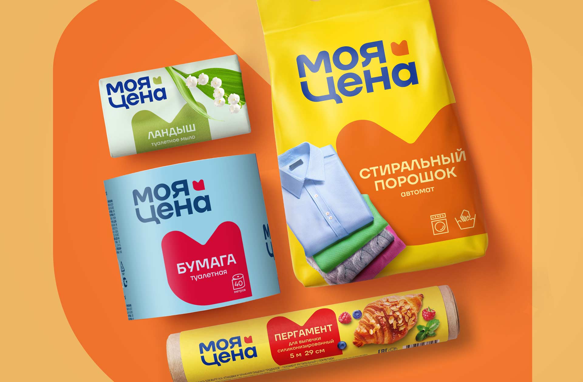
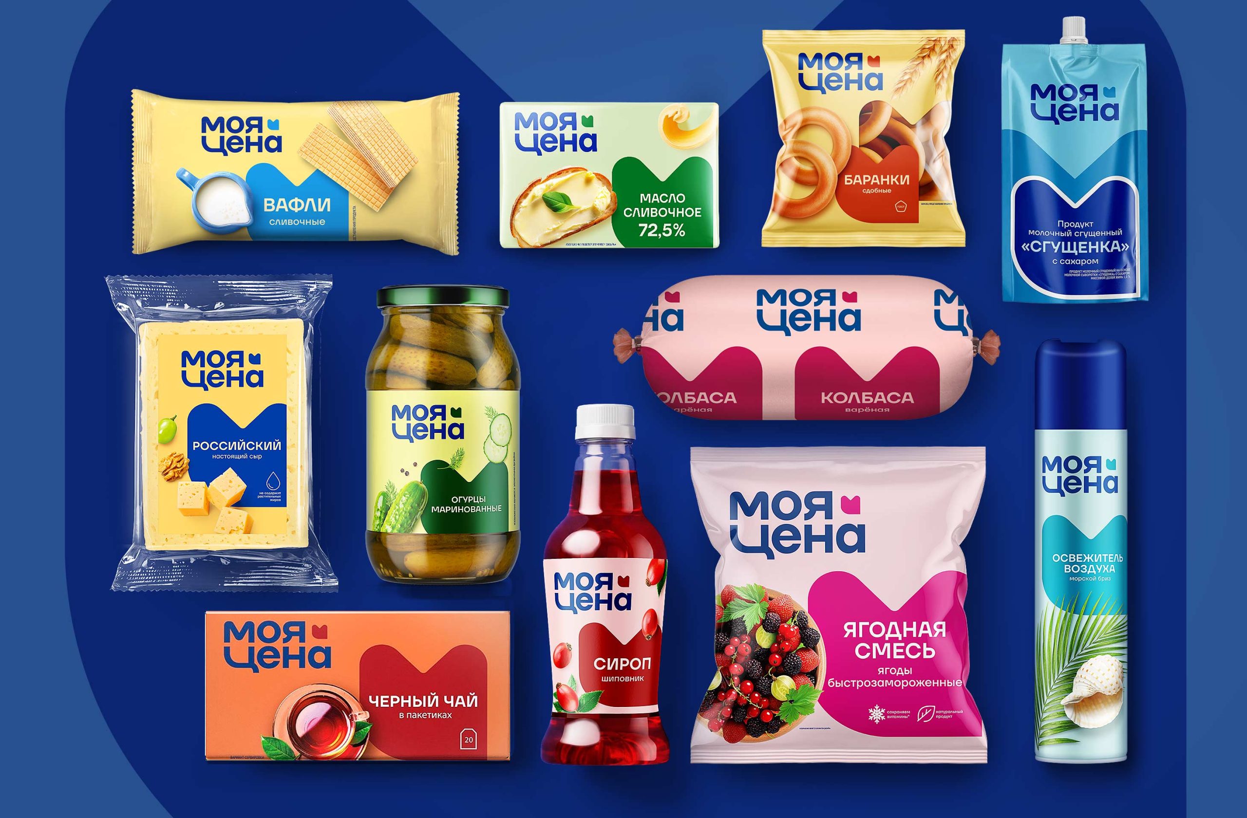
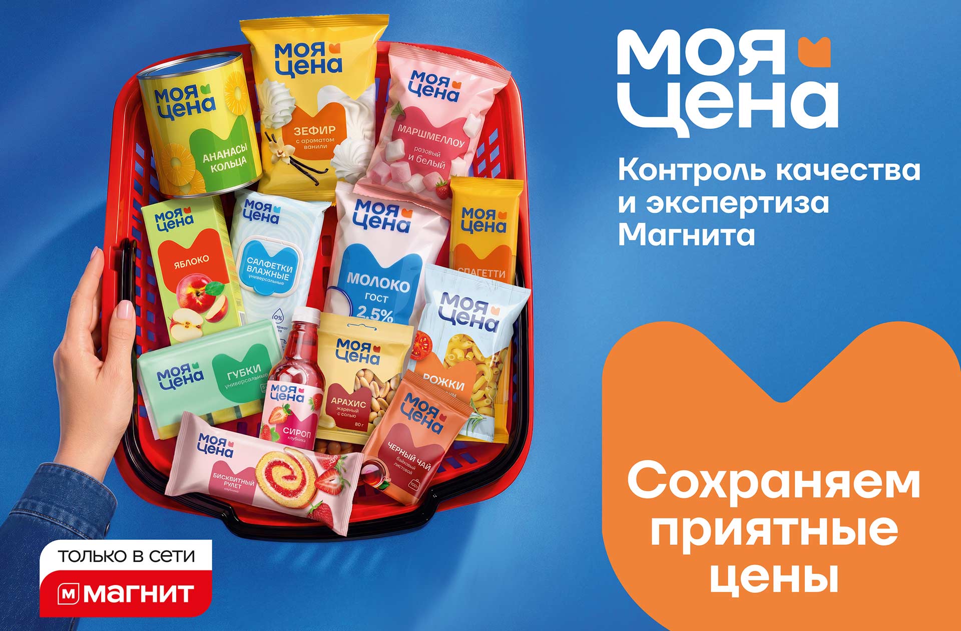
The brand’s assortment includes over 600 items, covering food and hygiene products, designed for those seeking affordable solutions every day. A refresh of the visual identity and packaging allowed the brand to adapt to current market trends and make it more modern, expressive, and appealing to a wider audience.
In the face of increasingly demanding consumers, especially younger generations who actively compare prices and values across brands, Magnit, in collaboration with the UPRISE agency, undertook a profound transformation of the “My Price” brand.
The previous visual style successfully addressed initial positioning challenges, but dynamic market development and audience expansion generated a demand for an evolution of the brand’s core essence. Therefore, the agency’s team undertook a conceptual overhaul to strengthen its status as a reliable and modern image.
The primary goal was to rethink the brand’s positioning and design to enhance recognition and trust. In-depth analysis was conducted and a new platform developed, based on the concepts of security, control, and the embodiment of a culture of responsible consumption. The “My Price” brand is not just an affordable product, but a smart choice that helps you save without sacrificing basic needs.
The core idea combines Magnit’s expertise and quality control with its unwavering commitment to maintaining attractive prices, building its positioning around the idea of security: customers can be confident they are making a smart and informed choice thanks to the simplicity, transparency, and accessibility of its products, without feeling inconvenienced. The brand strives to inspire trust and be perceived as a reliable and caring advisor who understands customer needs, helps them make informed choices, and is always ready to offer a simple solution, focusing on the perception of itself as an honest partner who cares about people, not just a seller of discounted goods.
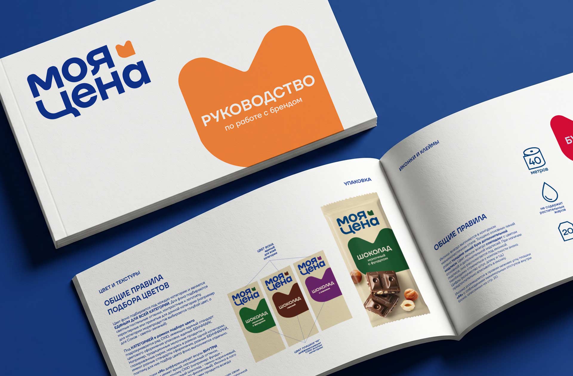
One of the key objectives for the project was updating the visual component: the UPRISE team developed a modern, minimalist, scalable design that emphasizes honesty and transparency. The main graphic element of the packaging and the logo icon is a bar formed by joining the capital letters “M” and “C” from the name. Its shape also resembles the “M” as a reference to Magnit and can be easily modified for use in communications and slogans. Communications emphasize price offers and ease of consumption, which evoke positive emotions and trust among the target audience. A unified brand book regulates the use of the logo, fonts, and color scheme to maintain a consistent image across all touchpoints.
This case demonstrates how a well-designed repositioning strategy and a modern, trustworthy design can enhance brand awareness, transforming “My Price” from a mere affordable product into a brand with character and soul, offering consumers not only savings but also confidence in their choice.

 Derrick Lin
 Biaa
Biaa Petitmoulin Studio
 White Bear Studio
 Eva Chistyakova
 monther al omari
 Atipus
 alchimistestudioParis
 oneandother
 bloomburo
 helocrene
 Shapers Studio
 Denver Design
 Aidearte
 andrew.huerta
 softmachine
 airobtq
 Buzz & Co.
 Ruby
Ruby themythographer
 IDNB Inc.
 viktorflr
 Zenpack