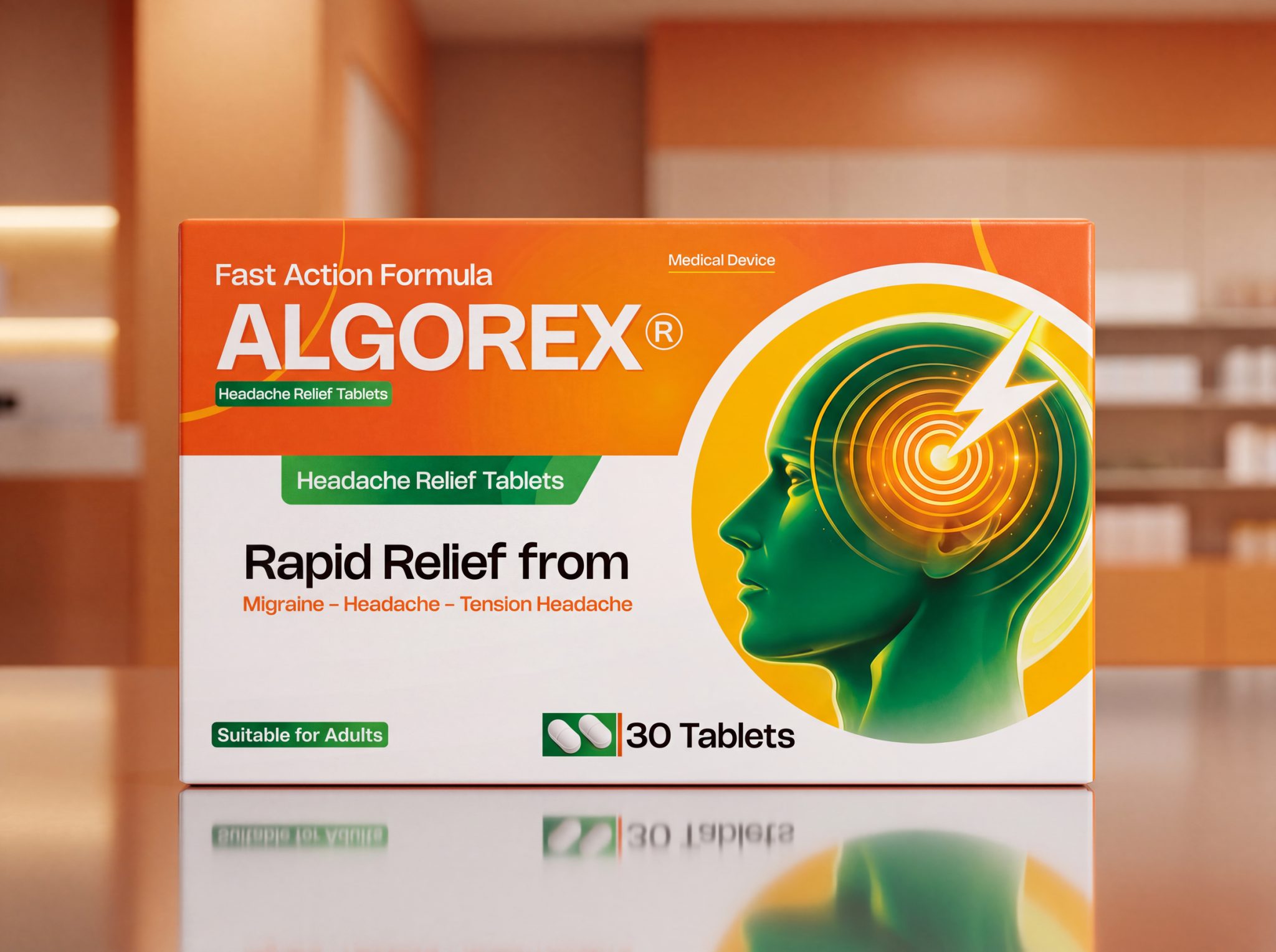

ALGOREX® is a conceptual packaging design created to explore a more contemporary visual language for over-the-counter headache relief products. The project aims to move away from the traditional pharmaceutical aesthetic by combining strong shelf visibility with a clear, reassuring user experience.
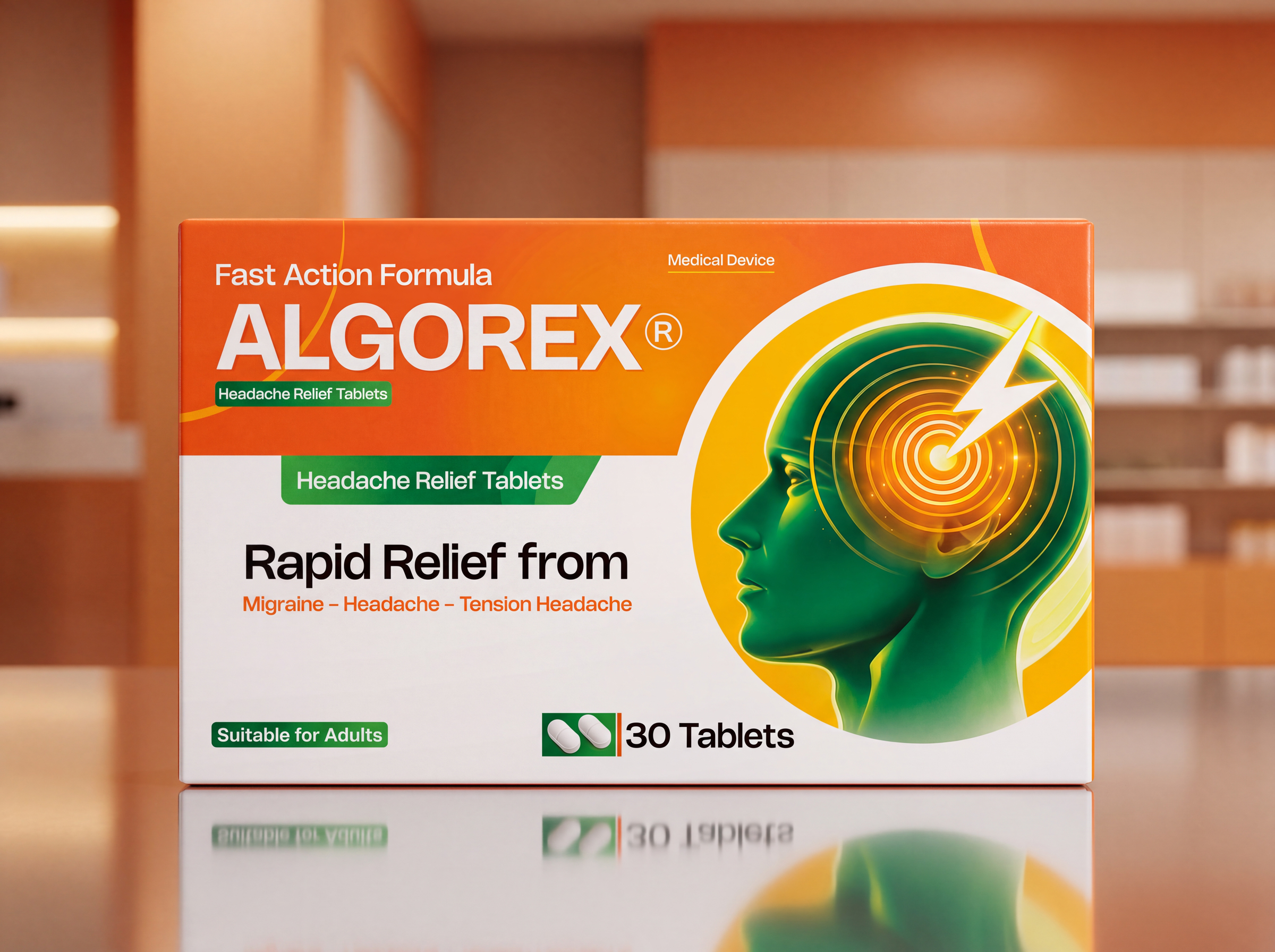
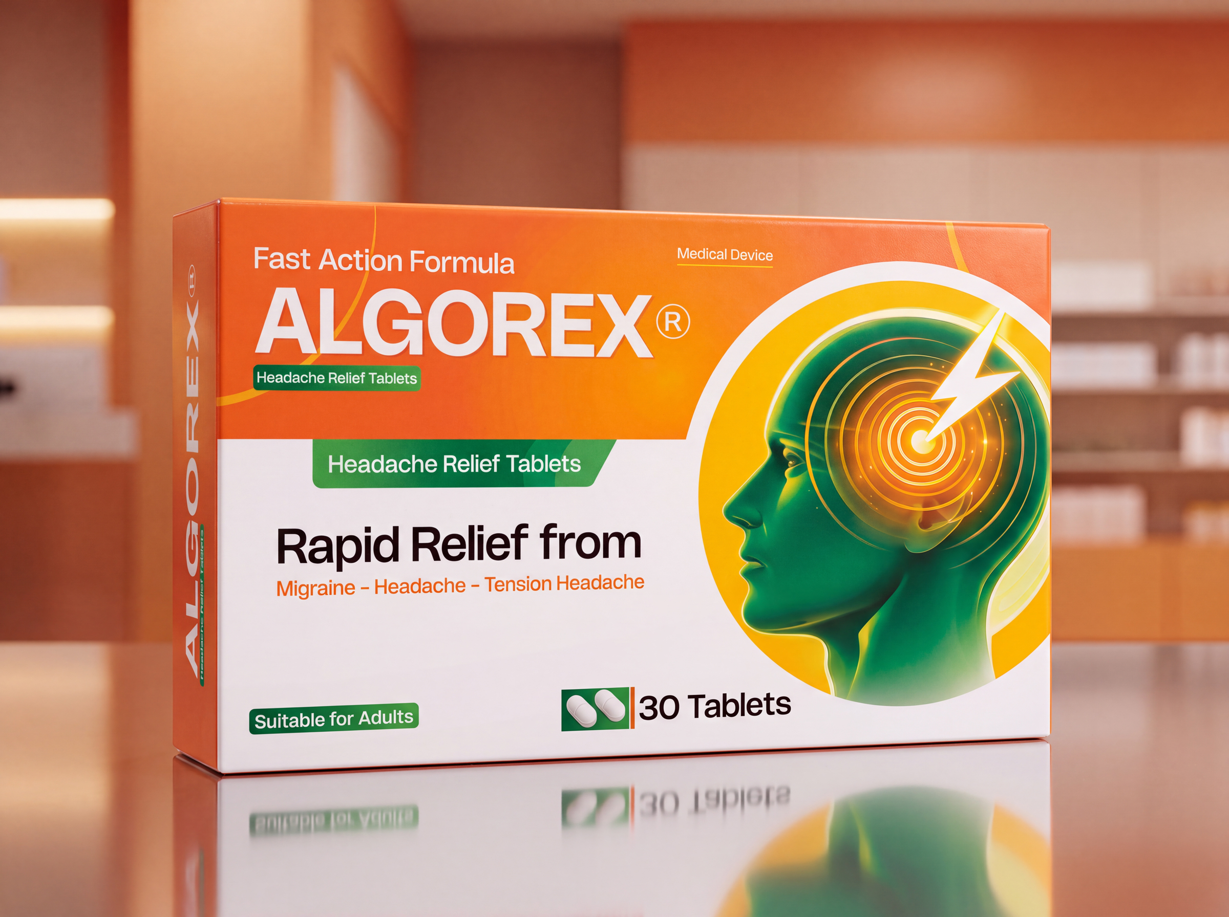
The visual identity is built around the idea of instant pain targeting. Rather than relying on generic medical imagery, the design introduces a stylized human profile combined with concentric energy waves and a bold lightning symbol to communicate the product’s fast-acting performance. This graphic element creates an immediate visual connection with the area of pain while remaining clean, modern, and easily recognizable.
The color palette was carefully selected to reinforce both functionality and emotional perception. Orange conveys speed, energy, and immediate action, while green introduces trust, balance, and well-being. A generous white space provides clarity and improves information hierarchy, allowing essential product details to remain highly legible.
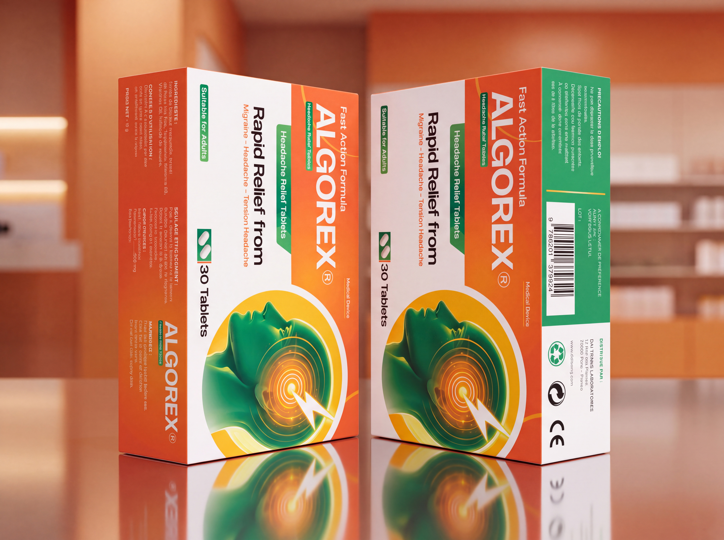
Typography follows a structured hierarchy that guides the consumer through the packaging in seconds. The product name dominates the composition, supported by concise benefit statements and clear dosage information. Every visual decision was made to maximize readability without sacrificing aesthetic quality.
Beyond appearance, the project focuses on creating a stronger emotional connection between healthcare products and consumers. Instead of presenting medicine as purely clinical, ALGOREX communicates confidence, efficiency, and modernity while maintaining the visual credibility expected within the pharmaceutical sector.
This concept demonstrates how strategic packaging design can elevate everyday healthcare products through thoughtful branding, intuitive information architecture, and impactful visual storytelling.

 monther al omari
 Ximena Ureta Design Studio.
 vitoramockup
 Up-Brands
 Sophiagdotcom
 Peter said
 ayeidadezigns
 Tancybox
 宏洛图品牌设计HONGLT
 Modern Theory
 Dozen Agency
 Atiq Alam
 Olio Studio
 Ruchi S. Joshi
 mmdesign
 awaiskhadim
 Octasoft
 United Creatives Studio
 Kingdom & Sparrow
 Anastasia Bakhmatskaya
 CreativeWise
 Great and Golden