

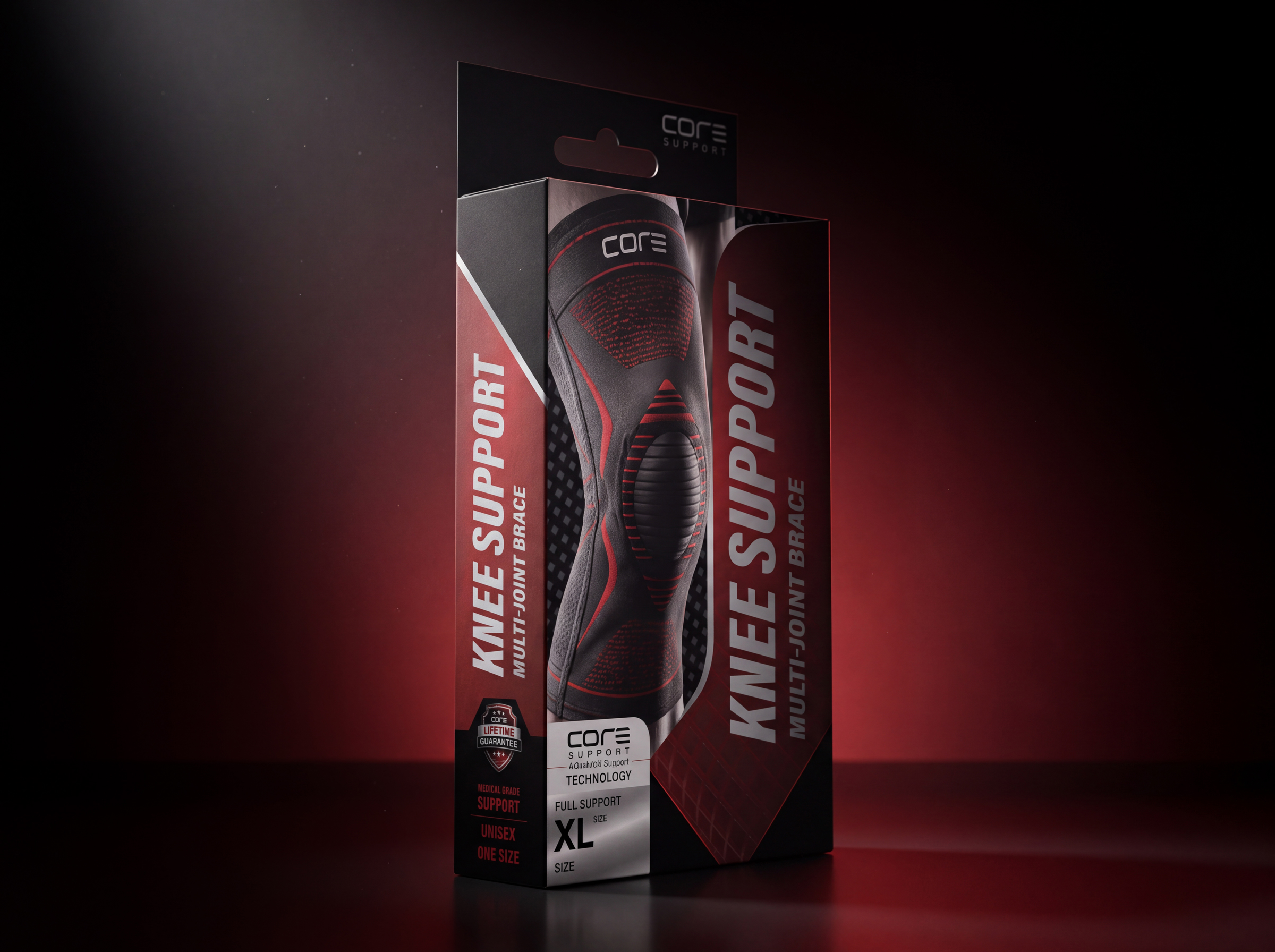
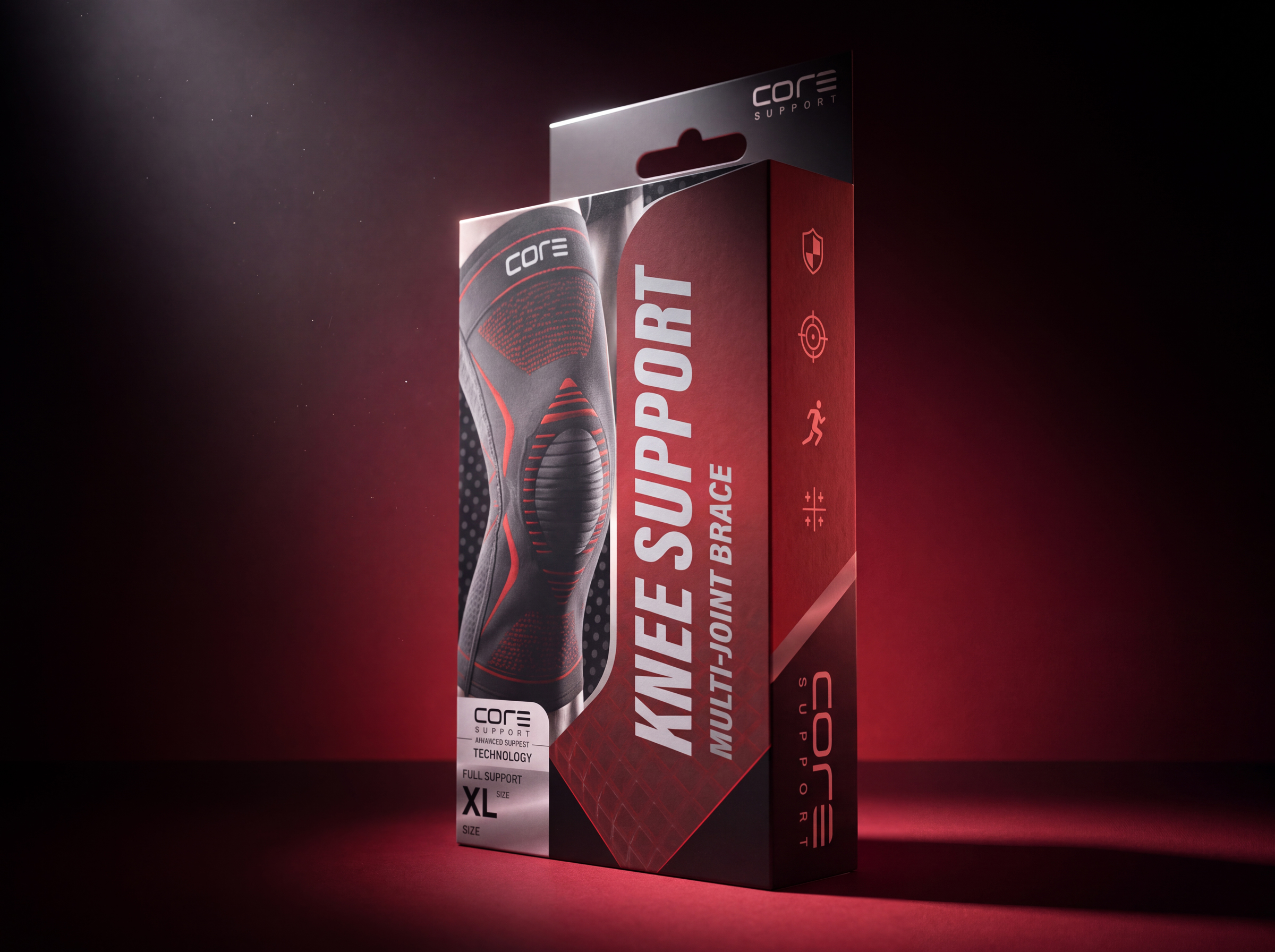
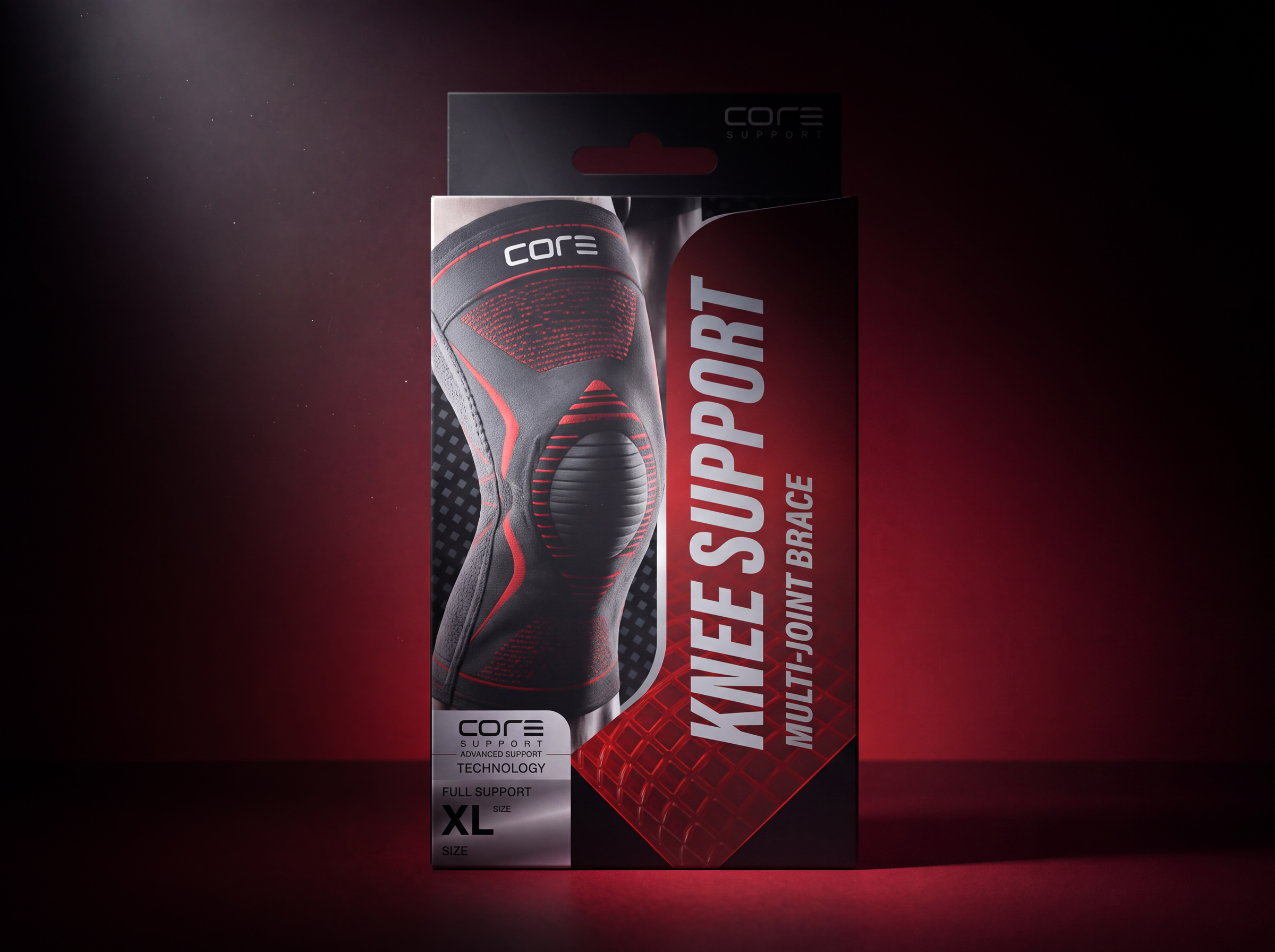
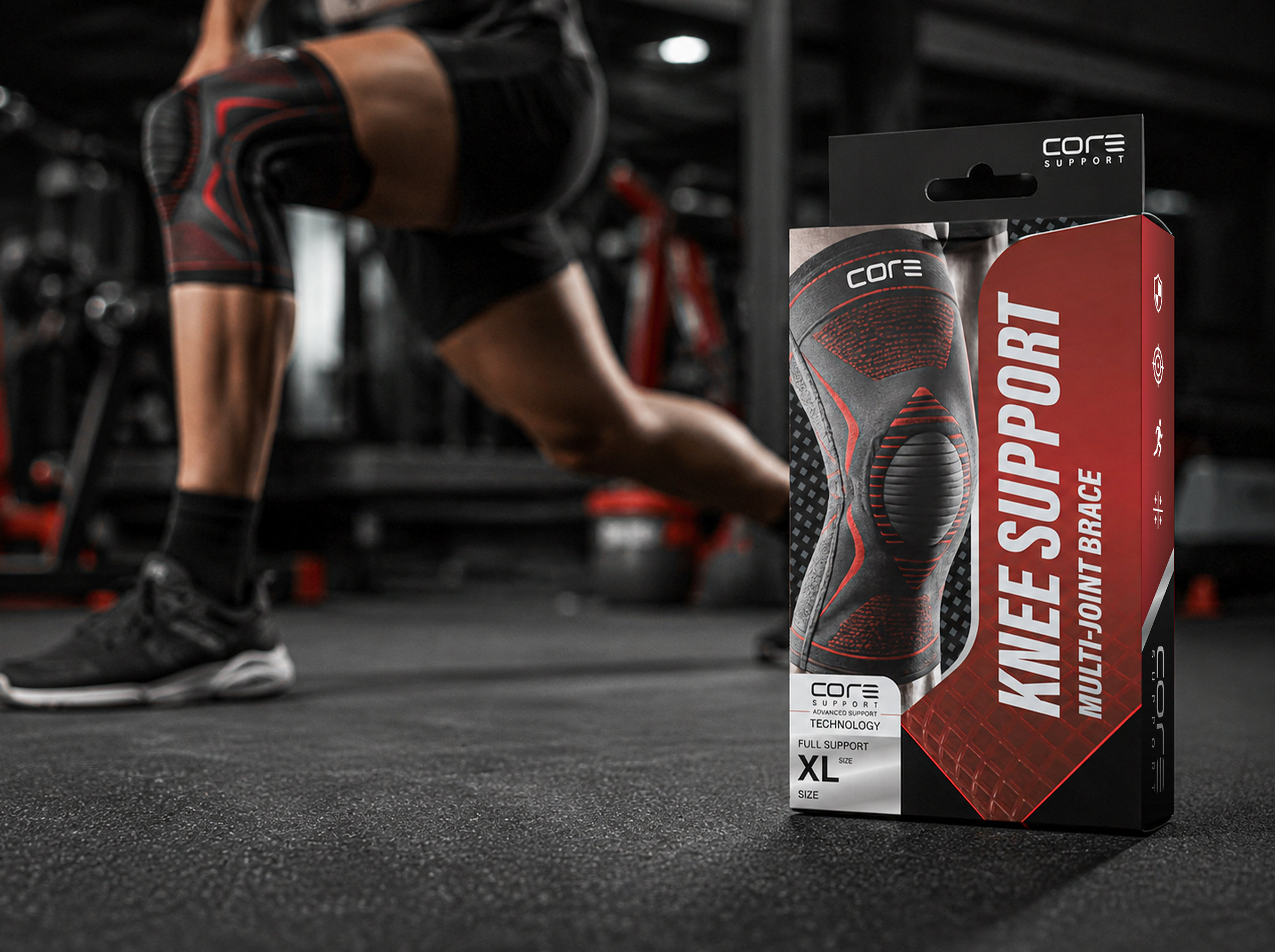
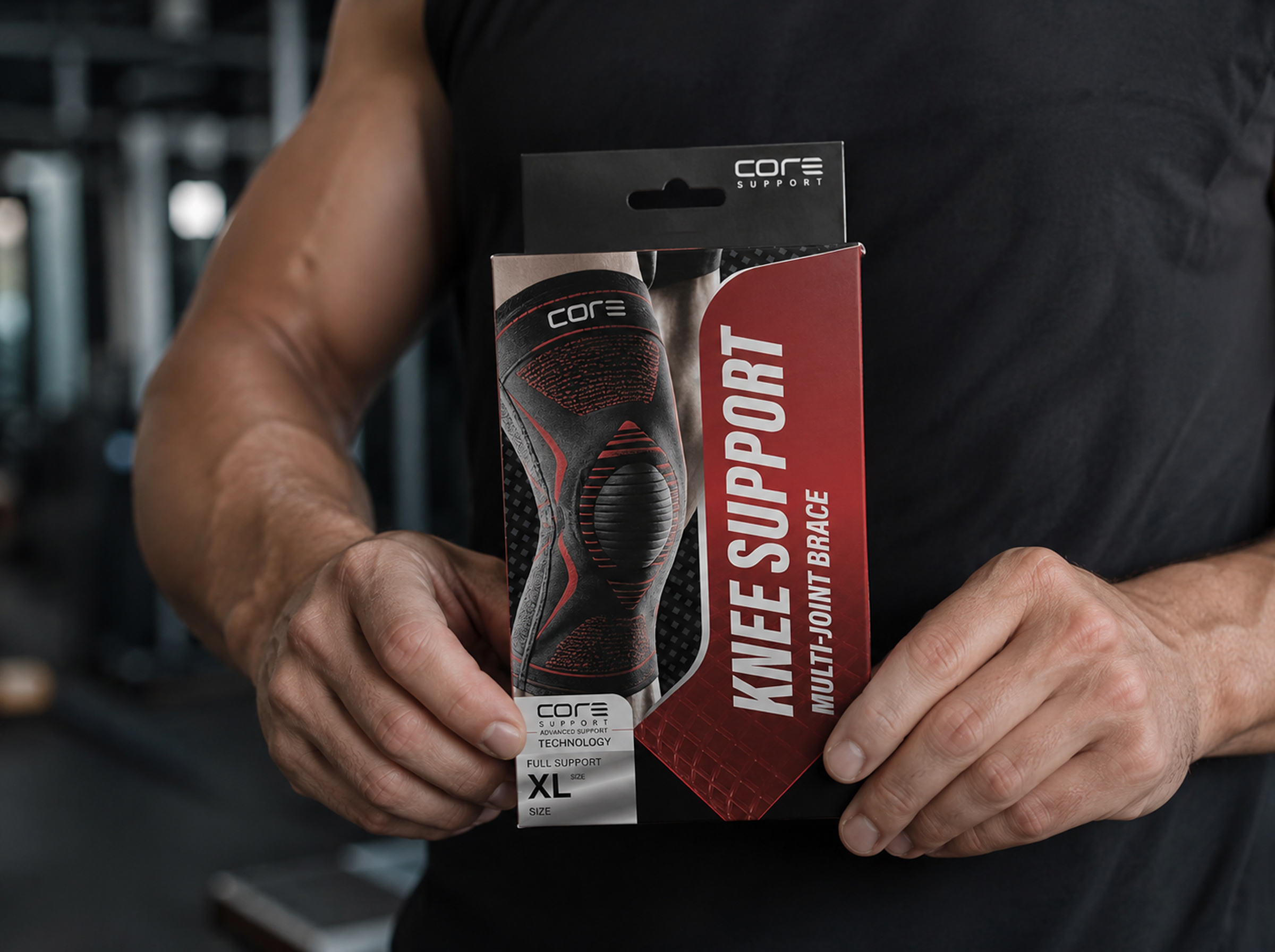
The CORE SUPPORT packaging concept was created to redefine the visual identity of sports support products through a premium, performance-driven approach. The objective was to design packaging that instantly communicates protection, durability, and confidence while standing out in a competitive retail environment. Inspired by modern athletic equipment and high-performance gear, the design combines bold typography, dynamic geometric graphics, and a powerful black-and-red color palette to create a strong shelf presence.
The front panel focuses on showcasing the knee brace as the hero element, allowing customers to immediately recognize the product while reinforcing its premium quality. Large vertical typography improves visibility from a distance, while diagonal shapes and textured backgrounds introduce movement and energy, reflecting the active lifestyle of the target audience. Every visual component was carefully positioned to establish a clear hierarchy and enhance readability without overwhelming the composition.
The side panels extend the visual identity by integrating technical icons and product highlights, maintaining consistency across every viewing angle. The back panel presents essential information, including product features, benefits, sizing instructions, usage recommendations, and compliance symbols within a clean, structured layout. The result is a packaging system that balances aesthetics with functionality, creating a professional retail experience while strengthening brand recognition. This concept demonstrates how thoughtful packaging design can elevate an everyday sports accessory into a premium product through strategic branding, typography, color, and information architecture.
 NEV
NEV Stefano Bracci
 Alina
Alina monther al omari
 Lizakjx
 JOAOMARCOSDESIGN
 alchimistestudioParis
 Harriet Neild
 octavio rojo
 宏洛图品牌设计HONGLT
 DESIGN CONCEPTS
 Alexander Skurihin
 Studio K95
 ARMBRAND
 Richa Rai
 houseoferas by Miti
 Agence des Coteaux
 Kushi Eaknath
 Ann Treasa
 Xiao Ning
 krrrrrllii
 babyage
 Deep
Deep