

Betonite – Packaging design concept work at Budapest Metropolitan University’s graphic design course
The assignment:
During my last semester at Budapest Metropolitan University, the task at this packaging design class was to choose a perfume brand that already exists and design perfume packaging for it that fits the brand’s aesthetics and is inspired by a certain artistic style or art history era.
The concept:
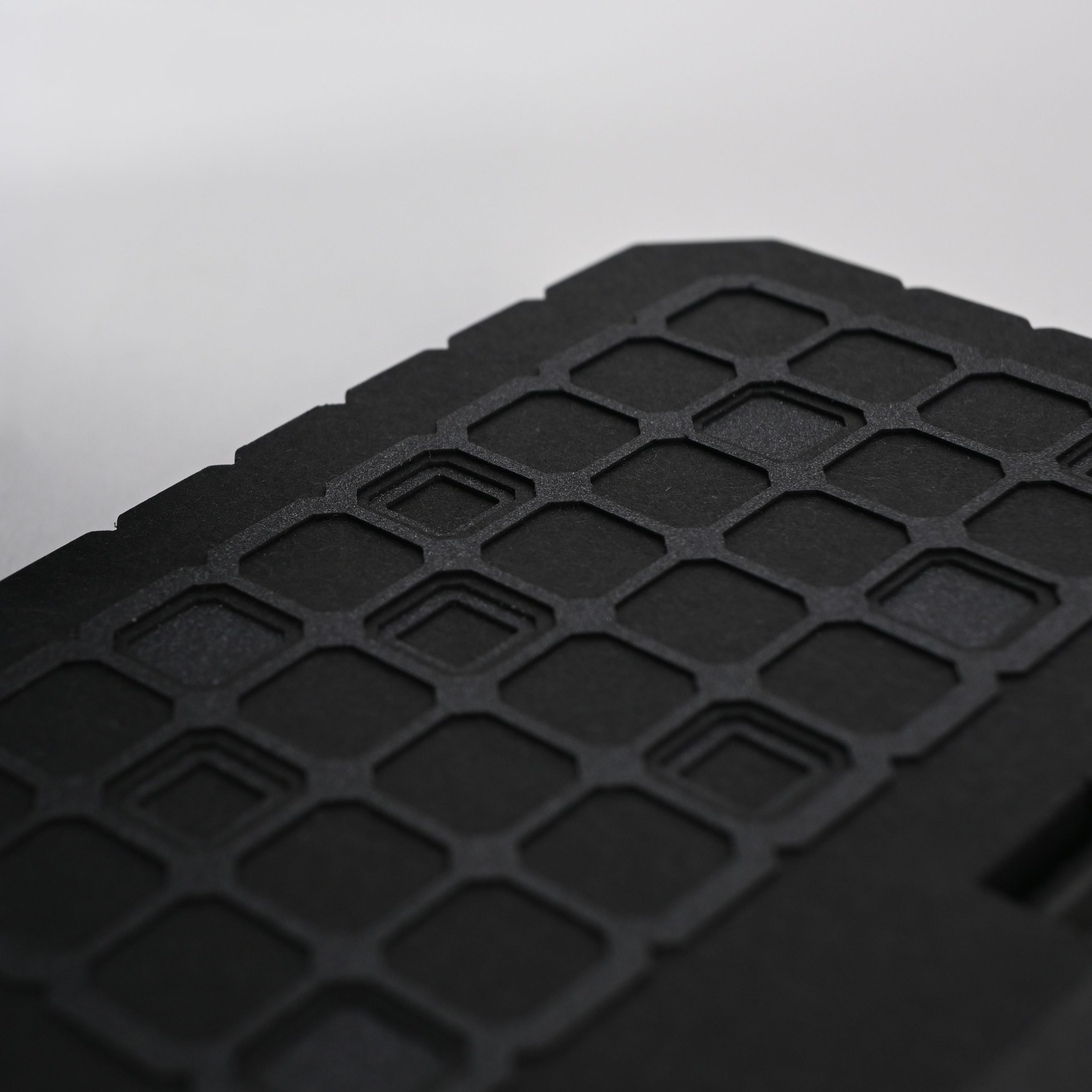
The brand I’ve chosen was Comme des Garçons Parfums, as their minimalistic, typography heavy and unique bottle shapes have caught my eye while researching for my project. Having a soft spot for geometric shapes, large contrast and strong lines, I chose brutalism as my style – which very much falls in line with Comme des Garçons Parfums’ visuals –, and within its category; brutalist architecture. One of the examples of this architectural style I’ve found fascinating is the so-called “Televizorke”, which are two buildings in Belgrade, Serbia that are named after their windows’ shapes, as it makes them appear as if they were plastered with television screens across their walls. I chose the shape of these windows to act as my base unit for my packaging design.
The name Betonite is a mixture of the Hungarian word “beton” meaning concrete and the suffix -ite, which is wordplay, turning the perfume name into sounding like it’s a naturally occuring material or mineral, as the -ite suffix oftentimes appears in such names. Unbeknownst to me, Comme des Garçons Parfums has already made a perfume named Concrete, but I’d like to imagine that great minds think alike – and this being a university project, it’s not a collision anyway.
The final results:
The final packaging design consisted of two mandatory elements: the packaging itself, and a leaflet that is capable of holding a 10ml sample vial of the fictional perfume. Albeit not part of the original assignment, I also created a design for the perfume bottle itself as well, so it would fit better with my package rather than repackaging an already existing glass bottle.
Technical specifics:
The package, the bottle and the sample vial were designed in McNeel Rhinoceros 8 and 3D printed out of PLA on a Bambu Lab P2S 3D printer. The paper labels and the leaflet were designed in Adobe Illustrator, and the latter were laser cut on a Trotec 300 laser cutting machine out of Curious Metallics paper in the shade Night and Pergraphica’s Infinite Black.
Credits:
Photography was done by Antal Ackerman – for which I’m eternally grateful.
The cover image used generative AI for the concrete block background, the packaging itself was however not AI generated.




 United Creatives Studio
 Kingdom & Sparrow
 Anastasia Bakhmatskaya
 CreativeWise
 Great and Golden
 Ximena Ureta Design Studio.
 Sorted Branding
 Lisa Sirbaugh Creative
 vitoramockup
 YQIAN
YQIAN Navegante
 Anastasia Cherepanova | xtramez
 Polaris Designs
 pavlyai
 Milena Kocharyan
 monther al omari
 Mohamed sherif midoo
 DESIGN CONCEPTS
 mmdesign
 markcreativestudio
 Rosario Lo Iacono