

Redesign of the isotonic range for a more contemporary and dynamic face of DrWitt.
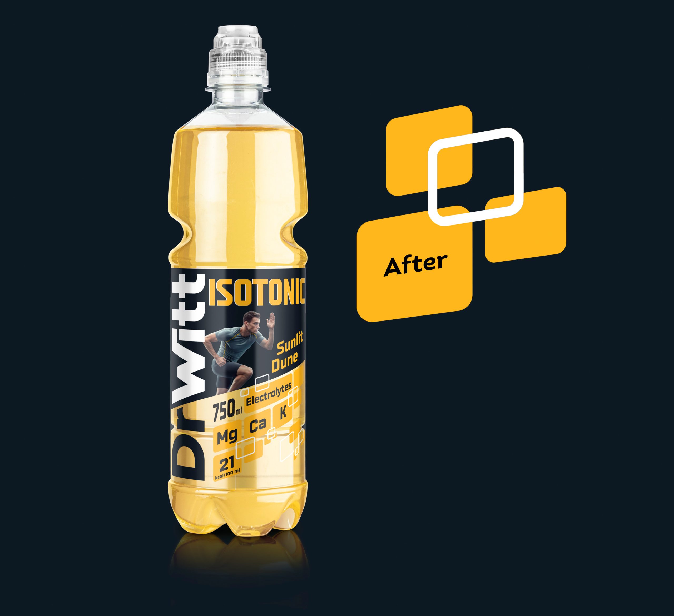
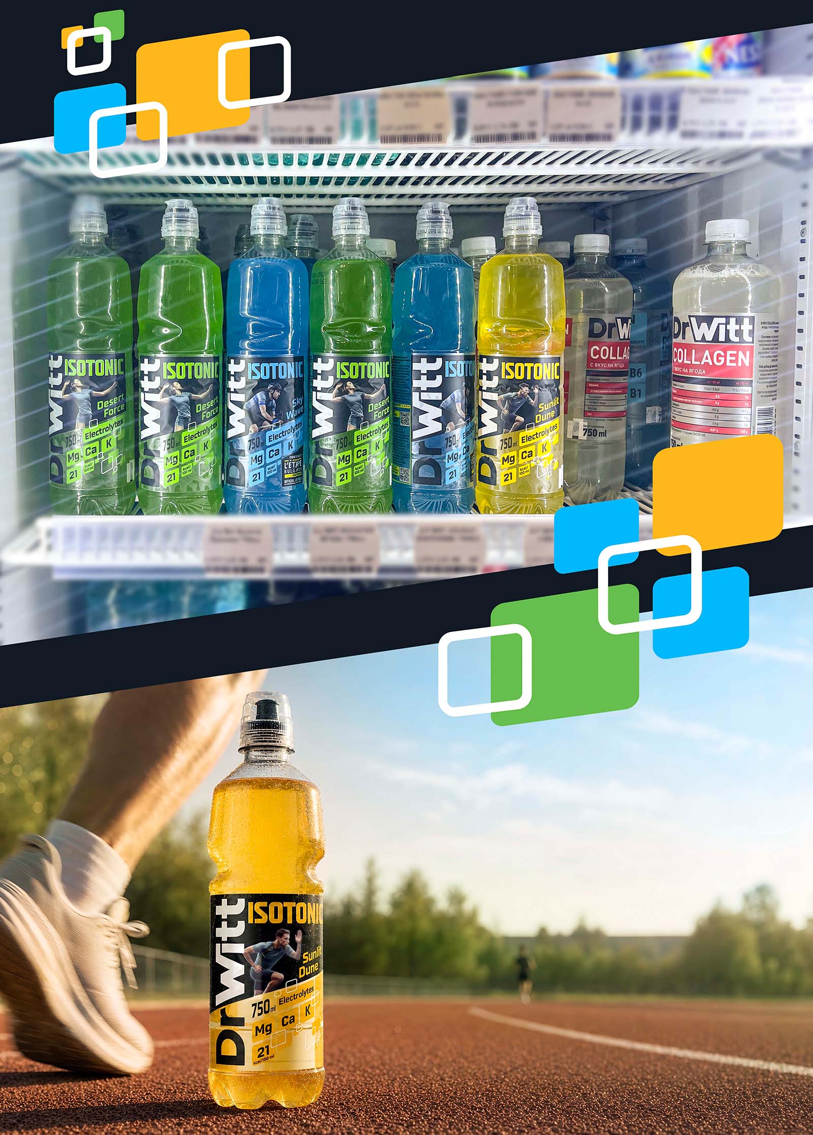
Modern World Studio developed the new visual system for DrWitt Isotonic — from the label design and differentiation of the three flavours to adaptations for special editions. The challenge was to give the isotonic range a distinct character without losing its connection to the established and recognisable DrWitt brand.
THE CHALLENGE
How do we establish Isotonic as a distinct range without separating it from DrWitt?DrWitt already has an established visual language and a recognisable presence. As the portfolio evolved, however, the isotonic drinks needed a clearer identity of their own. The challenge was to create a more contemporary and dynamic look that would stand apart from the rest of the DrWitt portfolio while maintaining a strong connection to the parent brand. The new bottle shape with a sports cap provided an additional opportunity to shape the new face of the range.
A FRESH TAKE
We maintained the connection to DrWitt, while changing the way the visual elements work together.
The composition gained more movement and contrast, while the graphic language was developed to give Isotonic a stronger presence as a distinct range. The new bottle shape with its sports cap complemented the direction, helping the packaging and graphic design speak the same visual language.
THREE FLAVOURS. ONE ACTIVE SYSTEM.
Sunlit Dune, Desert Force and Sky Flow each have their own character through colour, graphic elements and different sporting moments, while remaining united by a shared visual structure. The isotonic category is closely connected to movement, sport and an active lifestyle. We wanted this energy to be felt before the consumer even starts reading the label. The three sporting visuals bring movement and character to each flavour, while colour acts as a key navigation element, making the range easy to distinguish. The system was designed to evolve beyond the three existing flavours, with the flexibility to adapt to new products and special editions.
SPECIAL EDITION
From the start, the design needed to account for event communication where DrWitt appears as a sponsor. For L’ÉTAPE Bulgaria by Tour de France, we created a special label version that integrates the event identity without disrupting the core Isotonic structure. This allows the same visual system to work across the core range as well as special communication occasions.
THE RESULT
DrWitt Isotonic now has a distinct visual presence within the DrWitt portfolio — clear, cohesive and recognisable. We created a foundation that allows the range to evolve and expand with new products, flavours and communications.




 lunapanda
 Tridimage
 Analoguecreative
 lettera7
 alchimistestudioParis
 Lana B
 Colossal
 Pivot Studio
 M&A CREATIVE AGENCY
 monther al omari
 Anastasia Cherepanova | xtramez
 Hollóka Grafikai Műhely / Graphic Design Studio
 BOLD branding
 Antonia Skaraki
 Pâmella Lorrany
 Z9BKAdsgn
 Francesco Paternoster
 b1studio.ro
 Chris Creative Works
 Boordon
 Dmitriy Kuzovlev
 Brand Society
 yasharpic