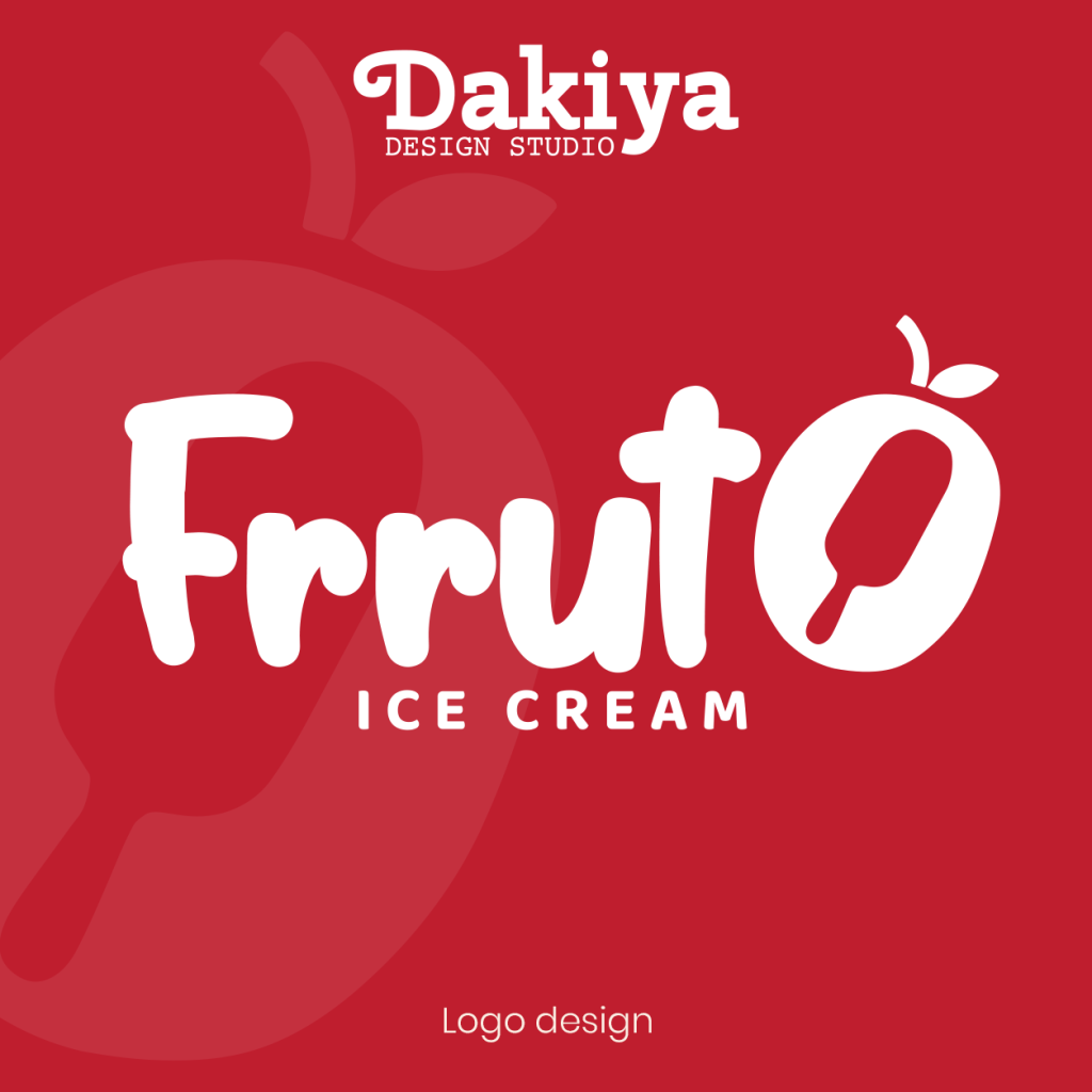

A logo that looks simple, but has a little story hiding inside.
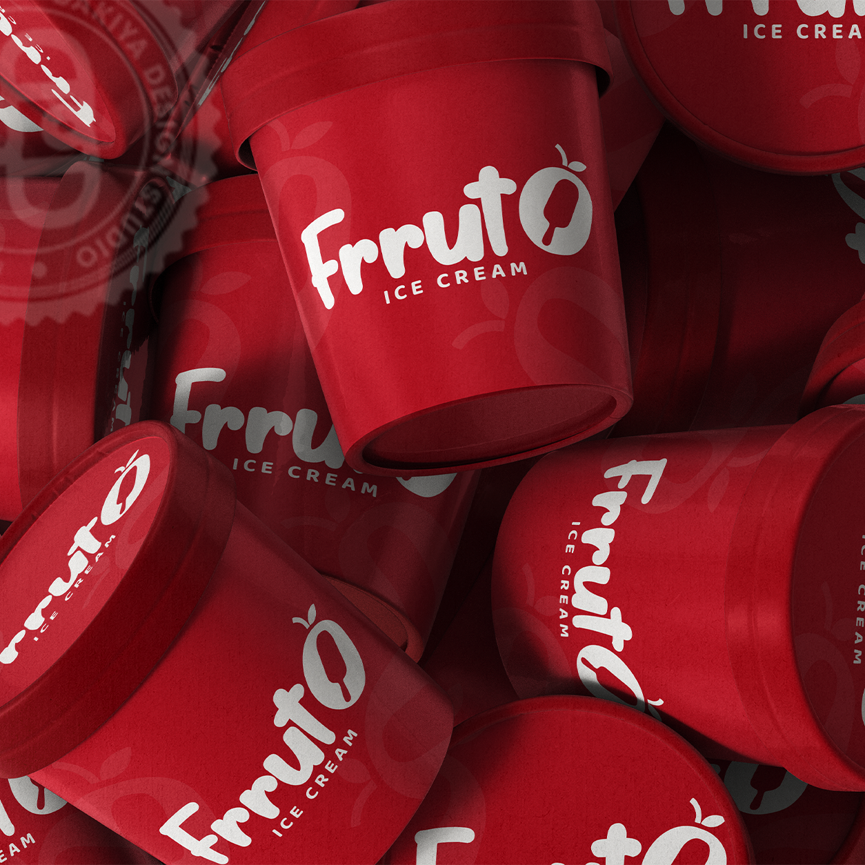
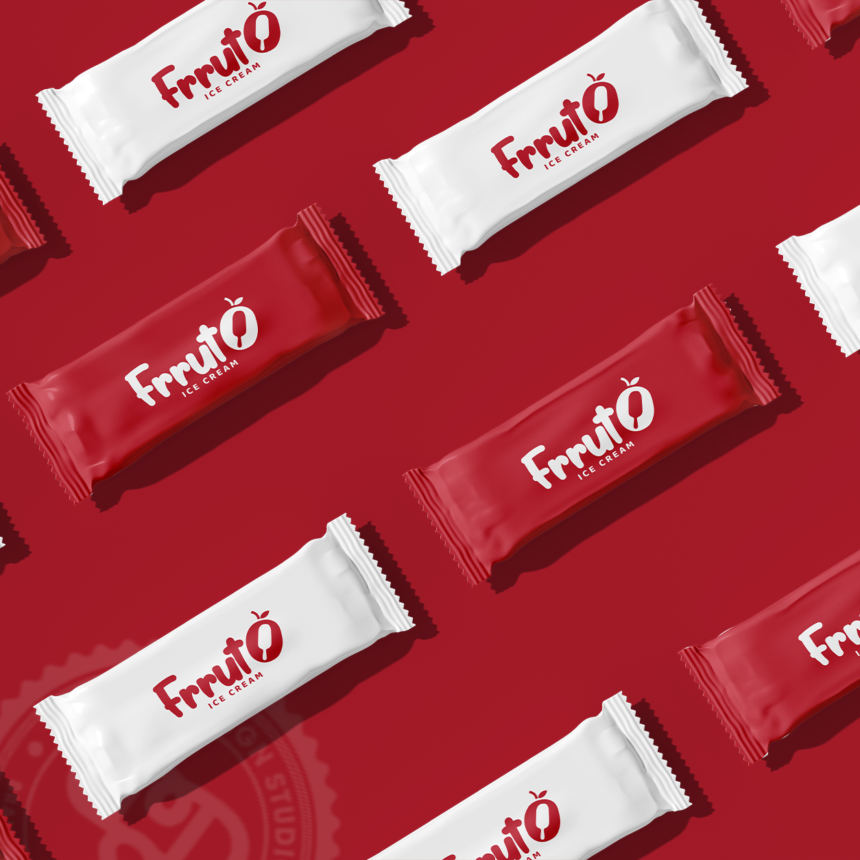
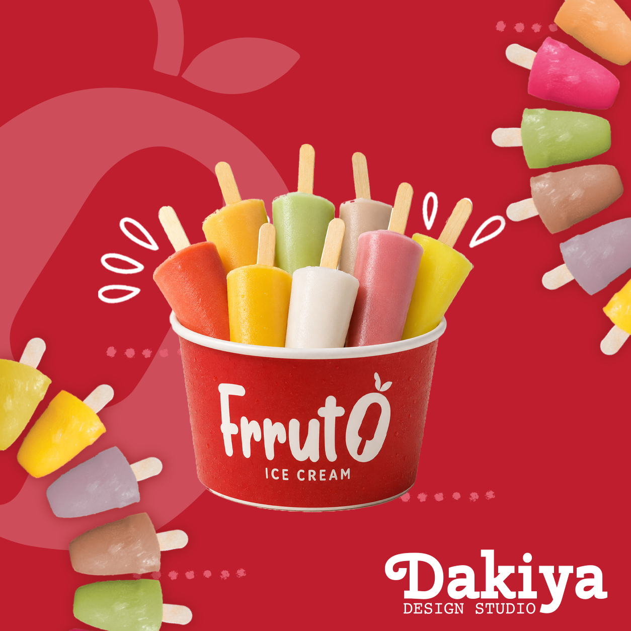
For Frruto, we wanted the identity to feel just as smooth, playful and natural as the ice cream itself.
The rounded, soft lettering takes inspiration from that creamy ice-cream texture. The “O” is shaped like a fruit, while the little leaf adds to the natural, fresh feel. And if you look a little closer, there’s an ice cream stick hidden in the negative space—a small detail that ties the whole idea together.
Because sometimes the best logos don’t need to say everything at first glance. They just need to make you look twice.
Logo design by Dakiya Design Studio
Branding • Logo Design • Packaging Design • Advertising
#DakiyaDesignStudio #LogoDesign #BrandIdentity #PackagingDesign #Frruto #IceCreamBrand #DesignStory #Branding #LogoConcept #CreativeDesign


 agarcia studio
 Wynand88
 Eva Chistyakova
 Maria Bukhtilova
 estudiomarciano
 monther al omari
 Thirst
 Maruf Nishat
 Gray Matter Studio
 Julia Jay
 Modern Theory
 Furt Goods
 Fluid
Fluid alchimistestudioParis
 Ancora
 Mostafa Abdelmawla
 MewKittyDraw
 Studio Shala
 43oz
43oz Lucid mk2
 Atiq Alam
 IDEOLOGO
 Open Strategy & Design