
Background
Viola is a Russian producer of high-quality dairy products. The company has inherited the centuries-old experience of northern cheesemakers and embodied it in a wide range of semi-hard cheeses: Tilsit, Gouda, Maasdam, Rossiysky, Flemish, and others.
Challenge
As the product range expanded, the company decided to enhance the line’s visibility and cohesion on the shelf among competitors by integrating the different SKUs into a single visual identity. Furthermore, Viola set the goal of making the logo more prominent and the design more modern.
Solution
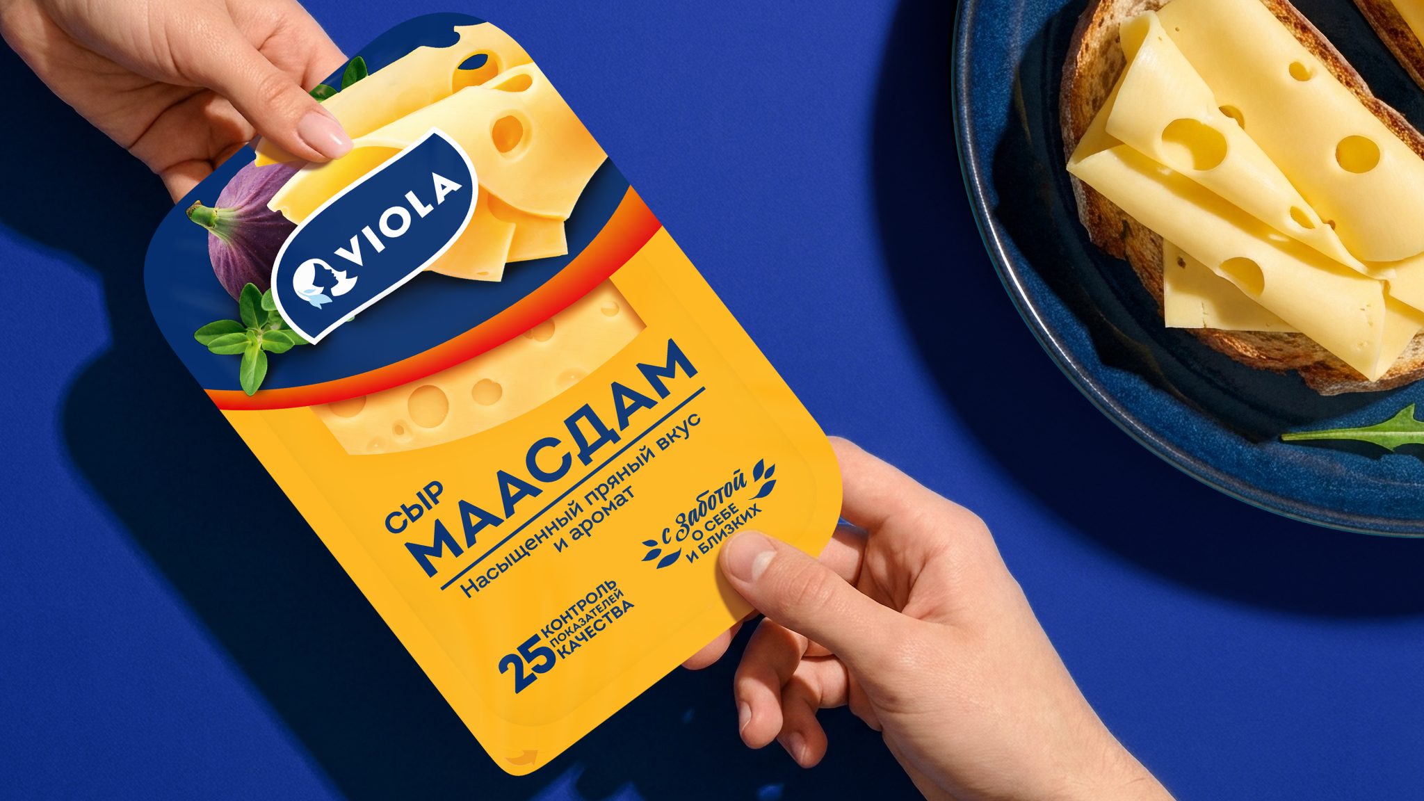
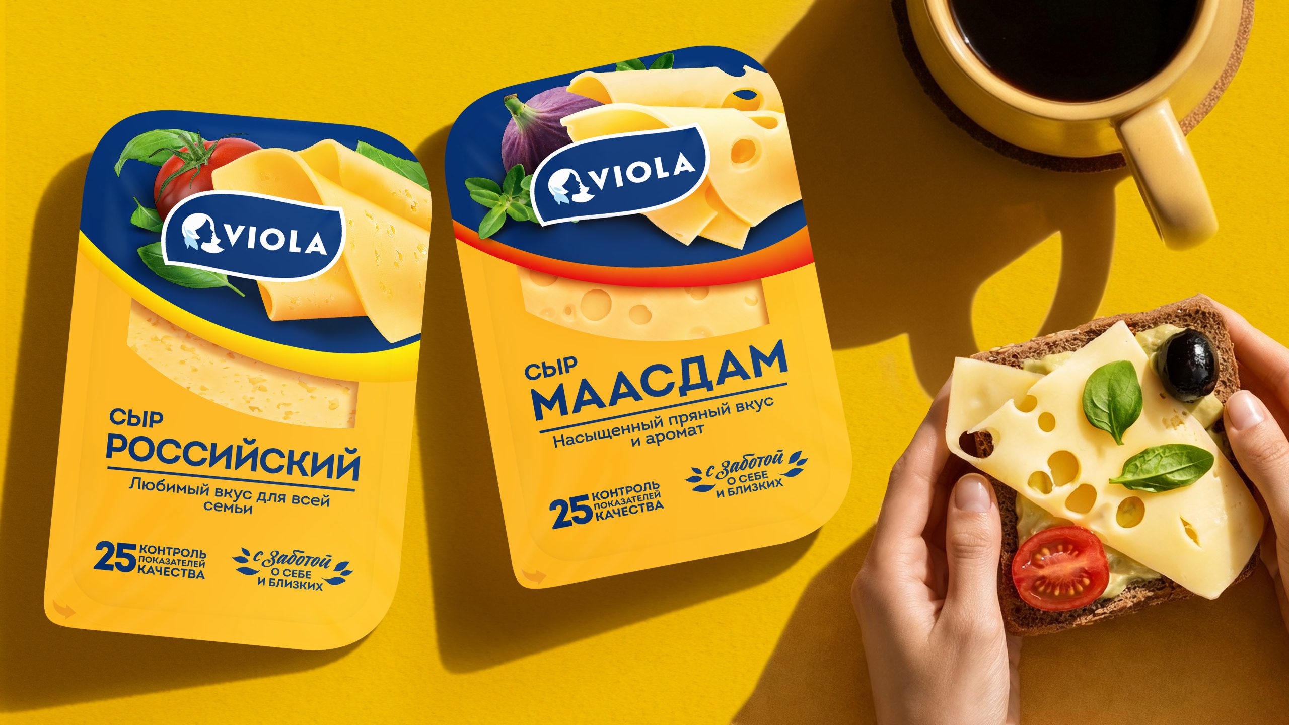
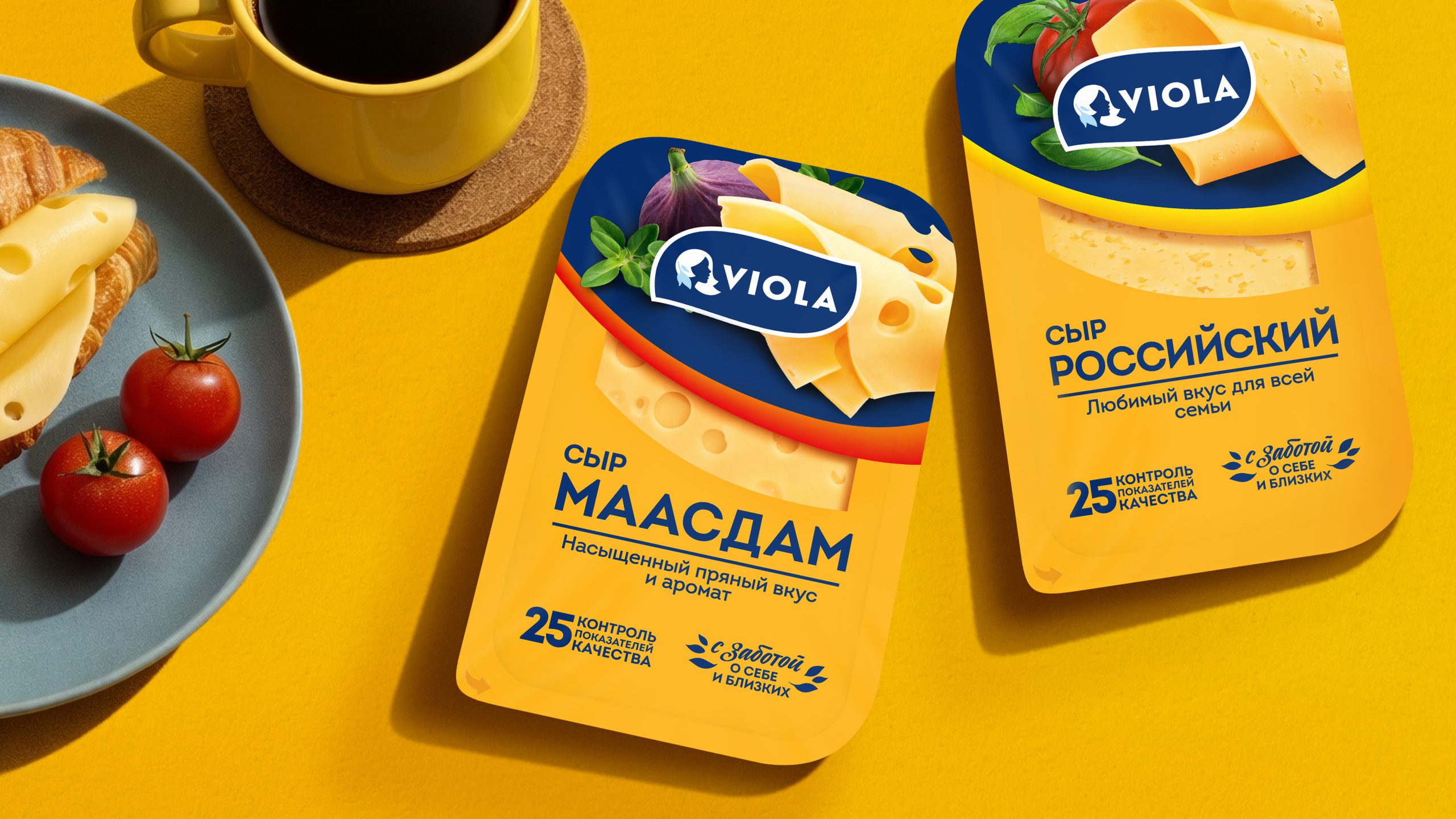
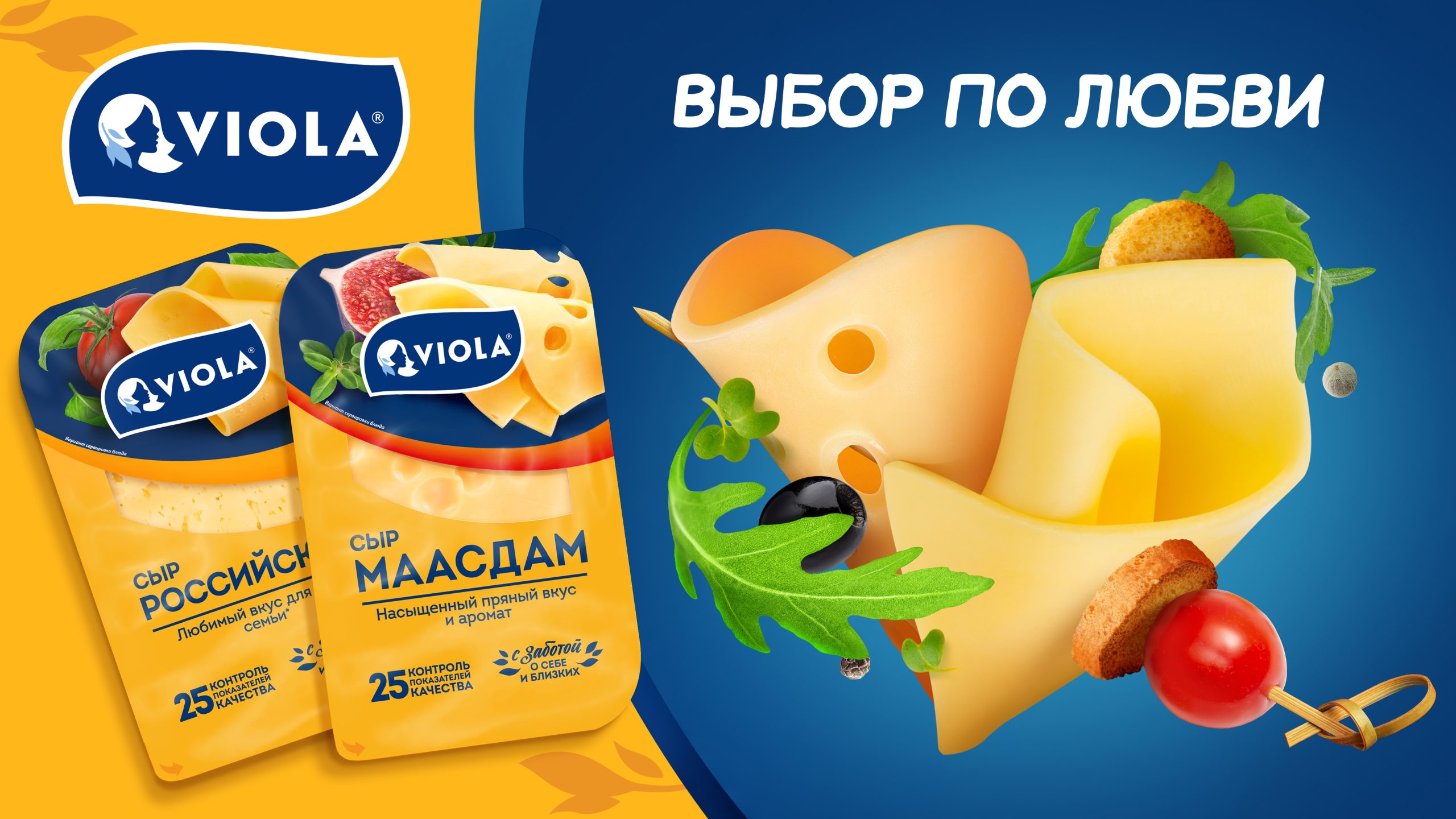
The VIEWPOINT team consolidated the line into a single visual unit so that the packaging would collectively enhance the brand’s shelf presence.
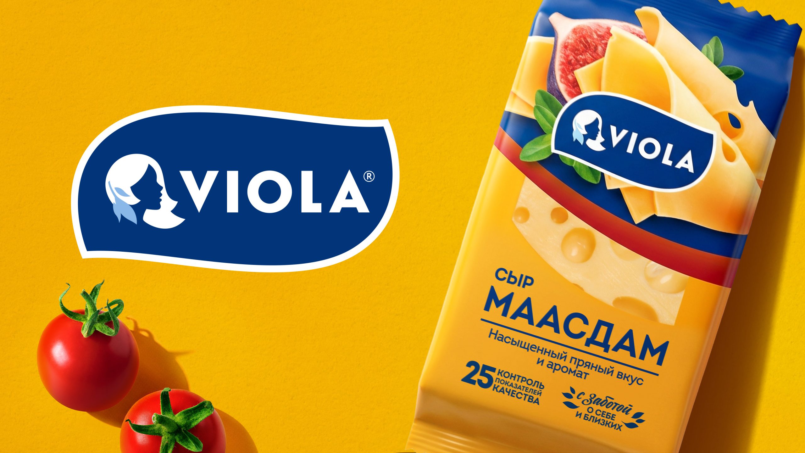
The basis was Viola’s signature blue and rich cheese yellow. A smooth blue arc, reminiscent of a serving plate, creates the line’s signature composition. At the top, we placed an appetizing food zone beneath the logo—an unusual move for this category that helps it stand out from the traditional designs of competitors.
The transparent window in the center remains, allowing the product to be seen, and next to it, a clear information structure with a large variety name. The SKUs are differentiated by colored arcs, the food zone, the cheese itself in the window, and the large name.
The result of close collaboration between the Viola team and the VIEWPOINT agency, a high-quality project brief, and a combination of industry expertise and creative solutions, is the new packaging for Viola cheeses—stylish, eye-catching on the shelf, and conveying the premium and natural qualities of the product.
 Natasha Spitsyna
 babyage
 GruppoSaida
 ahmedraoudgfx
 Hi estudio
 Nadezhda Gorelikova
 Studio Garces
 Brandsbylufo
 Rewot
Rewot alchimistestudioParis
 Asprey Creative
 kat bres
 Valérie Colace
 Atiq Alam
 Sara Communications
 David Hakobyan
 monther al omari
 Innovāt - Empowering Creative Innovation
 mmdesign
 Amjad Battal
 Hollóka Grafikai Műhely / Graphic Design Studio
 Palashcc
 ABC Design Communication
 ChrisSkarlatos
 Hedayat Hadavi
 Tia Nguyen