

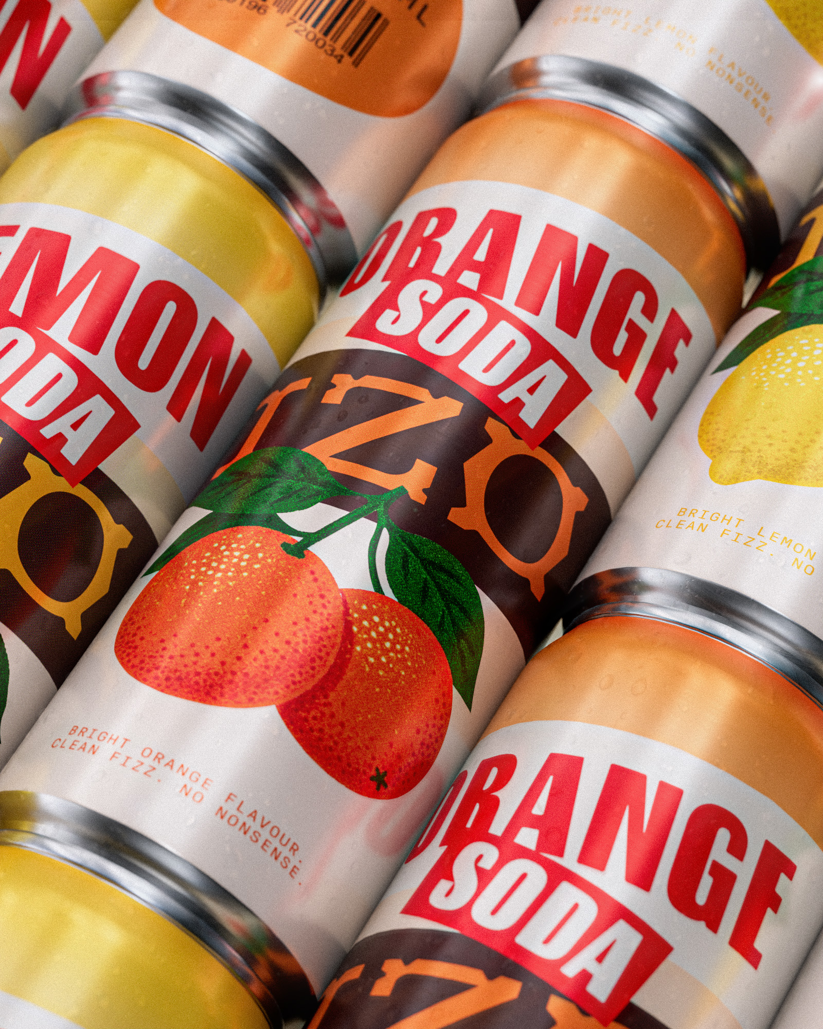
IZO Soda is packaging project inspired by mid-century beverage posters and classic citrus crate labels. The goal was to create a bold, instantly recognizable can that relies on typography, color, and composition rather than illustration overload or modern visual noise.
The brand takes inspiration from a time when beverage advertising promised color, optimism, and uncomplicated pleasure—then reinterprets that spirit for a new generation.
The challenge was to find a place between nostalgic craft sodas and the hyperactive language of modern soft drinks. IZO needed to feel energetic without becoming childish, familiar without looking old-fashioned, and distinctive without relying on complicated storytelling. Its short, punchy name became the foundation of a personality that is direct, cheerful, and difficult to ignore.



 Lisa Pokrovskaya
 Simple Studio
 Studio Unbound
 David Byerlee
 M&A CREATIVE AGENCY
 alchimistestudioParis
 monther al omari
 Studio Be Design
 LogoSayLove
 agenciabud
 Shustova p
 mutta
mutta @Allenarts13
 Sirka Agency
 Atiq Alam
 Dozen Agency
 j.substance
 SCD
SCD Cristian Lepore | crilep Copia
 Chris Creative Works