

Keith’s Cacao is 100% pure ceremonial-grade cacao, handcrafted in Guatemala for over 20 years. With a long-standing community and a brand full of character, the challenge was not to reinvent Keith’s, but to evolve it while preserving what had made it recognizable over time.
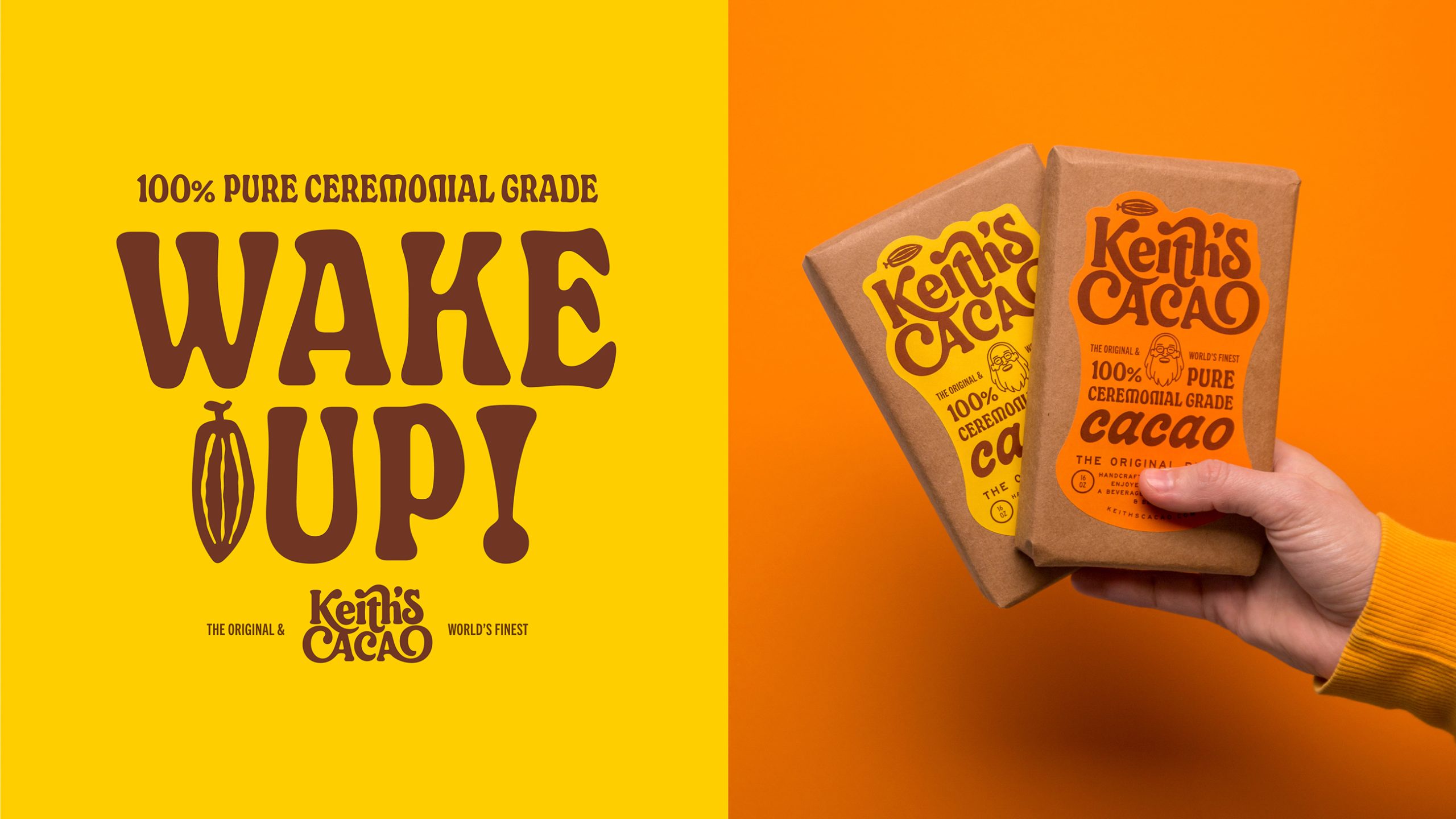
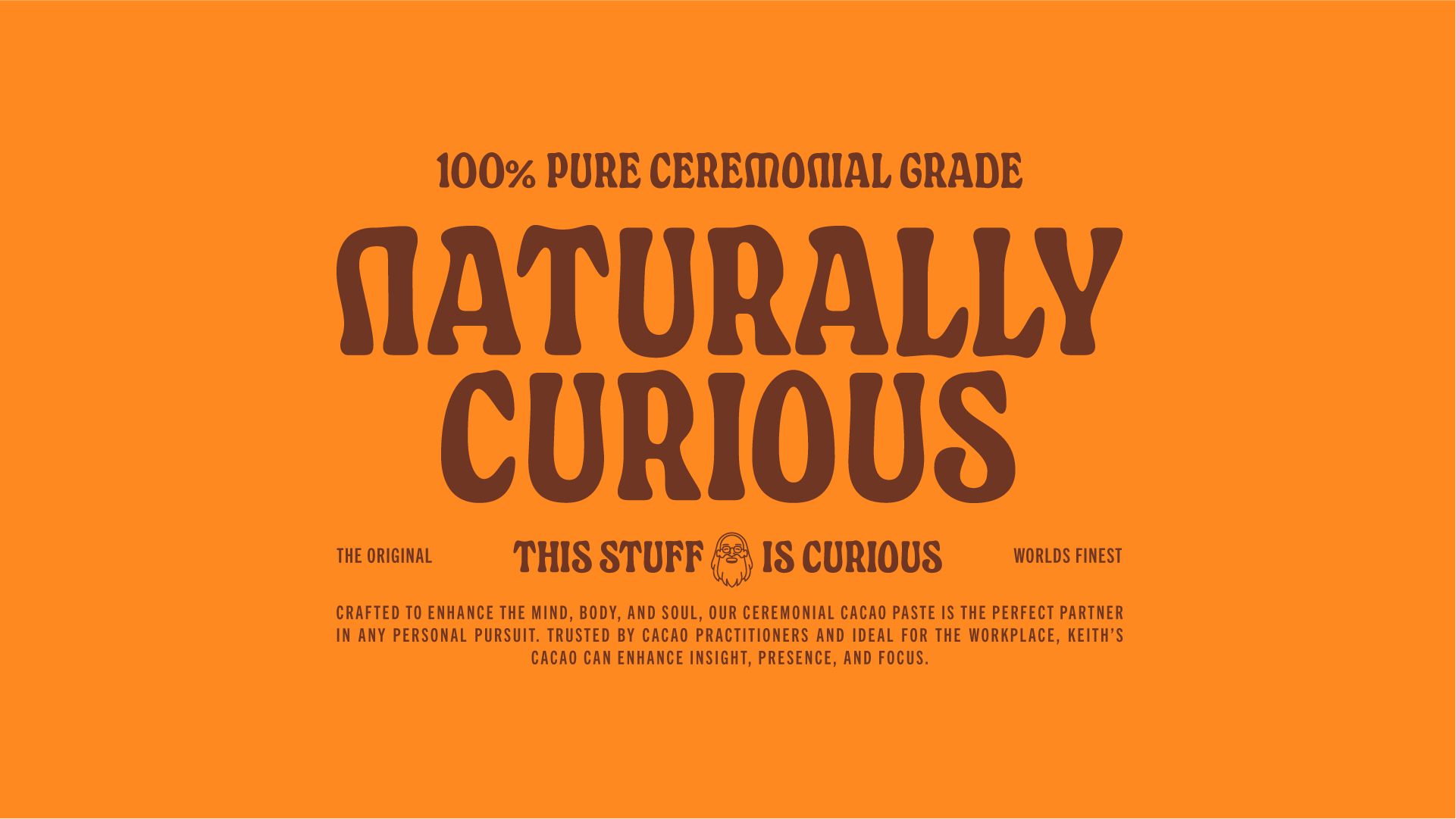
The packaging became a central part of this evolution. We developed a bold typographic identity inspired by Keith himself and the unconventional spirit of the brand, combining custom lettering, illustration and a warm, expressive color palette. The new label brings these elements together in a distinctive shape that gives the packaging a strong presence while keeping the natural kraft material of the original product visible.
Rather than creating a polished or overly premium expression of ceremonial cacao, the goal was to preserve the handmade, approachable character of Keith’s while giving the brand a clearer and more consistent visual system. The result is packaging that feels new but familiar — unmistakably Keith’s — and a system that can extend consistently across the wider brand and digital experience.






 krrrrrllii
 babyage
 Deep
Deep monther al omari
 Atiq Alam
 TUERCA Studio
 neo creative studio
 Pinot Agency
 Pixels Studio
 Anastasia Cherepanova | xtramez
 awaiskhadim
 Studio Be Design
 Belova Oksana
 We Craft Studio
 ArtDesignByDIna
 Ananya Taran
 Nadezhda Gorelikova
 orhanirmaktasarim
 WillBe
 Hi estudio
 43oz
43oz Rosario Lo Iacono
 alchimistestudioParis