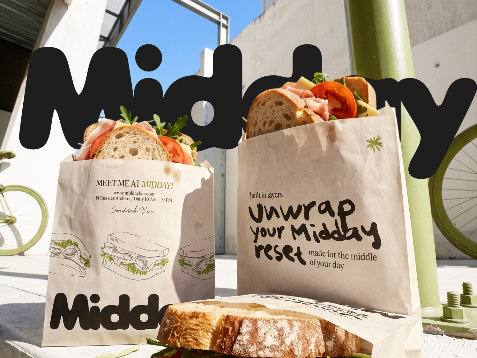

MIDDAY — Sandwich Bar Branding & Food Packaging Design
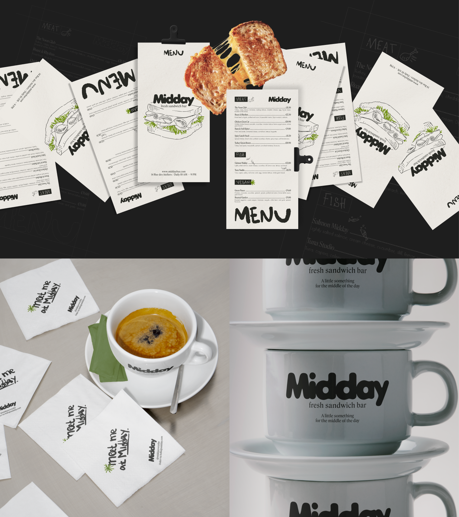
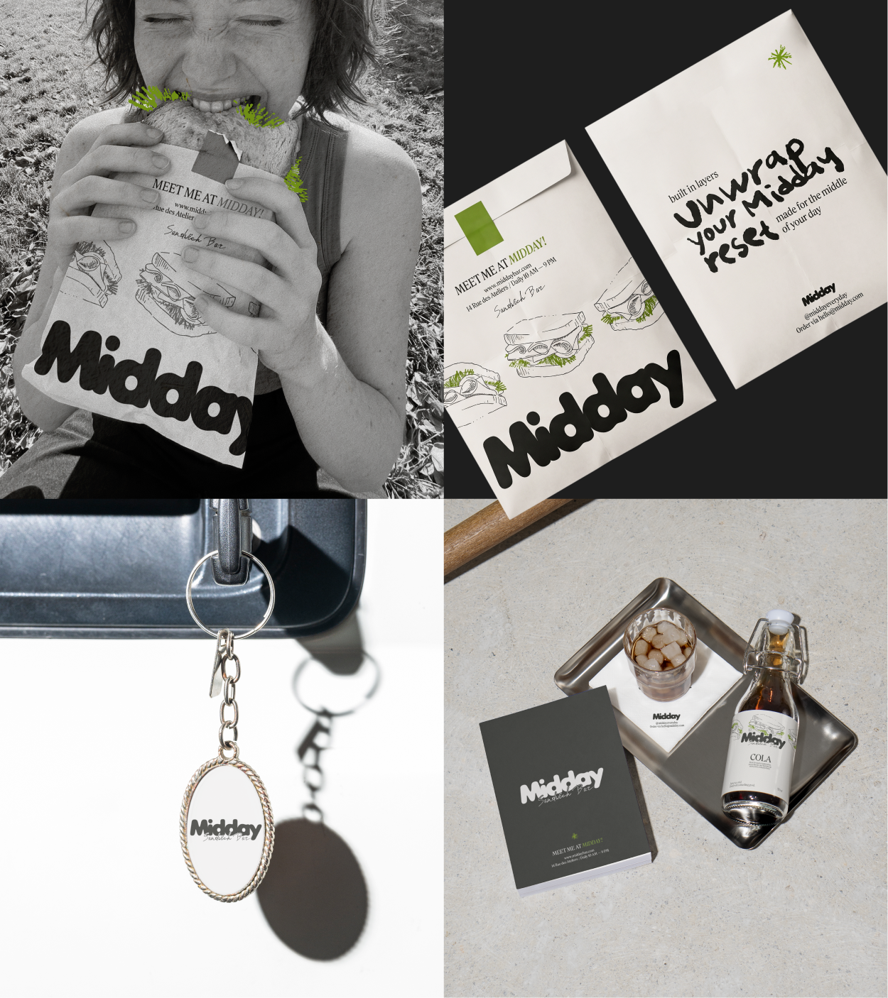
Midday is a contemporary sandwich bar with a bold, tactile identity built around freshness, layering, and a handmade approach. A chunky wordmark, sketch-style illustrations, handwritten typography, and a contrasting green, black, and white palette create a lively visual language that works equally well across packaging, interior spaces, and smaller brand touchpoints.
Challenge
The fast-casual category tends to fall into one of two extremes: it either feels overly functional and impersonal, or relies on an already familiar minimalist language — lots of sterile space, neutral colors, and predictable messaging around freshness.
For Midday, it was important to build a different kind of character. The brand needed to feel naturally at home in the rhythm of a busy lunch crowd, while still retaining the freshness and warmth of something made by hand.
Objective [The Big Idea — Midday Reset]
To create a distinctive visual system that makes Midday⚹ part of an everyday urban ritual — a place people want to return to again and again.
The visual language needed to communicate four core qualities at once: fresh, modern, clean, and crafted, without relying on the familiar visual codes of the healthy-food category.
Solution
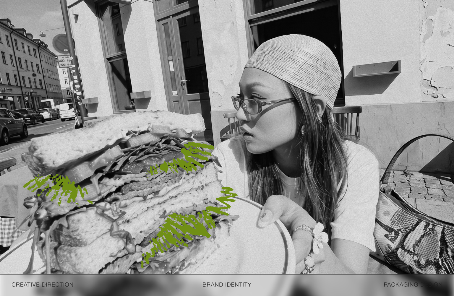
/sketch illustration/ Loose, sketch-like illustrations bring energy and a sense of imperfection into the system. They reference the process of making the food itself — fresh, handmade, and slightly messy — while helping Midday move away from the polished, sterile aesthetic typical of healthy-food brands /handwritten text/ Handwritten phrases create a more immediate and personal tone of voice, contrasting with the bold primary typography. This makes Midday feel less like an anonymous chain and more like a lively place with a distinct human character /green, black & white/ A limited color palette keeps the identity simple, graphic, and instantly recognizable. Bright green becomes the brand’s key freshness cue, while black and white bring structure, contrast, and visual clarity to the system /tactile details/ Embossing takes the identity beyond the purely visual and turns it into a physical experience. Raised logos and graphic elements reinforce the sense of craft and attention to detail — qualities Midday wants people to associate with the food itself.
Result
As a result, Midday⚹ gained a distinctive identity that works confidently across every touchpoint — from the storefront and menu to packaging and branded materials. It communicates the character of the place at a glance: fresh food, attention to detail, and a relaxed, informal atmosphere.
For the business, it creates a cohesive and flexible system that makes the brand stand out, stay memorable, and remain recognizable even beyond the physical space.





 Hi estudio
 43oz
43oz monther al omari
 Rosario Lo Iacono
 alchimistestudioParis
 Ebbi
Ebbi Maruf Nishat
 Mind Brand
 宏洛图品牌设计HONGLT
 Iyioluwanbelarami
 sahildoesartt
 Denis Ulianov
 Garry Veda
 arutza
 Lucid mk2
 MaheswariMadhu
 sanjnasnair
 POSH FMCG BRANDING
 Modern Theory
 Shubhashish Roy
 Affogato Brand Design
 Backbar Studios
 hello ocean
 Luciana
 Valérie Colace