

Rocco’s — Italian Gelateria Brand Identity & Packaging Design
A small gelateria built on family recipes, familiar faces and the simple pleasure of coming back.
Challenge
The main challenge was to preserve the feeling of an Italian brand with history without turning it into a nostalgic imitation of the past. Rocco’s needed to feel authentic, artisanal, and warmly nostalgic, while still remaining relevant today. The visual language therefore had to find a balance between heritage and contemporary design — keeping the character of a traditional Italian gelateria while moving away from obvious retro clichés.
Solution
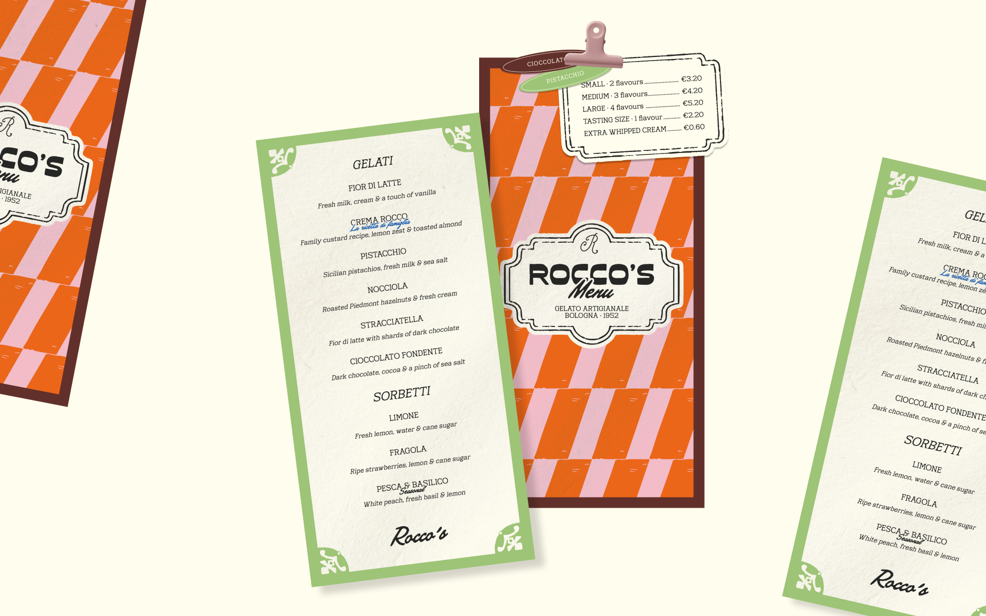
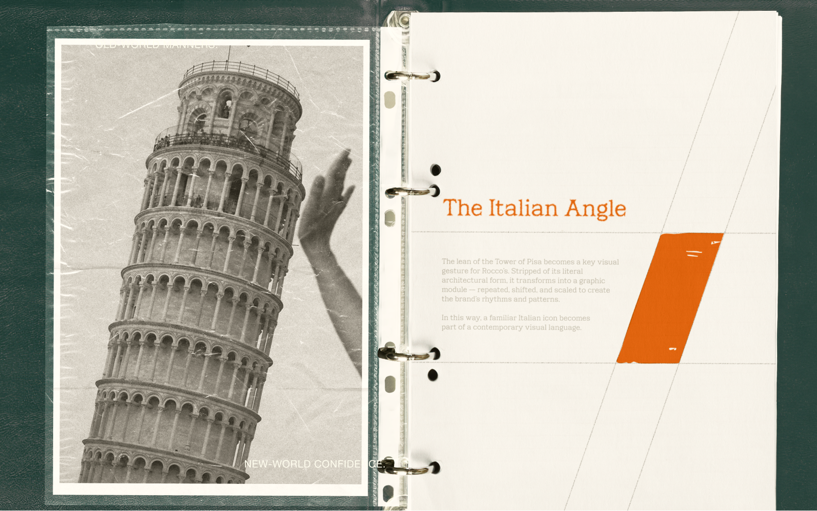
The visual system is built around a contemporary reinterpretation of Italian forms and graphic codes. One of the main sources of inspiration was the Tower of Pisa. Rather than illustrating it directly, its iconic lean was translated into a structural principle: diagonal shifts, tilted modules, and repeating geometry became the foundation of Rocco’s signature patterns and compositions. In this way, a familiar Italian landmark was transformed into an abstract graphic language.
A contrasting color palette, the decorative logo frame, and more heritage-inspired typographic details are combined with bold contemporary graphics and a flexible pattern system.
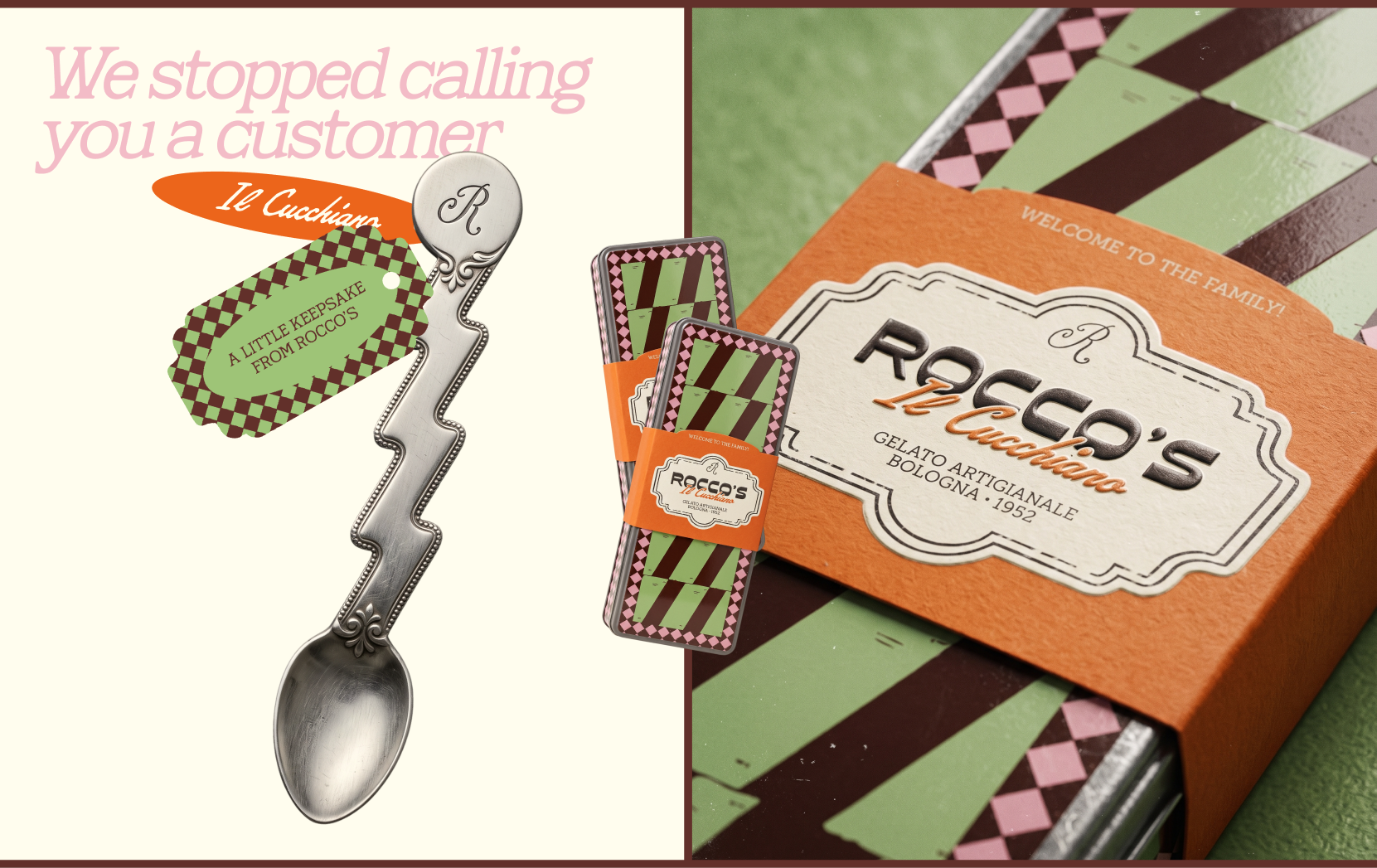
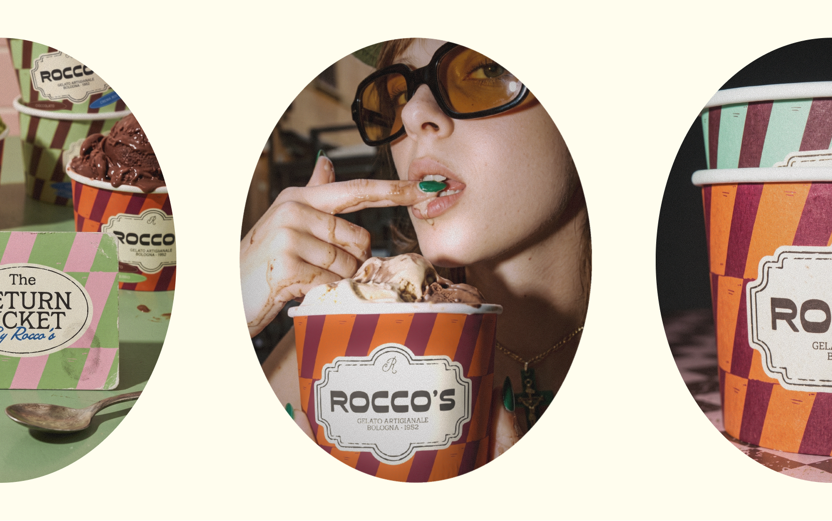
Another key part of the brand is The Return Ticket loyalty program. Nine returns lead to a complimentary tenth gelato and Il Cucchiaino — a personal metal spoon presented in a collectible tin case. This turns a familiar loyalty-card mechanic into a small ritual and a keepsake.
Result
I created a visual system where Italian heritage and contemporary graphic culture coexist on equal terms. Rocco’s is defined by color, tilted geometry, and distinctive patterns, with each touchpoint continuing the same story without simply repeating the previous one.
As a result, Rocco’s feels like a gelateria with a past that naturally belongs in the present.









 monther al omari
 Ximena Ureta Design Studio.
 vitoramockup
 Up-Brands
 Sophiagdotcom
 Peter said
 ayeidadezigns
 Tancybox
 宏洛图品牌设计HONGLT
 Modern Theory
 Dozen Agency
 Atiq Alam
 Olio Studio
 Ruchi S. Joshi
 mmdesign
 awaiskhadim
 Octasoft
 United Creatives Studio
 Kingdom & Sparrow
 Anastasia Bakhmatskaya
 CreativeWise
 Great and Golden