

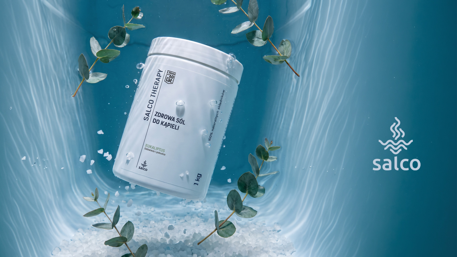
For Salco a company that extracts and sells medicinal salt, we designed a premium packaging line. The products were divided into categories and three different package sizes, and our task was to create a visually consistent product range.
The labels were designed to be minimalist, which led us to use a clean white background combined with dark grey graphics and typography. An additional colour was introduced only in the fragrance names, making it easier to distinguish between the different variants.
The labels were divided into three sections: the first presents the product series, type, name, and fragrance; the second contains information about the product’s properties, ingredients, and directions for use; and the third includes the company details.


 Affogato Brand Design
 Backbar Studios
 hello ocean
 POSH FMCG BRANDING
 Luciana
 Valérie Colace
 marjusguza
 Z9BKAdsgn
 Lilith Sivolenko
 Daria Levina
 Masha Kulichkova
 monther al omari
 Yana Chernova
 Atiq Alam
 ezgidesignstudio
 Pips Marin
 Antonia Skaraki
 Ezi Brand Design
 Kanishka Chhajer
 Zachary Kent
 SOT B&D
 Normal studio
 Garry Veda