

The KOFFO brand is positioned as a contemporary choice for cold-coffee enthusiasts. The range combines pure Arabica coffee—100% Arabica in every variety—with the convenience of aluminium cans designed for on-the-go consumption.
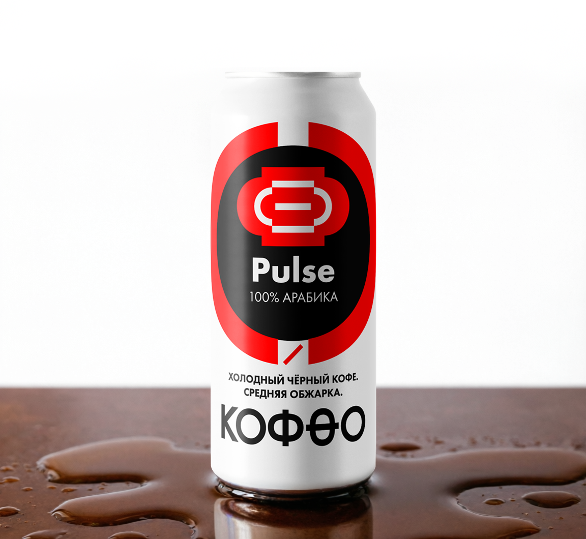
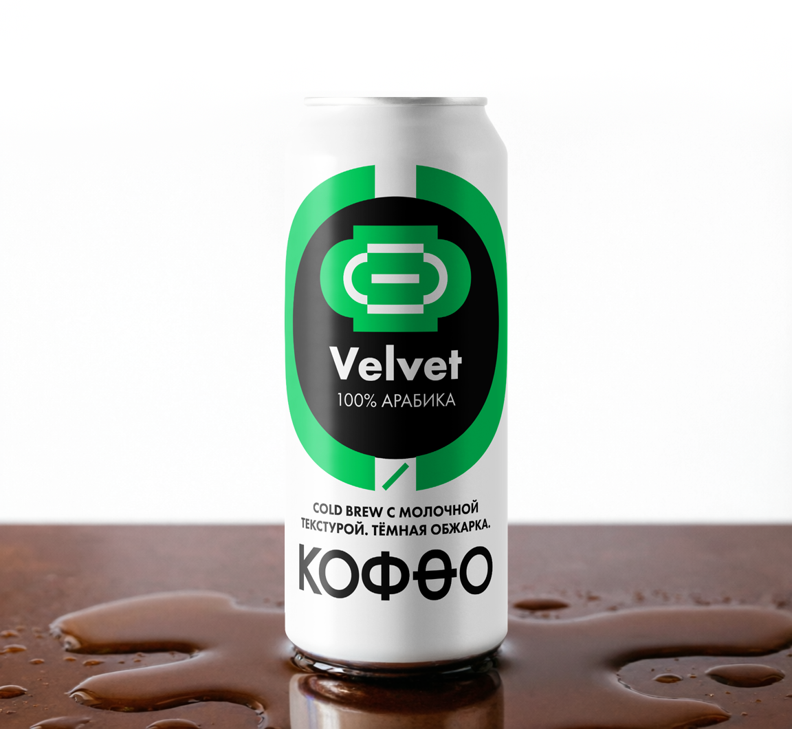
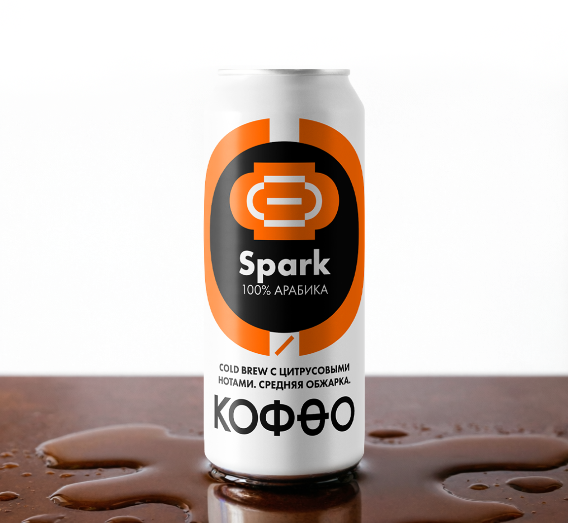
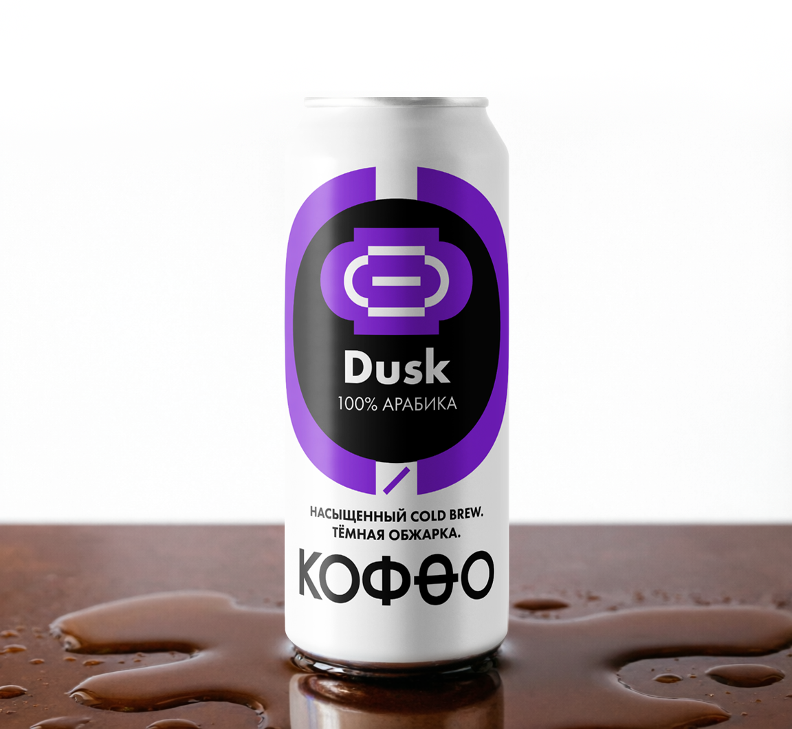
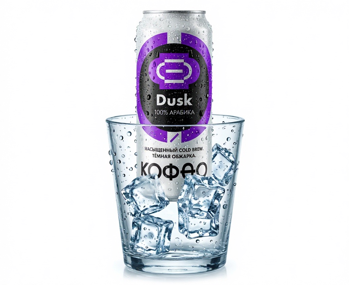
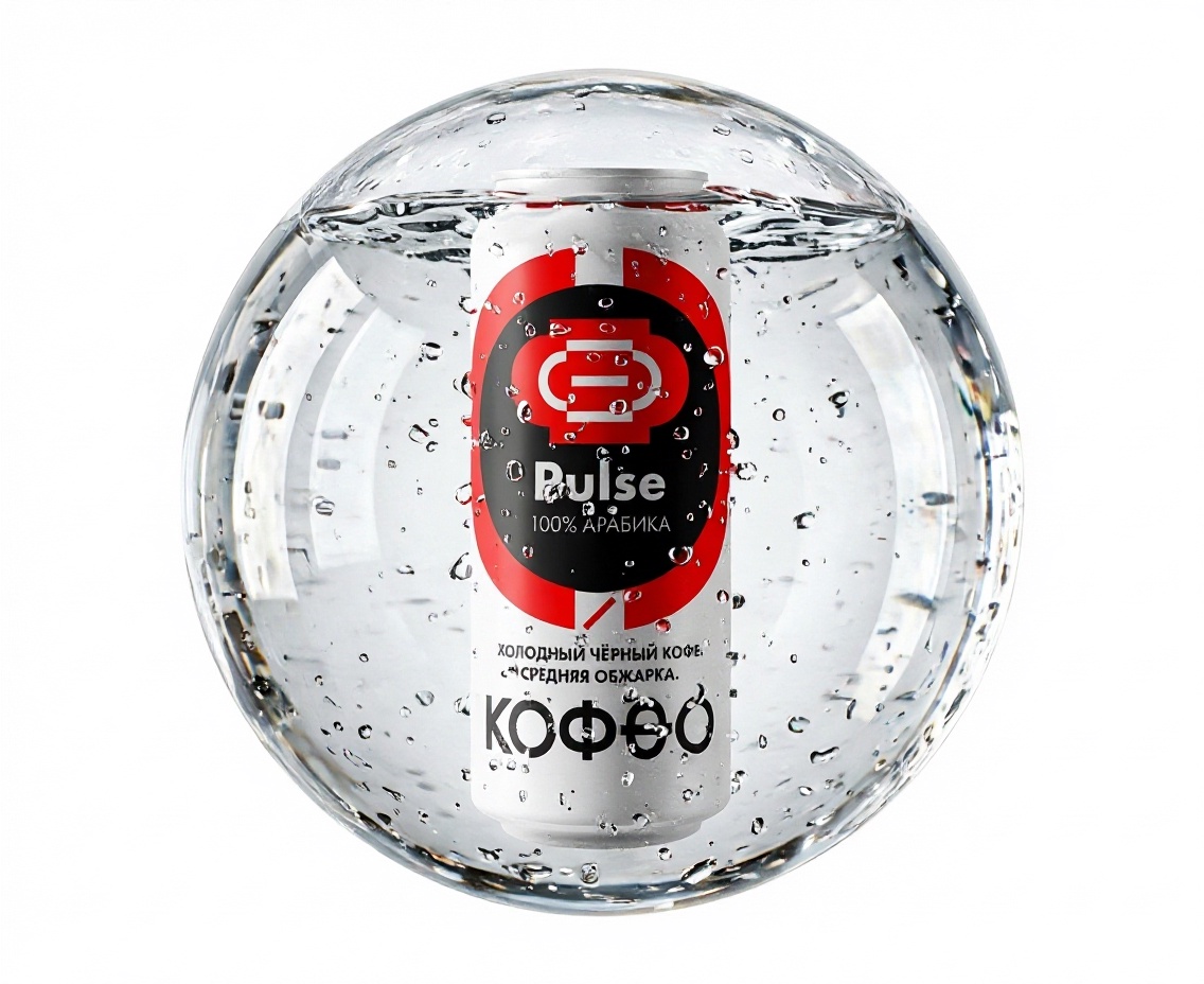
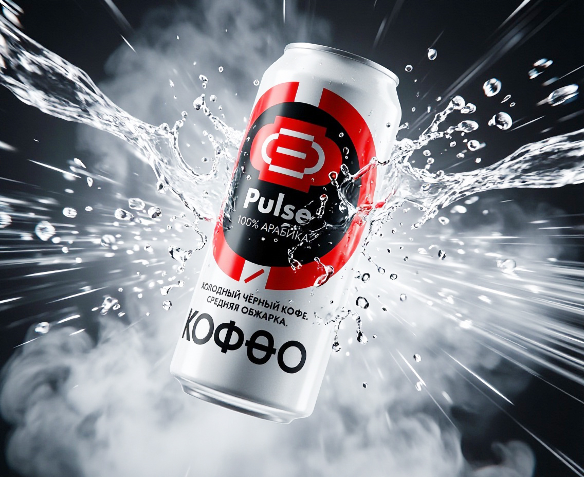
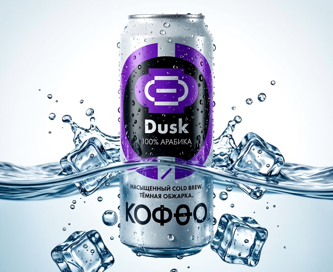
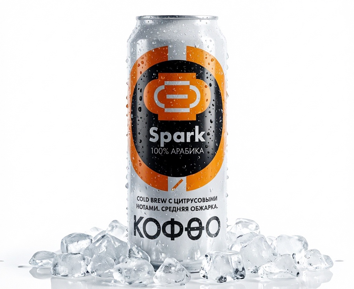
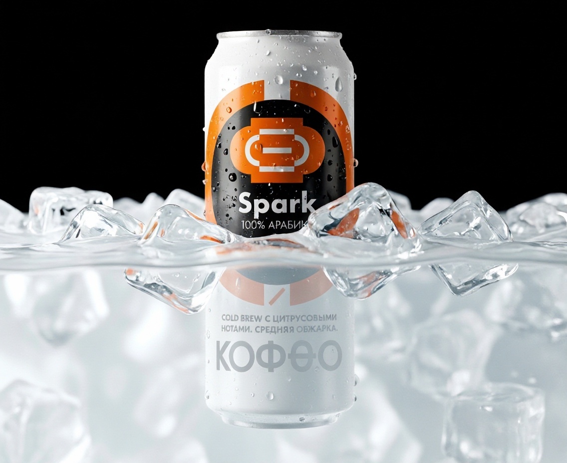
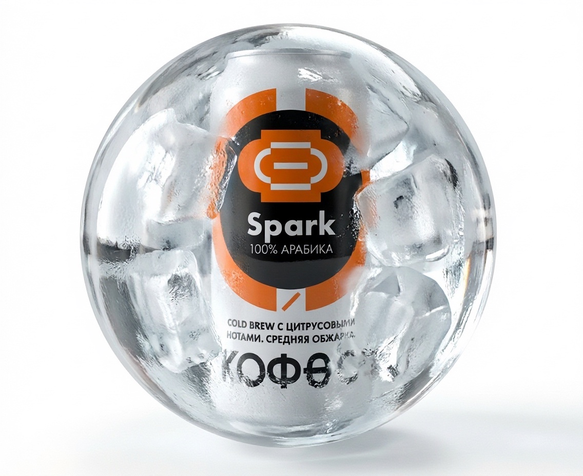
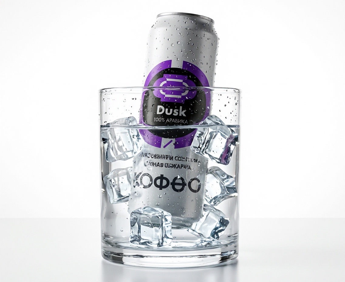
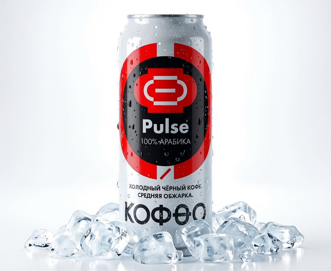
The packaging design is built around a colour-coding system, with each product assigned a distinctive accent colour that creates a recognisable silhouette against the can’s white background. At the centre of the composition is a black oval containing the brand’s stylised cup symbol. The colour of the symbol and surrounding arc corresponds to each product’s flavour profile. Large, bold, high-contrast sans-serif typography improves legibility both on retail shelves and across digital platforms.
The range consists of four varieties, each designed to deliver a distinct sensory experience:
Pulse — red accent. Medium-roast black cold coffee with a clean, straightforward profile and no added ingredients, created for those who prefer a classic coffee flavour.
Velvet — green accent. Dark-roast cold brew with a milky texture, offering a soft, enveloping flavour with pronounced creaminess.
Spark — orange accent. Medium-roast cold brew with citrus notes, combining refreshing acidity and fruity nuances for an energising start to the morning.
Dusk — purple accent. A rich, dark-roast cold brew with a full-bodied, deep flavour, pronounced bitterness and a lingering finish, intended for evening consumption.
Its cohesive visual language and clear flavour segmentation allow the brand to project an image that feels modern, technologically advanced and immediately accessible to consumers—avoiding unnecessary detail while delivering strong visual and flavour differentiation.


 Eva Chistyakova
 Puigdemont Roca
 marianaaworks
 bloomburo
 andreamarinnn
 Alina
Alina Saadmost
 Bruhken
 Maruf Nishat
 Richest Branding Pvt. Ltd.
 Sophiagdotcom
 saifullahmaslool
 Up-Brands
 Atiq Alam
 daniitenaa
 artworkbysofia
 monther al omari
 Valérie Colace
 Tianqii
 Anum
Anum anisameur
 tauqueer
 SOT B&D
 Palashcc
 Derrick Lin