

Inspired by administrative visual language that legitimizes and certifies its mexican origin, APROBADO uses regulatory constraint as a sign of prestige and transforms a simple physical phenomenon into a meaningful brand experience.
When the refrigerated bottle rests on a surface, natural condensation forms under its sculpted base. Once lifted, it leaves behind a temporary seal — an ephemeral imprint echoing the identity of the brand. Like an official stamp, it discreetly certifies the moment of tasting before gradually disappearing. The shape of the bottle is also a reminder of this function.
Rather than adding a new ritual, the design elevates an existing ritual. Each bottle naturally creates condensation; this concept simply gives purpose to this fleeting trace. The result is a subtle interaction that surprises the user while reinforcing the meaning of the brand name. The imprint exists only briefly, making each tasting unique. It becomes a visual reminder that great minds are not only meant to be appreciated, but also to be remembered. Just as every shared drink leaves an impression on those around the table, the bottle itself leaves its mark before disappearing.
APROBADO is more than a bottle. It’s a signature of the moment.
Curator’s Insight
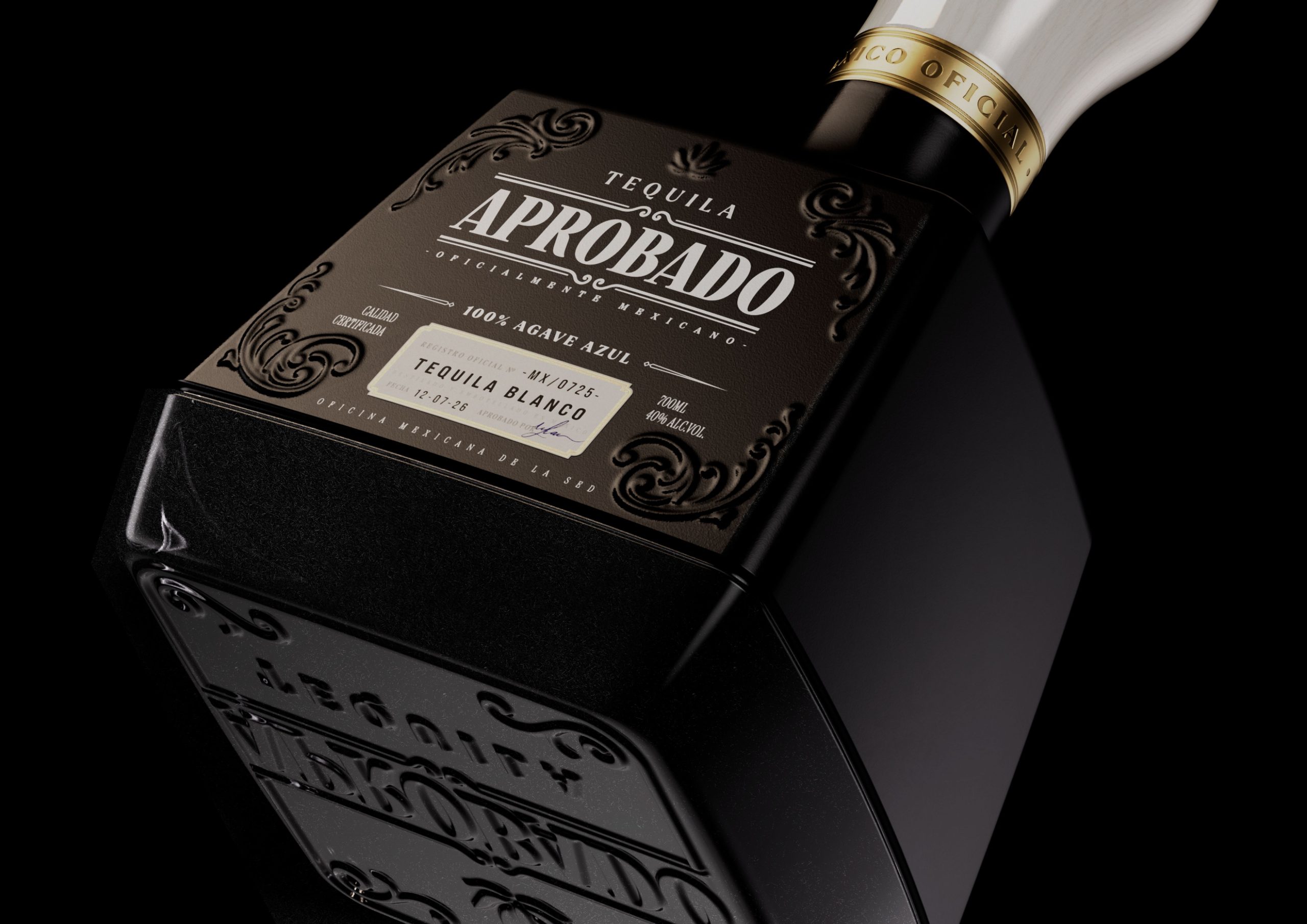
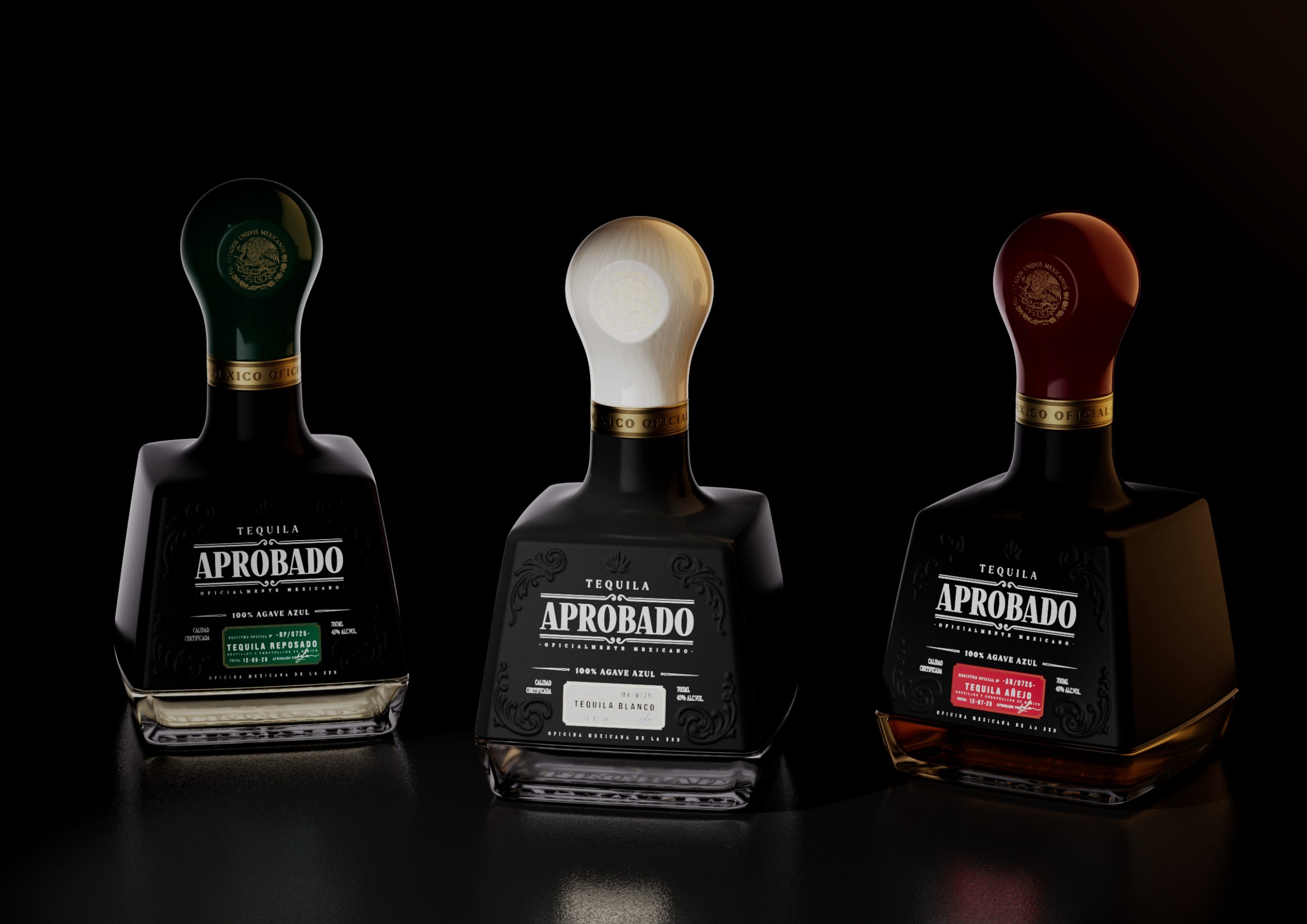
What does the heavy lifting here is the silhouette itself, before any liquid is poured or any bottle sweats. The bulbous cap on a narrow neck, sitting above a squared, faceted block, reads as a rubber stamp handle and head even at rest on a shelf, in a photo, from across a bar. That structural pun works in the static state, which matters more than it seems. Most packaging concepts depend on activation, on someone picking the bottle up or noticing a hidden detail. This one communicates its premise passively, through form alone, so it still functions in a retail environment where most bottles are only ever looked at, not handled.
The materiality reinforces this through contrast rather than repetition. Matte black label stock, debossed with scrollwork that recalls engraved seals, sits against a glossy cap and glass, echoing the difference between a stamped surface and a polished official document. The color coding across the three expressions borrows the visual logic of authentication tags rather than conventional flavor-coded packaging, a smaller but consistent extension of the same register.
Principle: when a concept depends on an experiential payoff, look for a structural or material cue that telegraphs it before the experience begins. A design that only works once activated is fragile. One that also works at rest is durable.

 softmachine
 monther al omari
 alchimistestudioParis
 airobtq
 Buzz & Co.
 Ruby
Ruby themythographer
 IDNB Inc.
 viktorflr
 Zenpack
 Wessam Hussien
 samarabdelmonem
 StudioMordius
 Polaris Designs
 Atiq Alam
 duha mohamed
 HassanEtman22
 agarcia studio
 Wynand88
 Eva Chistyakova
 Maria Bukhtilova