

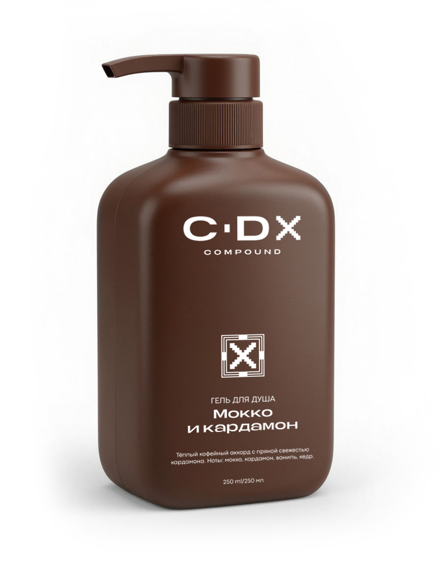
The C DX COMPOUND logo seamlessly integrates with the brand’s “compound/composition X” concept, conveying the formula’s precision and premium quality. Composition and symbolism. The central part is the abbreviation C DX: the letter “X” is designed in a pixel-art style of square modules, which can be read as a digital marker, code, or secret ingredient designation. The dot between the “C” and “DX” acts as a pause-emphasis, reinforcing the sense of a carefully crafted formula. Font pairing.
The “C DX” inscription is set in BERIER Regular—a clean, sans-serif with confident proportions that emphasizes technological advancement. The word “COMPOUND” below is Codec Pro Variable News: the monospaced geometry adds a “laboratory” touch, as if it were the markings on a formula bottle. Contrast and legibility. The white of the symbols against a dark brown background creates a strict yet warm contrast: the palette alludes to natural ingredients (cocoa, wood, spices), while the shape evokes precise measurements and protocols.
Layers of meaning. The letter “X” simultaneously reads as a formula variable, a premium marker, and a hint of a “secret ingredient”—this connects the visual with the positioning of the “Warm Rituals” line: each fragrance is based on a thoughtful, scientific composition. This logo functions as a unified symbol for the entire collection: it looks equally appropriate on a minimalist bottle front, in a “technical” version with codes like Code Ochre, and in sensory presentation—as a marker of the formula’s quality and uniqueness.
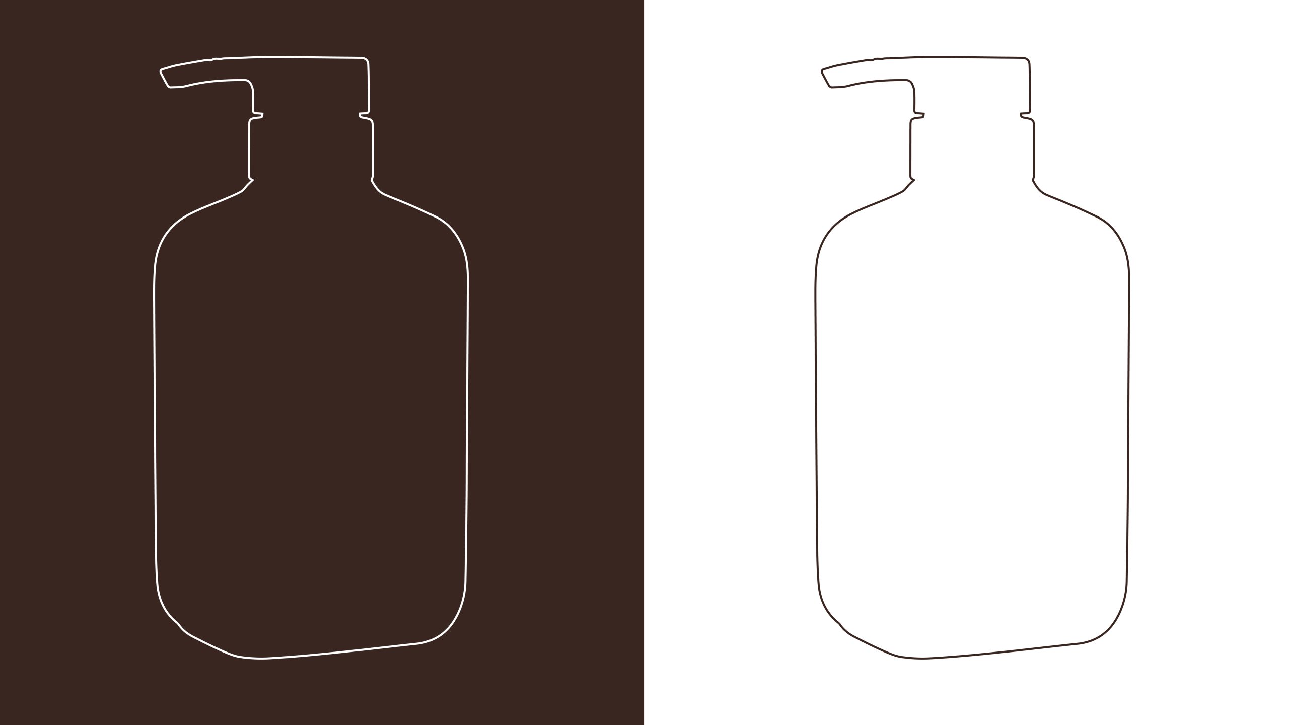
The icon is a simple, geometric symbol in a pixel-art style: a stylized “X” (or intersecting chevrons) composed of square modules, placed within a double square frame. The minimalist design supports the brand’s technical nature: it reads like a code, formula, or marker for a unique component. Contrasting versions (white on dark brown and dark brown on white) maintain clarity and recognizability in both color schemes.




 Studio Zak
 Ander Sanchez
 Atipus
 Widarto Impact
 hovski
 Ohmybrand
 CreativeWise
 Rauf Karaev
 Hooperstudio
 La Nube de Ideas
 Modern Theory
 Akim Melnik Design Studio
 preflightcreative
 Seyf El Haq Menouer
 Badraddine Attik
 Samriddhi Ravi
 Alessandro Ammaturo
 Amblr Studio
 vladlenalevit
 Sis Tsarukyan
 monther al omari
 alchimistestudioParis
 designsbysukaina
 About House of Ta
 Amjad Battal