

FERA is a premium cachaça concept created to explore how Brazil’s national spirit could connect with a more contemporary drinking culture. The opportunity was to move away from the traditional visual language often associated with the category and create something bold, modern and internationally relevant without losing its Brazilian identity.
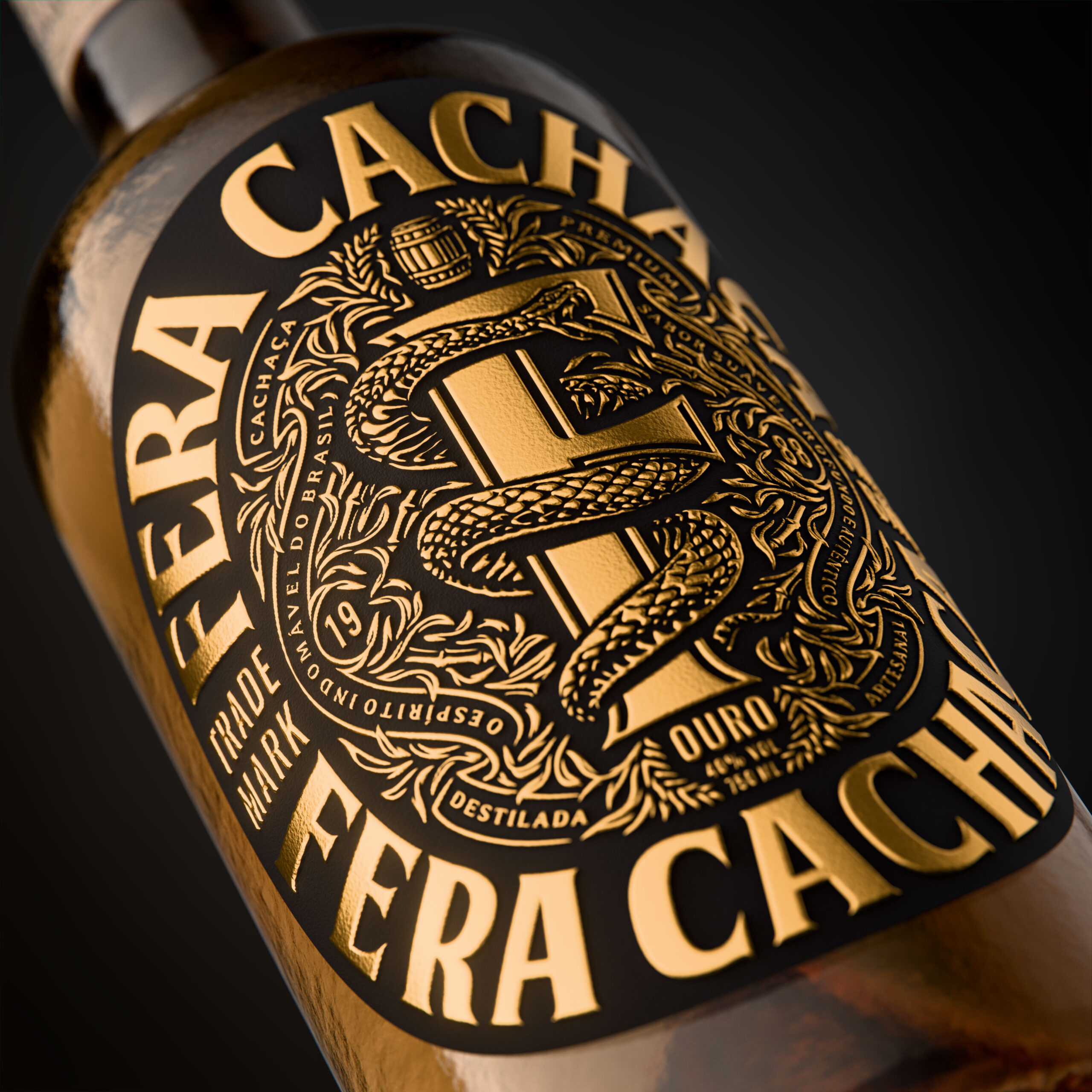
The concept is built around one strong, ownable idea: the name FERA, meaning wild or ferocious, supported by the serpent and custom F monogram as distinctive brand assets. “O Espírito Indomável do Brasil” — The Untamed Spirit of Brazil — became the foundation of the identity, expressing Brazil through attitude, energy and character rather than expected clichés.
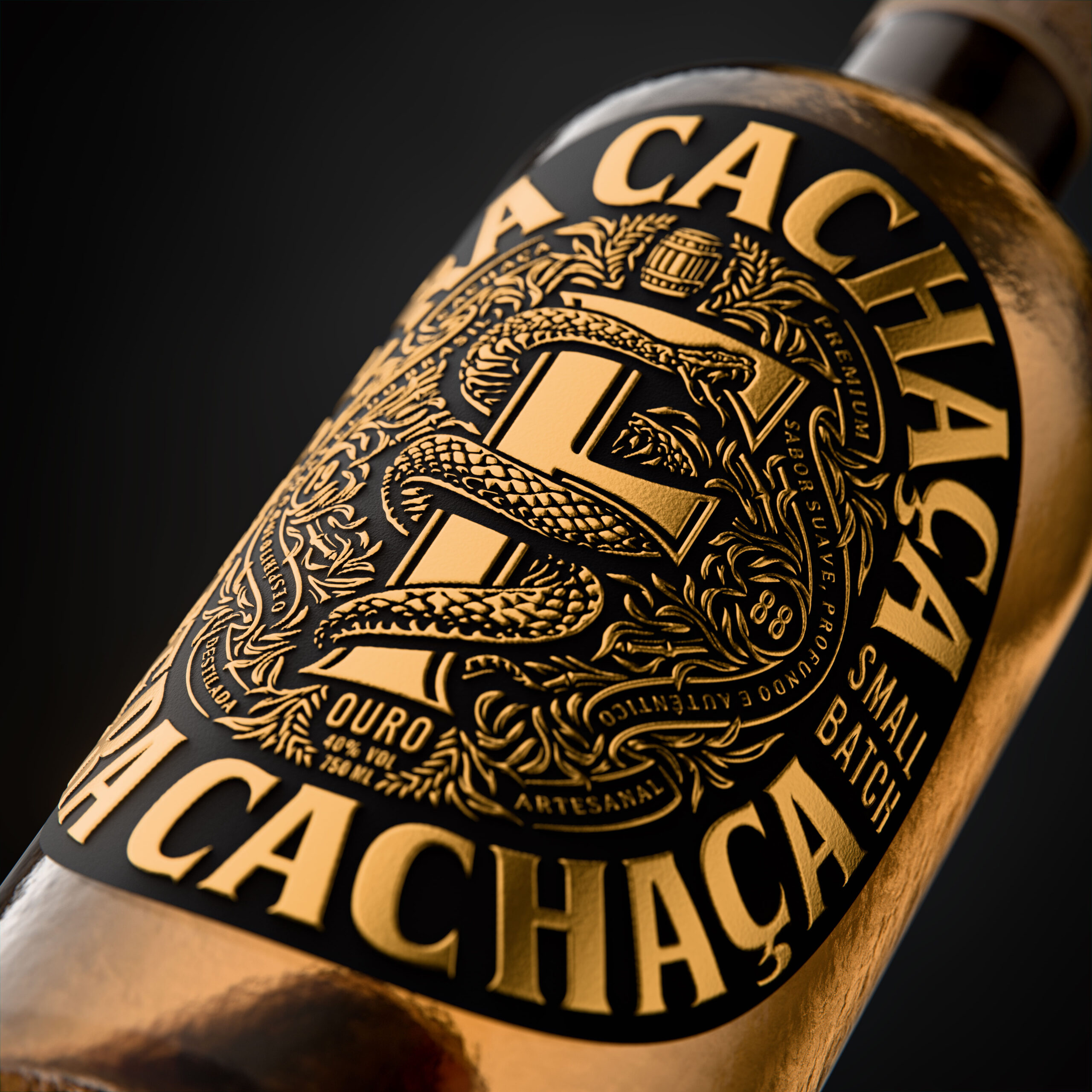
The packaging was designed for immediate shelf impact using a restrained black-and-gold palette. Black gives the bottle weight and confidence, while gold references the golden cachaça itself. From a distance, the design is intentionally simple and powerful.
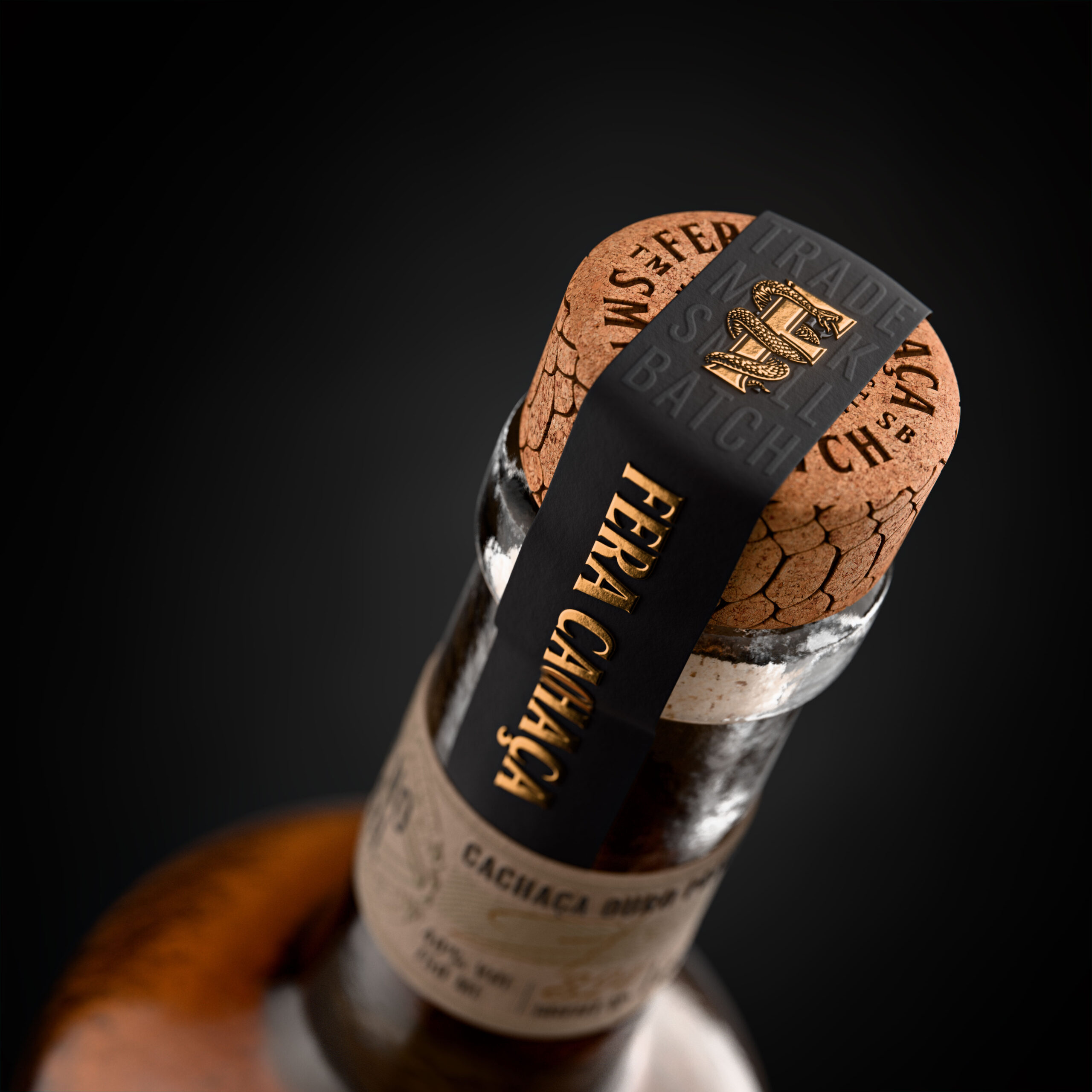
Up close, foil, embossing, tactile paper, neck detailing and closure elements reveal a richer level of detail. Every element works together to reinforce the balance between premium and untamed, creating a complete experience rather than simply a front label.
FERA was also designed as a flexible brand system with the potential to extend beyond the bottle into RTDs, cocktails and other modern drinking occasions, while remaining instantly recognisable.
Wynand du Plooy – Freelance Brand and Packaging Designer
Curator’s Insight
Cachaça packaging often leans on tropical shorthand, which makes it hard to sit beside whisky or cognac on a back bar. FERA solves this by borrowing the codes of engraved, heraldic labels and keeping the serpent and F monogram as its one local asset. The snake coils around the letter like a staff, so the mark reads as a crest rather than a logo. The wordmark repeats top and bottom and is clipped by the label’s curve, so the name still reads as the bottle turns. The neck is a deliberate change of register: warm, uncoated paper with a hand-numbered bottle sits under a black strip, which contrasts with the foil-heavy front. Loud from a distance, intimate up close. When a category is defined by clichés, import the visual grammar of a more established one, and keep a single native symbol to hold the identity.




 agarcia studio
 Eva Chistyakova
 Maria Bukhtilova
 estudiomarciano
 monther al omari
 Thirst
 Maruf Nishat
 Gray Matter Studio
 Julia Jay
 Modern Theory
 Furt Goods
 Fluid
Fluid alchimistestudioParis
 Ancora
 Mostafa Abdelmawla
 MewKittyDraw
 Studio Shala
 43oz
43oz Lucid mk2
 Atiq Alam
 IDEOLOGO
 Open Strategy & Design
 cem kutlu