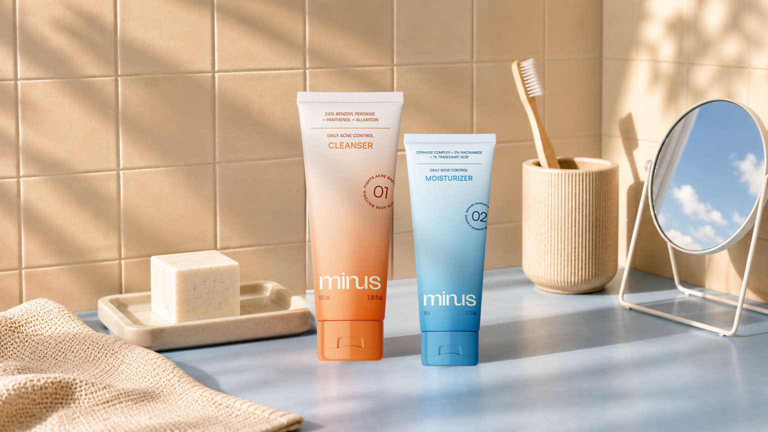

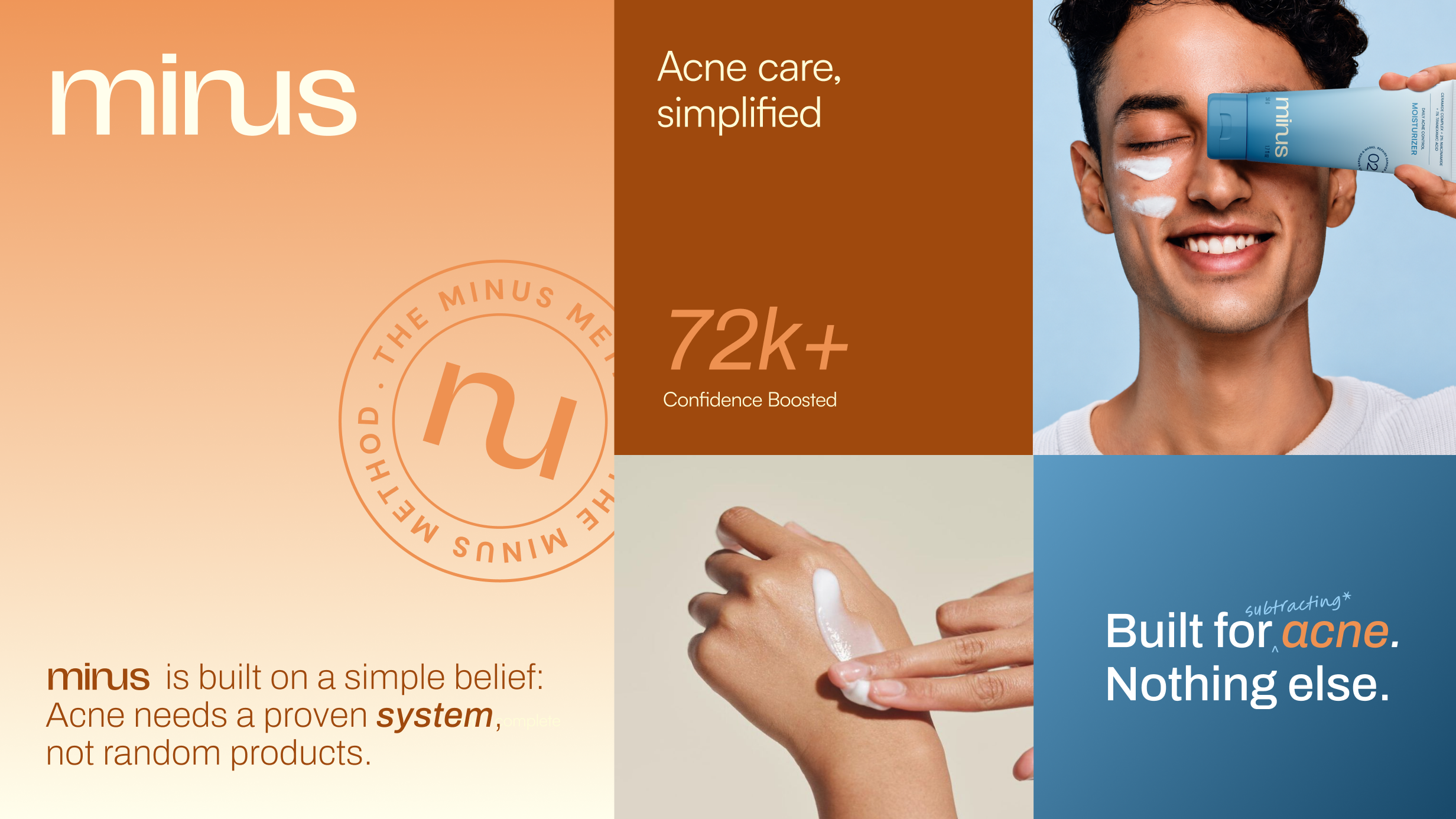
MINUS is an acne treatment brand designed for teenagers and young adults navigating one of the most emotionally vulnerable stages of their lives. Created to bridge the gap between everyday skincare and dermatological care, the brand challenges a category dominated by beauty-led messaging and trend-driven ingredients. The project involved building the complete brand strategy, positioning, verbal identity, visual identity, and packaging system around one goal: making effective acne treatment simple, accessible, and trustworthy.
Breaking Category Conventions -The challenge was to create a brand that resonated with a young audience without looking trendy, superficial, or beauty-obsessed. It needed to feel scientifically credible without becoming overly clinical, while addressing the emotional impact of acne with empathy rather than fear or shame. At the same time, the brand had to clearly differentiate itself in an overcrowded skincare market filled with ingredient-led claims, influencer marketing, and cosmetic-first positioning.
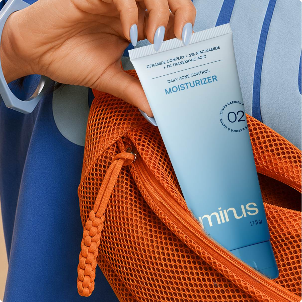
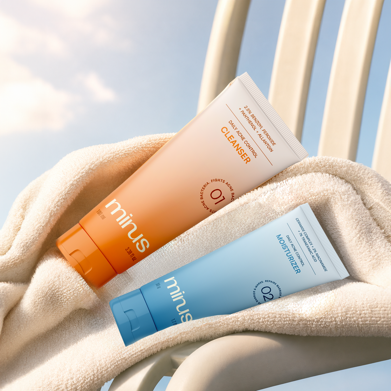
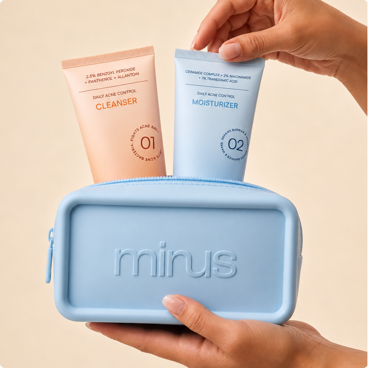
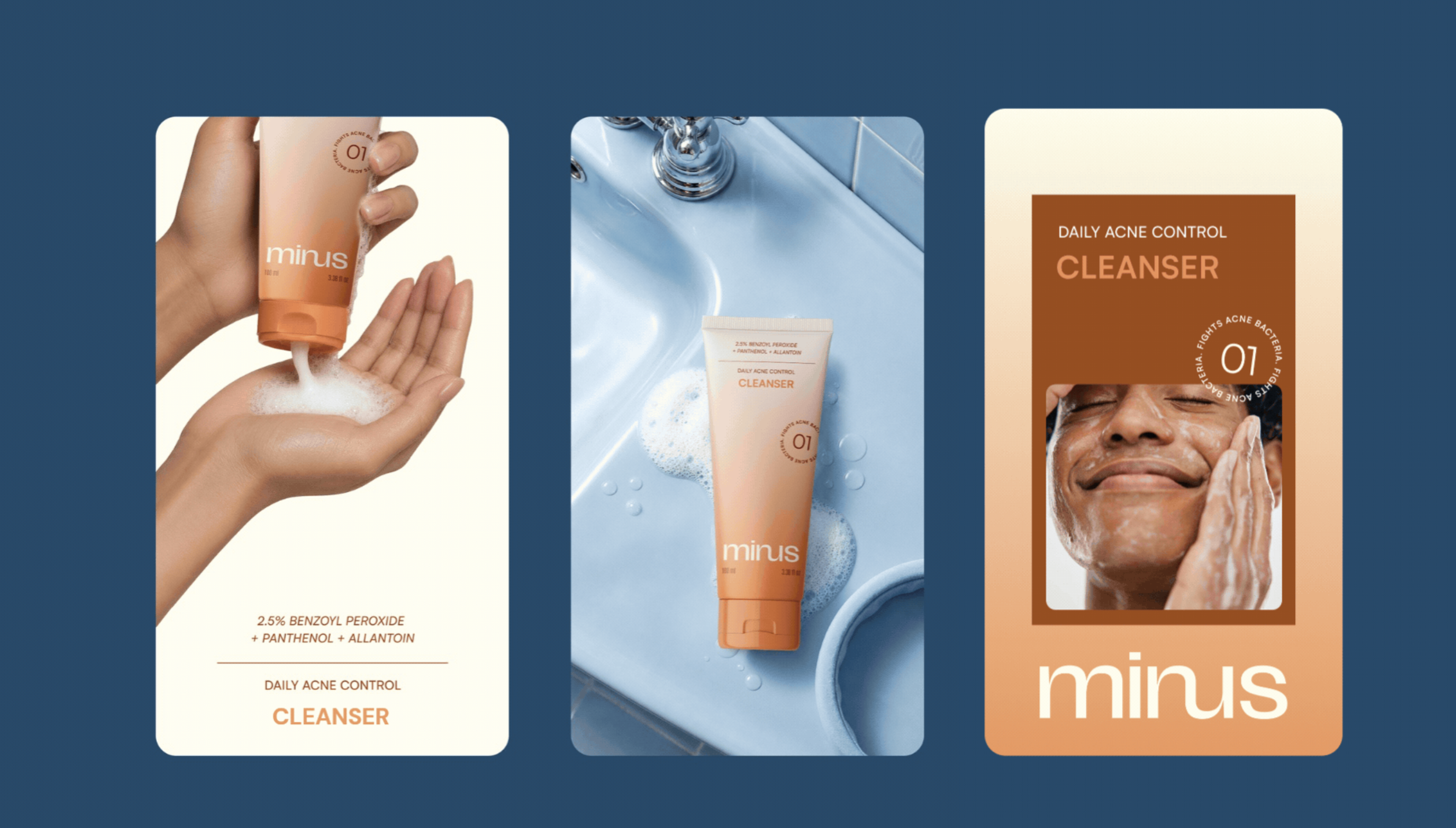
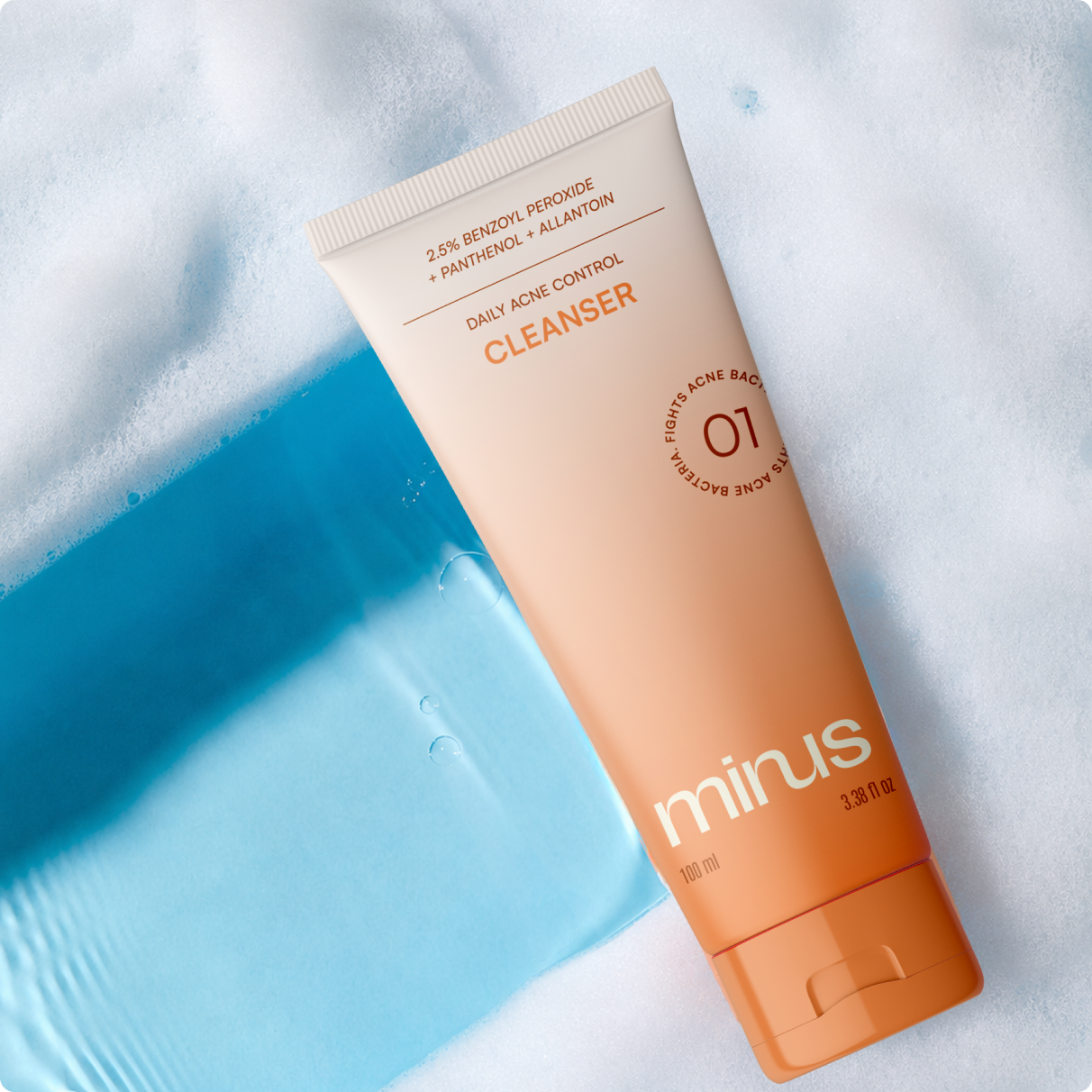
Designing for Clarity- The brand was built around one central idea: replacing confusion with clarity. This thinking translated into a minimal, system-led design language that feels calm, trustworthy, and approachable without compromising on treatment credibility. A soft colour palette, subtle gradients, generous whitespace, and clean typography create a reassuring visual presence, while structured layouts and clear information hierarchy reinforce simplicity and ease of use.

 monther al omari
 Shustova p
 mutta
mutta @Allenarts13
 Sirka Agency
 Atiq Alam
 Dozen Agency
 j.substance
 SCD
SCD Cristian Lepore | crilep Copia
 Chris Creative Works
 Aligned Design Co.
 CreativeWise
 Agence des Coteaux
 Ramyromeo2024
 Grain of Design ®
 Ebbi
Ebbi BFS Studio
 butterflyhunters
 Asprey Creative
 About House of Ta
 Up-Brands
 KJS CRAFT
 hello ocean
 PG Branding