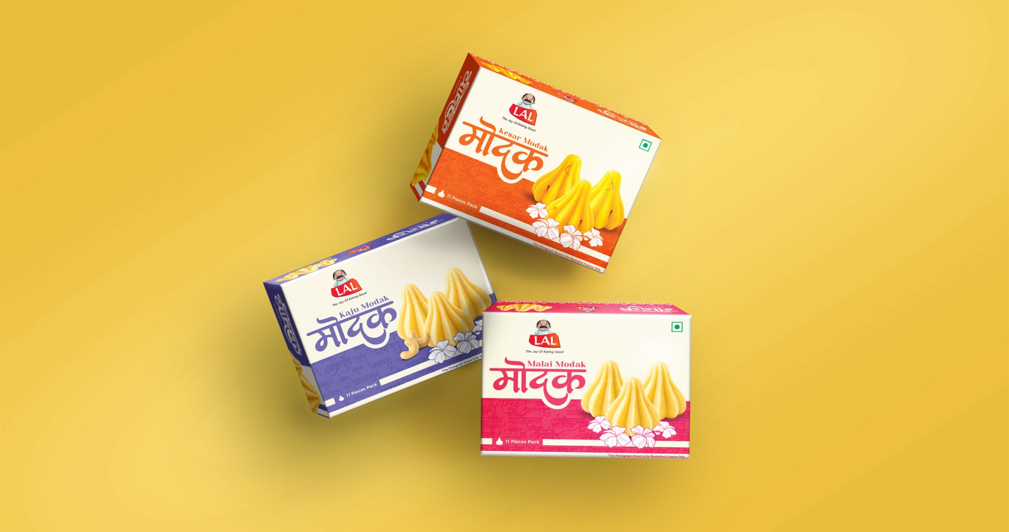

MODAK — Festive Sweets FMCG Packaging Design.
THE BRIEF
Create a festive Ganesh Chaturthi Modak packaging range that feels Indian, contemporary, appetising and instantly recognisable, across three flavours – Kesar, Malai and Kaju – while maintaining one cohesive visual identity.
THE CHALLENGE
Make a traditional festive sweet stand out on a modern retail shelf while creating immediate festival recall, product recognition and clear SKU differentiation across the three flavours.
THE SOLUTION
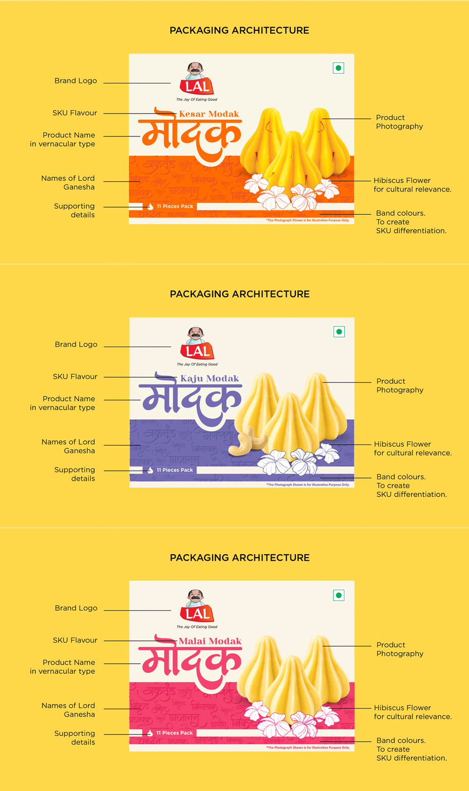
Build the visual language around cultural storytelling rather than literal religious imagery – using the Modak as the hero, Ganesha’s many names as a vernacular pattern, Hibiscus as a festive cue, bold Indian typography and distinct flavour colours to create a memorable packaging family.
A contemporary festive packaging system developed for Lal Sweets’ Modak range for Ganesh Chaturthi. The challenge was to create strong SKU differentiation while maintaining a cohesive brand presence across the range. Colour became the primary navigation tool, supported by bold Indian typography, appetite-led product photography and culturally relevant festive details.
View complete case study – Behance




 NEV
NEV Stefano Bracci
 Alina
Alina monther al omari
 Lizakjx
 JOAOMARCOSDESIGN
 alchimistestudioParis
 Harriet Neild
 octavio rojo
 宏洛图品牌设计HONGLT
 DESIGN CONCEPTS
 Alexander Skurihin
 Studio K95
 ARMBRAND
 Richa Rai
 houseoferas by Miti
 Agence des Coteaux
 Kushi Eaknath
 Ann Treasa
 Xiao Ning
 krrrrrllii
 babyage
 Deep
Deep