
Context
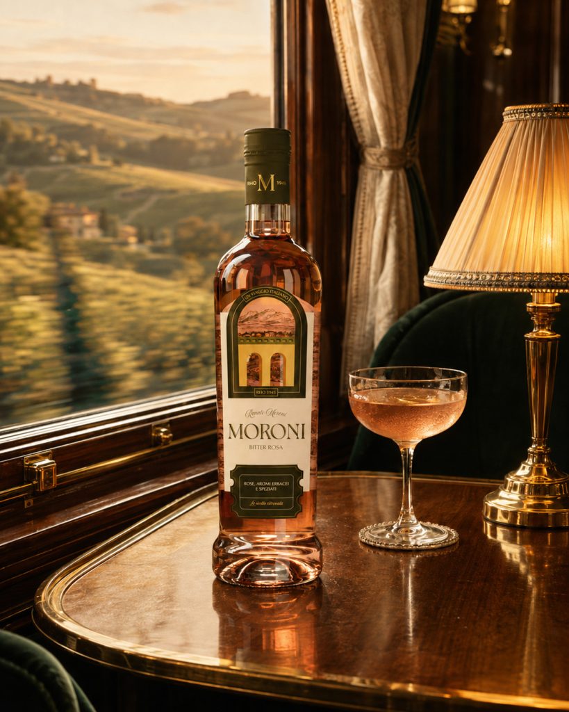
Moroni Bitter was born from a family recipe dating back to 1945, first created in post-war Milan and now brought back to market as an authentic alternative to more industrial aperitif brands. The product already had a genuine story, a strong artisanal heritage and a distinctive character, but its existing identity no longer reflected its value or supported the brand’s new positioning. The project therefore started with the need to build a more recognizable and contemporary world around Moroni, one that could preserve its roots without turning them into nostalgia.
Challenge
In a market shaped by brands with highly recognizable identities, the challenge was to find a distinctive space for Moroni, moving away from both mainstream aperitif codes and the more predictable expressions of Italian premium branding. The strategic analysis identified the Explorer as the brand’s main archetype: an invitation to discover new flavours through Italian landscapes, ingredients and local cultures. This led to the idea of a slow journey across Italy, imagined aboard a train, where every stop becomes an opportunity to experience a different territory. A journey through Italian taste.
Execution
The new visual system translates this idea into a range designed as a sequence of destinations. Each bitter is connected to an Italian territory related to the ingredients and sensory profile that define it, from the Gulf of Orosei to Gran Paradiso and the Langhe hills. Illustrated landscapes turn the labels into windows onto each destination, while engravings, frames and graphic details evoke the visual language of slow travel and vintage print, reinterpreted through a cleaner, contemporary approach. The Moroni logotype was redesigned, the colour palette made more natural and distinctive, and the entire packaging system structured to give each expression its own identity while keeping the range visually consistent. Moroni does not portray Italy as a single image. It travels through it.
Curator’s Insight
The arch is doing more structural work here than it first appears. Rather than functioning as decoration, it operates as a consistent viewport across all three labels, a fixed aperture that holds a different illustrated landscape in each expression. This is a harder design problem than it looks. A range system needs enough repetition to read as one family and enough variation to let each product stand apart, and most ranges solve this by keeping illustration constant and rotating color, or the reverse. Moroni does both at once inside a single frame, which is why the range reads as cohesive from a distance and distinct up close.
The engraving style inside the arch is worth pausing on too. It borrows the cross hatching and fine linework of nineteenth century topographic prints, but the typography surrounding it, the logotype and category name, stays clean and unadorned. That gap between an ornamented illustration and a restrained wordmark keeps the bottle from tipping into costume design. It lets the heritage cue live in the image rather than in the lettering, which is usually the more legible place to put it and the harder one to get away with.
Principle: when a brand needs to signal both consistency and individuality across a range, look for one fixed structural element that can hold variable content, rather than varying the structure itself. Constraint at the framework level is often what makes variation at the content level feel intentional instead of scattered.




 lunapanda
 Tridimage
 Analoguecreative
 lettera7
 alchimistestudioParis
 Lana B
 Colossal
 Pivot Studio
 M&A CREATIVE AGENCY
 monther al omari
 Anastasia Cherepanova | xtramez
 Hollóka Grafikai Műhely / Graphic Design Studio
 BOLD branding
 Antonia Skaraki
 Pâmella Lorrany
 Z9BKAdsgn
 Francesco Paternoster
 b1studio.ro
 Chris Creative Works
 Boordon
 Dmitriy Kuzovlev
 Brand Society
 yasharpic