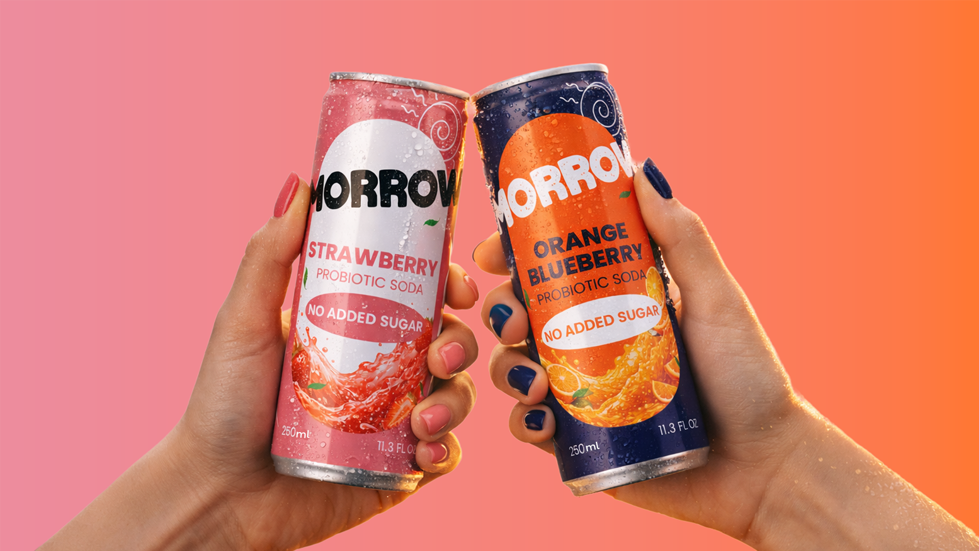

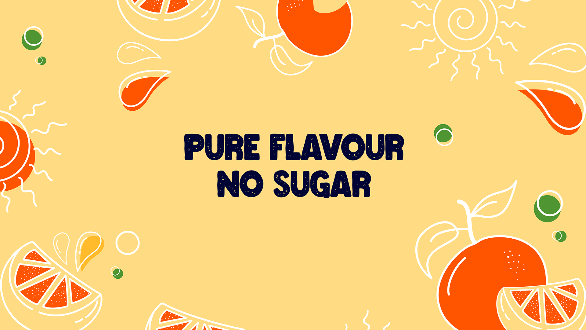
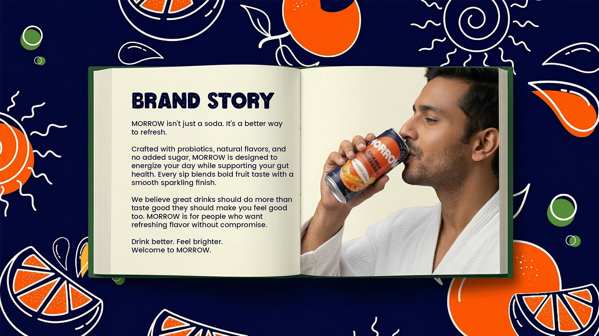
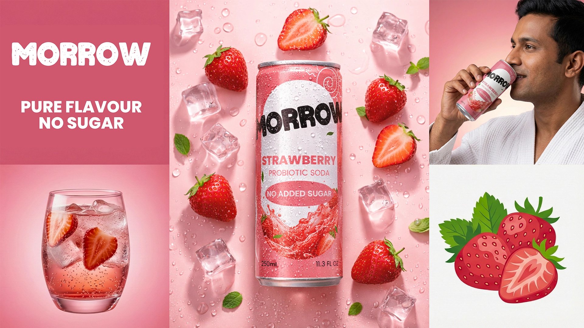
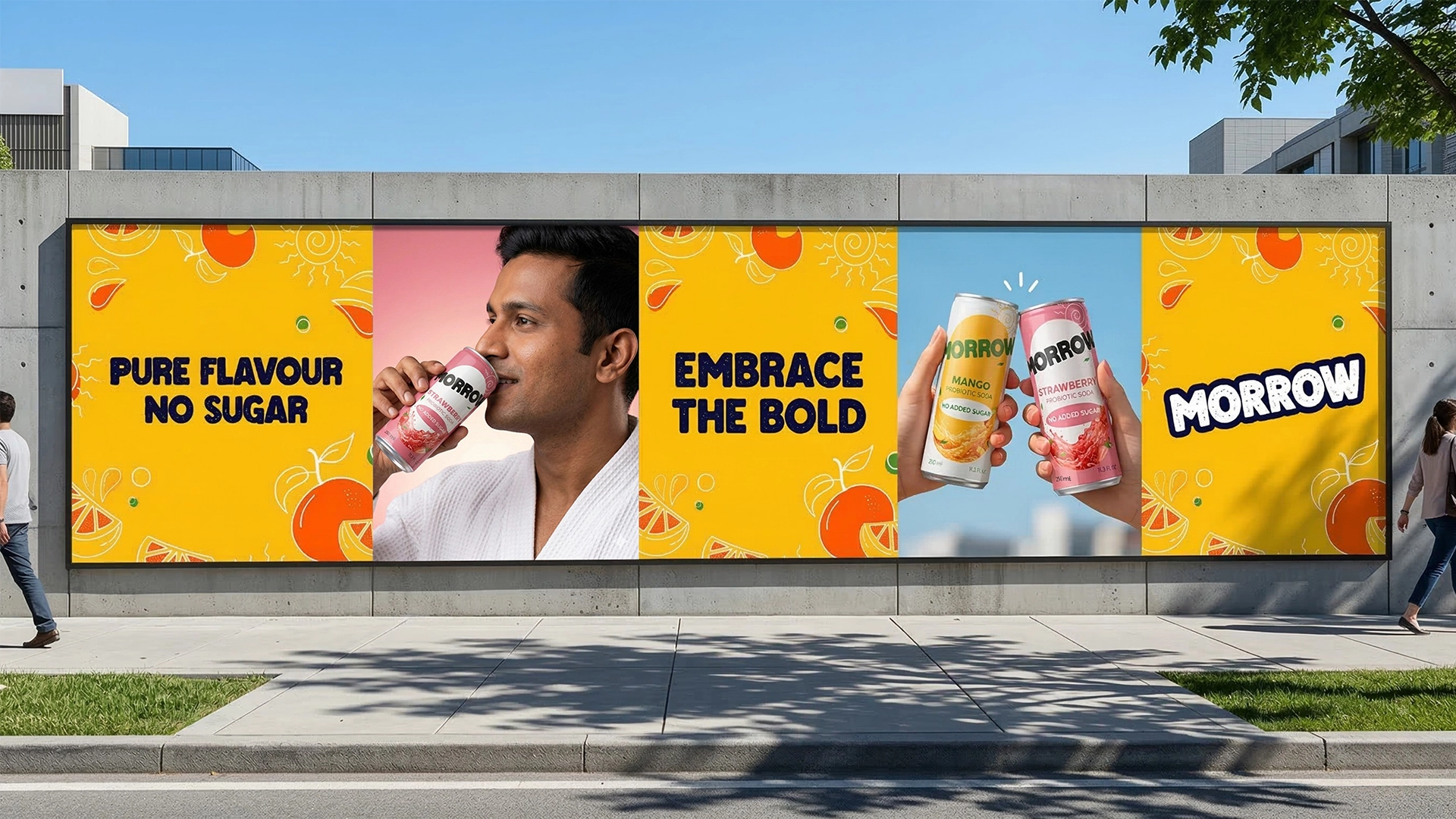
MORROW is a vibrant prebiotic soda brand designed for consumers who want refreshing fruit flavour without unnecessary added sugar. Built around the message “Pure Flavour, No Sugar,” the brand transforms functional drinking into a colourful and enjoyable everyday experience.
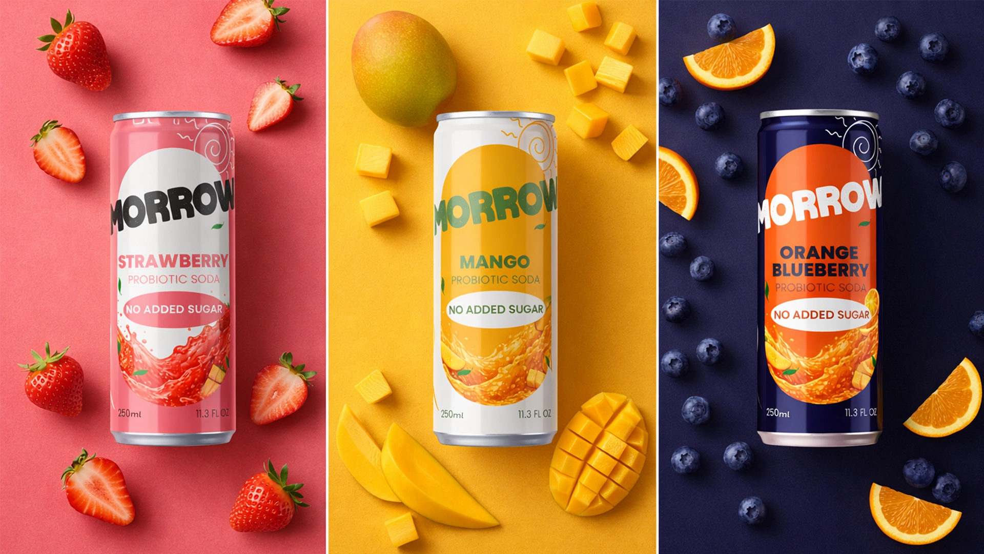
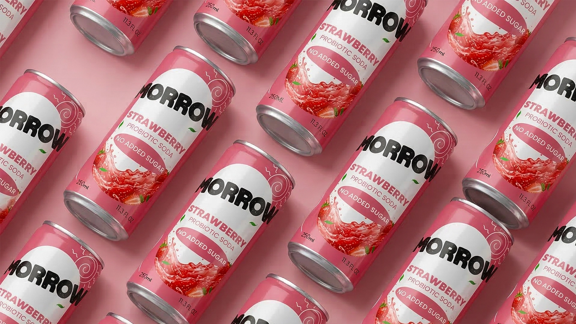
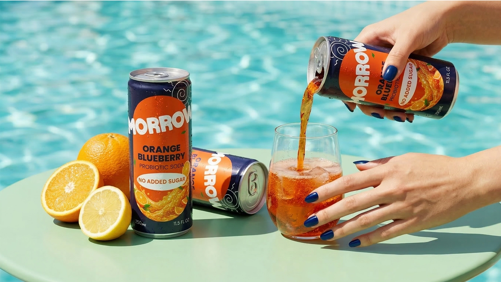
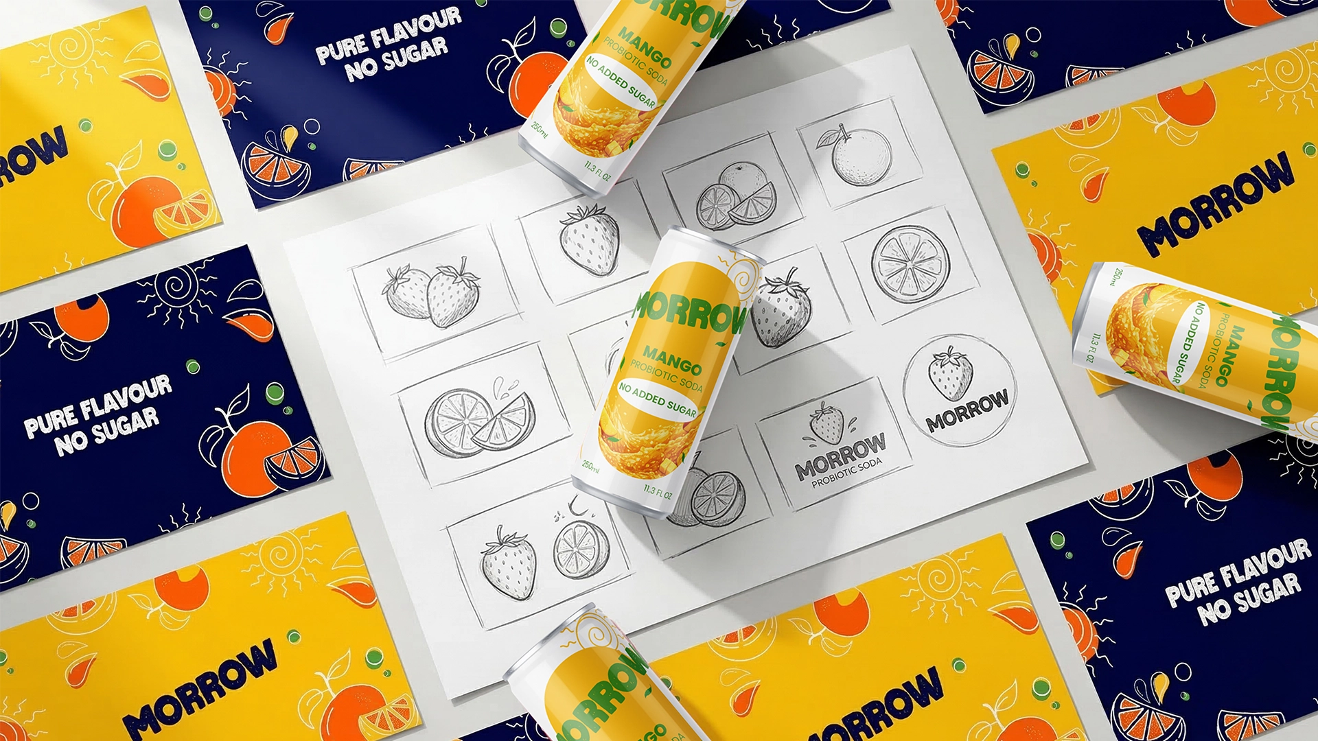
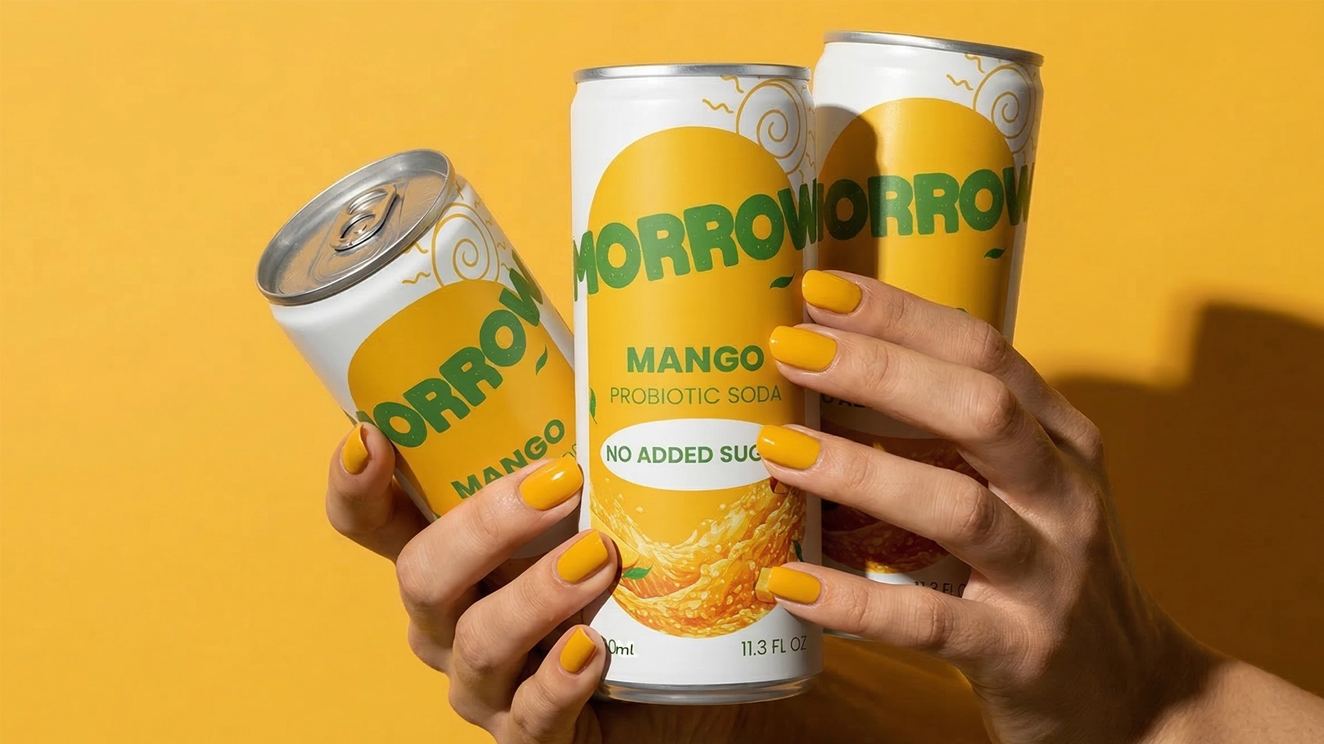
The range includes Strawberry, Mango and Orange–Blueberry flavours. Each variant uses its own distinctive colour palette and fruit imagery while remaining part of one consistent packaging family.
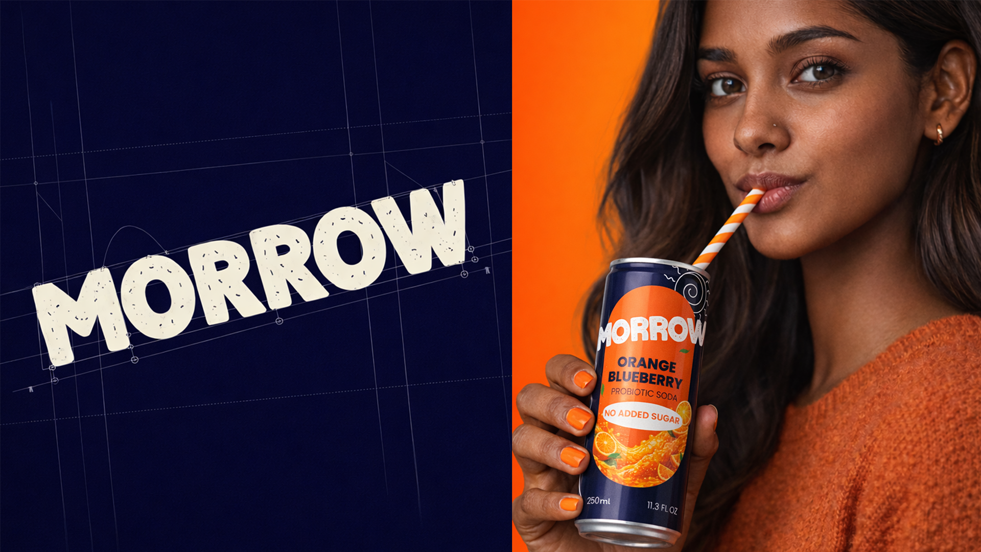
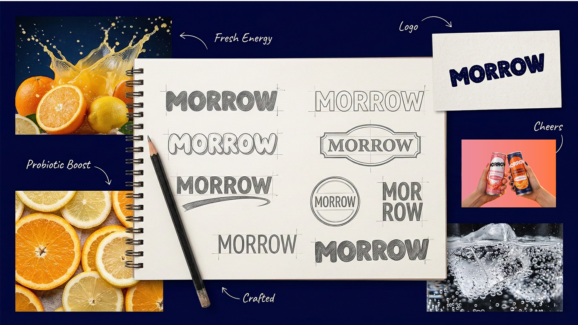
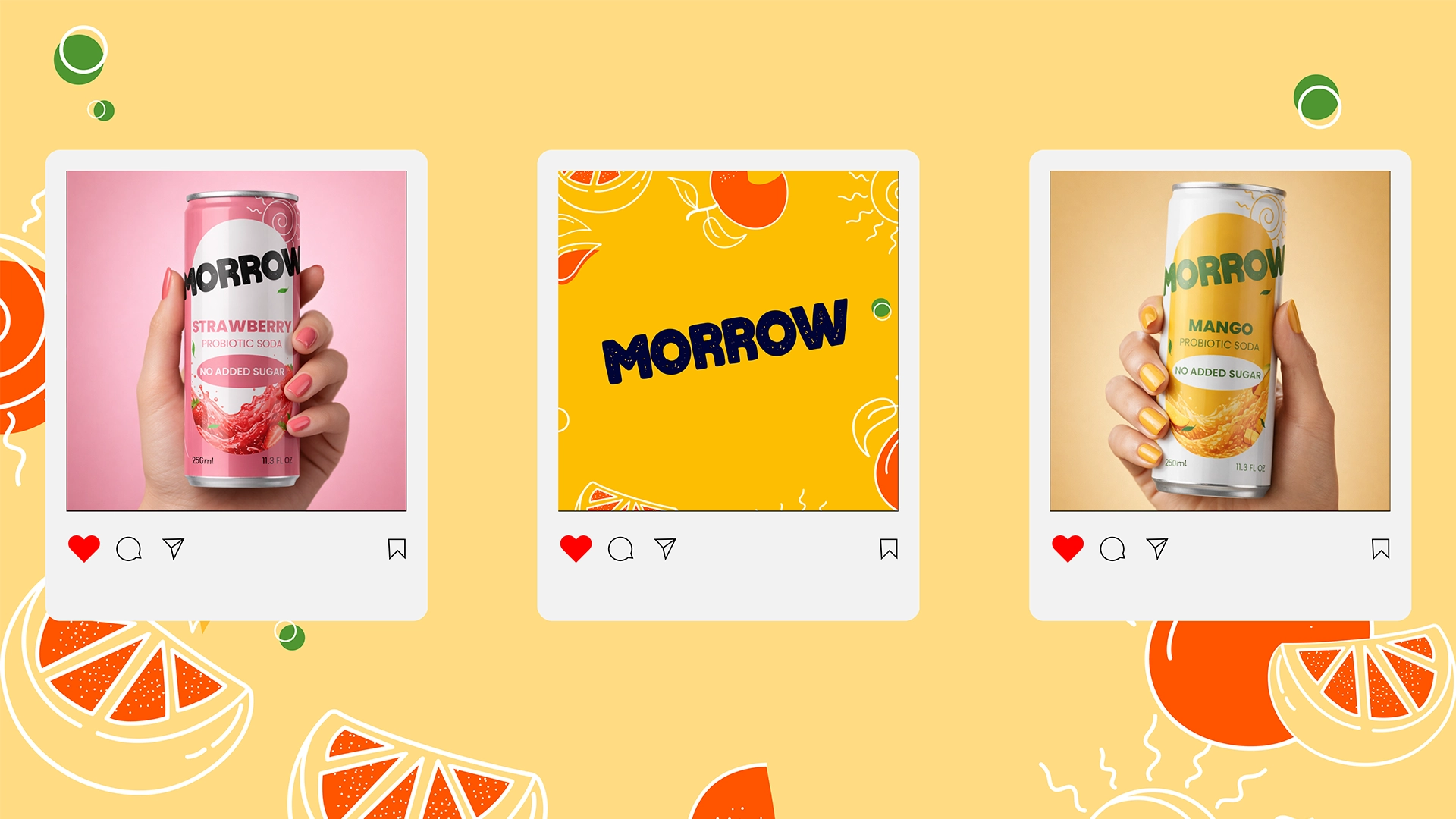
The identity combines a bold, expressive wordmark with energetic typography, hand-drawn fruit illustrations and high-contrast colour blocking. Pink communicates the freshness of strawberry, bright yellow captures tropical mango, and deep navy with orange introduces the richer Orange–Blueberry flavour.
Clear front-of-pack information allows the flavour and no-added-sugar benefit to be understood quickly. The illustrated visual system gives MORROW a youthful and approachable personality while creating strong shelf visibility.
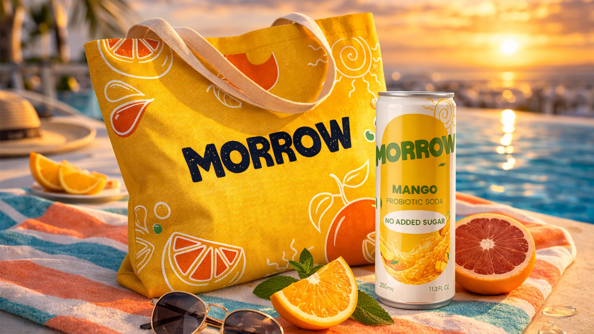
The identity extends beyond the aluminium cans into advertising, social media, merchandise and lifestyle photography. The result is a flexible and recognisable beverage brand that balances functional benefits with flavour, optimism and modern visual energy.
 omarchafik
 nastyaabeketova
 Roberto Núñez Studio
 ZarifGraphic
 octavio rojo
 Nadezhda Gorelikova
 Chris Creative Works
 Danh Huynh
 Pattopatricio
 cem kutlu
 David Byerlee
 marikvel
 FATLEG
 Fait Studio
 Effect Agency
 Yana Madoyan
 M&A CREATIVE AGENCY
 monther al omari
 Rabia zouina
 宏洛图品牌设计HONGLT
 Atiq Alam
 Poli Ortiz