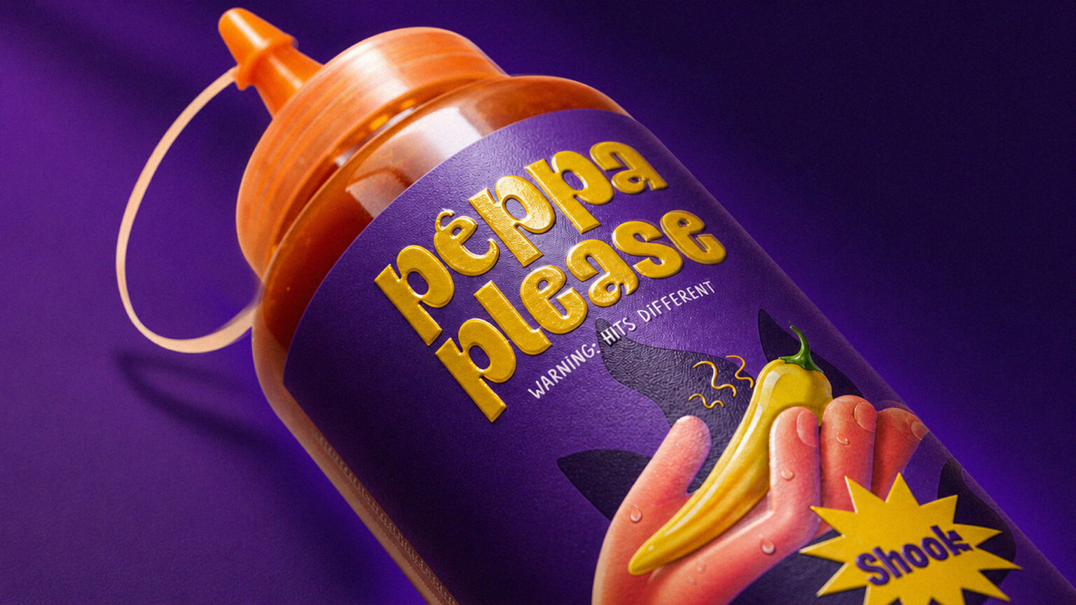

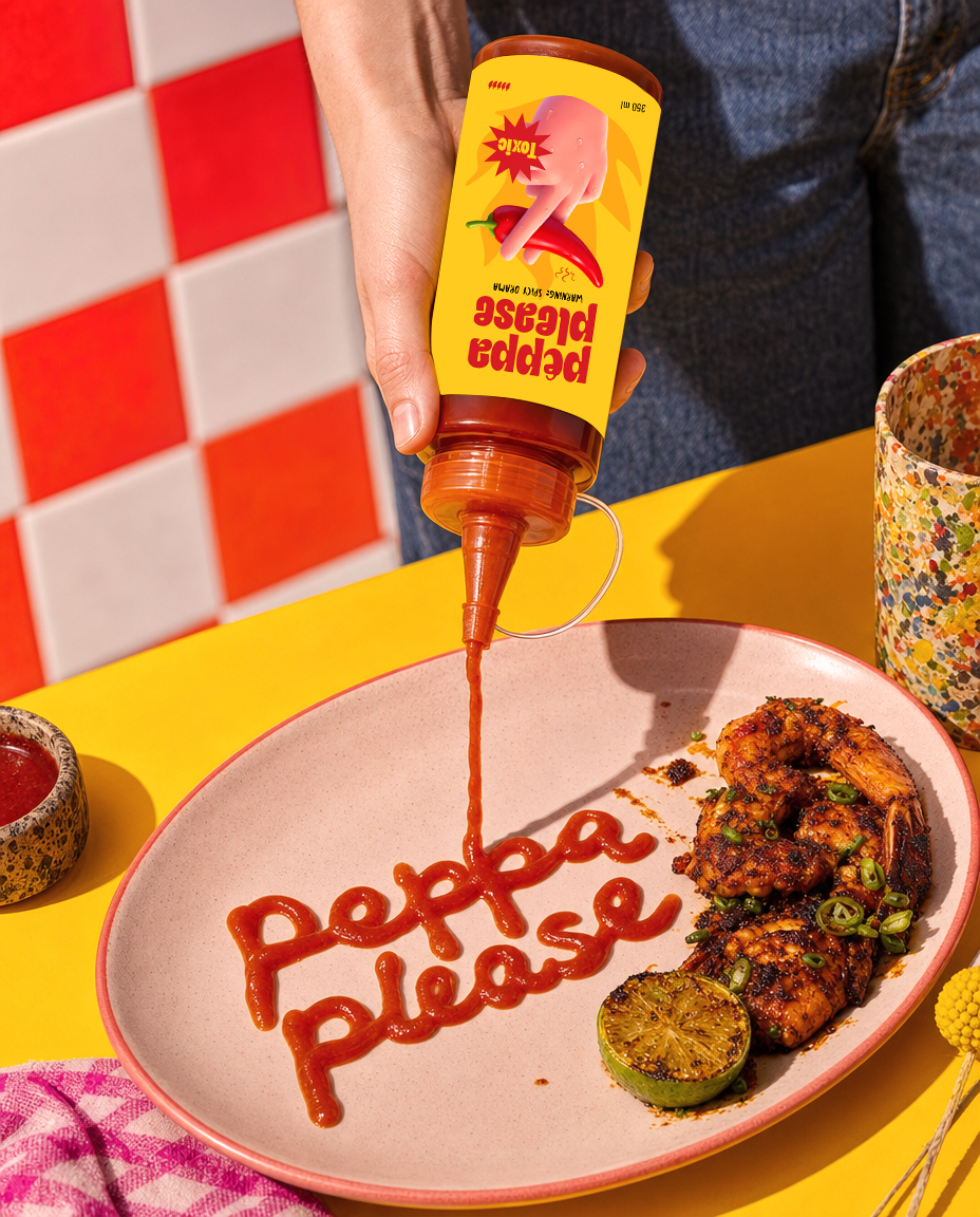
Peppa Please is a bold and playful hot sauce brand built around a simple idea: every flavor has a personality of its own.
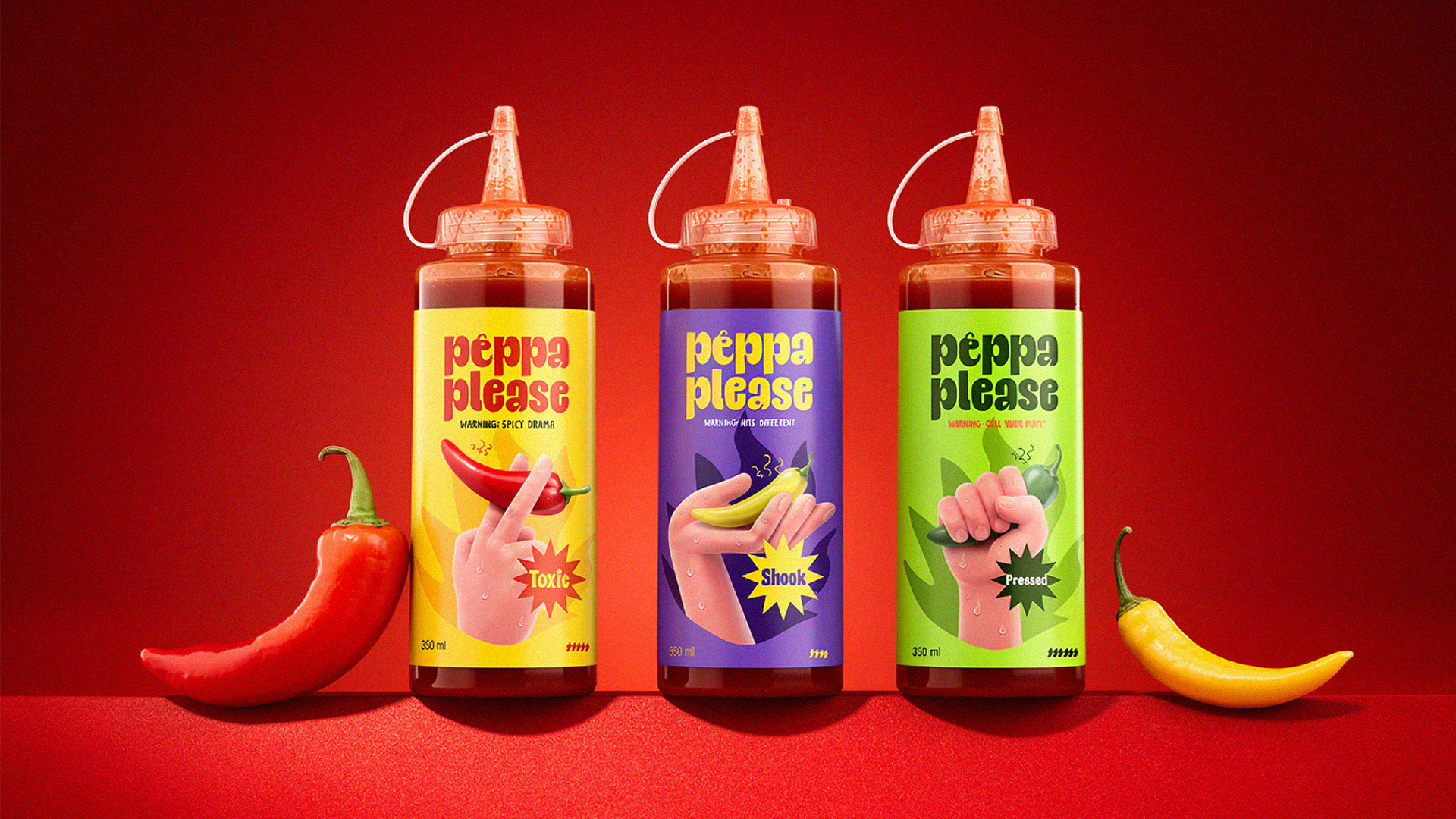
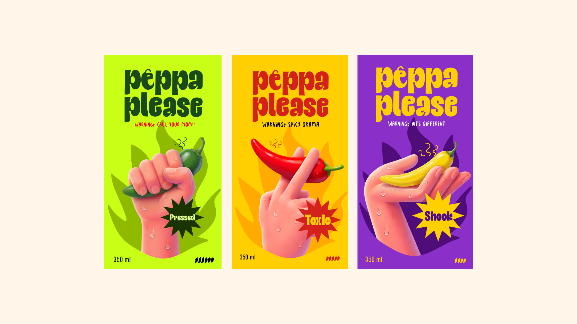
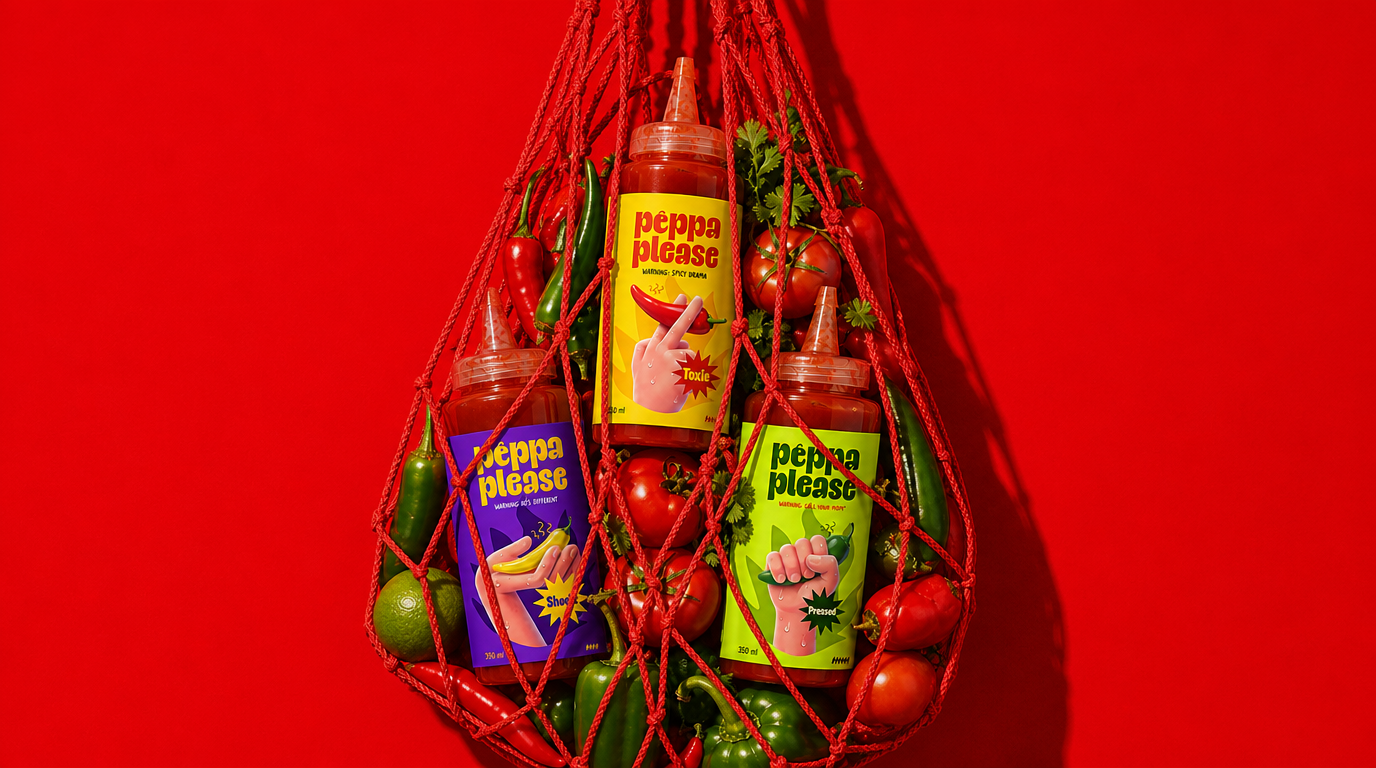
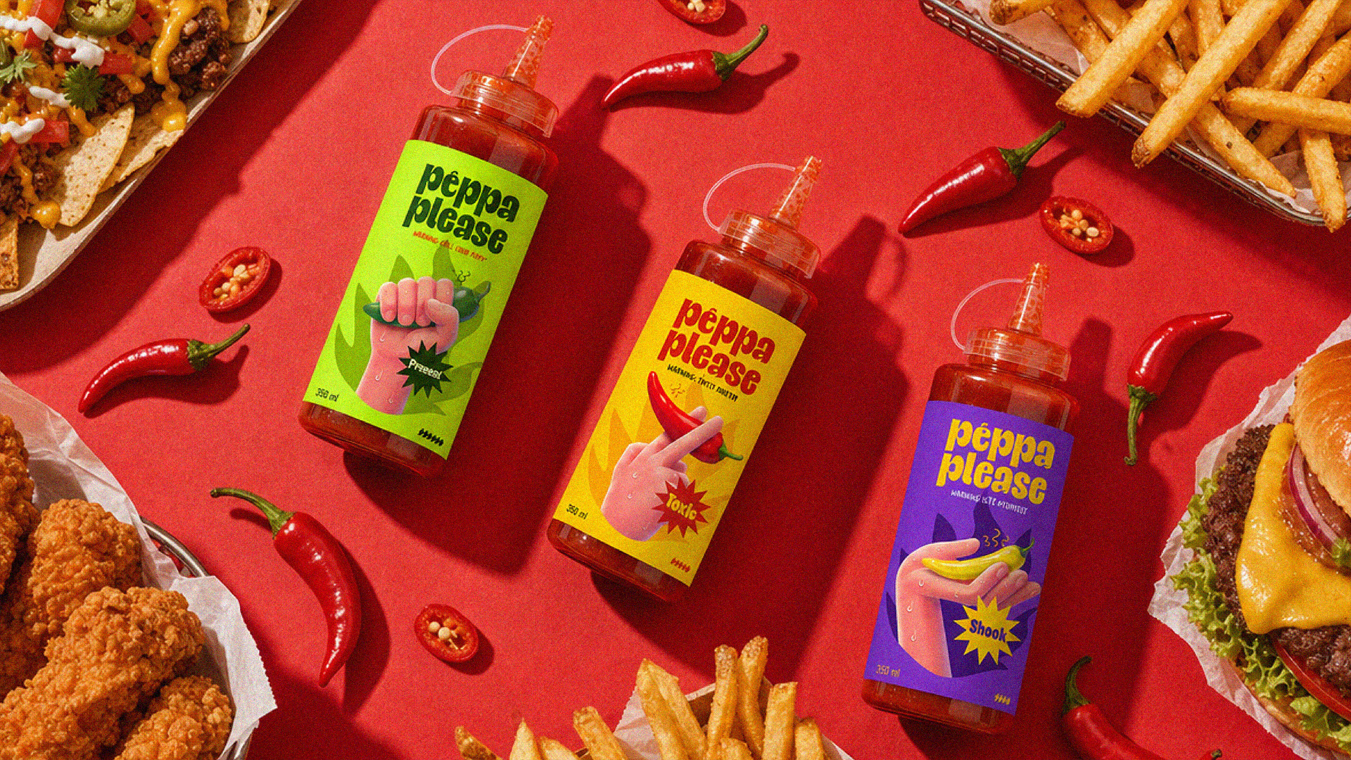
The project started as a branding challenge by Designer Briefs, with the goal of creating a distinctive hot sauce brand with a strong personality and memorable packaging. Instead of treating each flavor as simply a different color, I developed a character and attitude for each one, allowing the flavors to communicate through their own visual language and tone of voice.
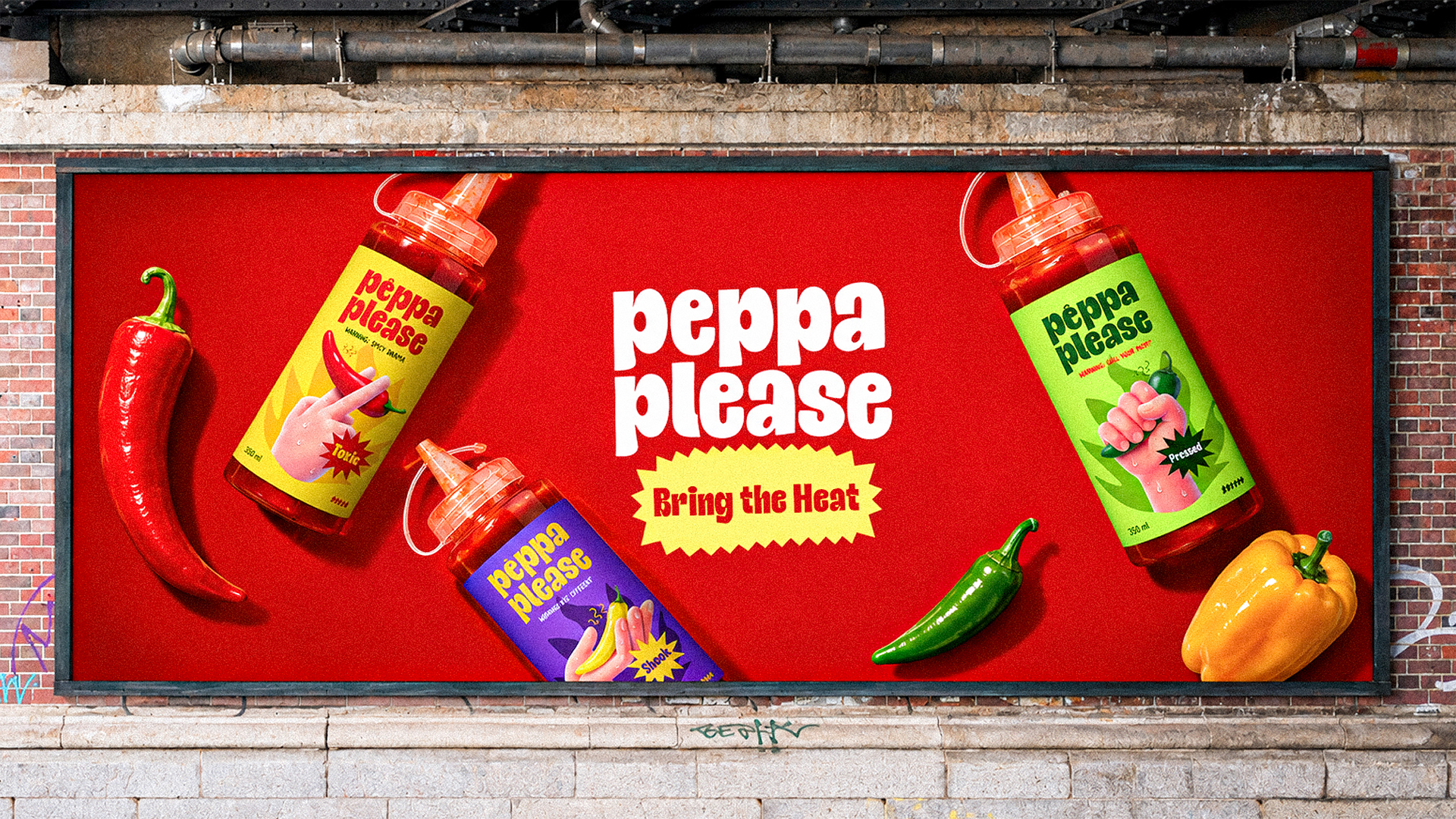
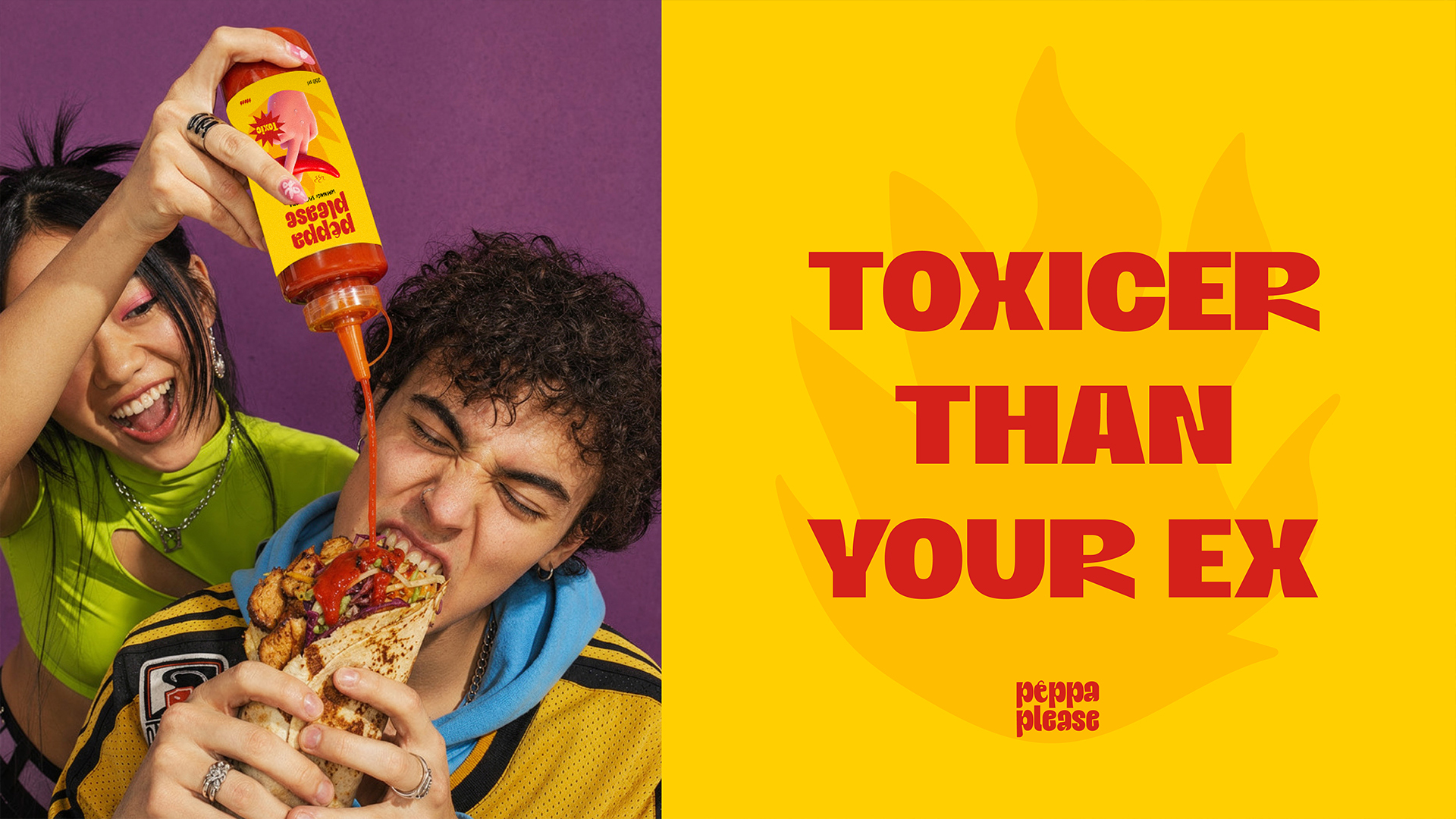
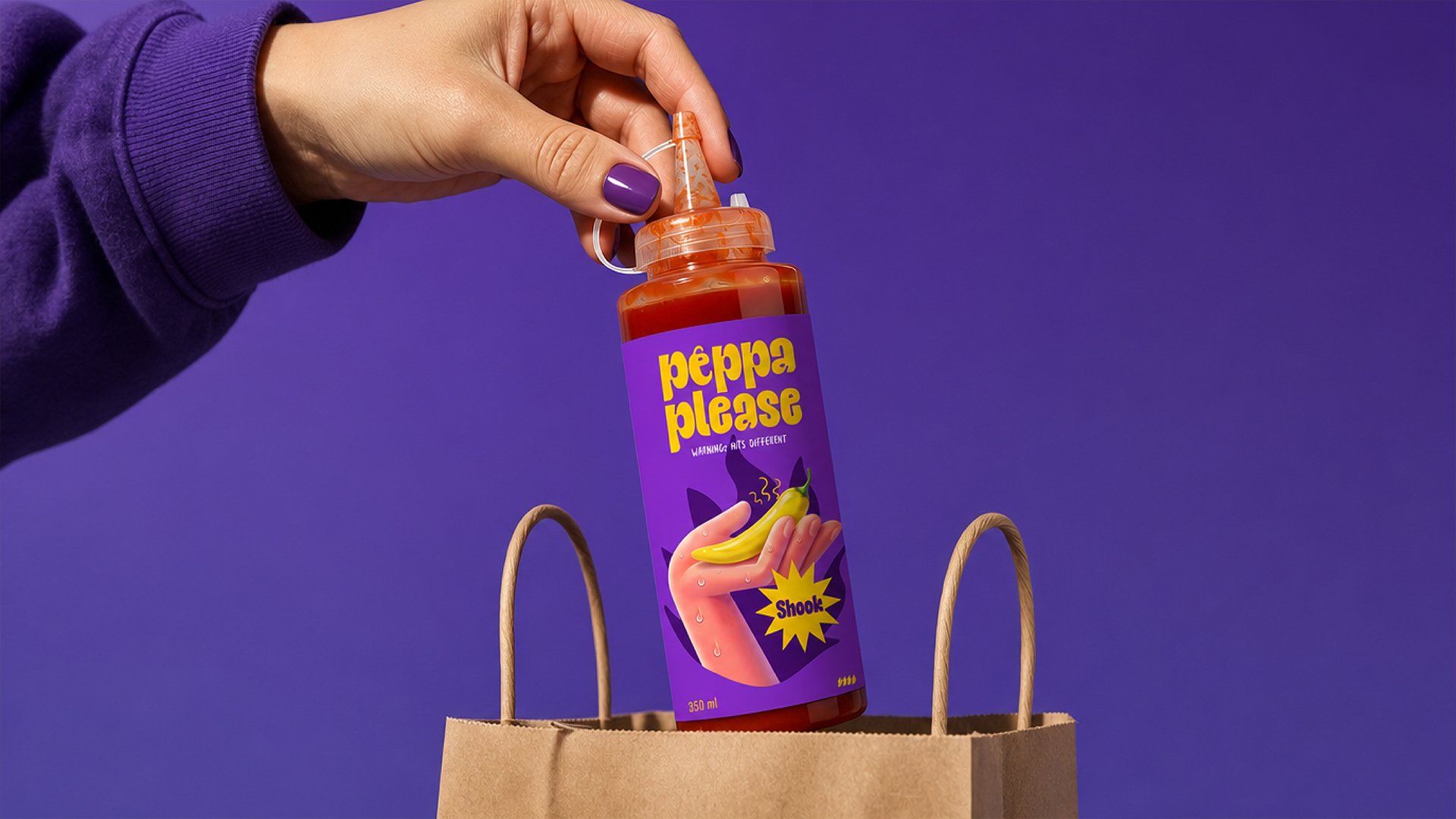
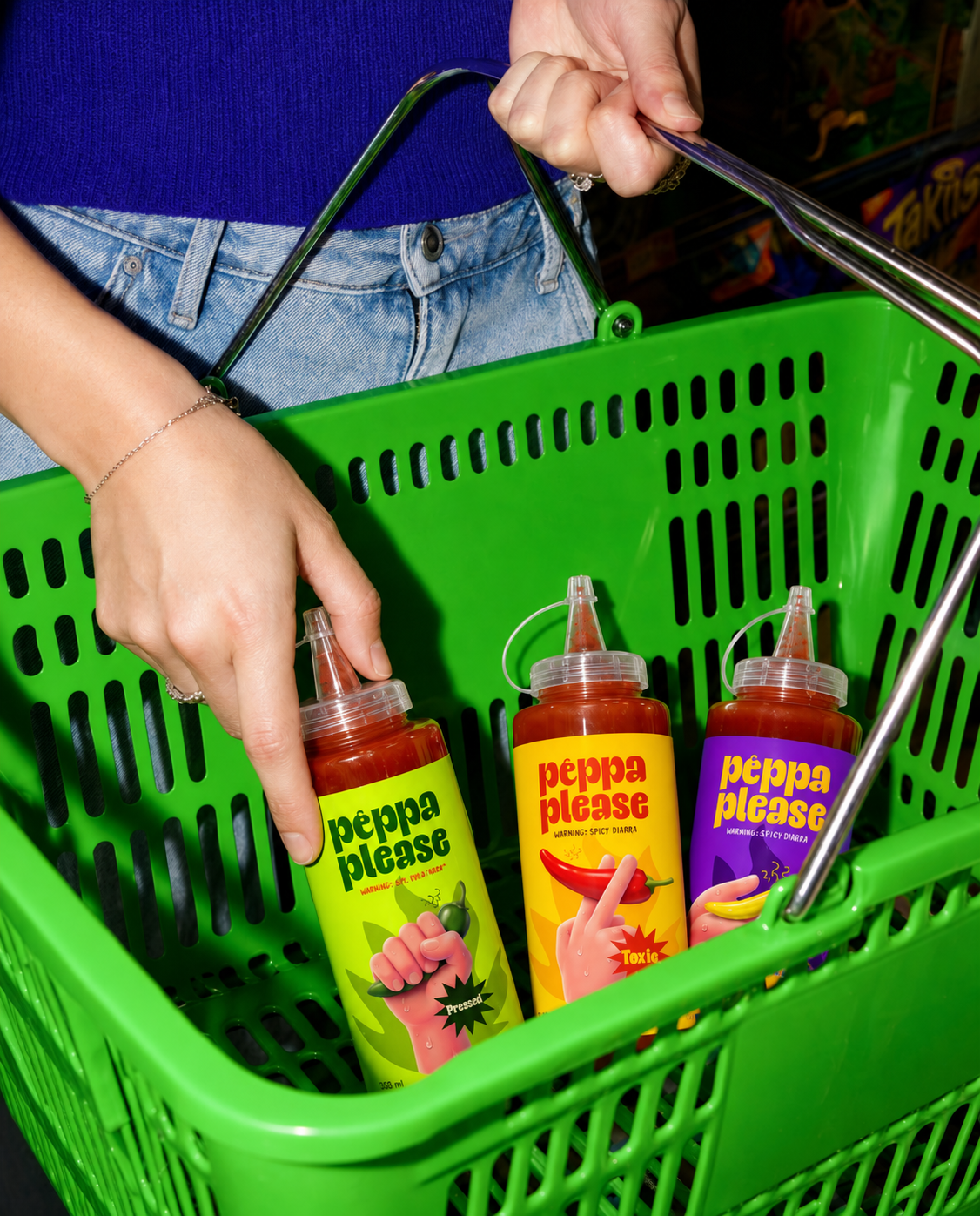
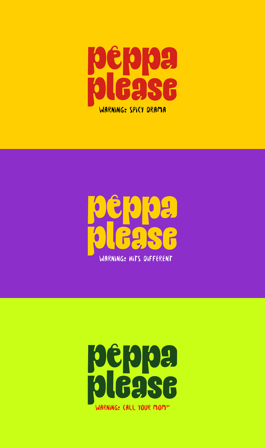
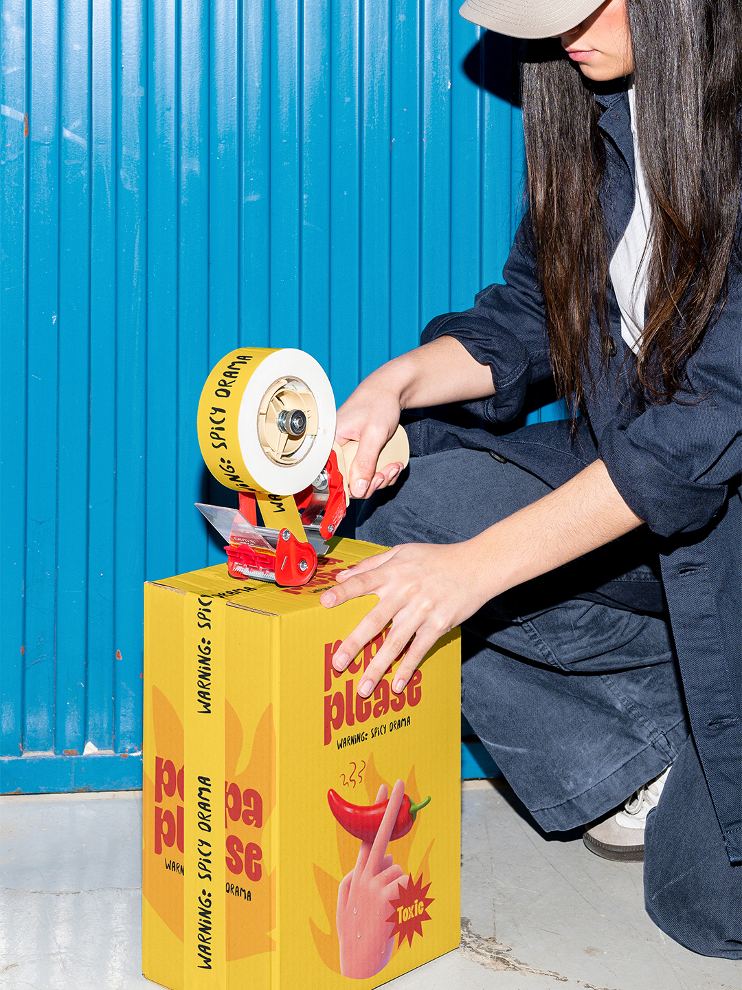
The packaging system combines expressive typography, playful illustrations, bold color combinations, and unexpected copy to create a brand that feels cheeky, confident, and slightly unpredictable. Each bottle is designed to feel like a different personality within the same brand family, while maintaining a consistent visual identity across the range.
The result is a playful packaging system that turns choosing a hot sauce into part of the brand experience — where the question is not only how hot it is, but what kind of attitude comes with it.
Curator’s Insight
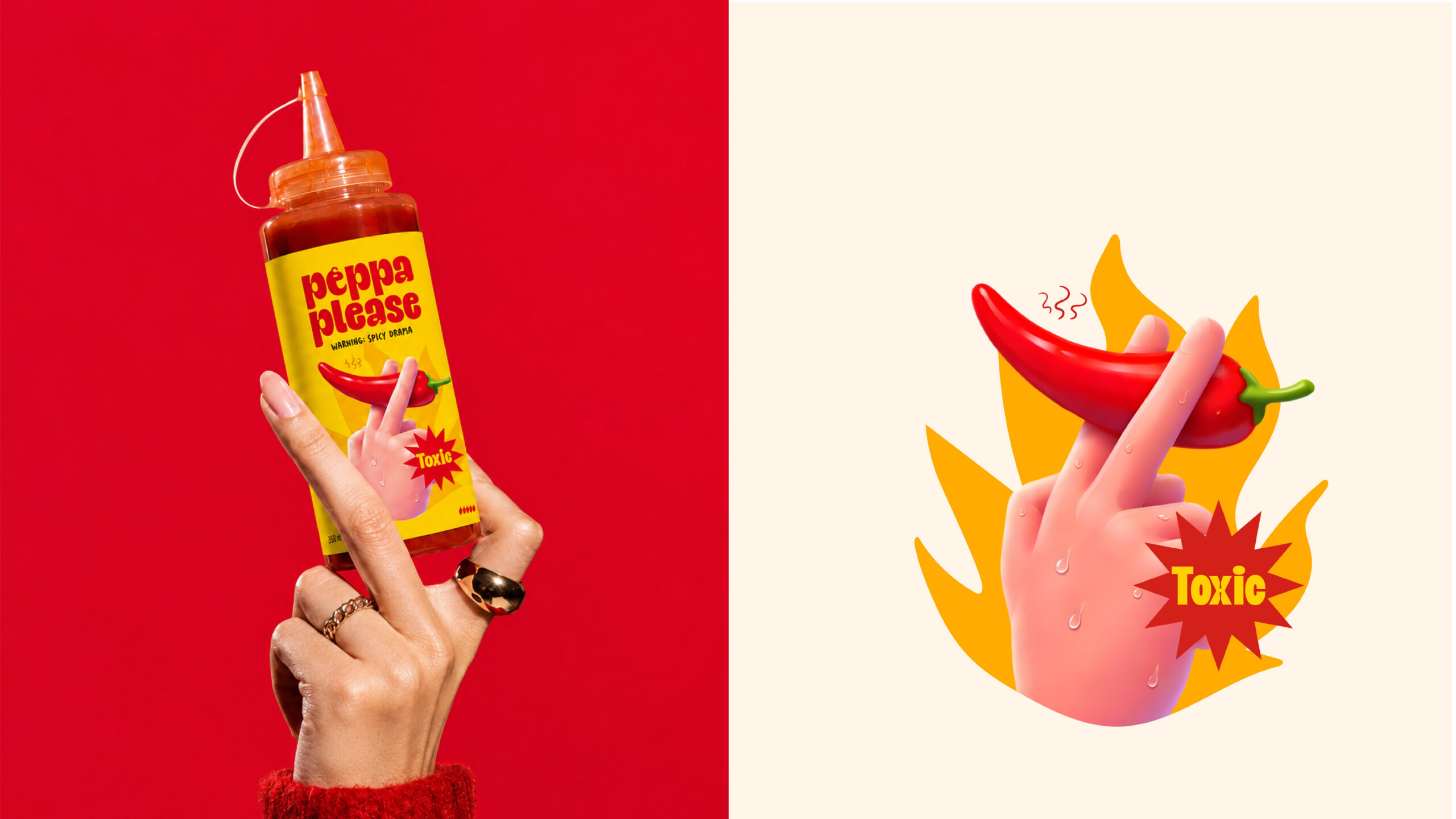
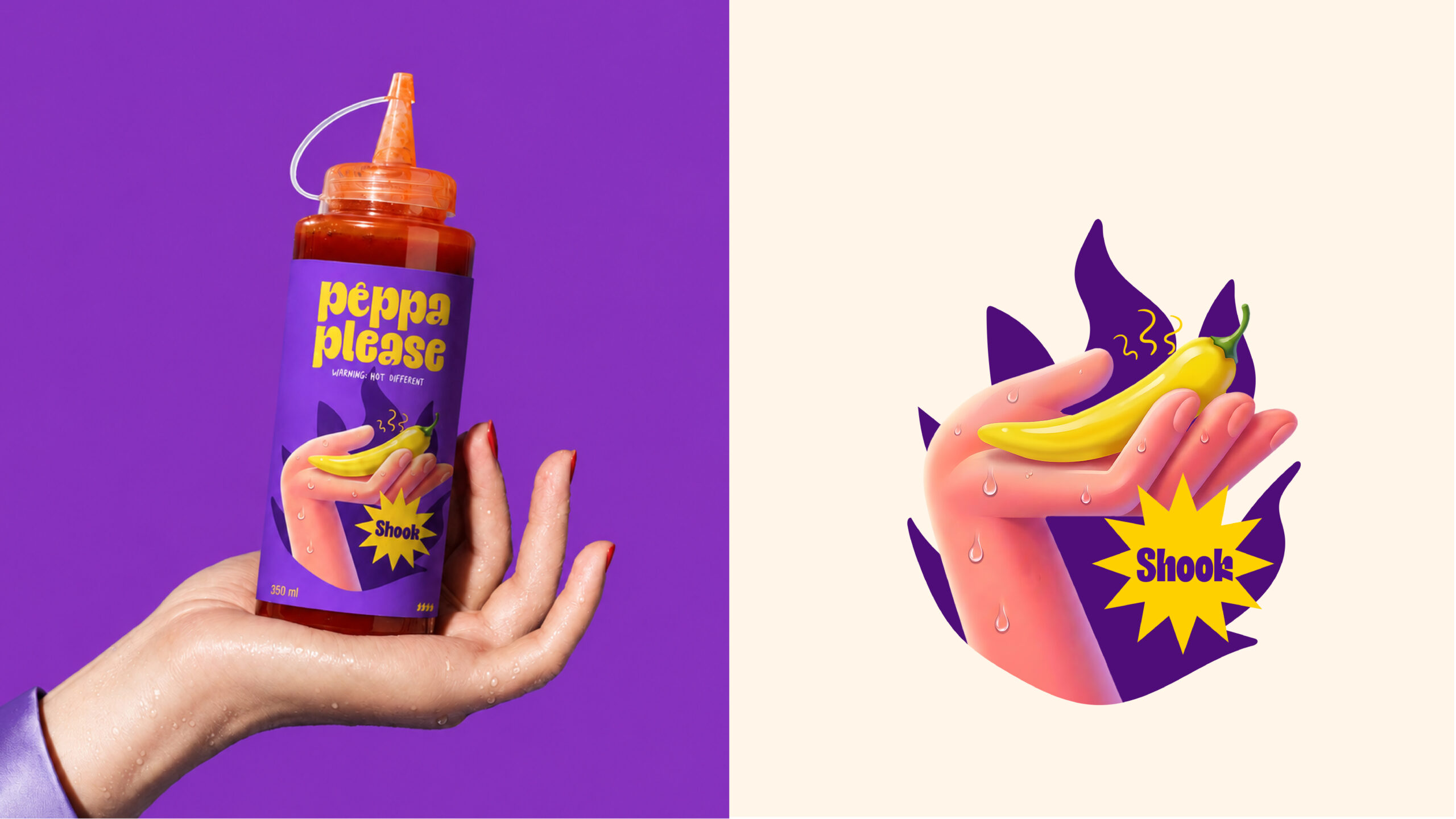
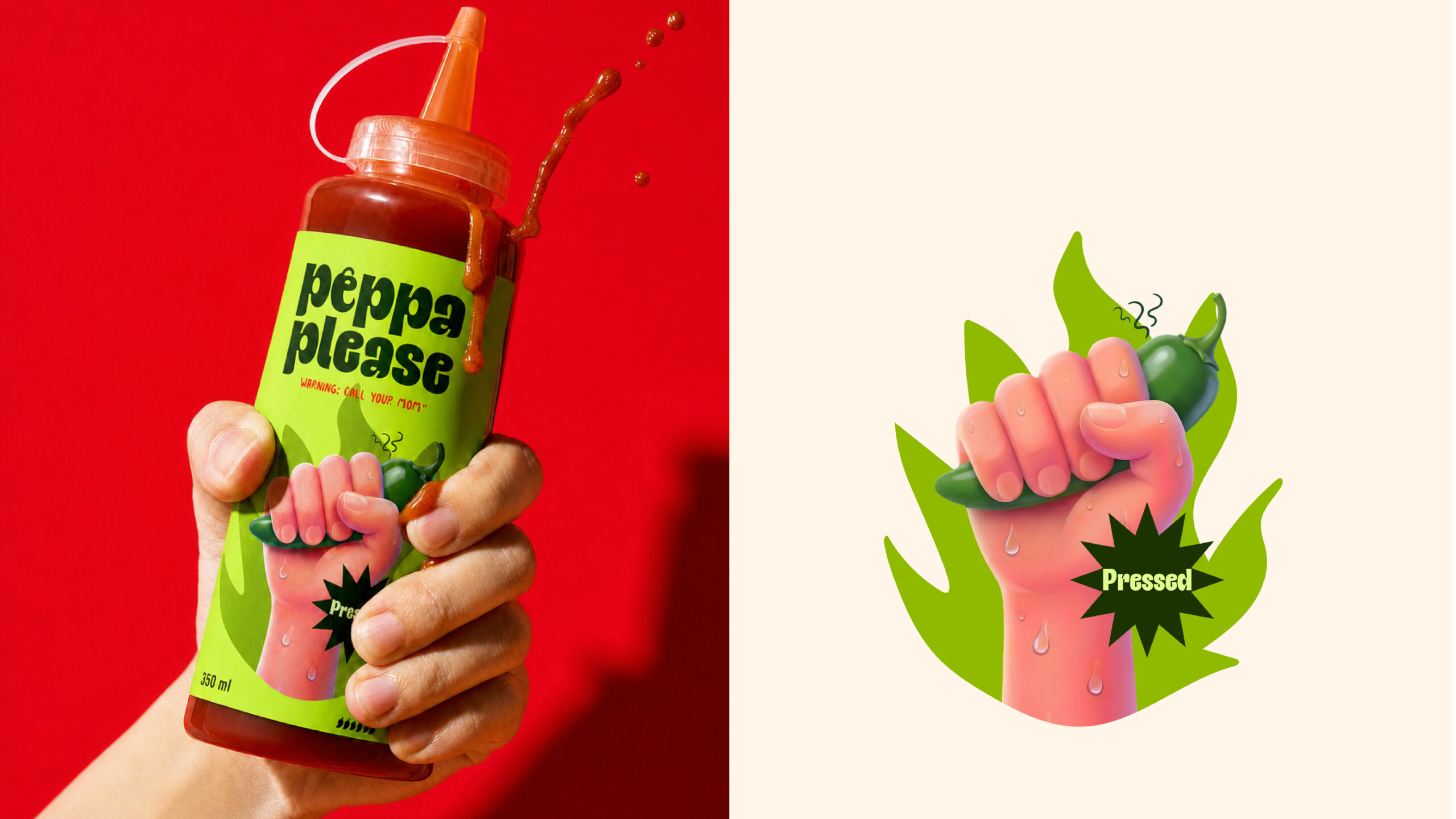
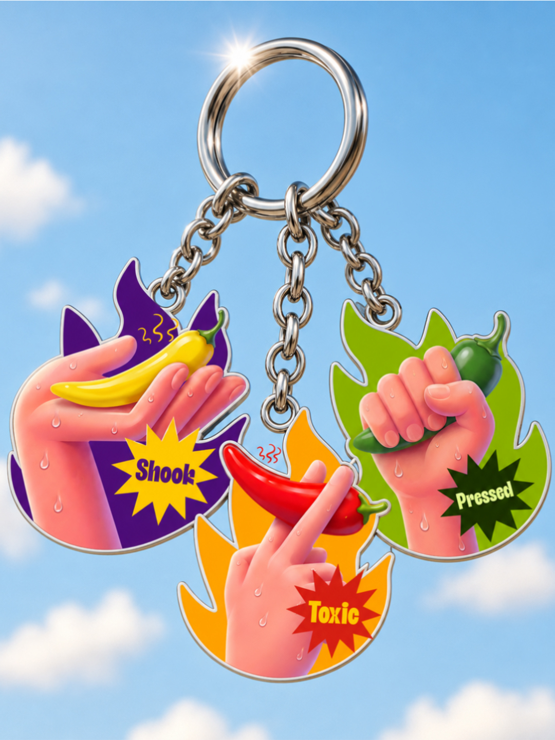
What carries this range is the hand. Rather than illustrate the peppers themselves, the designer illustrates the act of holding them, and escalates the grip from a light two-finger pinch to a full fist as the flavors climb. That progression does the job a heat scale usually does on a hot sauce label, but through gesture instead of numbers or flame icons, so the intensity reads as physical sensation before it reads as information.
The sticker-burst word tags (Toxic, Shook, Pressed) work similarly, sitting outside the illustration like a reaction caught mid-thought rather than a spec sheet. Paired with the bouncy, slightly off-kilter lettering of the logotype, the whole system leans into a comic-strip register that a straighter, more restrained typeface would undercut.
 hello ocean
 monther al omari
 the Labelmaker
 alamgirbrands
 kat bres
 Vantablack Studio
 GruppoSaida
 studiorevv
 grafisercreative
 Kate Reichel
 UPRISE
 Modern Theory
 By siddika
 MAISON D'IDÉE Prague
 Kinshuk Bainss
 Palashcc
 www.branding.uz
 Hutton Creative
 DESIGN CONCEPTS
 Tancybox
 Up-Brands
 sayadworks
 Kingdom & Sparrow
 furtgoods
 Si me preguntas
 Narrow House Packaging Branding & Design