
ABOUT
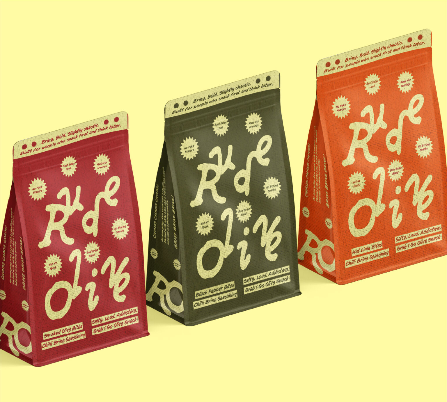
Rude Olive is a conceptual grab-and-go olive snack brand created for people who crave bold flavours and even bolder personalities. Rather than approaching olives through a traditional gourmet or artisanal lens, the brand reimagines them as a rebellious, energetic, and highly snackable product.
Built around ideas of messy, fun, chaotic, bold, and rebellious, the identity takes inspiration from street culture and imperfect expression. The goal was to transform a simple olive snack into a brand with attitude, personality, and a strong visual presence.
SOLUTION
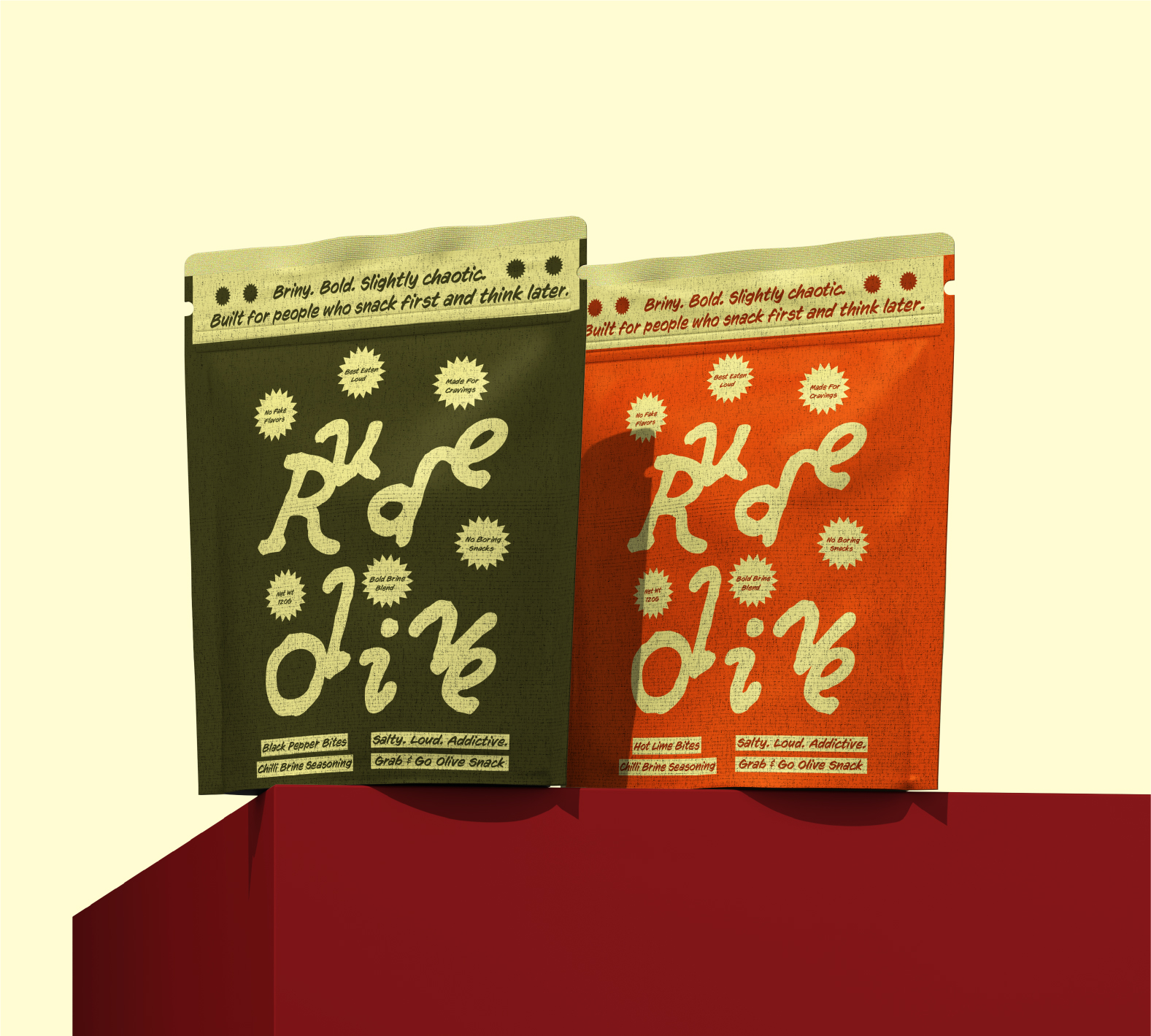
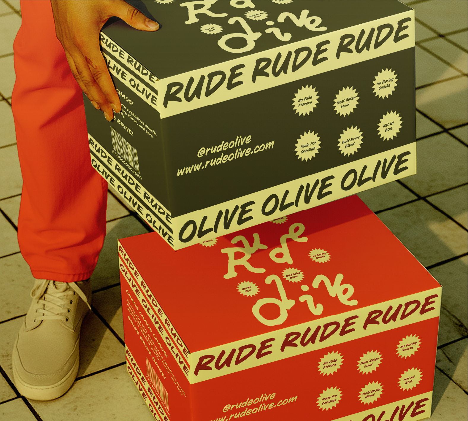
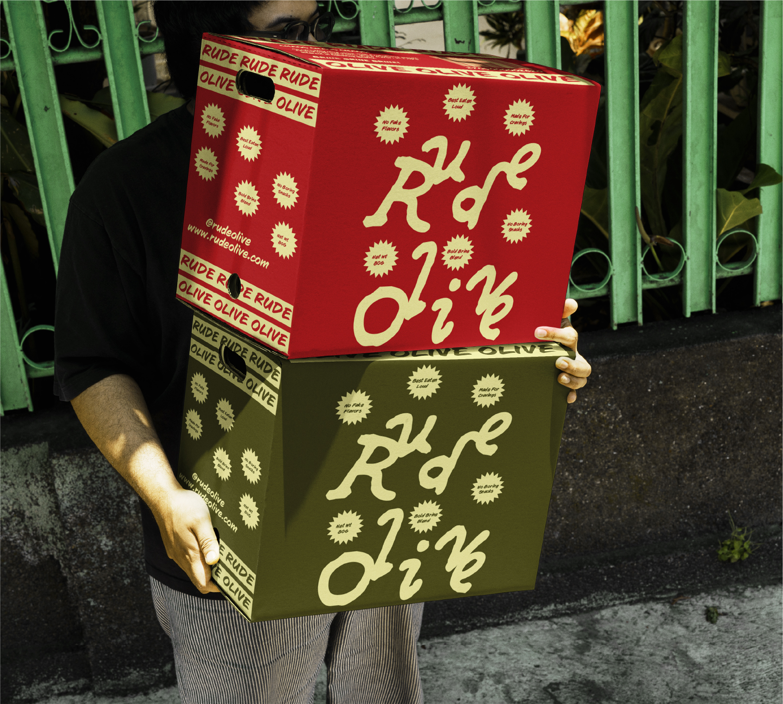
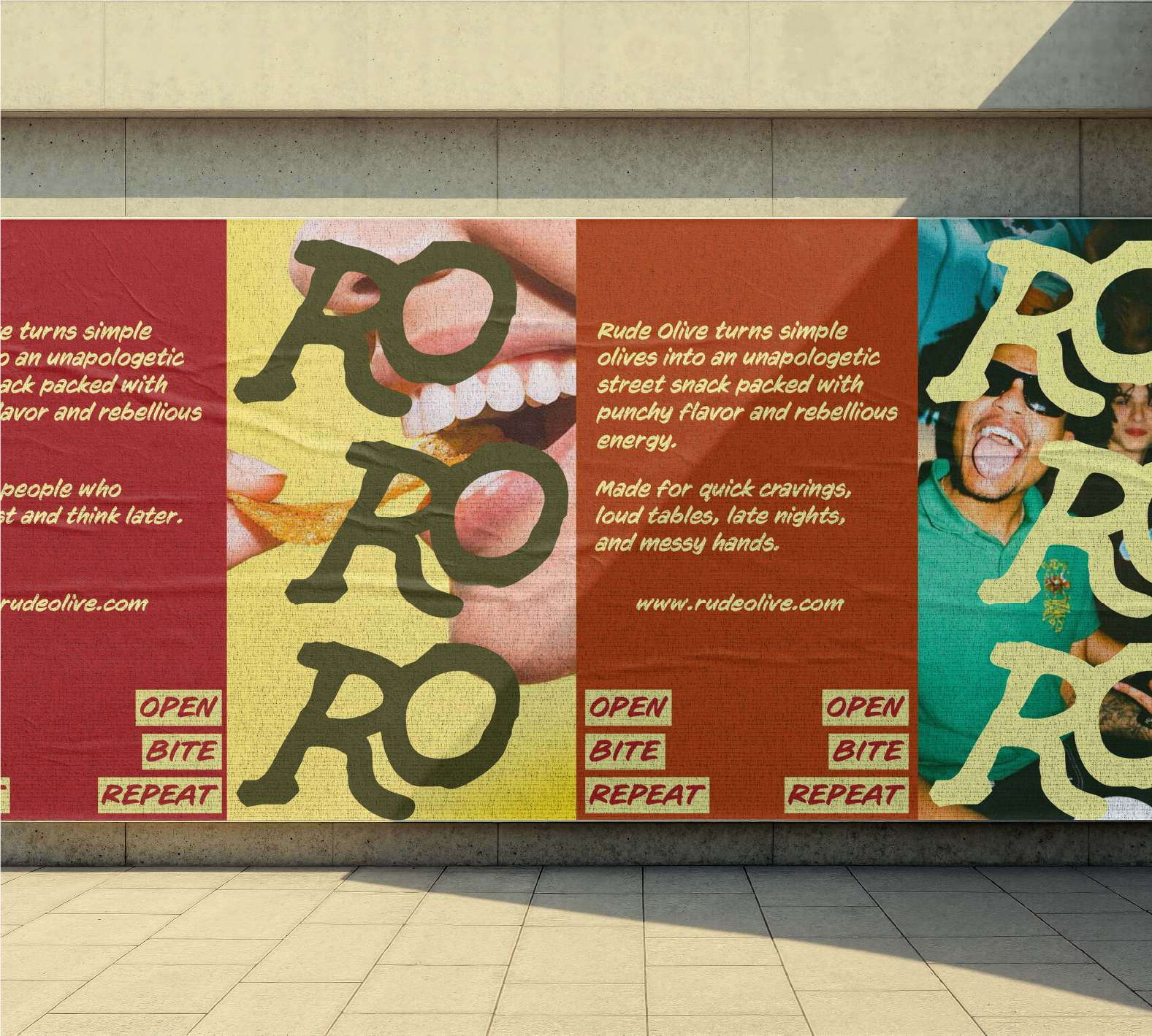
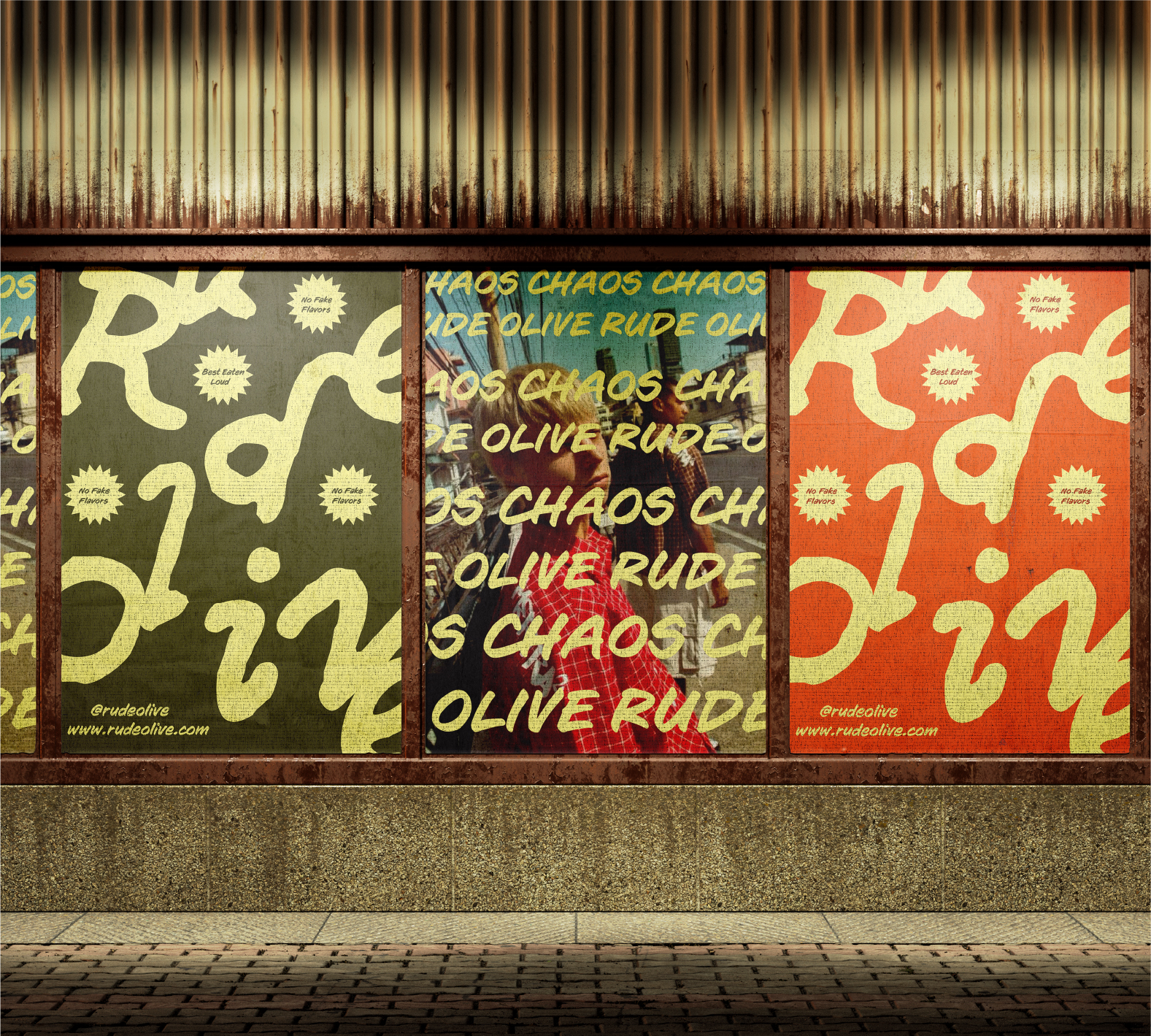
The packaging identity is built around the idea of controlled chaos — embracing imperfect typography, unconventional spacing, oversized type, repeated messaging, and expressive compositions while maintaining a consistent underlying structure.
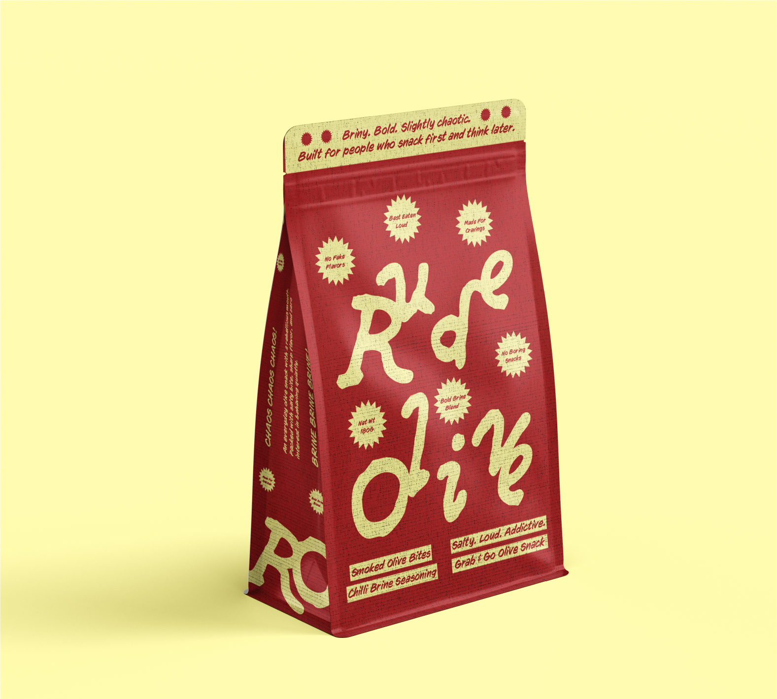
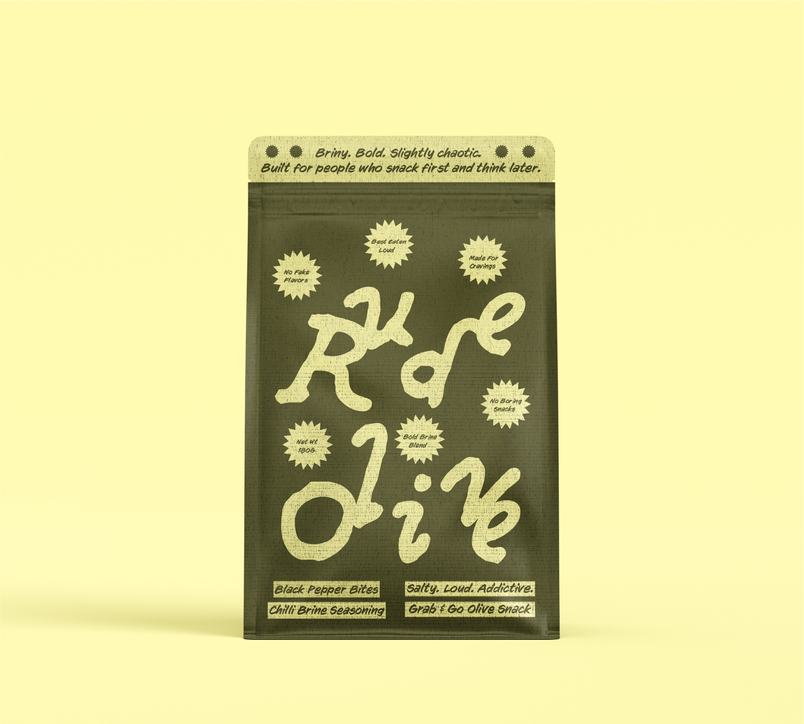
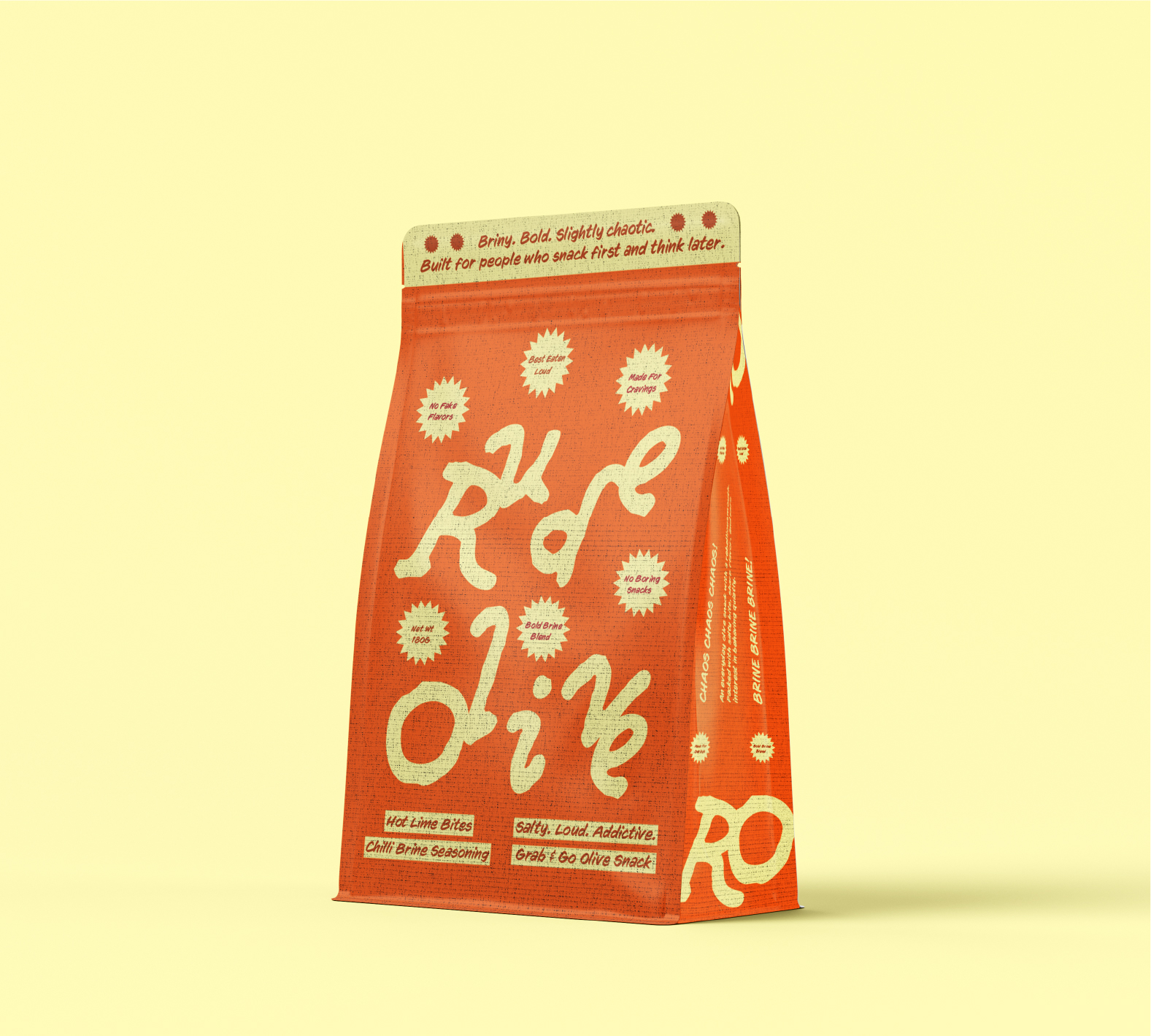
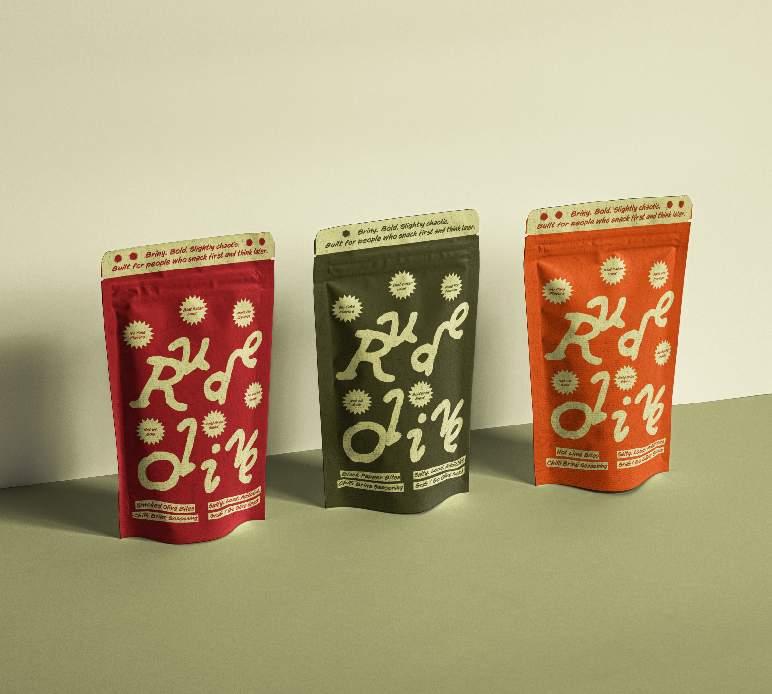
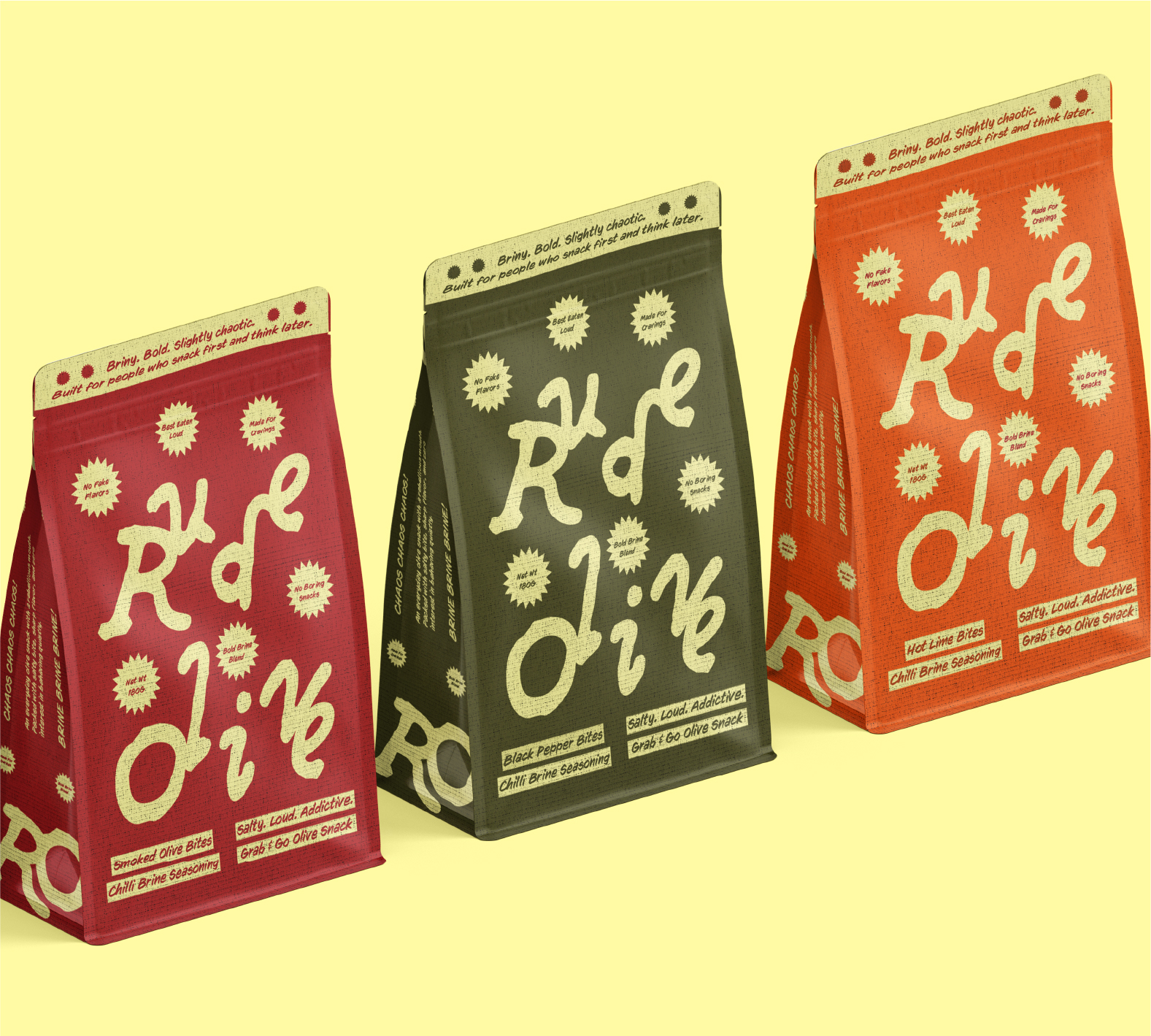
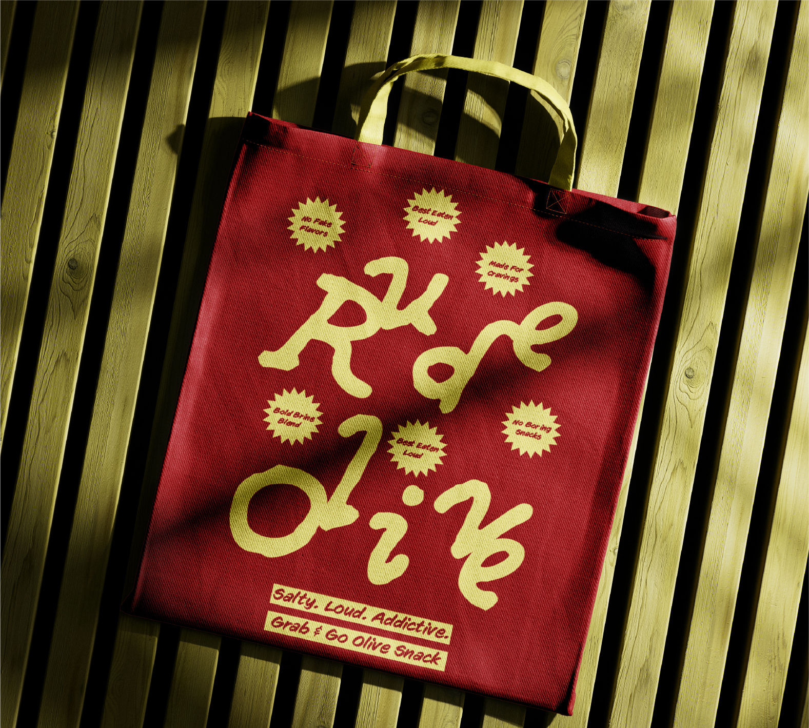
Typography becomes the primary visual driver. An intentionally uneven wordmark, compressed layouts, and bold typographic compositions create movement and energy across the packaging. A high-contrast colour system differentiates the flavours while keeping the entire range visually connected.
Rather than treating imperfection as a flaw, the design uses it as a defining characteristic of the brand. The result is packaging that feels spontaneous and slightly unpredictable while remaining cohesive and recognizable across the range.
RESULT
Rude Olive transforms an everyday olive snack into a bold grab-and-go experience with a distinctive personality. The packaging combines expressive typography, vibrant colour, playful messaging, and controlled imperfection to create a system that feels loud, confident, and unapologetically different.
The final result is a cohesive packaging identity that turns a simple snack into something memorable, energetic, and full of attitude.
 Akshay 11
 lunapanda
 Tridimage
 Analoguecreative
 lettera7
 alchimistestudioParis
 Lana B
 Colossal
 Pivot Studio
 M&A CREATIVE AGENCY
 monther al omari
 Anastasia Cherepanova | xtramez
 Hollóka Grafikai Műhely / Graphic Design Studio
 BOLD branding
 Antonia Skaraki
 Pâmella Lorrany
 Z9BKAdsgn
 Francesco Paternoster
 b1studio.ro
 Chris Creative Works
 Boordon
 Dmitriy Kuzovlev
 Brand Society
 yasharpic