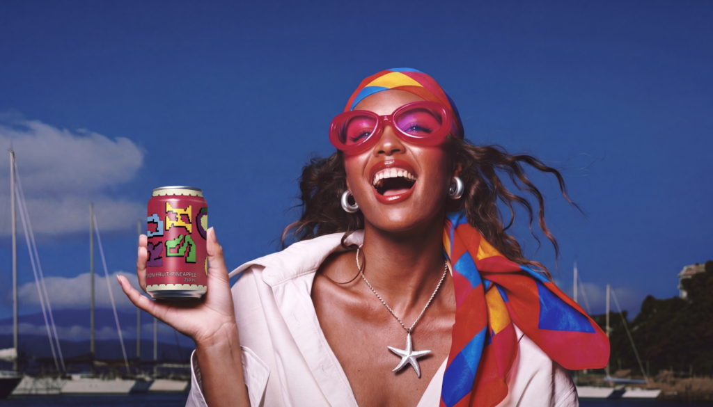

RUSH — Energy Drink Branding, Packaging & AI Campaign
RUSH is a self-initiated energy drink brand concept created for a young audience that values self-expression, spontaneity, movement and vibrant experiences.
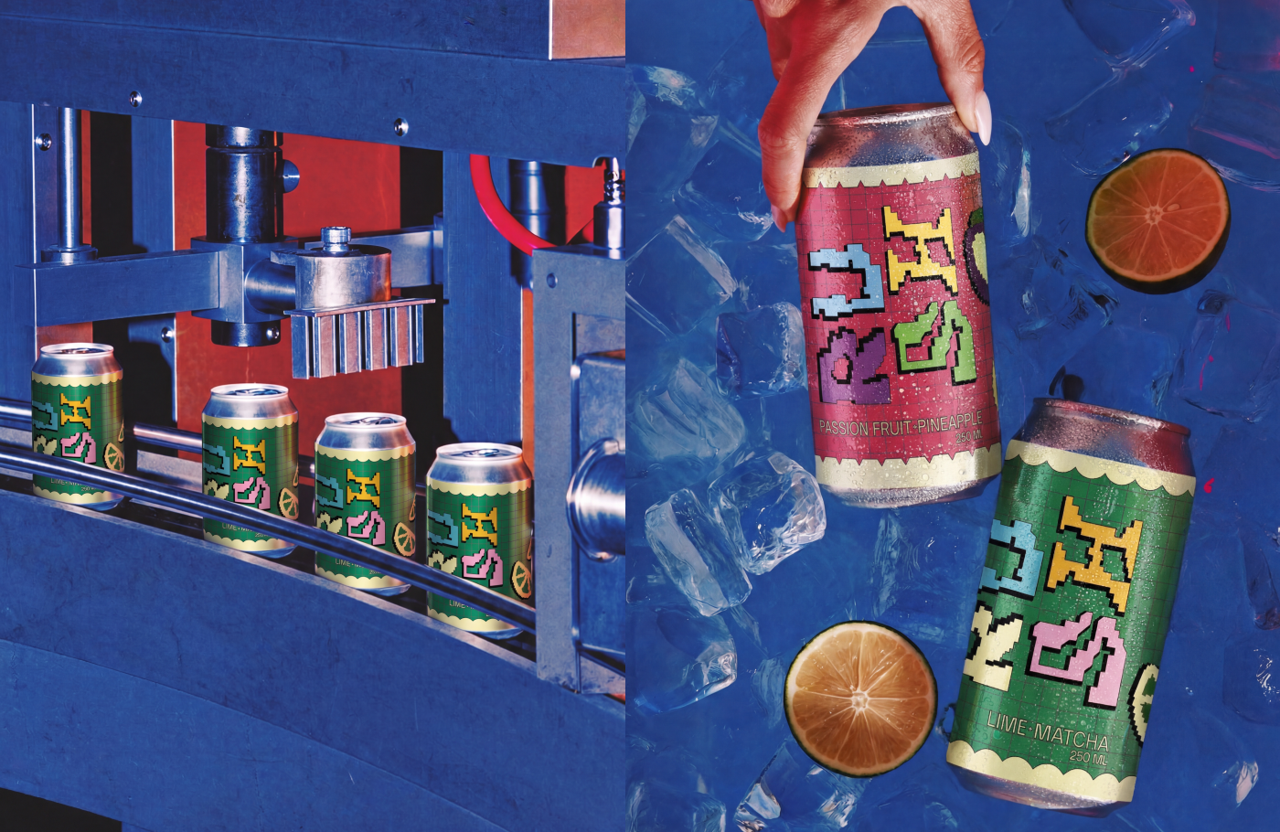
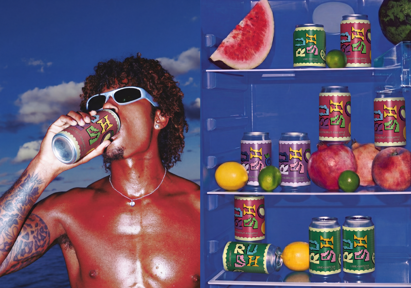
The visual identity is built around a system of custom pixel-inspired fruit illustrations developed specifically for the packaging. Each flavour is represented through simplified geometric graphics, creating a distinctive and recognisable visual language across the range. Bold colour combinations, modular compositions and references to retro gaming and digital aesthetics give RUSH an energetic personality while allowing each flavour to stand out individually.
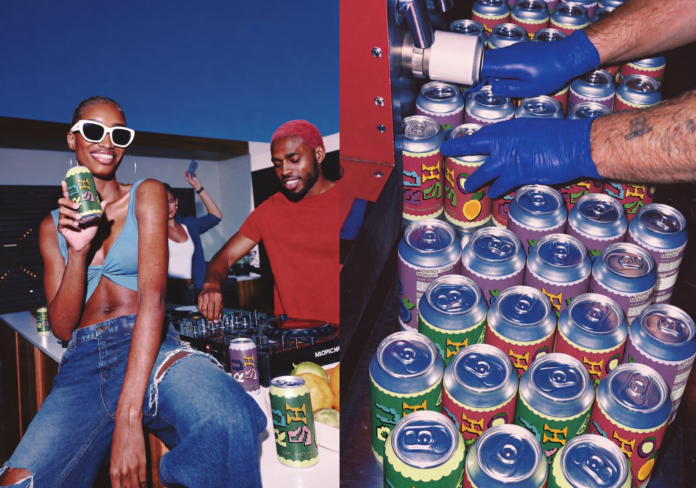
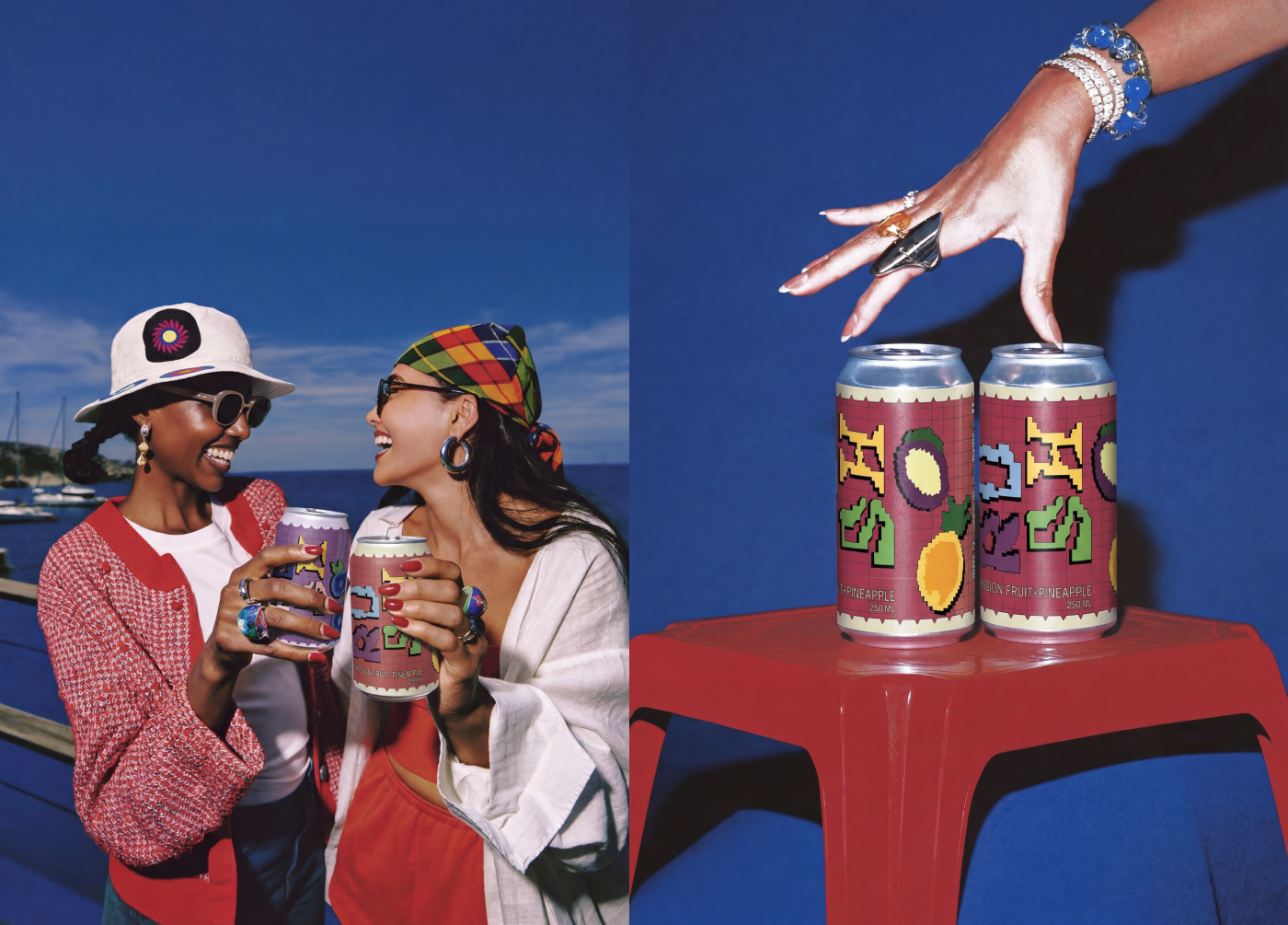
The packaging was designed to feel expressive, playful and highly visible. Rather than following the aggressive visual conventions often associated with energy drinks, RUSH uses colour, pixel-inspired graphics and dynamic compositions to create a more playful interpretation of energy. The visual language connects the physical product with a generation shaped by gaming, social media and digital culture.
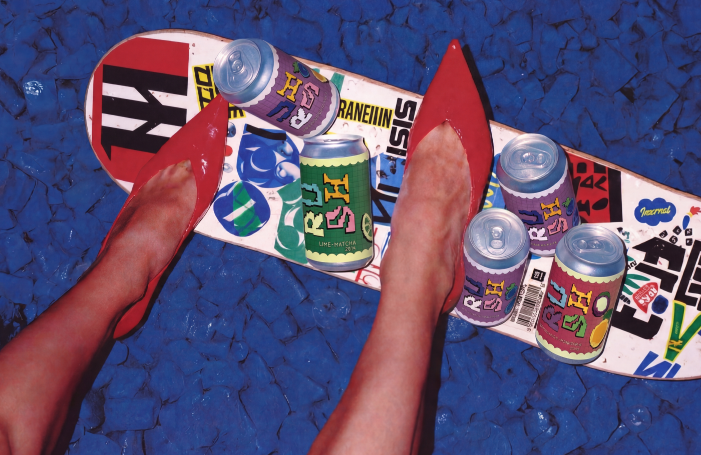
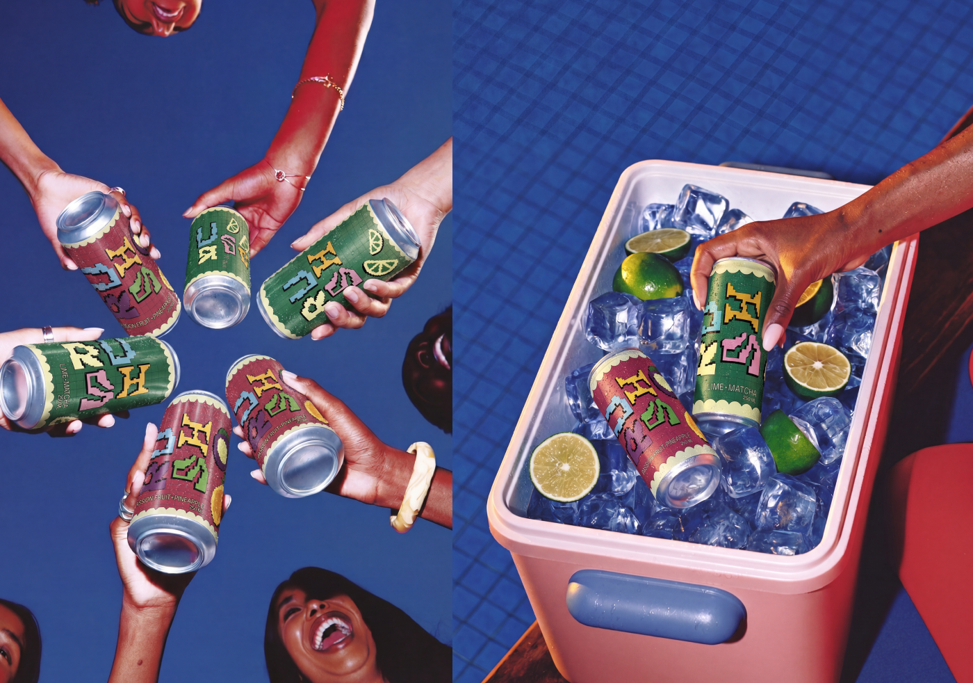
The identity was extended into an AI-powered advertising campaign designed to build a broader visual world around the product. The campaign places RUSH in vibrant lifestyle scenarios inspired by parties, travel, music events, friendship and active urban life.
AI was used as a visual production tool for the campaign imagery, while the brand identity, packaging design, typography, colour system and pixel-inspired graphic language were developed as part of the original design process.
Together, the packaging and campaign create a cohesive brand universe that connects physical packaging with contemporary digital image-making. The result is a bold, youthful and expressive energy drink concept built to stand out both on the shelf and across digital platforms.



 habiba hatem
 Up-Brands
 sayadworks
 Kingdom & Sparrow
 furtgoods
 Si me preguntas
 Narrow House Packaging Branding & Design
 Clever Branding
 About House of Ta
 Hossam khalifa
 Backbar Studios
 Holy Studio
 Prime
Prime Naeema Raashid
 Buddy Creative
 ezgidesignstudio
 Minim Brand Design
 Nenad Došen Studio
 Atyan
Atyan Massimo Lo Cascio
 Carreto Concepts Design Studio
 Charles Mason
 Pinot Agency
 VIEWPOINT
 Maruf Nishat