

ABOUT
The Prism was born from a simple observation: the most beautiful things aren’t always created—they’re simply uncovered. Just as a prism reveals the hidden spectrum within a single beam of light, the brand is built around the idea that extraordinary experiences already exist; they simply require a different perspective to be seen.
Designed as a modern functional beverage, The Prism invites people to slow down, notice more, and rediscover the familiar in an entirely new way. Rather than celebrating intensity, the brand celebrates presence—transforming everyday moments into experiences worth lingering in.
SOLUTION
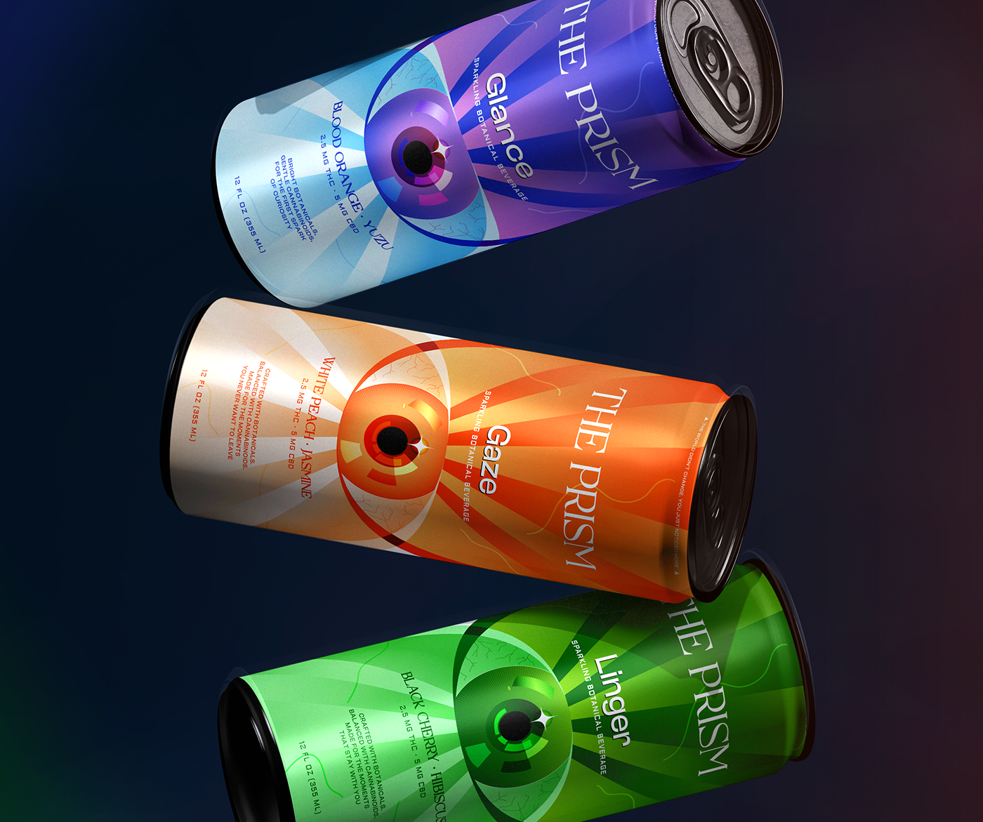
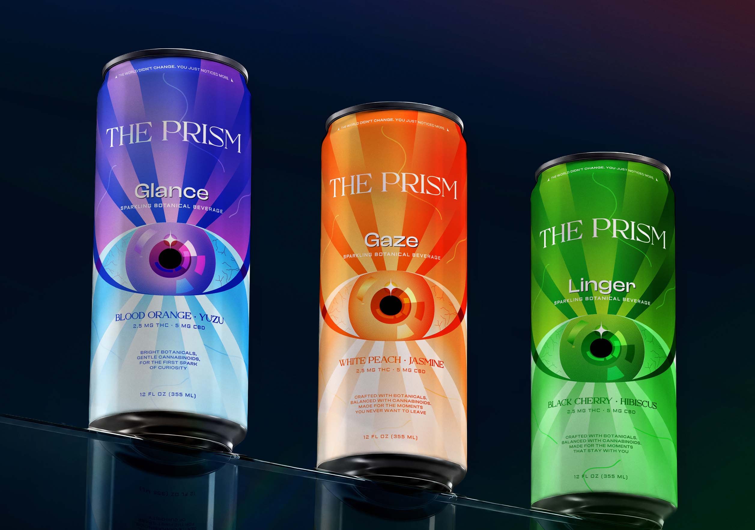
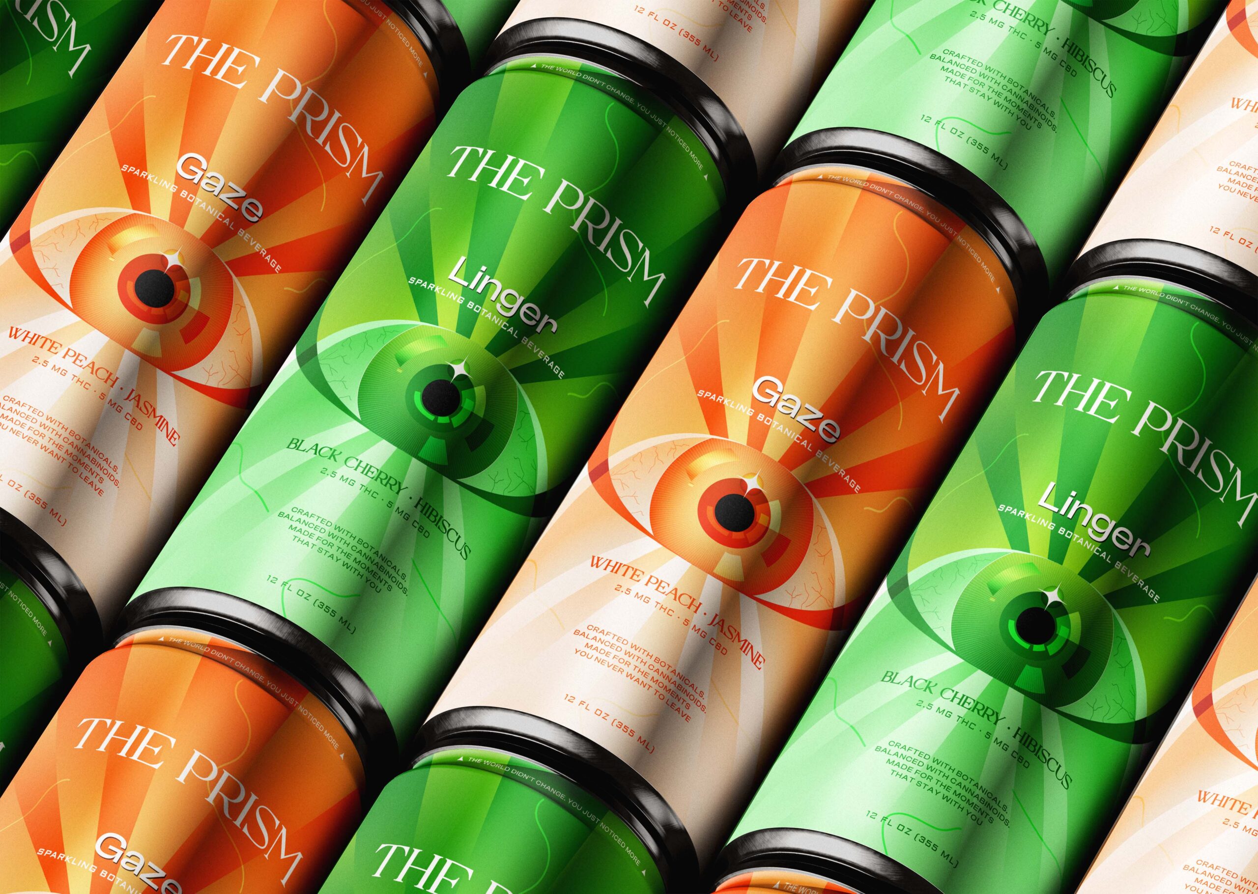
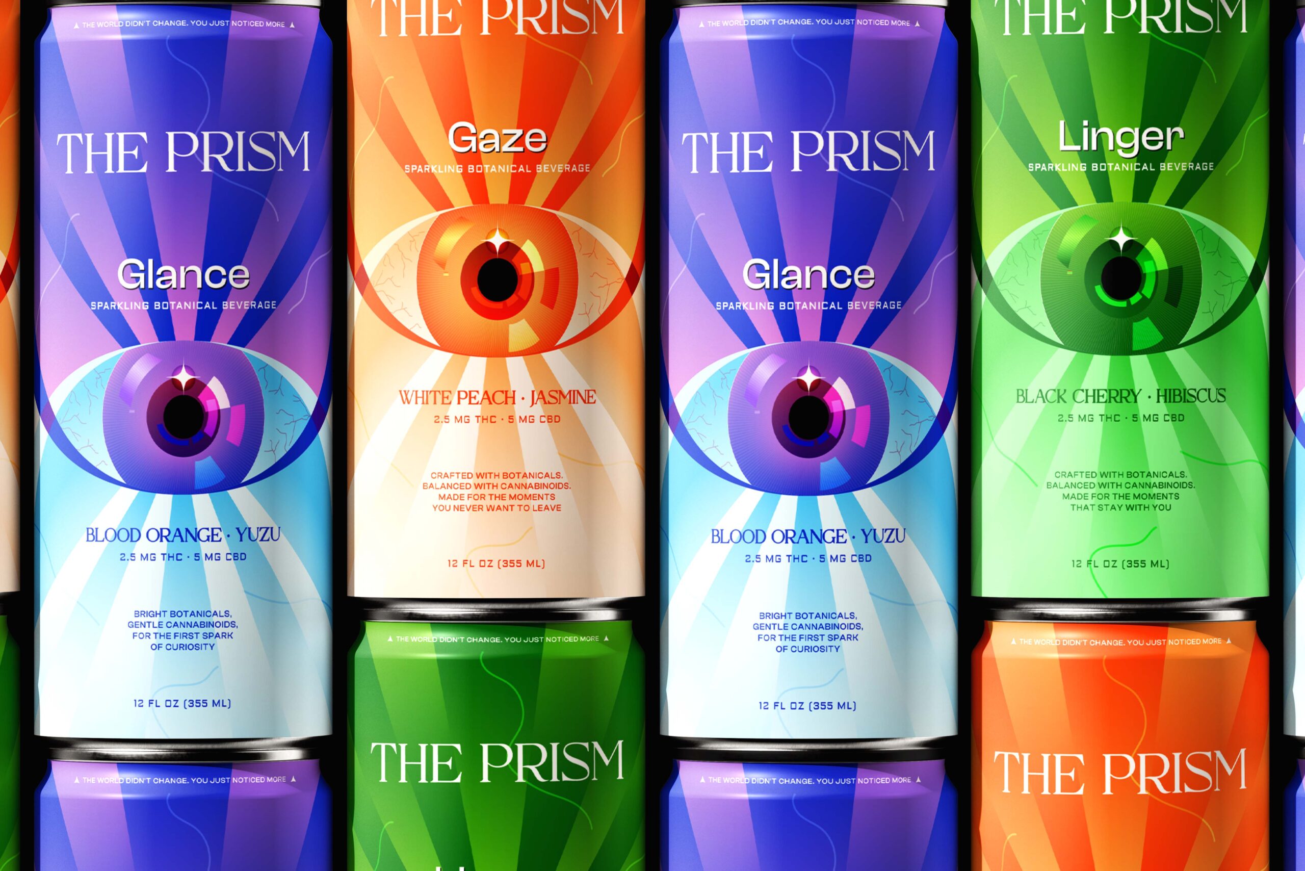
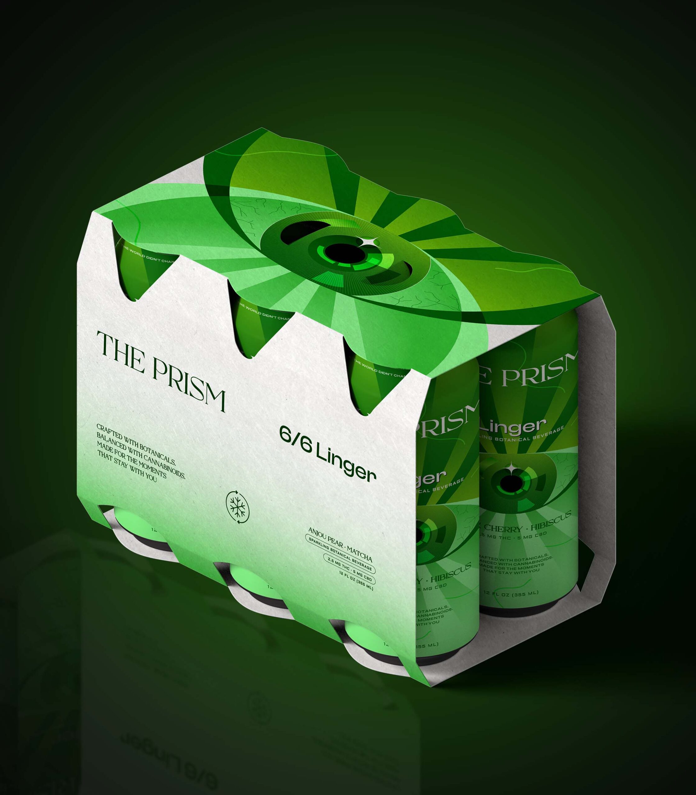
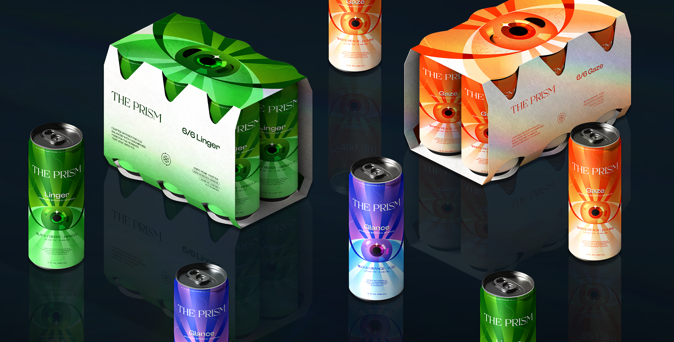
We translated this philosophy into a visual identity where every design element reflects the behaviour of light itself. Minimal compositions, refined typography, luminous gradients, and iridescent finishes create a packaging system that feels both mysterious and sophisticated. The range is structured as a progression of experience—GLANCE, GAZE, and LINGER—guiding consumers from curiosity to deeper presence and lasting impression. Instead of relying on conventional beverage category cues, the packaging creates intrigue through restraint, allowing light, colour, and materiality to become the hero.
RESULT
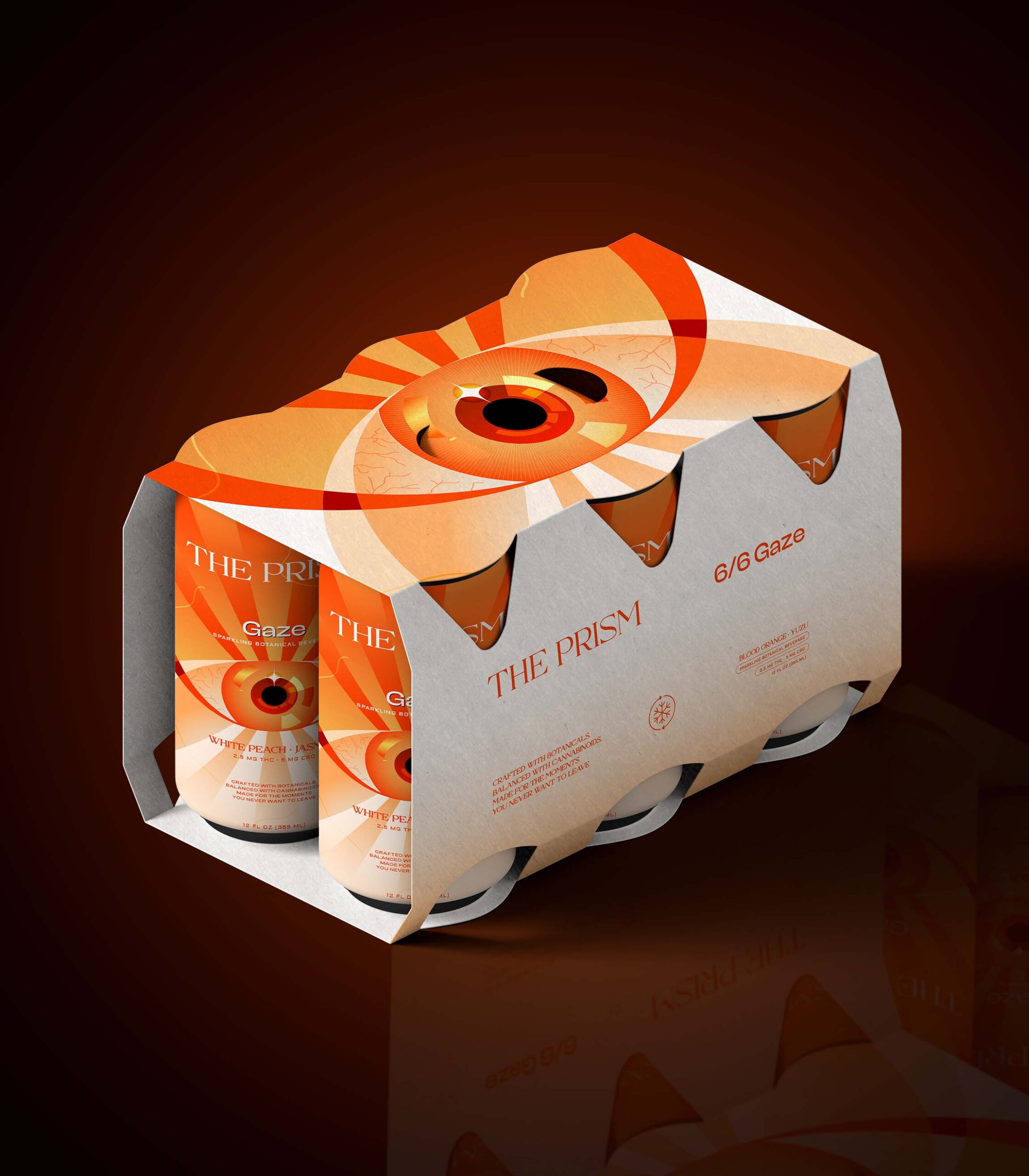
The Prism transforms a beverage into an experience of discovery. Every can feels like an object worth keeping, inviting interaction long before the first sip. By turning the behaviour of light into a scalable visual system, the brand establishes a distinctive identity that stands apart in the functional beverage category—proving that the most memorable packaging doesn’t demand attention; it rewards those who take a second look.



 Natasha Spitsyna
 babyage
 GruppoSaida
 ahmedraoudgfx
 Hi estudio
 Nadezhda Gorelikova
 Studio Garces
 Brandsbylufo
 Rewot
Rewot alchimistestudioParis
 Asprey Creative
 kat bres
 Valérie Colace
 Atiq Alam
 Sara Communications
 David Hakobyan
 monther al omari
 Innovāt - Empowering Creative Innovation
 mmdesign
 Amjad Battal
 Hollóka Grafikai Műhely / Graphic Design Studio
 Palashcc
 ABC Design Communication
 ChrisSkarlatos
 Hedayat Hadavi
 Tia Nguyen