Curator's PicksSubmit a projectShare your work

Explore by Country

AfghanistanAfricaAlbaniaAlgeriaAmerican SamoaAndorraAngolaAnguillaAntarcticaArgentinaArmeniaAsiaAustraliaAustriaAzerbaijanBahamasBahrainBangladeshBarbadosBelarusBelgiumBeninBoliviaBosnia and HerzegovinaBotswanaBrazilBritish Indian Ocean TerritoryBrunei DarussalamBulgariaCambodiaCameroonCanadaChileChinaChristmas IslandColombiaCosta RicaCote D'ivoireCroatiaCubaCyprusCzech RepublicDemocratic People's Republic of KoreaDenmarkDominican RepublicEcuadorEgyptEl SalvadorEstoniaEthiopiaEuropeFijiFinlandFranceFrench GuianaFrench Southern TerritoriesGeorgiaGermanyGhanaGlobalGreeceGuadeloupeGuatemalaGuyanaHaitiHondurasHong KongHungaryIcelandIndiaIndonesiaIranIraqIrelandIsraelItalyJamaicaJapanJordanKazakhstanKenyaKuwaitKyrgyzstanLatviaLebanonLibyaLithuaniaLuxembourgMacedoniaMadagascarMalaysiaMaldivesMaliMaltaMarshall IslandsMauritiusMexicoMoldovaMonacoMongoliaMontenegroMoroccoMyanmarNepalNetherlandsNew CaledoniaNew ZealandNicaraguaNigeriaNorth AmericaNorwayOceaniaOmanPakistanPalestiniaPanamaPapua New GuineaParaguayPeruPhilippinesPolandPortugalPuerto RicoQatarRepublic of KoreaRepublic of KosovoRomaniaRussian FederationSan MarinoSao Tome and PrincipeSaudi ArabiaSenegalSerbiaSeychellesSingaporeSlovakiaSloveniaSomaliaSouth AfricaSouth AmericaSpainSri LankaSudanSwazilandSwedenSwitzerlandSyrian Arab RepublicTaiwanTajikistanThailandTrinidad and TobagoTunisiaTurkeyTurkmenistanUgandaUkraineUnited Arab EmiratesUnited KingdomUnited StatesUnited States Minor Outlying IslandsUruguayUzbekistanVanuatuVenezuelaViet NamVirgin Islands, U.S.YemenZambiaZimbabwe

Materials

Browse all

TOY — NECTARS

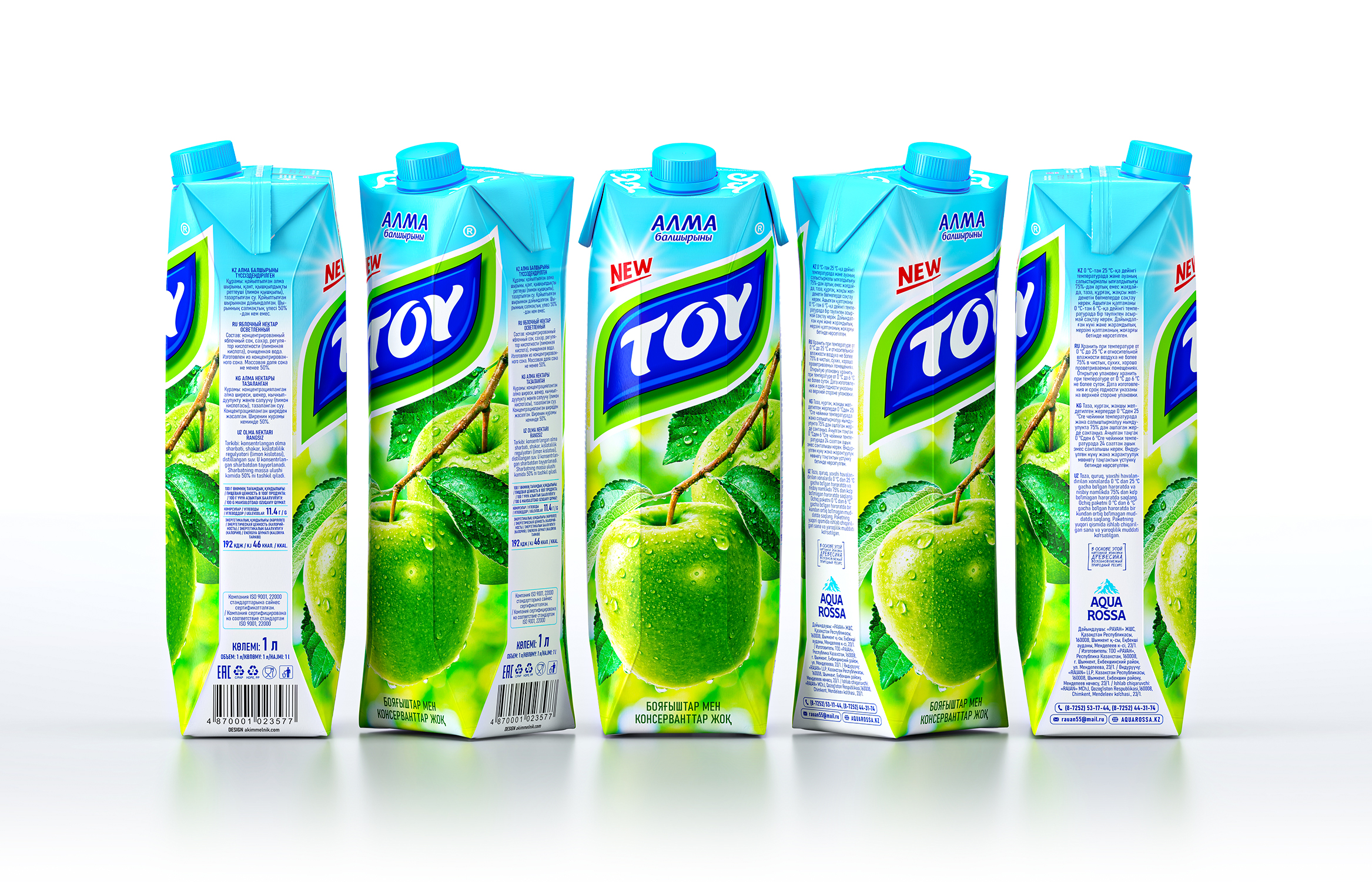
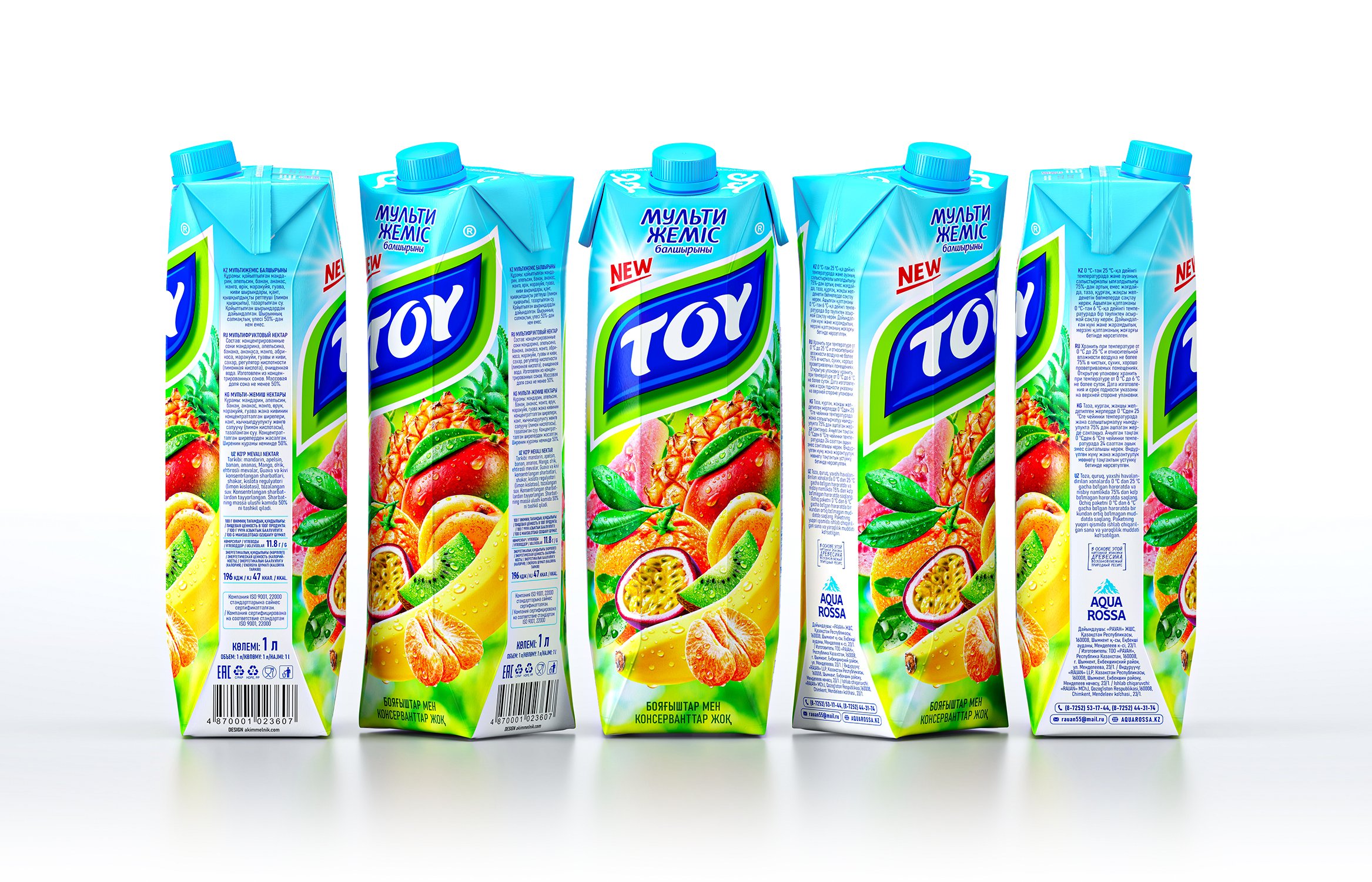
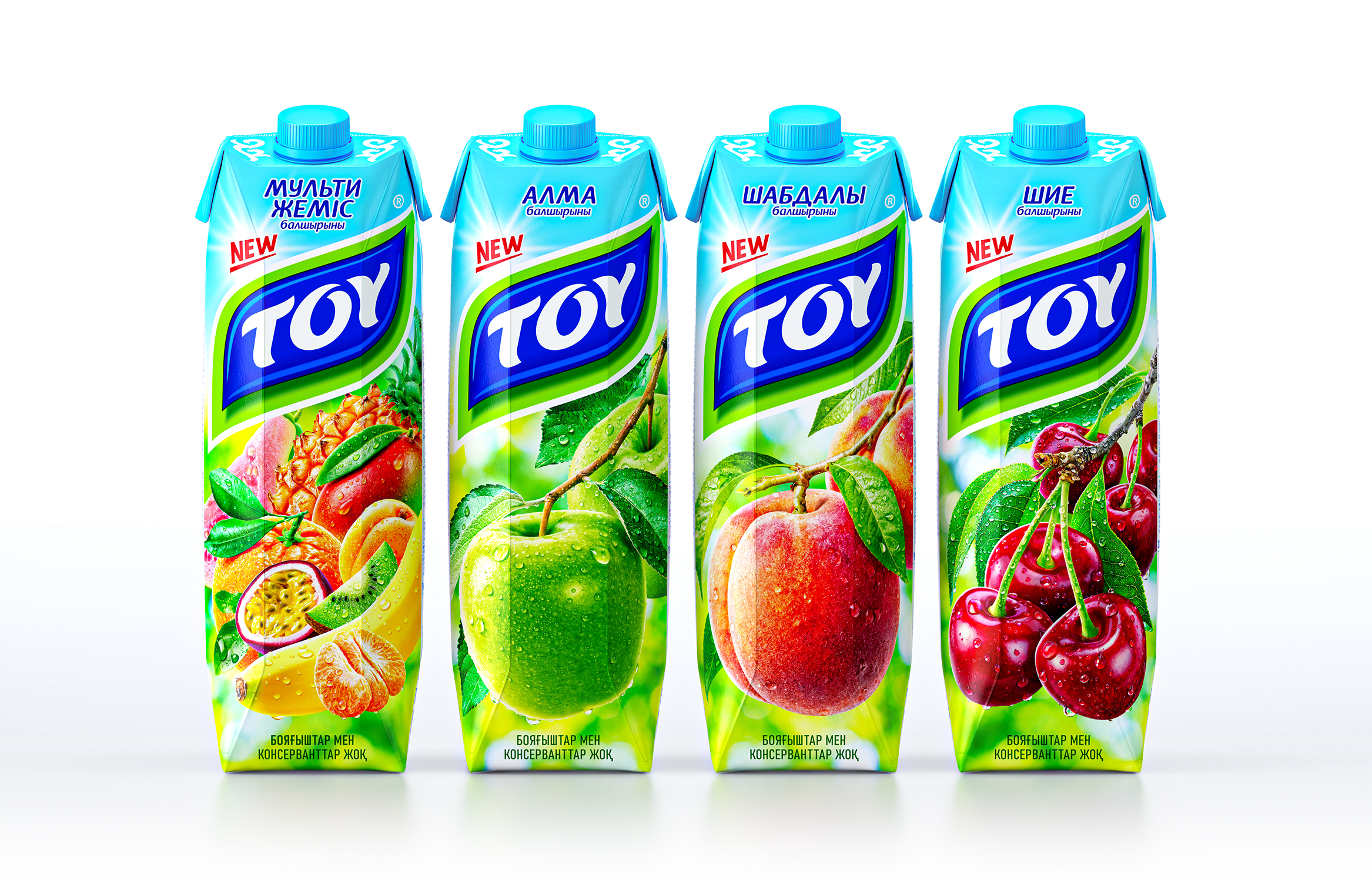
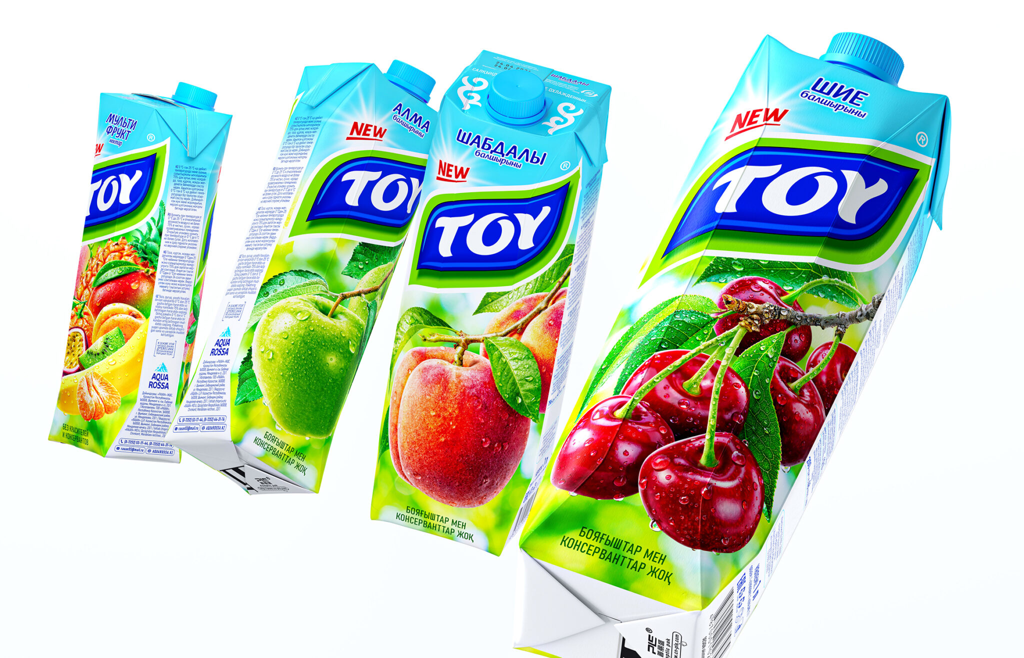
The packaging design for TOY nectars combines vibrant photorealistic images of fruit with a distinctive brand identity. The light green and blue color scheme creates a sense of coolness, freshness, and naturalness, evoking the natural origins of the fruits and berries used to make the drink.

The central element of the composition is the TOY brand name, displayed on a contrasting blue-green background in the shape of a stylized leaf. This graphic solution creates a strong visual accent, enhances brand recognition, and ensures shelf visibility.

Photorealistic images of juicy, ripe fruit, not yet picked, convey a sense of freshness and naturalness, creating emotional appeal. The line consists of four flavors: peach, cherry, apple, and multifruit. The flavor name is positioned at the top of the packaging for easy reading. The word “NEW” draws attention and signals an important stage in the development of the long-established brand.

The result is a clear system that combines brand recognition, appetizing visual presentation of the product, and convenient navigation between flavors.
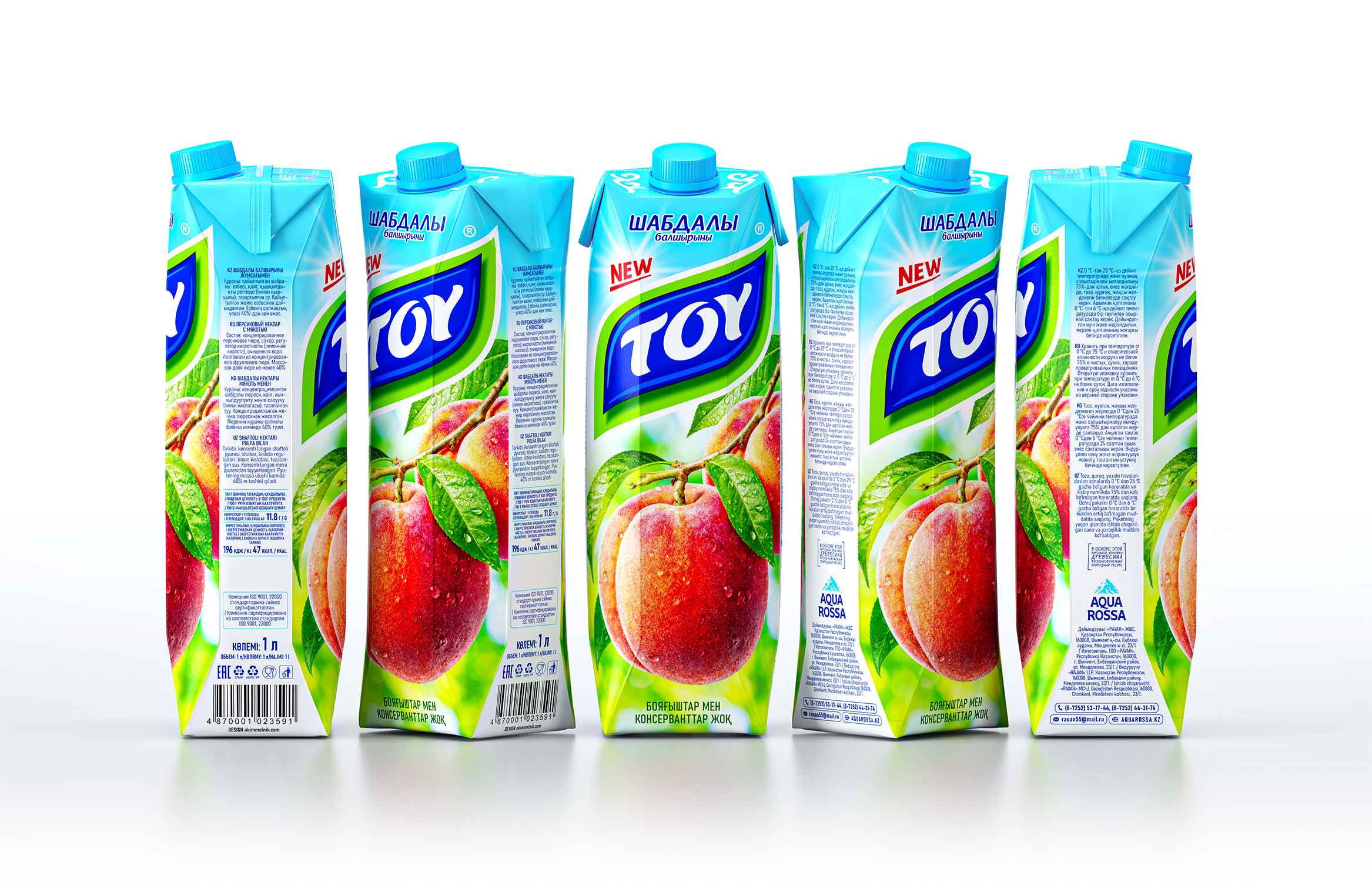
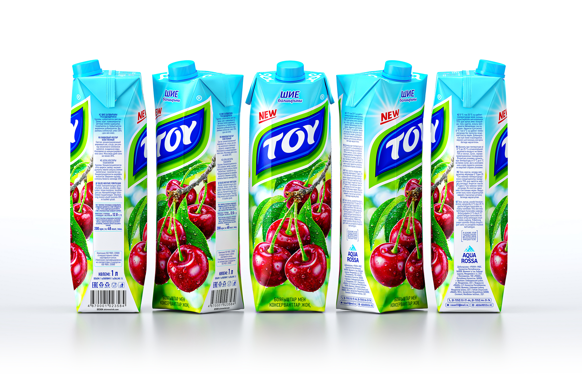
 

TOY — NECTARS, juice packaging design by Akim Melnik Design Studio, Kazakhstan. Image 1 of 5.TOY — NECTARS, juice packaging design by Akim Melnik Design Studio, Kazakhstan. Image 2 of 5.TOY — NECTARS, juice packaging design by Akim Melnik Design Studio, Kazakhstan. Image 3 of 5.TOY — NECTARS, juice packaging design by Akim Melnik Design Studio, Kazakhstan. Image 4 of 5.TOY — NECTARS, juice packaging design by Akim Melnik Design Studio, Kazakhstan. Image 5 of 5.

Comments

0 comments