
VIÑA VILLAR
ABOUT
Viña Villar is one of the flagship wines of Bodegas El Villar, a winery in Villar del Arzobispo, inland Valencia, in eastern Spain. The winery asked for a substantial change to the label without losing what its regular buyers already recognise. The brief was short: cleaner, more classic, and a bottle that would match the wine.
SOLUTION
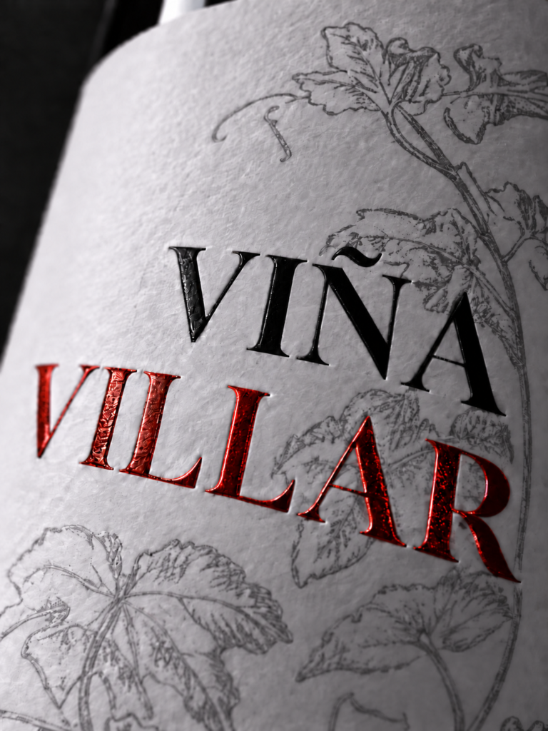
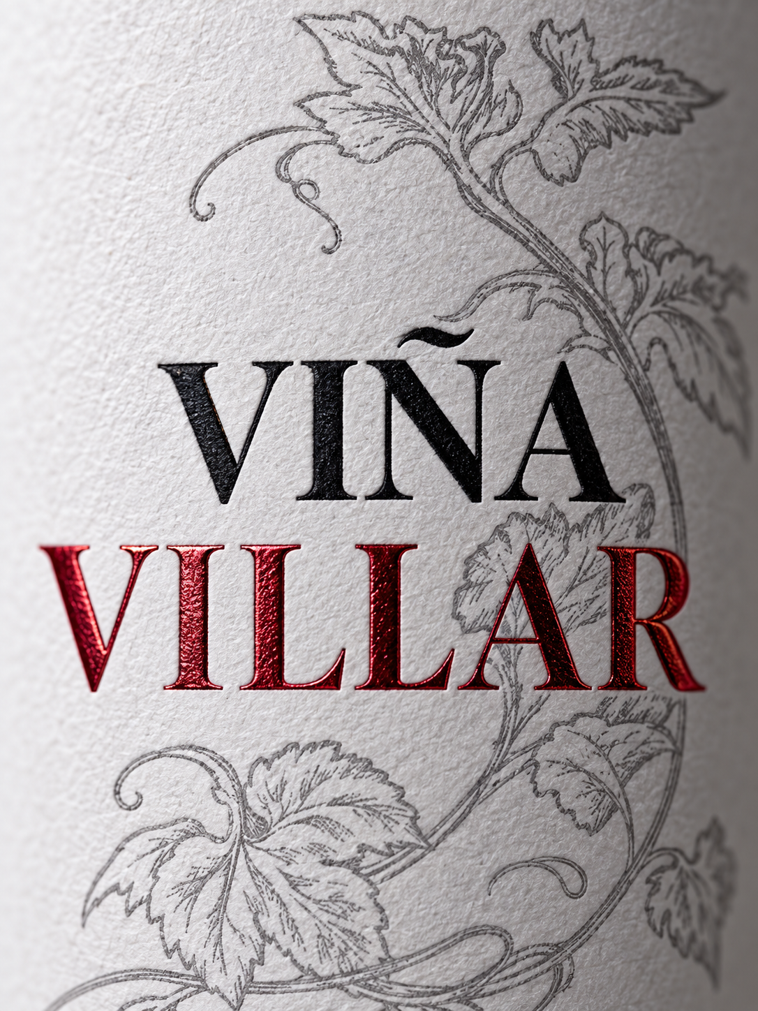
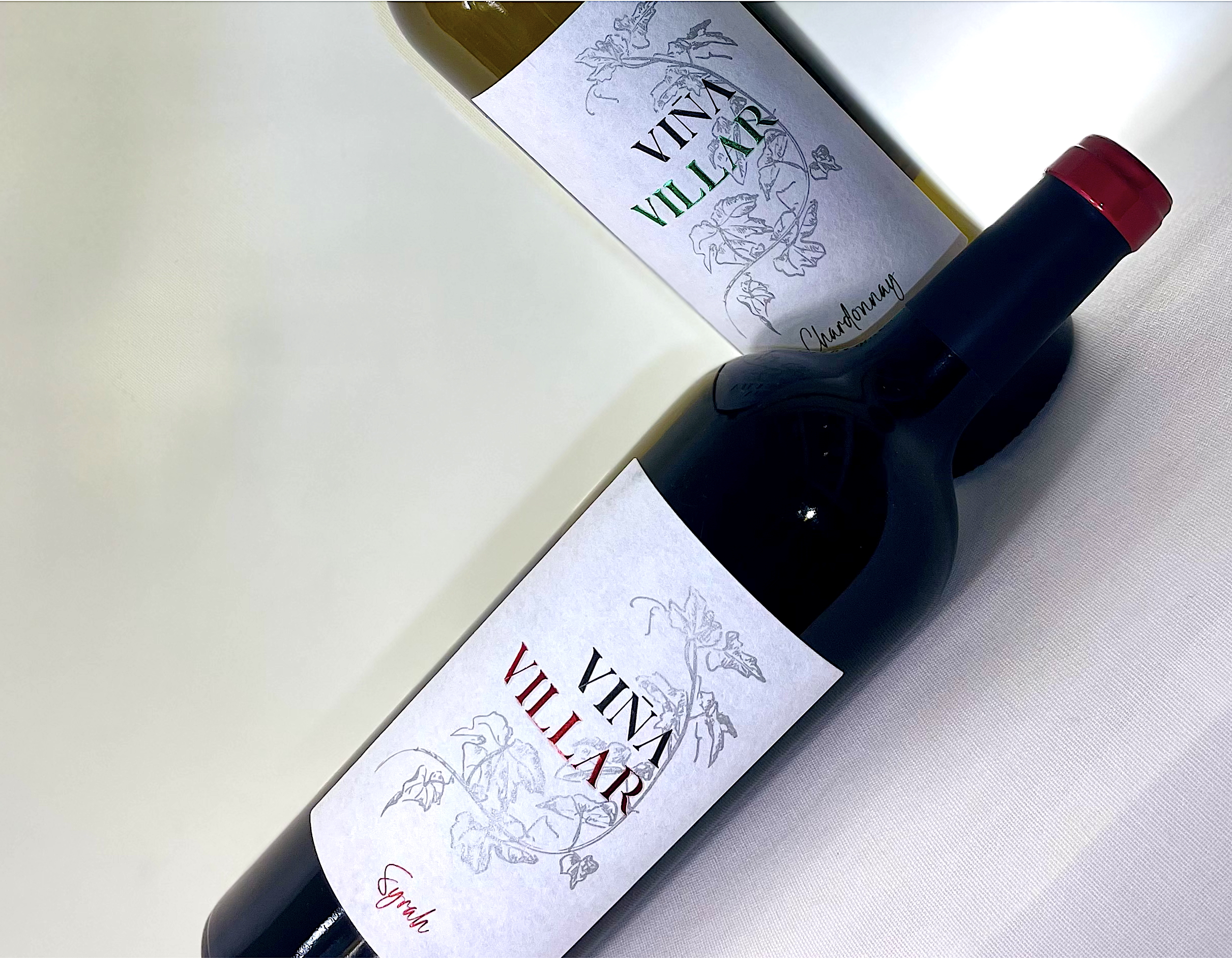
The redesign started with the container rather than the artwork. The wine moved from a standard Bordeaux bottle to a tapered premium Bordeaux, which gave the label a wider and more upright field to work with. The previous design — a naive vine illustration over a vanilla background on a narrow label — was replaced by a composition built on empty space, with a single delicate branch drawn in silver. The paper does much of the work: a cotton-textured stock that absorbs a lot of ink and softens anything printed flat, so the metallic and relief finishes end up as the only sharp elements on the label. The wine name carries three of them at once — screen-printed varnish, hot foil stamping and blind embossing — so the hierarchy is built through relief and light rather than type size. Four print processes in total, layered on a substrate that deliberately blurs everything else.
RESULT
A quiet, classic label where the premium signal comes from material and finish instead of ornament. The brand stays recognisable on the shelf, but the bottle now reads — and handles — like a higher-tier wine.


 Lisa Pokrovskaya
 Simple Studio
 Studio Unbound
 David Byerlee
 M&A CREATIVE AGENCY
 alchimistestudioParis
 monther al omari
 Studio Be Design
 LogoSayLove
 agenciabud
 Shustova p
 mutta
mutta @Allenarts13
 Sirka Agency
 Atiq Alam
 Dozen Agency
 j.substance
 SCD
SCD Cristian Lepore | crilep Copia
 Chris Creative Works